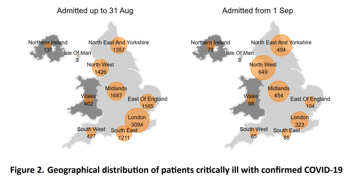
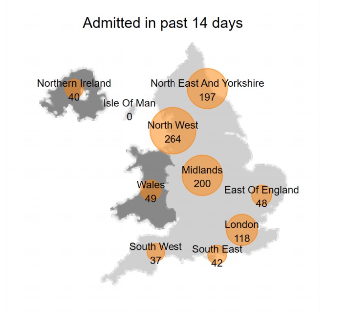
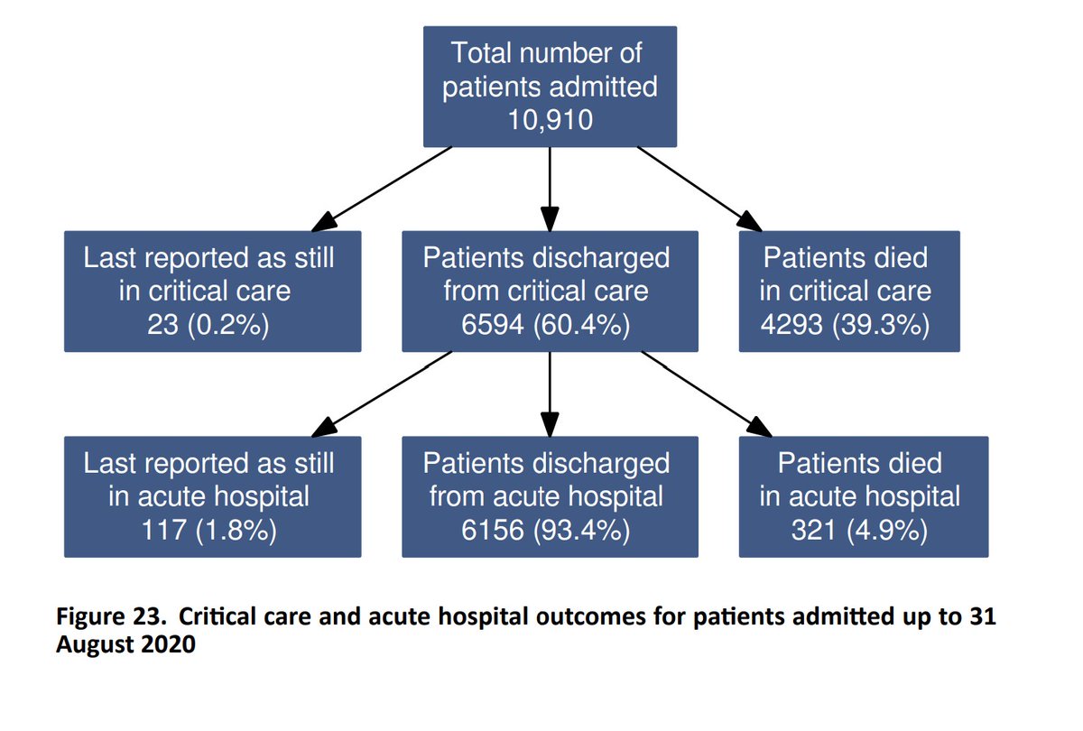
A review of the latest COVID-19 intensive care report from @ICNARC, on behalf of @COVID19actuary and @ActuaryByDay. It covers 2,350 admissions from 1st Sep to 29th Oct, with 995 in the last 14 days, still heavily weighted to the north. 1/10
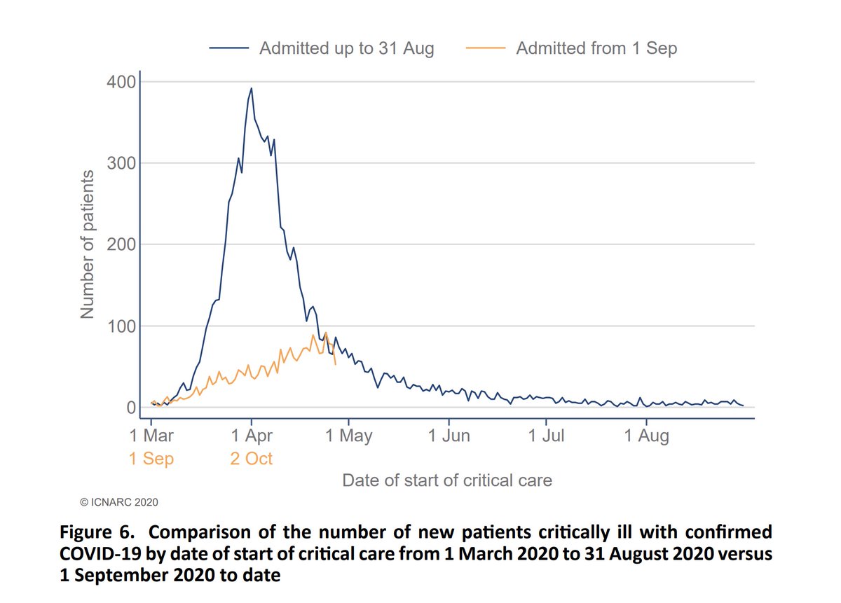
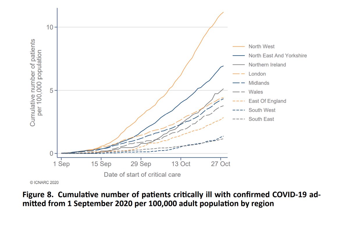
We see how the growth has been much more gradual this time - "flattening the curve", but regionally it& #39;s a very mixed picture when assessed against the relative population sizes. There is an element of data lag in the most recent days that results in some levelling off. 2/10
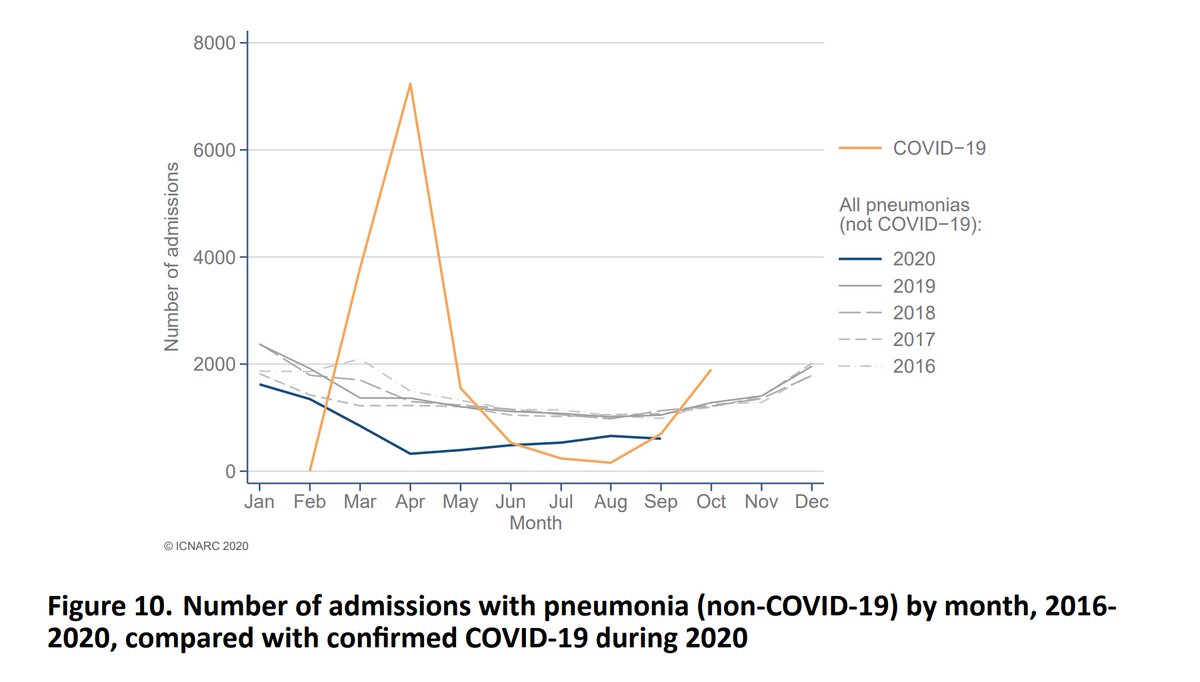
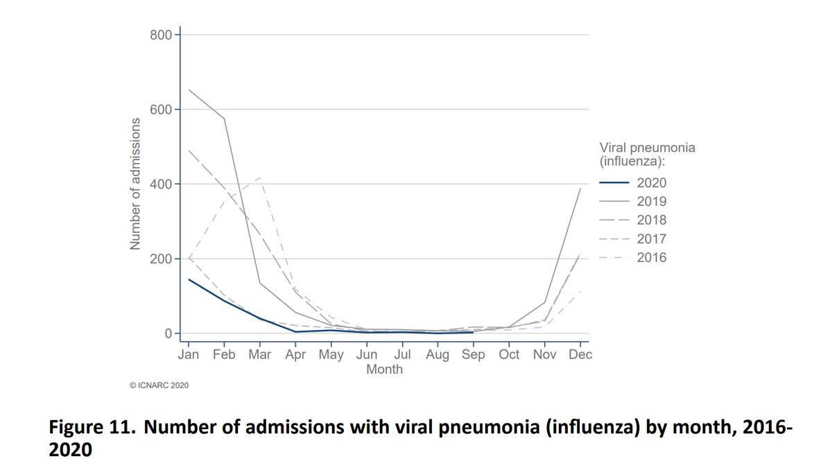
Two charts next that compare COVID admissions with pneumonia and flu. We would only be expecting the latter to start picking up in Nov, and even then not at the volumes of COVID admissions we are seeing. 3/10
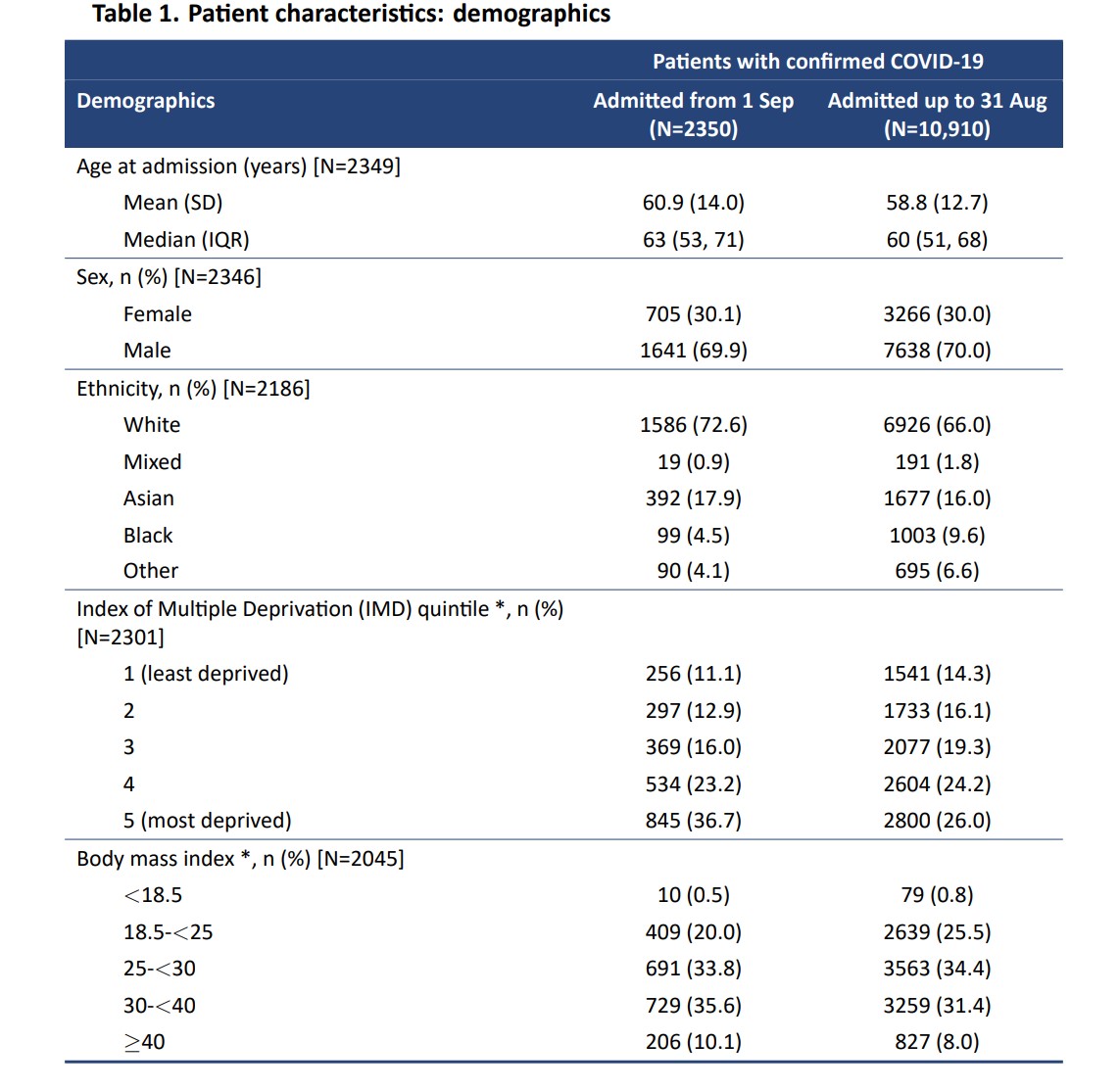
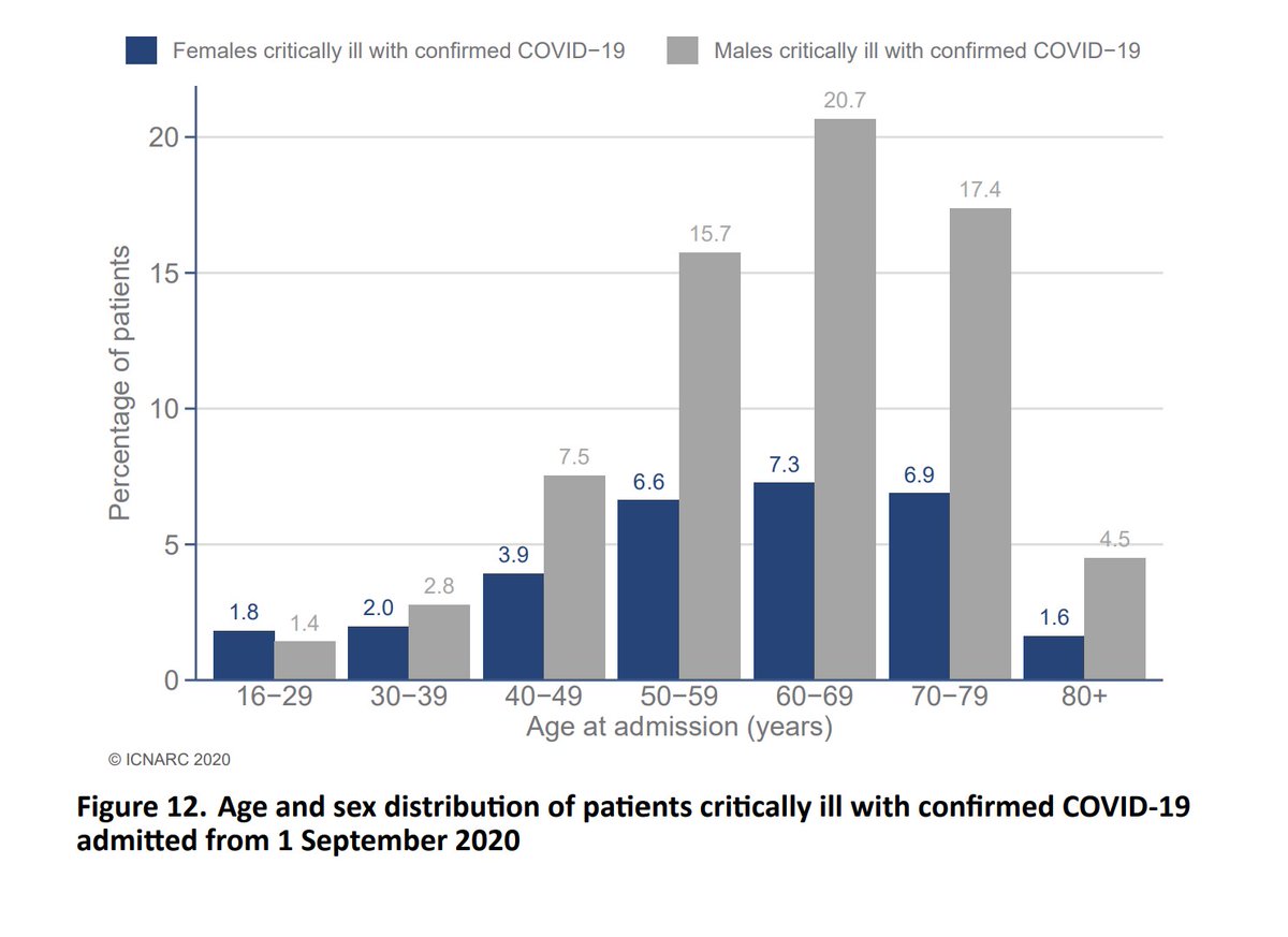
The average age admitted is slowly drifting up, presumably reflecting the position in the infected population. Ethnic minorities make up a lower proportion than the first wave, but in contrast the most deprived and obese are more heavily represented. 4/10
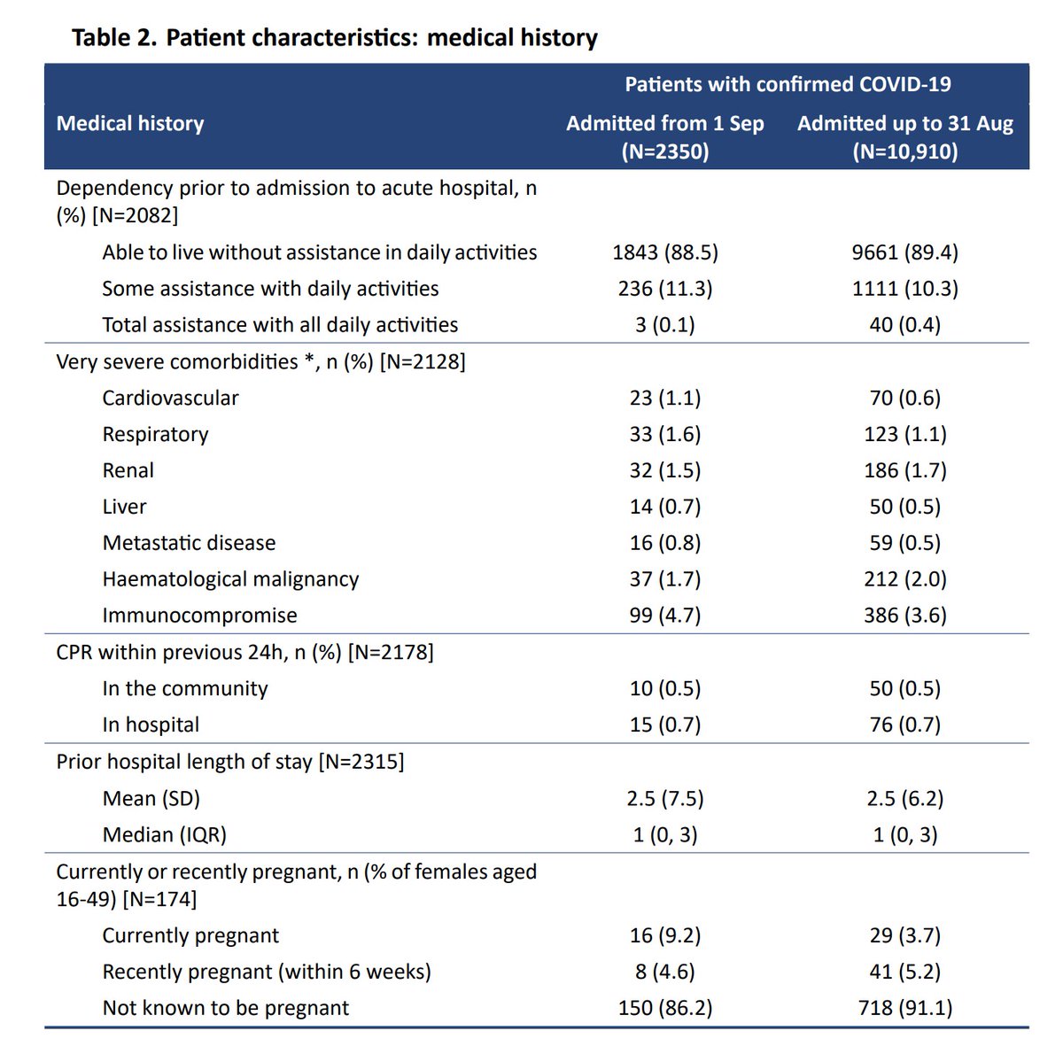
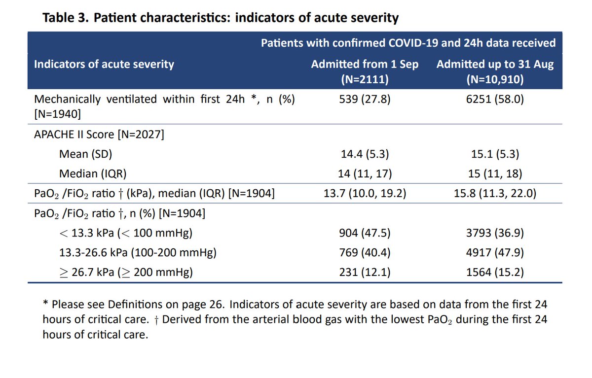
Only 1 in 8 have severe comorbidities, so these aren& #39;t all people who would have died soon anyway. We also see a much lower need for ventilation, roughly half the first wave. That influences outcomes as we come to later. 5/10
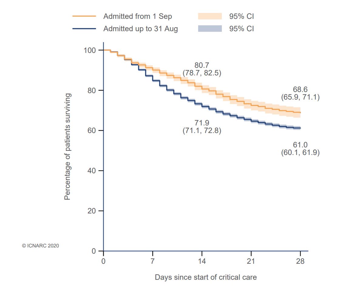
Outcomes are much improved, reflecting the progress made in understanding how best to treat severely ill patients, with a 20% reduction in 28 day mortality. 30% is still a high mortality rate though, so this remains a very serious illness. 6/10
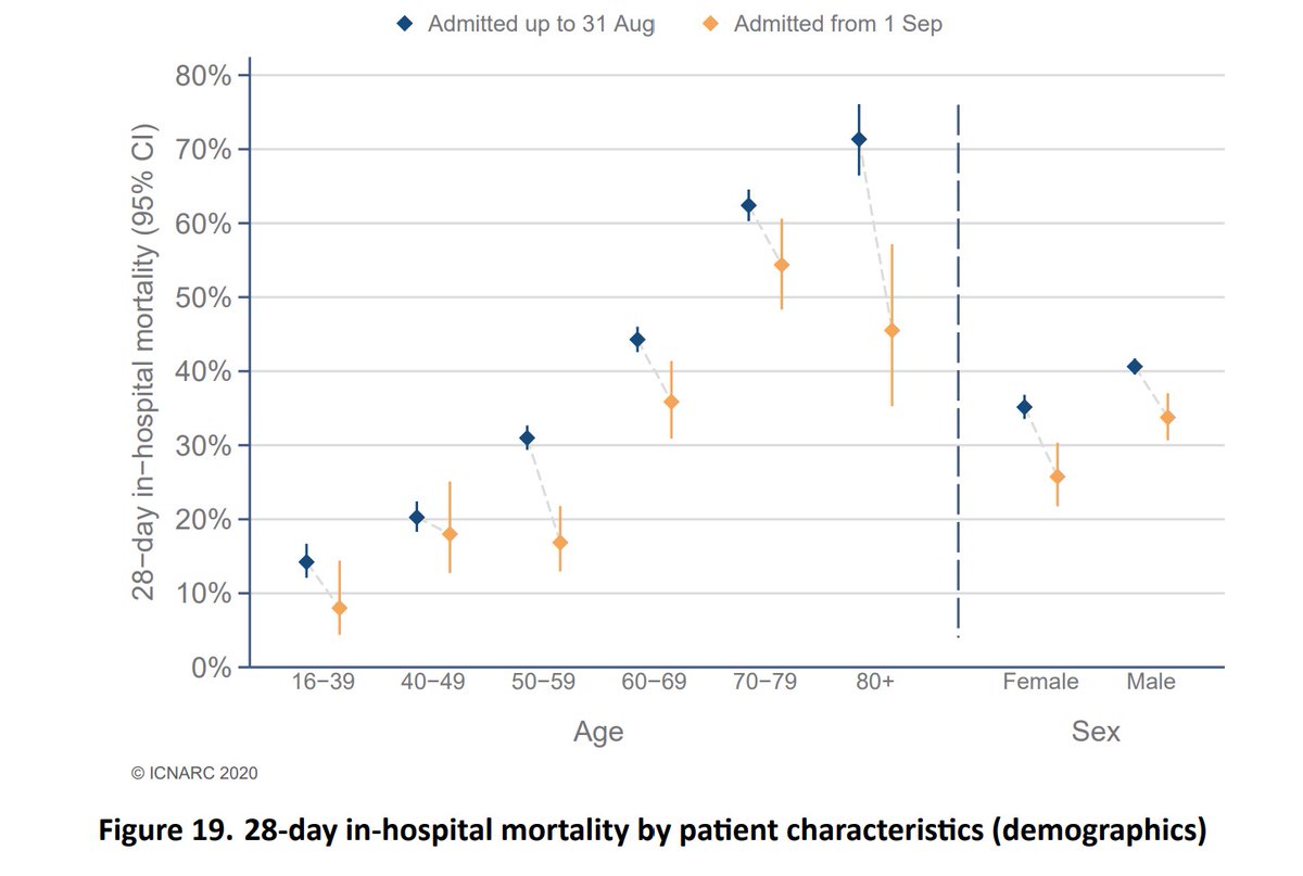
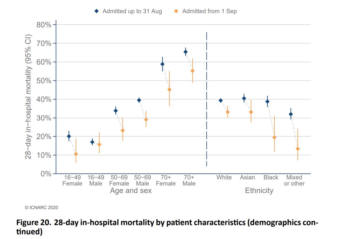
Some great charts next showing how outcomes have improved by patient characteristic. We see improvements at all ages, (though much less so for younger males), and most notably in black and mixed race survival. 7/10
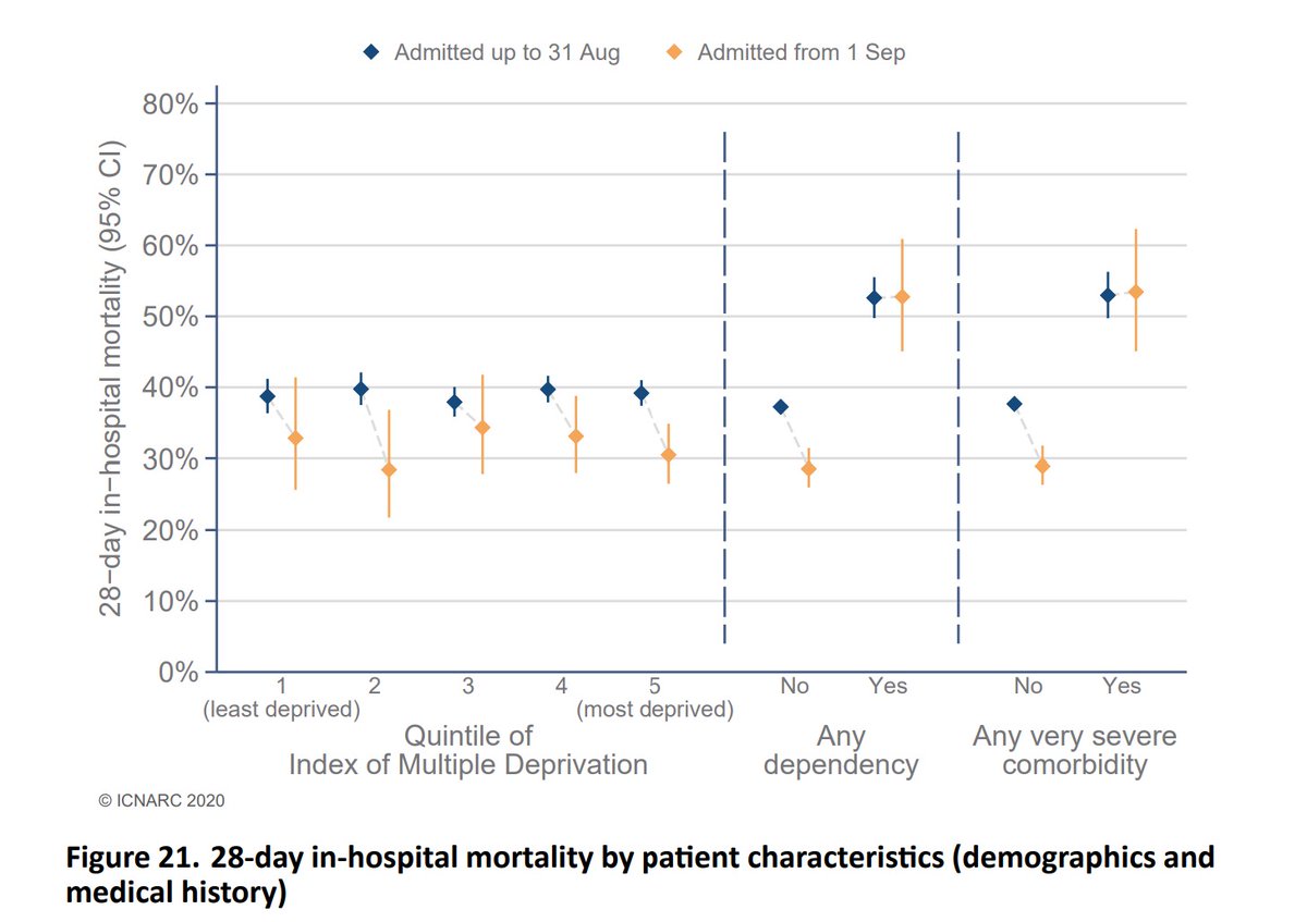
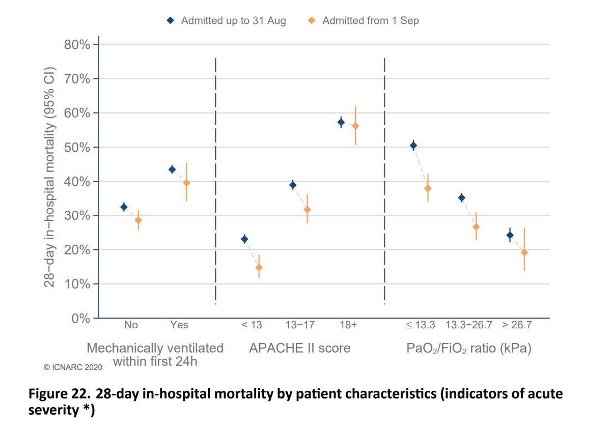
Two more, the first one shows that outcomes for those with serious comorbidities have been more resistant to improvement. The second one highlights that not needing to mechanically ventilate significantly improves outcomes - the gain within each group is lower. 8/10
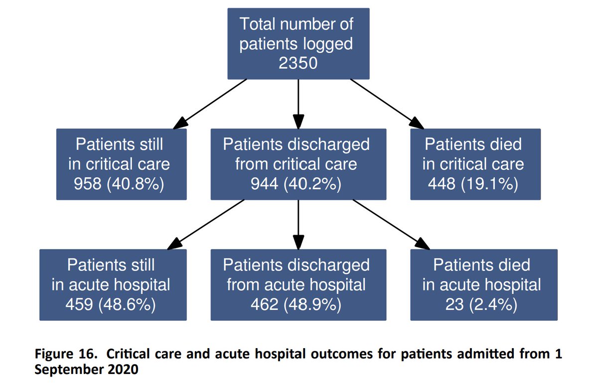
Here& #39;s a summary of overall outcomes for both waves. The mortality rate is much lower, although the second wave is much less mature, so this comparison needs to be treated with some caution. Nevertheless we see from the previous slides the significant improvements achieved. 9/10
Finally, thanks to all at @ICNARC and a big shout out this week to all the data clerks who provide information to enable such detailed and timely analysis on a weekly basis. 10/10 END https://twitter.com/ICNARC/status/1322266621797425157">https://twitter.com/ICNARC/st...
The latest report can always be found here, along with a dataset with some of the underlying numbers. https://www.icnarc.org/Our-Audit/Audits/Cmp/Reports">https://www.icnarc.org/Our-Audit...

 Read on Twitter