I& #39;m uncomfortable with comparisons with the 1st wave - there& #39;s an implication that as long as numbers are lower, everything& #39;s OK, which I disagree with. But with numbers in the NW rising, how do admissions compare? 1/7
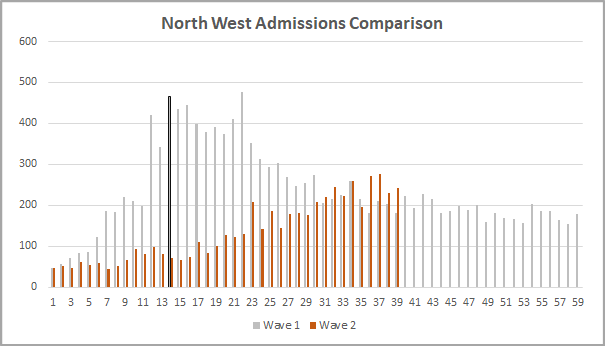
At first sight much better. The peak day so far is much lower, and it& #39;s taken longer to get to even half that level. (I& #39;ve assumed the peak was on D14 in the first wave as the later peak appears to be data catch up.) I& #39;ll discuss the current trend later. 2/7
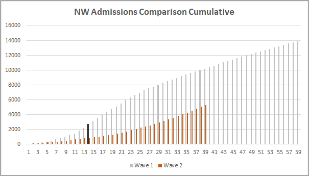
If you look at the cumulative position, again we& #39;re well down on Wave 1. But interestingly, the total admissions are almost twice that seen by the first peak. They& #39;ve just been much more spread out. Remember "flatten the curve" - it& #39;s clearly had a big effect this time. 3/7
Deaths are much lower too, with "only" 725 hospital deaths so far, compared with 1593 to the first peak day for deaths (138 on 11/4). The peak day so far is 45 on 17/9. Better treatment will be a big part of this, both on general wards and in ICU/HDU& #39;s. 4/7
We& #39;ve seen tentative signs of a levelling off of admissions in the last couple of days, reflected in the moving average stalling, which may be due to recent measures taking effect. We need more data to be sure though, and deaths may take another week to replicate any trend. 5/7
Within this data will be differing pictures by hospital, and it& #39;s important not to lose sight of that. This article gives a flavour of the current position. 6/7 https://www.independent.co.uk/news/health/coronavirus-nhs-hospitals-second-wave-patients-intensive-case-b1231906.html">https://www.independent.co.uk/news/heal...

 Read on Twitter


