Daily #COVID19 case counts are increasing in the US and we seem to hitting a third wave (or second surge if you& #39;d prefer). Here I wanted to look at how case counts through time correlate across different states. 1/12
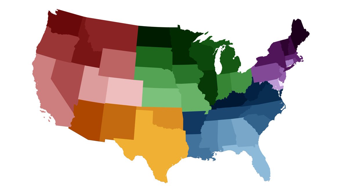
I start with a simple coloring to group states in the West (in red), the Southwest (in orange), the Midwest (in green), the Southeast (in blue) and the Northeast (in purple). Color ramp borrowed from @andersonbrito_. 2/12
Using data from @COVID19Tracking, I plot daily confirmed cases for each state since March as a stacked chart. The three crests are obvious (though not clear how large the third will end up being). Different regions are contributing to each wave to different degrees. 3/12
Keep in mind that these numbers represent reported cases and that the proportion of infections reported as cases has increased over the course of the US epidemic as testing capacity has improved. 4/12
We can look at correlations between states. For example, when case counts are high in New York they are also high in New Jersey (correlation coefficient of 0.95), while when case counts are high in New York they are low in Texas (correlation coefficient of -0.38). 5/12
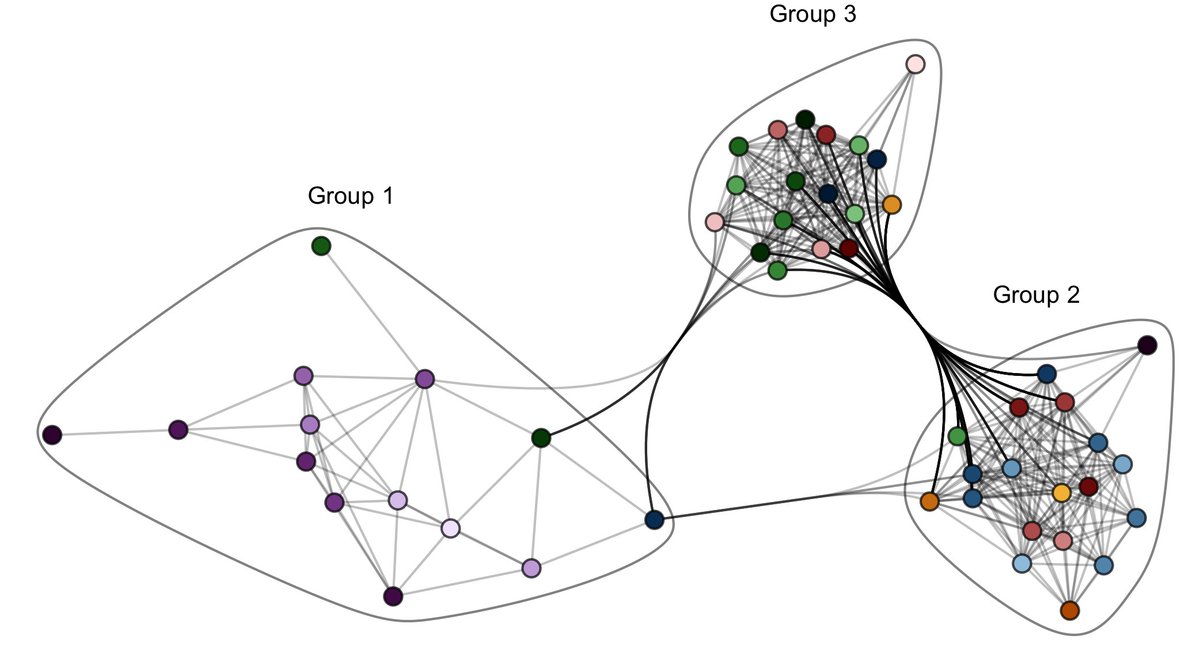
If we look at all pairs of states we can construct a network diagram where each state is a node and edges connect states that have a correlation coefficient of 0.6 of higher, ie states with similar epidemic timeseries. 6/12
There appear to be three different "communities" in this network, or groups of states that resemble one another in their timeseries of confirmed cases. I& #39;ve labelled these simply as groups 1, 2 and 3. 7/12
Network connections obviously differ based on the the threshold chosen. But I get very similar groupings at thresholds above or below the 0.60 correlation coefficient used here. 8/12
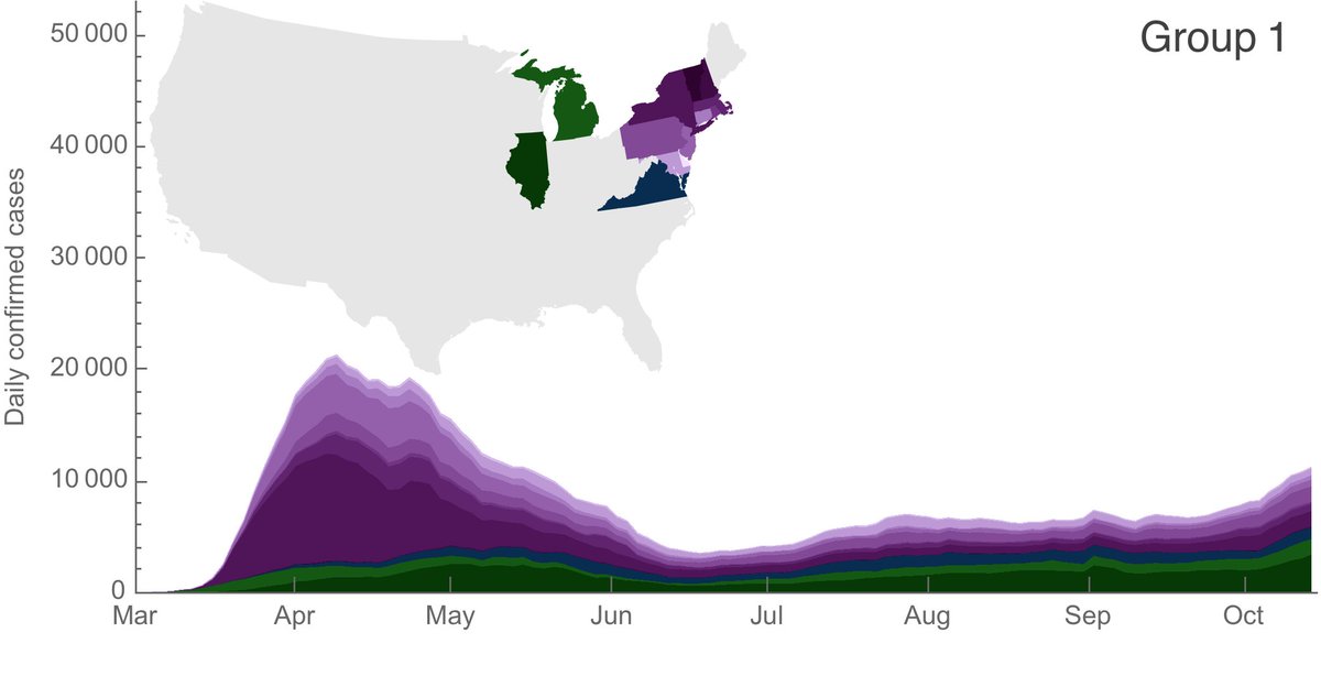
In group 1 are primarily states in the Northeast that had a first wave in March and April, followed by little summer circulation, but where case counts have been slowly creeping up in the past ~6 weeks. 9/12
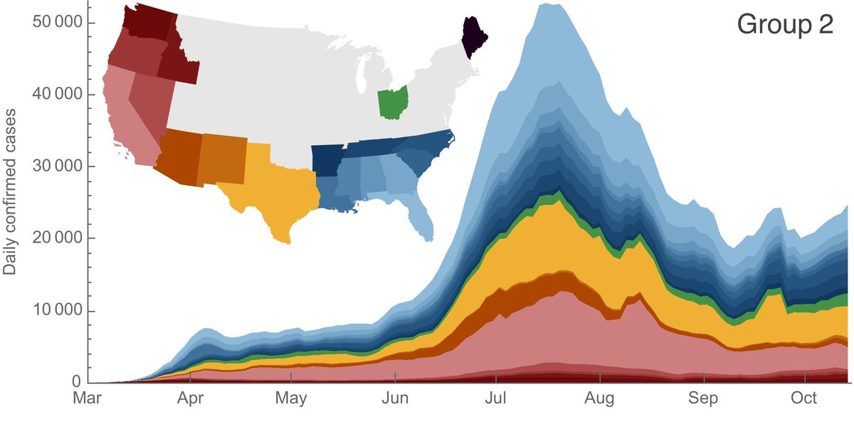
In group 2 are primarily states in the Sun Belt that were involved in the second wave, peaking in July and August. This was followed by sustained circulation but at lower levels than the summer peak. Many of these states have also been creeping up in the past ~6 weeks. 10/12
In group 3 are primarily states in the Midwest and the Mountain West that were not involved in either the first or second waves and that have seen steady increases in case counts since July. 11/12
Seasonal coronaviruses show seasonal circulation patterns. I expect that moving into fall and winter will make controlling COVID-19 more challenging, but I would generally expect continued circulation at case levels not dramatically different to those of the past months. 12/12
(Sorry to be absent these last couple months. I& #39;ll try to get back to more regular updates.)

 Read on Twitter


