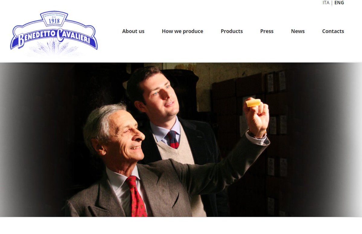
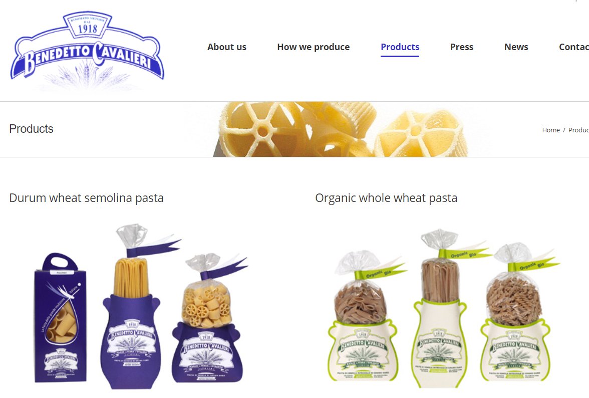
This is the website of my favorite pasta company: http://www.benedettocavalieri.it/en/
I">https://www.benedettocavalieri.it/en/"... would now like to talk about the meeting that determined the website& #39;s design & content. I have lots of experiences with Italian relatives & inlaws, so I& #39;m pretty sure I know what happened.
I">https://www.benedettocavalieri.it/en/"... would now like to talk about the meeting that determined the website& #39;s design & content. I have lots of experiences with Italian relatives & inlaws, so I& #39;m pretty sure I know what happened.
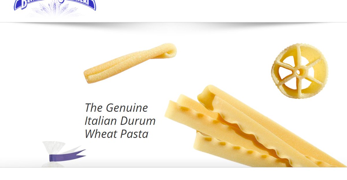
First off was a lengthy discussion about the pasta shapes were to fly into the screen. There was great agitation and disagreement about which shapes would make the cut, and even more contention over the velocity and direction of each one.
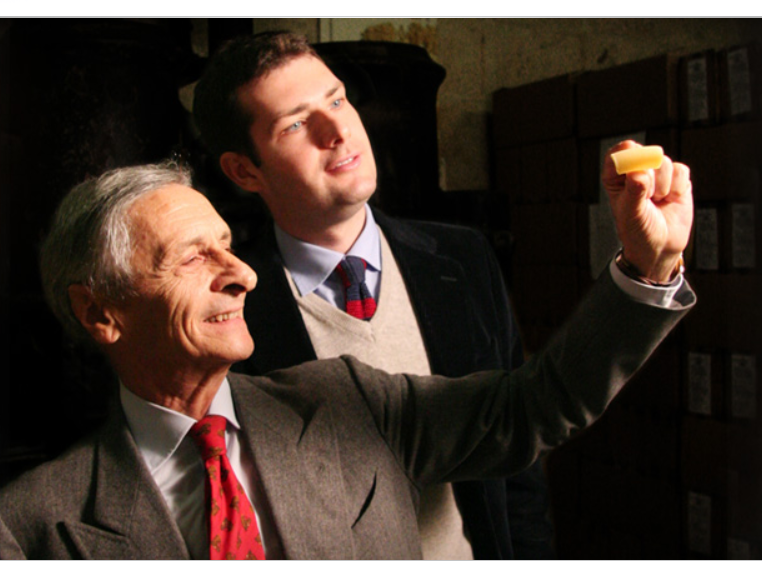
"We need an Italian Harry Potter, but a little older, and more broad-shouldered. He is to be amazed by one pasta held up to the light by a very slender, older man. He must be in a suit from the 1940s. We are not flexible on these."
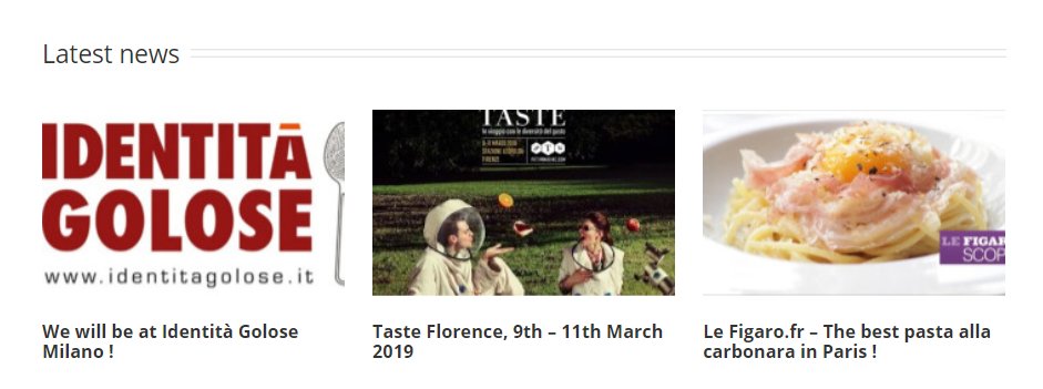
"The articles that rave about our pasta are very important, and so they must be placed into archival, PDF format. They will load slowly, to create the same sense of hunger and longing that our pasta does. DO NOT MAKE the images link to the articles. Only the little text below."

 Read on Twitter