I think I& #39;ve spent too long attacking other people& #39;s wrong numbers lately and I& #39;m not sure that& #39;s helping. So here& #39;s a fairly brief non-technical thread to tell people who aren& #39;t scientists what I think is going on at the moment. TLDR: I think it& #39;s probably all fine still (1/10)
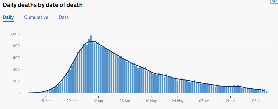
You& #39;ve probably seen graphs like this on the news. These are all the deaths in England, by the day they happened. Unfortunately the news tend to give graphs by date of reporting, which have big weekend effects. This is better, and updated daily at https://coronavirus-staging.data.gov.uk/deaths?areaType=nation&areaName=England">https://coronavirus-staging.data.gov.uk/deaths... (2/10)
You can see deaths are coming down from their peak on 8th April (there was a bit of a bump around 25th June), but it seems like the graph is flattening out lately.
It is, but that& #39;s what you& #39;d expect. (3/10)
It is, but that& #39;s what you& #39;d expect. (3/10)
If we believe that the famous R number is roughly constant and less than 1, then everything would get multiplied by the same factor each week, which gives a curve that flattens out in this way. There& #39;s a kind of "law of diminishing returns". (4/10)
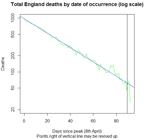
I wrote a Spectator piece early in the epidemic to explain this https://www.spectator.co.uk/article/how-to-read-coronavirus-graphs.">https://www.spectator.co.uk/article/h... What was true on the way up is also true now. If things are being multiplied by the same factor weekly, if we plot on those weird logarithmic axes, we should get a straight line. (5/10)
So here goes, here& #39;s the same data for English deaths post-peak on logarithmic axes. It sure looks a lot like a straight line to me! (though the bump around 25th June is more dramatic now). (6/10)
The blue line gives a rule of thumb: basically, each day& #39;s figure is on average 80% of what it was a week ago. So, when you hear any number, an easy quick check is: see if it& #39;s much more or much less than 80% of the corresponding figure a week ago. (7/10)
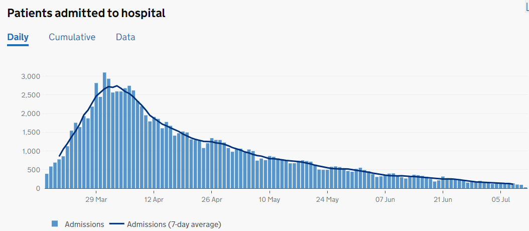
You can do the same with hospitalizations in England. The raw numbers have a similar shape. Note though that the peak is earlier (31st March) - so this data would be an early indicator of problems. (8/10)
On logarithmic axes, you see a very similar picture to deaths. The blue trend line is 81% not 80%, and there& #39;s a weekly pattern wobbling around that (because test results and NHS services have day-of-week effects I think). But again, doesn& #39;t seem anything to worry about. (9/10)
Of course, all this may change, and it& #39;s important to keep an eye on these numbers. But for now, I personally feel these two key indicators are still going in the right direction. (10/10)

 Read on Twitter


