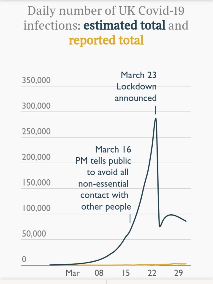
This Sunday Times graph of *modelled* infections surprises me https://www.thetimes.co.uk/article/three-weeks-of-dither-and-delay-on-coronavirus-that-cost-thousands-of-british-lives-05sjvwv7g">https://www.thetimes.co.uk/article/t... I& #39;d have assumed that such a narrow spike in infections would have led to a rapid dropoff in deaths post peak, which we didn& #39;t see. Am obviously wrong though.
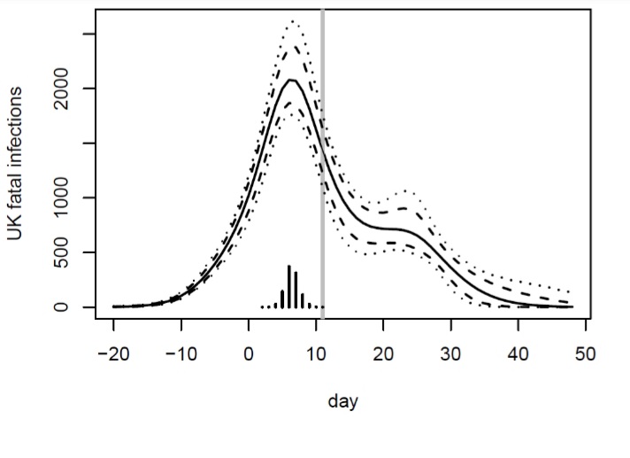
This is the curve my colleague Simon Wood estimated https://www.bristol.ac.uk/maths/news/2020/peak-lockdown.html">https://www.bristol.ac.uk/maths/new... which looks more like what I& #39;d imagined, given people changing behaviour pre-lockdown.
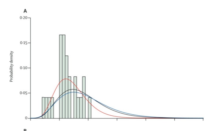
Density function for infection to death time was estimated in this Lancet paper (albeit based on Wuhan and Diamond Princess data) https://www.thelancet.com/journals/laninf/article/PIIS1473-3099(20)30243-7/fulltext">https://www.thelancet.com/journals/... (axes notches are 10 days). Should be able to convolve that with Sunday Times graph and get a plausible UK death curve.
But broadly speaking, if you add two random variables that are both fairly concentrated within a 10 day window, shouldn& #39;t the answer be concentrated within a 20 day window?
I& #39;d like to know more about the Sunday Times curve though, given what @FraserNelson has said about Imperial model not allowing smaller R other than through full lockdown.
And in the light of e.g. @TomChivers piece this week, I think Simon& #39;s curve above is worth discussing too.
And in the light of e.g. @TomChivers piece this week, I think Simon& #39;s curve above is worth discussing too.

 Read on Twitter


