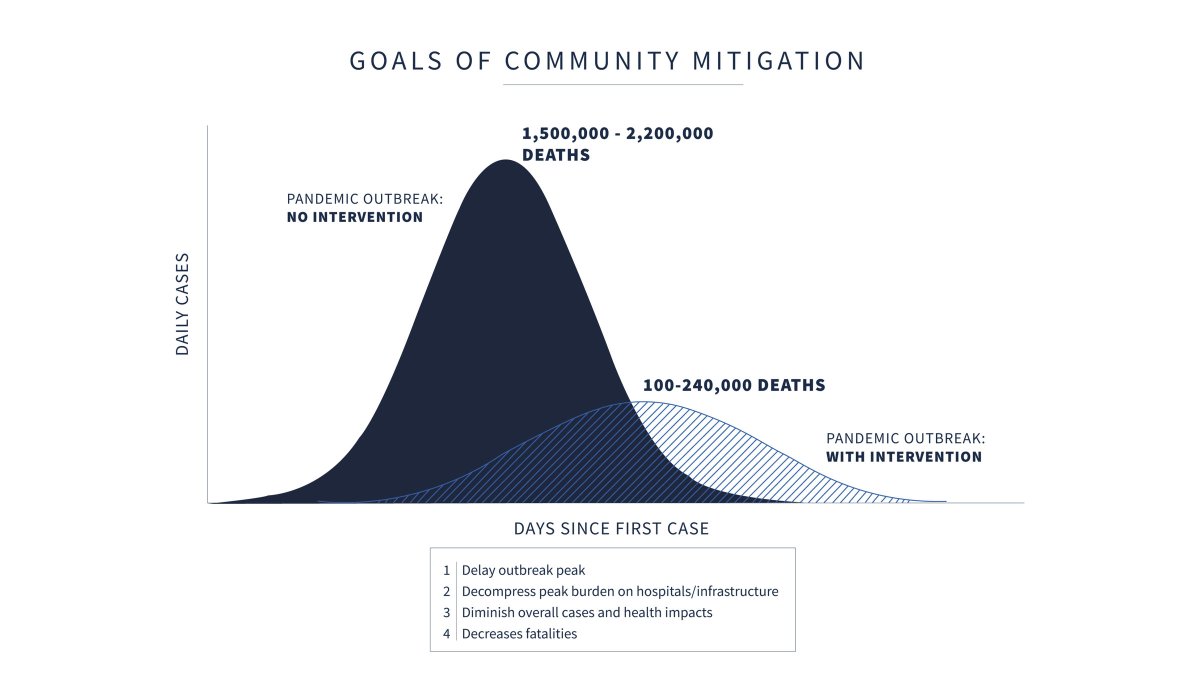
Thread. It looks like the IHME model is fond of drawing curves that are quite symmetric, i.e. they expect deaths to fall about as fast as they expect them to rise. There& #39;s no particular reason to expect this, empirically or theoretically, however. https://twitter.com/CT_Bergstrom/status/1250374214822973441">https://twitter.com/CT_Bergst...
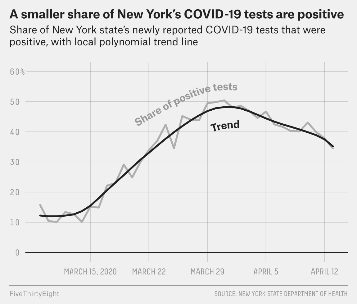
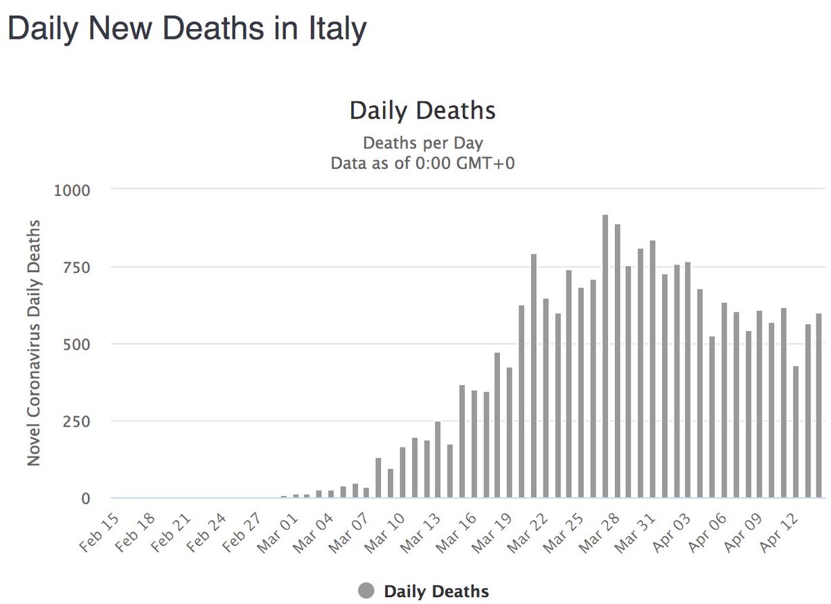
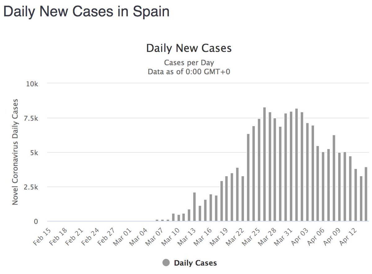
Instead, we& #39;re seeing signs of asymmetry. In New York, things do look like they& #39;re getting noticeably better, but they& #39;re not getting better as quickly as they& #39;re got worse. Same in Italy; there& #39;s a decline in deaths, but it& #39;s not particularly symmetric. Spain is more ambiguous.

 Read on Twitter