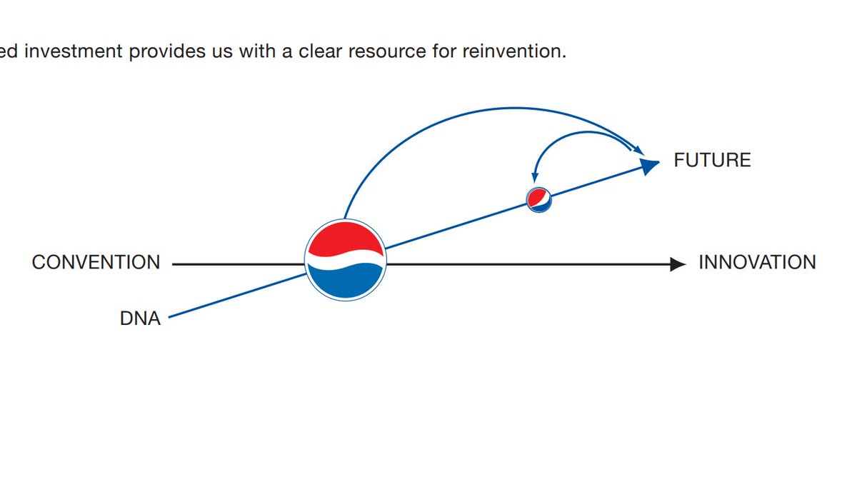
I& #39;m having trouble concentrating on science animations right now, so instead here are some screenshots from my favourite document on the planet.
These are taken from a & #39;work in progress& #39; document from Pepsi& #39;s 2008 rebrand. Every figure is as incomprehensible as this one. 1/23
These are taken from a & #39;work in progress& #39; document from Pepsi& #39;s 2008 rebrand. Every figure is as incomprehensible as this one. 1/23
"The investment in our DNA leads to breakthrough innovation and allows us to move out of the traditional linear system and into the future." 2/
Does anyone remember what we *did* drink out of in 2009? (By the way, this document was produced by the Arnell Group, who were paid $1 million by Pepsi for the new logo) 5/
The document doesn& #39;t say *why* the aspect ratio of the Parthenon is relevant. I guess it must be obvious 6/
The document includes a timeline of 11 events in design. Two of them are Euclid studying mathematics and Pepsi& #39;s rebranding 7/
Here we have a side by side comparison of the Earth& #39;s geodynamo and the Pepsi globe 9/
Magnetic dynamics and Pepsi globe dynamics. "Emotive forces shape the gestalt of the brand identity." 11/
"The Breathtaking Color Palette is derived using a scientific method of color assignment based on the product’s essence and primary features." 16/
Shopping aisles obey Fermat& #39;s principle 17/
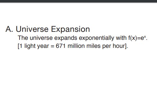
We were so busy telling people that a light year doesn& #39;t measure time that we forgot to tell them it isn& #39;t a speed either 21/
But why stop there? 23/23. (Actually I will stop there because that& #39;s the end of the document. Hopefully back to science animations soon!)
Addendum. The full document is here: https://www.goldennumber.net/wp-content/uploads/pepsi-arnell-021109.pdf">https://www.goldennumber.net/wp-conten...
Just in case anyone thinks I& #39;m the first to put this out there: the document was leaked in 2009 and is pretty infamous

 Read on Twitter


