
 Read on Twitter
I& #39;ve just watched the trailer for the new Dickens movie. I& #39;m not usually bothered by inaccuracies in historical dramas, but I& #39;d like to politely request that film makers STOP PUTTING MASSIVE HEADLINES ON VICTORIAN NEWSPAPERS.

For most of the nineteenth century, the biggest daily newspapers carried nothing but densely-packed adverts on their front page. Here are some examples from around the time this film is set...


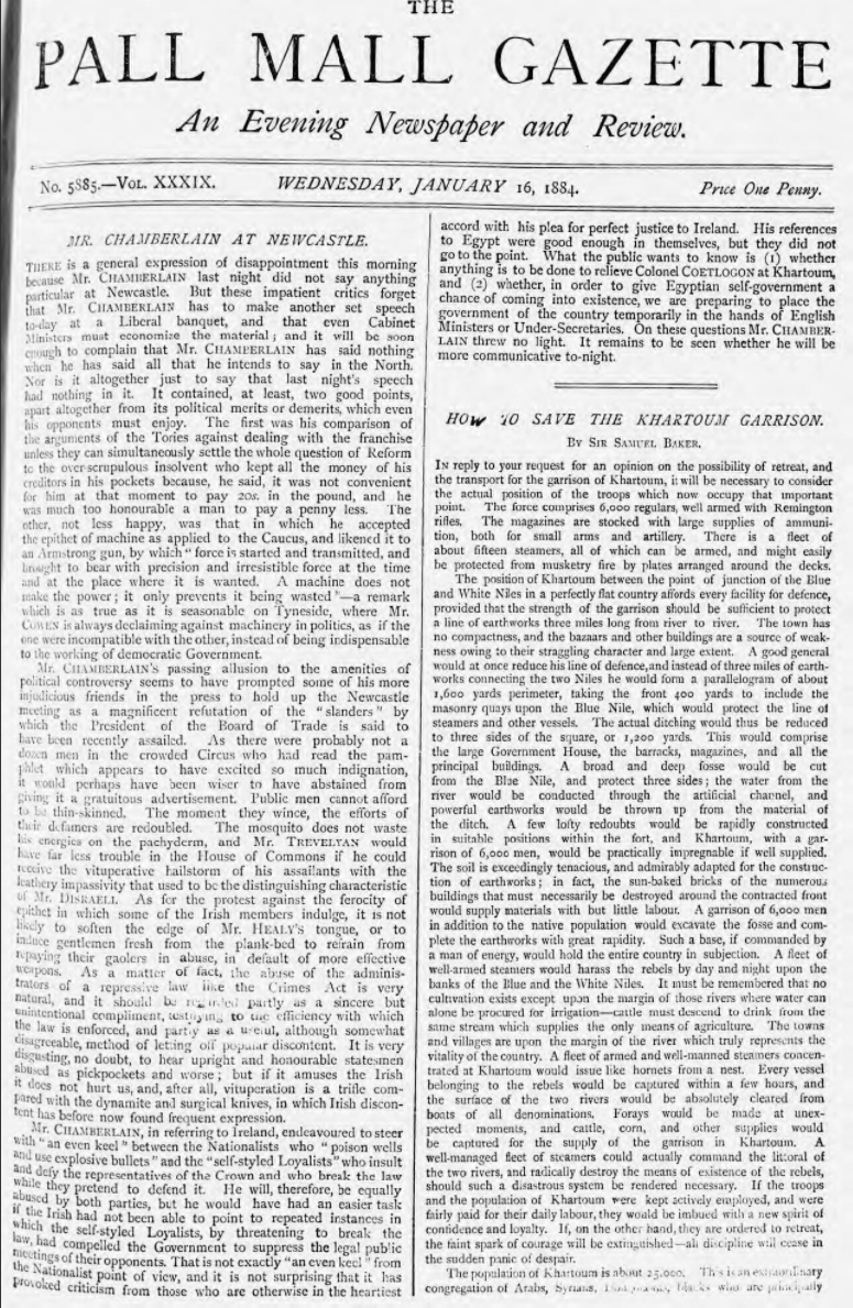
To put this is further perspective, this relatively modest 24-point headline from W. T. Stead& #39;s Pall Mall Gazette was considered innovative (and rather radical) in 1885... nearly thirty years after Dickens died.
 in 1885... nearly thirty years after Dickens died.")
Meanwhile, the front page of papers like The Times still looked like this in 1965!

SURELY a sensationalist, populist paper like the Daily Mail would have news and headlines on its front page, right? Not until the 1940s!


Welcome to the smallest hill that I& #39;m willing to die on.
I know these props serve a convenient narrative purpose, but media history matters too! The ‘newspaper’ as we know it evolved, piece-by-piece, over many centuries and went through countless transformations on the way.
If we imagine the ‘newspaper’ as an unchanging institution that looked much the same in 1843 as it does today, then the imminent death of print journalism looks apocalyptic; but the migration to digital isn’t an ending, just another chapter in a long story.
While we& #39;re here, I should point out that not *all* Victorian newspapers looked like a wall of text. Some weeklies like the Illustrated Police News (low-brow, crime, sensation) and the Illustrated London News (high-brow, news, culture, etc) looked rather different...
 and the Illustrated London News (high-brow, news, culture, etc) looked rather different...")
 and the Illustrated London News (high-brow, news, culture, etc) looked rather different...")
You might also be surprised to learn that interviews - something we now think of as being so central to the practice of journalism - were uncommon in British papers until the 1880s. They were regarded as an invasion of privacy & condemned as an uncouth American import!
(DNCJ)
")
")
(DNCJ)
Thanks for humouring this (admittedly *very* petty) rant about the cinematic misrepresentation historical newspapers. Join me next time as I try to sit through the trailer for the forthcoming P. T. Barnum movie without having an aneurysm. https://www.youtube.com/watch?v=AXCTMGYUg9A">https://www.youtube.com/watch...
...aaaaaand we& #39;re back! The Greatest Showman features quite a few newspapers. The New York Herald *did* occasionally feature news on its front page as well as the usual adverts, but not headlines like this in the 1840s.


However, unlike the British papers I posted before, the New York Herald *did* print news-related images on its front page from time to time. So this prop from the film isn& #39;t totally anachronistic.


This enormous internal headline and cross-column article is a bit weird though, as is the by-line portrait. The vast majority of articles in nineteenth-century newspapers were unsigned, so it would be rare for a journalist& #39;s *name* to appear, never mind a picture of them!

The keen-eyed historians among you might have noticed that all of these props have had the date removed, which would normally appear centred under the masthead. One has & #39;New York& #39;, one & #39;Saturday& #39;, and the other is just blank. Real masthead in the 4th image.


I suspect that this is because the film (which, to my surprise, I actually rather enjoyed!) condenses, rejigs, and omits large parts of Barnum& #39;s career. They avoided pinning moments to specific dates, and generally kept the passage of time fairly vague.
The New York Tribune also makes a brief appearance. As is often the case, they get details like the masthead right - including the Tribune& #39;s taller left & right columns. We don& #39;t get a closer look though so, as far as I can tell, it& #39;s just the headline that& #39;s wrong here.


Finally, I also spotted a copy of The New York Times! The formatting is weird for all the usual reasons. Also: the NYT wasn& #39;t founded until 1851, a decade after Barnum opened his & #39;American Museum.& #39; AND it was known as the & #39;New York Daily Times& #39; until 1857.


In sum: still out here dying on that hill.
"But Bob," I hear you all cry, "what about the on-screen representation of Victorian newspapers in 2016& #39;s The Limehouse Golem?" Well...

... they did a pretty good job! Here& #39;s their reproduction of the Penny Illustrated Paper, plus a trial-related front page from the real periodical published in the 1880s when the film was set. The caption should be below the image, but aside from that it looks okay to me.


Our old friend The Illustrated Police News also makes a welcome appearance, but there are some peculiar errors here. The paper only carried illustrations on its cover at this point, so those text-heavy side column& #39;s under Dan Leno& #39;s fingers are out of place. Why add them?!


Let& #39;s take a closer look. Like the props in The Greatest Showman, the date has been omitted. Ackroyd& #39;s novel is set in 1880, which means that the film used the wrong masthead for the IPN. It didn& #39;t look that until May 1882. But this isn& #39;t a deal breaker, even for me!

Similarly, they were right to put adverts on the back page of the Penny Illustrated Paper. In 1880 these adverts were plainer and more densely-packed, but later in the decade they did start to look quite like the move prop. So maybe the film is set slightly later than the novel?


Bonus points: the Penny Illustrated Paper *did* actually carry adverts for Isaac Walton & Co!


I also liked the incidental use of print culture in the film. The Pall Mall Gazette was (usually) a respectable gentleman& #39;s evening paper, which seems appropriate for the reading rooms of the British Museum.
 a respectable gentleman& #39;s evening paper, which seems appropriate for the reading rooms of the British Museum.")
 a respectable gentleman& #39;s evening paper, which seems appropriate for the reading rooms of the British Museum.")
In one scene they also depicted a poor character& #39;s lodgings with pages from newspapers and periodicals pasted onto the walls, which was reportedly quite a common practice.  https://abs.twimg.com/emoji/v2/... draggable="false" alt="👍" title="Thumbs up" aria-label="Emoji: Thumbs up">
 " title="In one scene they also depicted a poor character& #39;s lodgings with pages from newspapers and periodicals pasted onto the walls, which was reportedly quite a common practice. https://abs.twimg.com/emoji/v2/... draggable="false" alt="👍" title="Thumbs up" aria-label="Emoji: Thumbs up">" class="img-responsive" style="max-width:100%;"/>
In summary: I thought The Limehouse Golem& #39;s tone was misjudged, the plot was too predictable, key performances were wooden, and the casting of Dan Leno was CATASTROPHICALLY bad. But the newspapers are mostly on-point, so it& #39;s a solid 4/5 stars from me.
Welcome back to this ridiculous thread. I& #39;ve been playing Red Dead Redemption 2 this weekend. Earlier today I encountered a newspaper vendor. You can probably guess where this is going...

I bought this newspaper in a small, mid-western livestock town called Valentine. I know what you& #39;re probably thinking: "headlines and news on the front page again?! He& #39;s going to have a heart attack!" But actually...


... American newspapers in this period (the game is set in 1899) often had news on their front page. Here& #39;s a broadly comparable paper from the town of Corinth, Mississipi. As you can see, the game& #39;s mixture of display adverts & news on the front page isn& #39;t anachronistic at all!
 often had news on their front page. Here& #39;s a broadly comparable paper from the town of Corinth, Mississipi. As you can see, the game& #39;s mixture of display adverts & news on the front page isn& #39;t anachronistic at all!")
The game& #39;s use of crude woodcut images in support of some leading news stories is also pretty plausible. That said, I& #39;m not enough of an expert on frontier American journalism to know whether a remote, small-town paper would& #39;ve had the resources to do this.


The game& #39;s adverts look reasonably authentic to my eye as well. In fact, their advertisement for & #39;Millicents Cigarettes& #39; is pretty much just a copy of a real advert for Player& #39;s Navy Cut cigarettes!


The in-game paper also uses headers & sub-headers in a way that was very characteristic of American journalism. By the end of the 19th century, some British papers (particularly evening & weeklies) started using similar strategies, but it was very much an American invention.
 started using similar strategies, but it was very much an American invention.")
 started using similar strategies, but it was very much an American invention.")
Alas, they didn& #39;t get everything right! The structure of the in-game page is rather weird in the way that stories are squared-off into sections that require readers to jump back-and-forth between columns, rather than read top-to-bottom...

By this point in time, the columnar structure of newspaper pages was often disrupted by images, display adverts, and (in some papers) headers that spanned multiple columns. But the flow of stories was (in all instances I recall seeing) read top-to-bottom.
 headers that spanned multiple columns. But the flow of stories was (in all instances I recall seeing) read top-to-bottom.")
I don& #39;t know enough about the principles (or vocabulary) of typesetting to critique its appearance here, but it looks *slightly* off to me. More whitespace? A different approach to kerning? Over-use of hyphens to split words at the end of a line? (RDRD2 paper on right)
 of typesetting to critique its appearance here, but it looks *slightly* off to me. More whitespace? A different approach to kerning? Over-use of hyphens to split words at the end of a line? (RDRD2 paper on right)")
 of typesetting to critique its appearance here, but it looks *slightly* off to me. More whitespace? A different approach to kerning? Over-use of hyphens to split words at the end of a line? (RDRD2 paper on right)")
So far though, aside from their mistreatment of columns, I& #39;ve been fairly impressed by the game& #39;s representation of newspapers. Turns out that they didn& #39;t blow *all* their research budget on temperature-sensitive horse testicles. I& #39;ll be back if/when I find more papers...
A year after starting this ridiculously petty thread, I finally got around to watching & #39;The Man Who Invented Christmas& #39; in full. I thought the newspaper with the massive headline might just have been used in promotional images, but here it is in the actual film!

In this scene, Dickens is using the newspaper to hide from Thackeray during a visit to the Garrick Club. Most of the discussions we had about cinematic headlines surrounded their utility for plot exposition, but it turns out that this was mainly just a sight gag!
While we& #39;re here... In the film, Thackeray reviews A Christmas Carol for The Spectator. In an emotional final scene, John Forster reads out the glowing review from what looks like a large, SEVEN-COLUMN MORNING PAPER. The Spectator was a small, two-column weekly...


That said, it wasn& #39;t uncommon for daily newspapers to reprint reviews and other articles from papers like The Spector, so it& #39;s not *entirely* implausible. Except, of course, for the fact that Thackeray actually published his review in Fraser& #39;s Magazine the following February...
The book itself fares a bit better, I think - although I& #39;m less of an expert on literary objects. Most of the details here look fairly accurate to me.


Actually, the title page in the cinematic prop seems to be missing the publisher& #39;s name at the bottom! I wonder why they omitted this? The lower section of the page is always *just* out of shot in every other scene in which the prop appears.


I was beginning to wonder this too. The layout of the text and the paragraph spacing inside the move prop looks off to me as well, though I can& #39;t seem to find a *precise* scan/facsimilie of the 1st edition that shows the opening pages of text. https://twitter.com/arrroberts/status/1074808059166371845">https://twitter.com/arrrobert...
Before you all think I& #39;m totally insane (too late?), I must say that these relatively minor historical inaccuracies didn& #39;t undermine my enjoyment of the film. Unfortunately, I can& #39;t say the same for the clunky script and unconvincing central performance. It was okayish. 2.5/5.
Brace yourself for another eye-wateringly bad newspaper prop, this time from the latest series of Victoria, set in the 1840s. No massive headline this time, but the image, column layout, typography, and masthead are abysmally bad. (Spotted by @sbasdeo1)
")
To put this in some perspective, here’s the real Morning Chronicle from that period. As usual, the front page is just a wall of small adverts.

People always tell me that newspaper props *need* to look like this in order to communicate something quickly to the audience, but this one doesn’t show anything useful. In fact, the character reading it explains the news with some expository dialogue. So it’s *pointlessly* bad.
Literally *everything* about this masthead is wrong. The weird bit saying ‘Morning Newspaper’ helpfully explains that this paper was published in the morning, just in case the name ‘MORNING chronicle’ wasn’t clear.

If you’re still not certain what time of day it was published, the bizarre and totally invented slogan clarifies that this was ‘All the MORNING News for One and All.’ This also sounds like something from a radical Chartist paper, not a fairly respectable middle-class daily paper.

The Morning Chronicle cost 5d in 1848, not 7d (and price was on top-right of page). And the 2 July in that year actually fell on a Sunday, which is the ONE DAY of the week that the Morning Chronicle wasn’t published.
. And the 2 July in that year actually fell on a Sunday, which is the ONE DAY of the week that the Morning Chronicle wasn’t published.")
Incidentally, we know it’s supposed to be 1848 because the news story in question is about the Revolution in France. You know, the one that’s famously known as the FEBRUARY REVOLUTION. Reported here... in July.
¯\ _(ツ)_/¯
¯\ _(ツ)_/¯
Big shout-out to the TV series Victoria for continuing to get mid-19thC newspapers *spectacularly* wrong. A satirical cartoon on the front page of a morning newspaper! https://twitter.com/victorianlondon/status/1117151398221746179?s=21">https://twitter.com/victorian...
I love the new TV series of What We Do In The Shadows so much I& #39;m even willing to overlook this horrifying misrepresentation of Victorian newspapers from the opening credits.

As we& #39;ve seen before in this thread, the massive headline and use of images is a common movie prop mistake (or a deliberate decision to prioritize plot, depending on how you look at these things...), but this one also elevates prosaic shipping news to bizarre prominence! Dear me.
But having said all of that, it& #39;s an offbeat comedy that doesn& #39;t claim to be a faithful representation of the past. It also makes fun and effective use of other pieces of historical print culture throughout the series. So I& #39;ll let it off.
I’ll just leave this spin-off thread about a bad Daily Mail reproduction here, so that all of my ranting about anachronistic newspaper props is in one place. https://twitter.com/digivictorian/status/1255870790676946944?s=21">https://twitter.com/digivicto... https://twitter.com/DigiVictorian/status/1255870790676946944">https://twitter.com/DigiVicto...
As ever, if *YOU* spot a historical newspaper prop in a film, tv show, game, etc, then please send it my way and I’ll dissect it here in tedious detail.
I HAVE BEEN SUMMONED! https://twitter.com/FernRiddell/status/1308133582414770178?s=20">https://twitter.com/FernRidde...
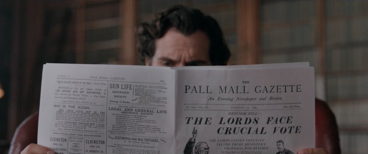
I swore I& #39;d stop banging on about the misrepresentation of newspapers in historical dramas, but then THIS happened in #EnolaHolmes https://abs.twimg.com/hashflags... draggable="false" alt="">, and here we are again.
 , and here we are again." title="I swore I& #39;d stop banging on about the misrepresentation of newspapers in historical dramas, but then THIS happened in #EnolaHolmes https://abs.twimg.com/hashflags... draggable="false" alt="">, and here we are again." class="img-responsive" style="max-width:100%;"/>
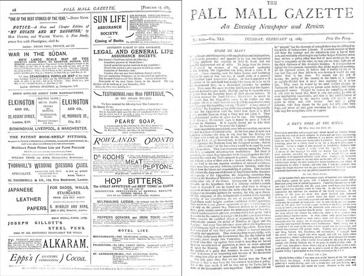
The Pall Mall Gazette — a real Victorian newspaper with a fascinating history — crops up several times in #EnolaHolmes https://abs.twimg.com/hashflags... draggable="false" alt="">. Here& #39;s what the paper looked like at this time.
They got the masthead and back page of adverts spot on, but...
They got the masthead and back page of adverts spot on, but...
 . Here& #39;s what the paper looked like at this time.They got the masthead and back page of adverts spot on, but..." title="The Pall Mall Gazette — a real Victorian newspaper with a fascinating history — crops up several times in #EnolaHolmes https://abs.twimg.com/hashflags... draggable="false" alt="">. Here& #39;s what the paper looked like at this time.They got the masthead and back page of adverts spot on, but..." class="img-responsive" style="max-width:100%;"/>
...the front pages are baaaaaaad. Really bad.


The Pall Mall Gazette was an evening paper with a different format to many of the morning papers I& #39;ve posted in this thread. Unlike, say, The Times, the PMG *did* print news on its front page instead of adverts — so it& #39;s not *entirely* wrong to see it here in #EnolaHolmes https://abs.twimg.com/hashflags... draggable="false" alt="">.
 ." title="The Pall Mall Gazette was an evening paper with a different format to many of the morning papers I& #39;ve posted in this thread. Unlike, say, The Times, the PMG *did* print news on its front page instead of adverts — so it& #39;s not *entirely* wrong to see it here in #EnolaHolmes https://abs.twimg.com/hashflags... draggable="false" alt="">.">
 ." title="The Pall Mall Gazette was an evening paper with a different format to many of the morning papers I& #39;ve posted in this thread. Unlike, say, The Times, the PMG *did* print news on its front page instead of adverts — so it& #39;s not *entirely* wrong to see it here in #EnolaHolmes https://abs.twimg.com/hashflags... draggable="false" alt="">.">
As I mentioned near the start of this thread, the Pall Mall Gazette — under the maverick editorship of W. T. Stead — was also experimenting with typography & headlines in the 1880s. But this famous headline from 1885 was BIG for the time!

So, while the massive font and egregious use of italics is totally out of step with the Pall Mall Gazette and other Victorian papers, I guess a generous interpretation would say that it was still kinda in the *spirit* of Stead& #39;s experimental and sensationalist journalism.

Unlike morning papers, the Pall Mall Gazette also made sparing use of simple images — though not on the front page like the prop in the film. Detailed front-page images like this were chiefly limited to weekly newspapers (who had longer to produce them as a result).
.")
.")
The film also gives us a good look at the inside of the paper, and again it& #39;s a mixed bag of material lifted directly from the real PMG (all fine) and additional stuff grafted awkwardly on top to serve the plot.
 and additional stuff grafted awkwardly on top to serve the plot.")
 and additional stuff grafted awkwardly on top to serve the plot.")
At one point, the inside of the Pall Mall Gazette randomly does an impersonation of The Times& #39; personal adverts page.
¯\_(ツ)_/¯
_/¯")
¯\_(ツ)_/¯
Actually, sorry, it does that *twice*.

On the plus side, it looks like they& #39;ve got the size of the paper roughly correct. The PMG was much smaller than a morning broadsheet. I can& #39;t check for sure without googling the length of Henry Cavil& #39;s fingers, and today is not that day.

The morning newspapers in the rack at the back of the reading room are alright too — look at the size of those bad boys!


