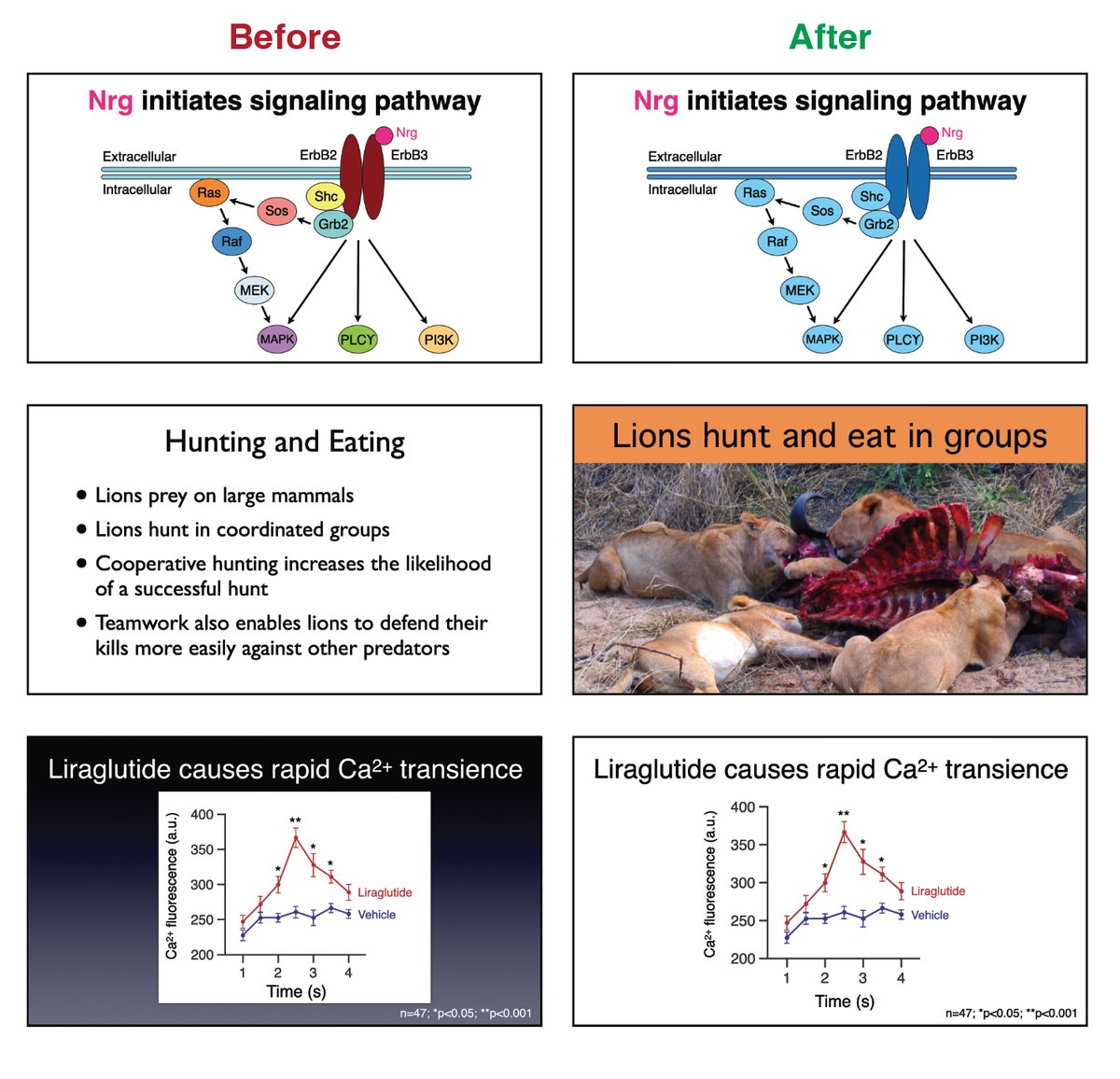
A thread on designing visually appealing slides. There are lots of great books/websites/videos about making slide presentations—this thread will focus on quick visual design tips that are easy to employ. Compiled by @__Matt_Carter__ .  https://abs.twimg.com/emoji/v2/... draggable="false" alt="🧵" title="collectie" aria-label="Emoji: collectie">1/25
The power of slides as presentation tools is that they allow you to show your audience whatever you want them to see whenever you want them to see it. This is a powerful advantage over a paper, poster, or handout.  https://abs.twimg.com/emoji/v2/... draggable="false" alt="🧵" title="collectie" aria-label="Emoji: collectie">2/25
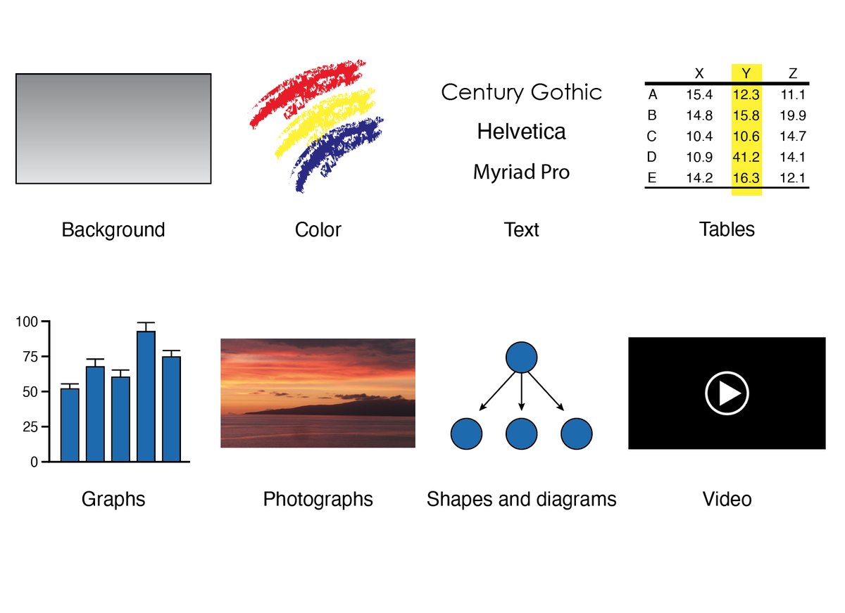
Because there are only a modest number of elements that constitute a slide, the design choices you make about each can greatly affect the clarity of your information and tone of your presentation.  https://abs.twimg.com/emoji/v2/... draggable="false" alt="🧵" title="collectie" aria-label="Emoji: collectie">3/25
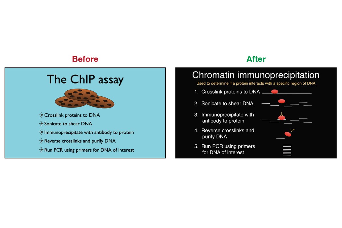
The key tip is to add design instead of decoration. Designing a slide to convey information to an audience adds meaning and value. In contrast, slides that are “decorated” are missed opportunities to convey information.  https://abs.twimg.com/emoji/v2/... draggable="false" alt="🧵" title="collectie" aria-label="Emoji: collectie">4/25
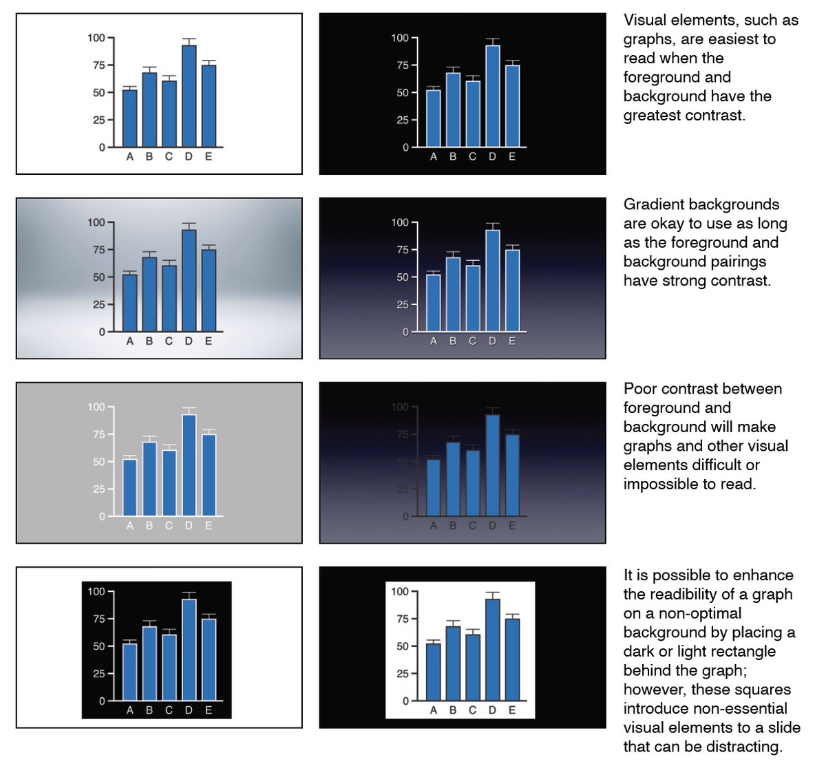
When possible, choose inconspicuous slide backgrounds. The best backgrounds are just that: backgrounds that, by themselves, lack visual content.  https://abs.twimg.com/emoji/v2/... draggable="false" alt="🧵" title="collectie" aria-label="Emoji: collectie">5/25
When choosing a background, consider how your charts and photographs will appear when placed in the foreground. (It is for this reason I almost always choose a white background for academic presentations).  https://abs.twimg.com/emoji/v2/... draggable="false" alt="🧵" title="collectie" aria-label="Emoji: collectie">6/25
Use color deliberately to emphasize important information. Make sure to also use color sparingly so the audience knows what to look at. If color is used sparingly, it will also be visible to colorblind individuals.  https://abs.twimg.com/emoji/v2/... draggable="false" alt="🧵" title="collectie" aria-label="Emoji: collectie">7/25
Most font decisions on slides should be about optimizing legibility, especially ensuring that text is legible in the back of a presentation room. Sans serif fonts are always a great choice.  https://abs.twimg.com/emoji/v2/... draggable="false" alt="🧵" title="collectie" aria-label="Emoji: collectie">8/25
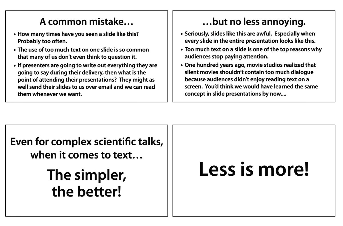
Try your best to keep text to a minimum. Adding more and more words to a slide increases the likelihood that your audience will stop paying attention.  https://abs.twimg.com/emoji/v2/... draggable="false" alt="🧵" title="collectie" aria-label="Emoji: collectie">9/25
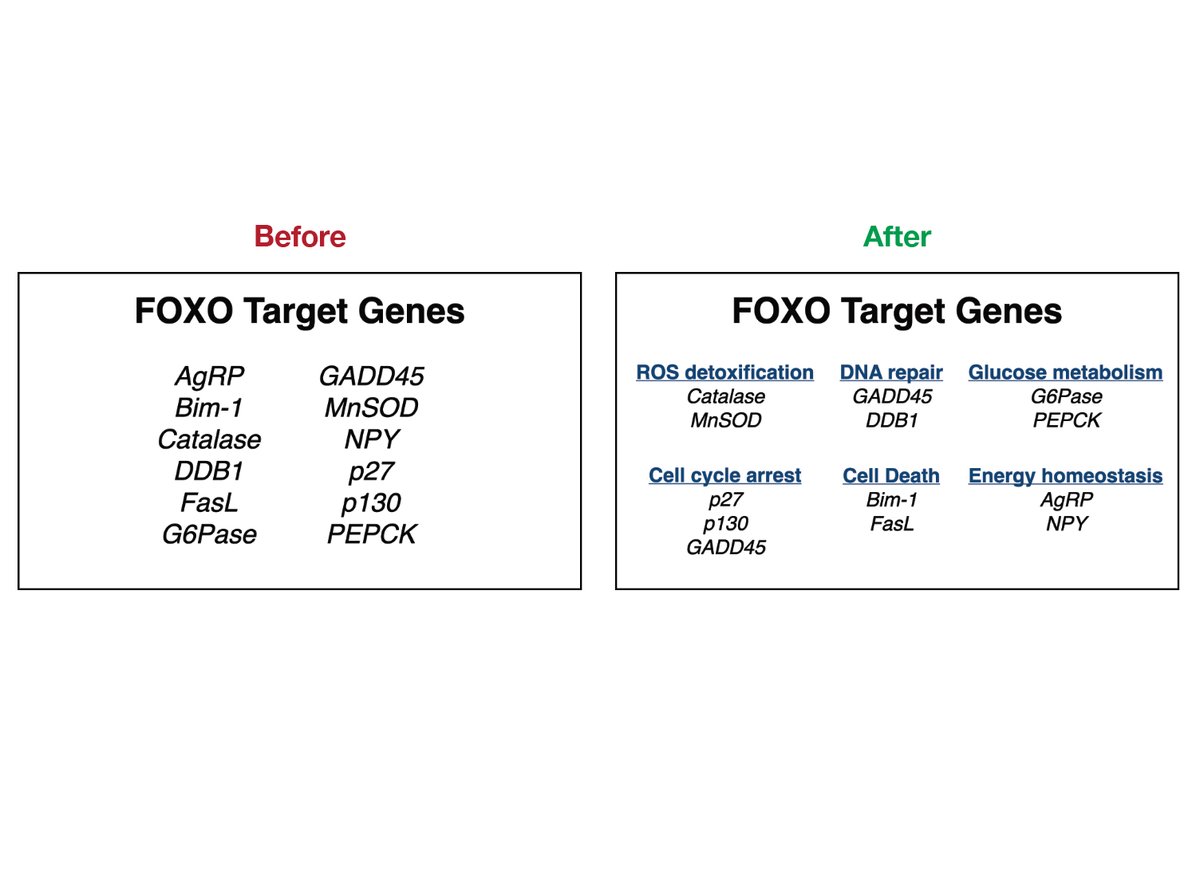
Minimize the use of lists and outlines. They aren’t fun to look at and can cause audience members to become distracted.  https://abs.twimg.com/emoji/v2/... draggable="false" alt="🧵" title="collectie" aria-label="Emoji: collectie">10/25
Instead of presenting multiple items in one long list, consider splitting them up into different categories that are more manageable for an audience to comprehend.  https://abs.twimg.com/emoji/v2/... draggable="false" alt="🧵" title="collectie" aria-label="Emoji: collectie">11/25
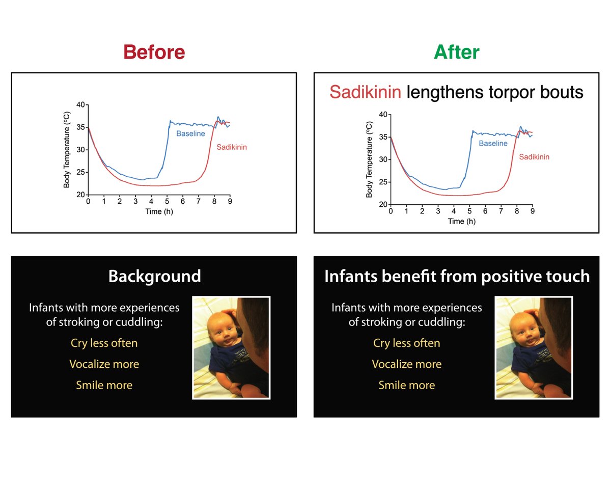
Instead of thinking of slide titles as simply titles, think of slide titles as an opportunity to make a point. Say something deliberately that presents a clear, unmistakable conclusion.  https://abs.twimg.com/emoji/v2/... draggable="false" alt="🧵" title="collectie" aria-label="Emoji: collectie">12/25
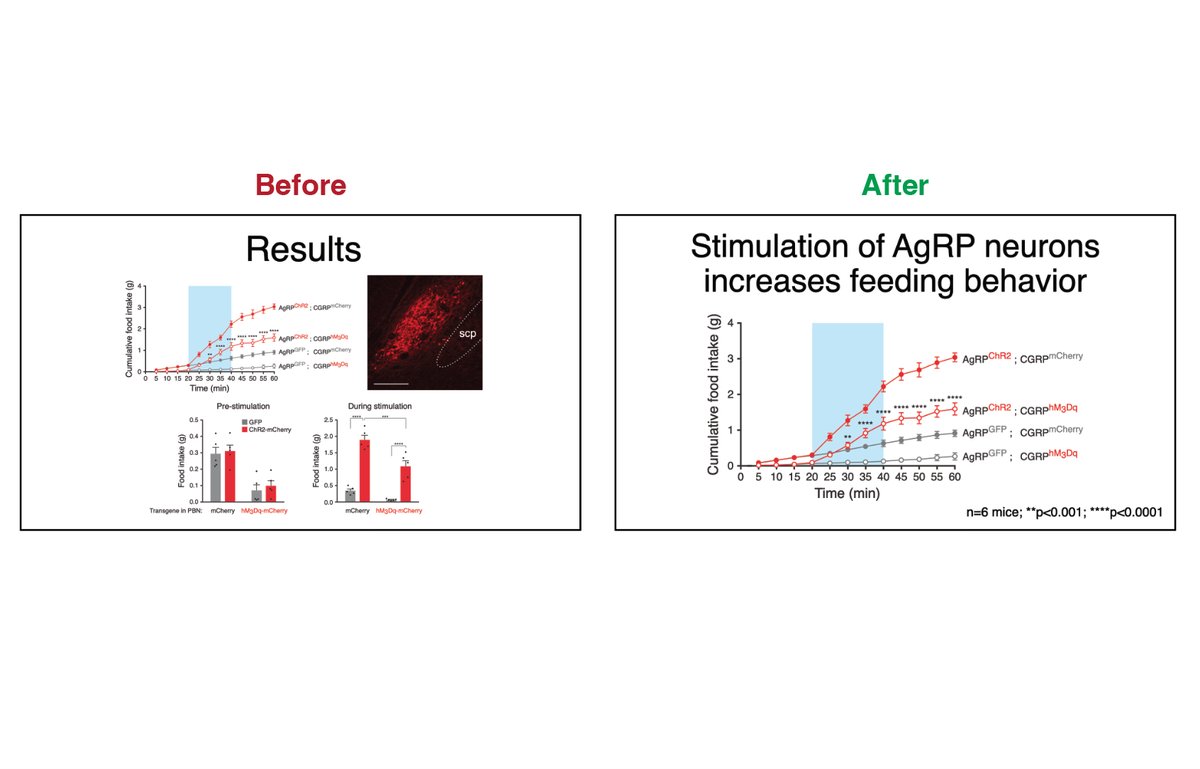
Audiences can only meaningfully reflect on one piece of information at a time. Therefore, try to only place one meaningful table or graph per slide unless you have a good reason.  https://abs.twimg.com/emoji/v2/... draggable="false" alt="🧵" title="collectie" aria-label="Emoji: collectie">13/25
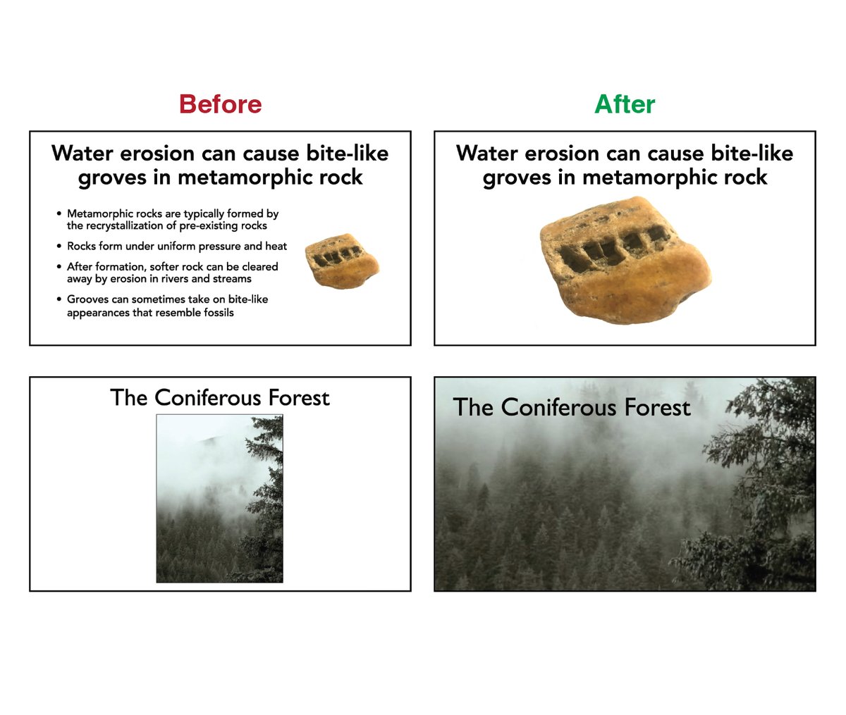
Photographs are much more engaging than text. Consider replacing long sections of text with a representative photograph that will instantly communicate a concept. If your photo has high resolution, make it as large as possible.  https://abs.twimg.com/emoji/v2/... draggable="false" alt="🧵" title="collectie" aria-label="Emoji: collectie">14/25
If a photograph is too small to fill the entire slide, place it within a frame so it stands out from the background. When presenting fluorescent images, use a dark background so the signal is the brightest aspect of the visual scene.  https://abs.twimg.com/emoji/v2/... draggable="false" alt="🧵" title="collectie" aria-label="Emoji: collectie">15/25
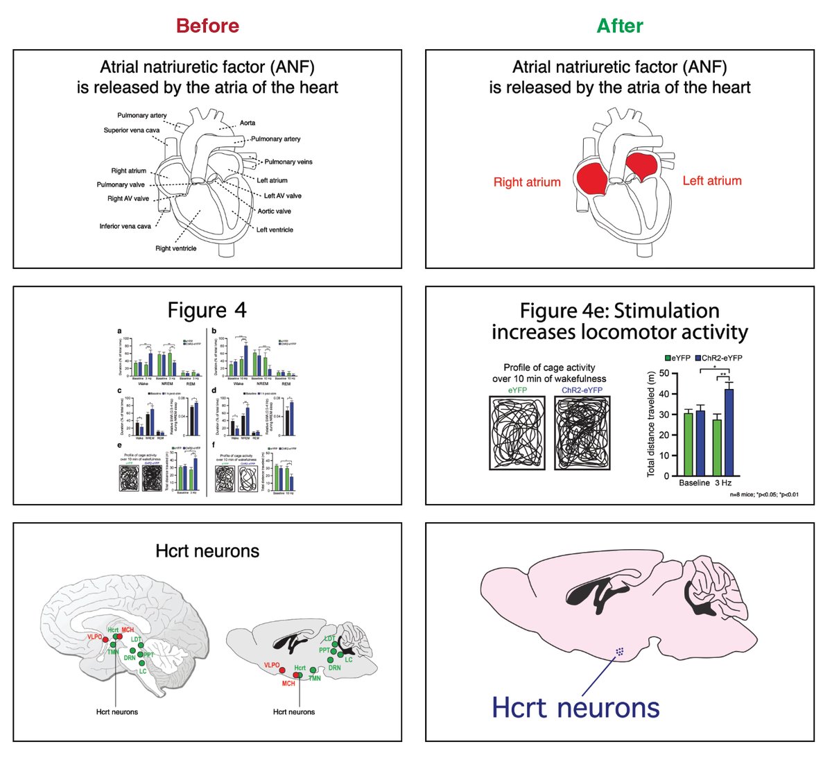
Make sure your audience knows exactly what they are looking at. Explain a photograph or diagram, either using oral narration or subtle labels/references.  https://abs.twimg.com/emoji/v2/... draggable="false" alt="🧵" title="collectie" aria-label="Emoji: collectie">16/25
Design a natural flow of information. For example, Western audiences have a natural tendency to read a slide as they would read a book (from left to right and top to bottom).  https://abs.twimg.com/emoji/v2/... draggable="false" alt="🧵" title="collectie" aria-label="Emoji: collectie">17/25
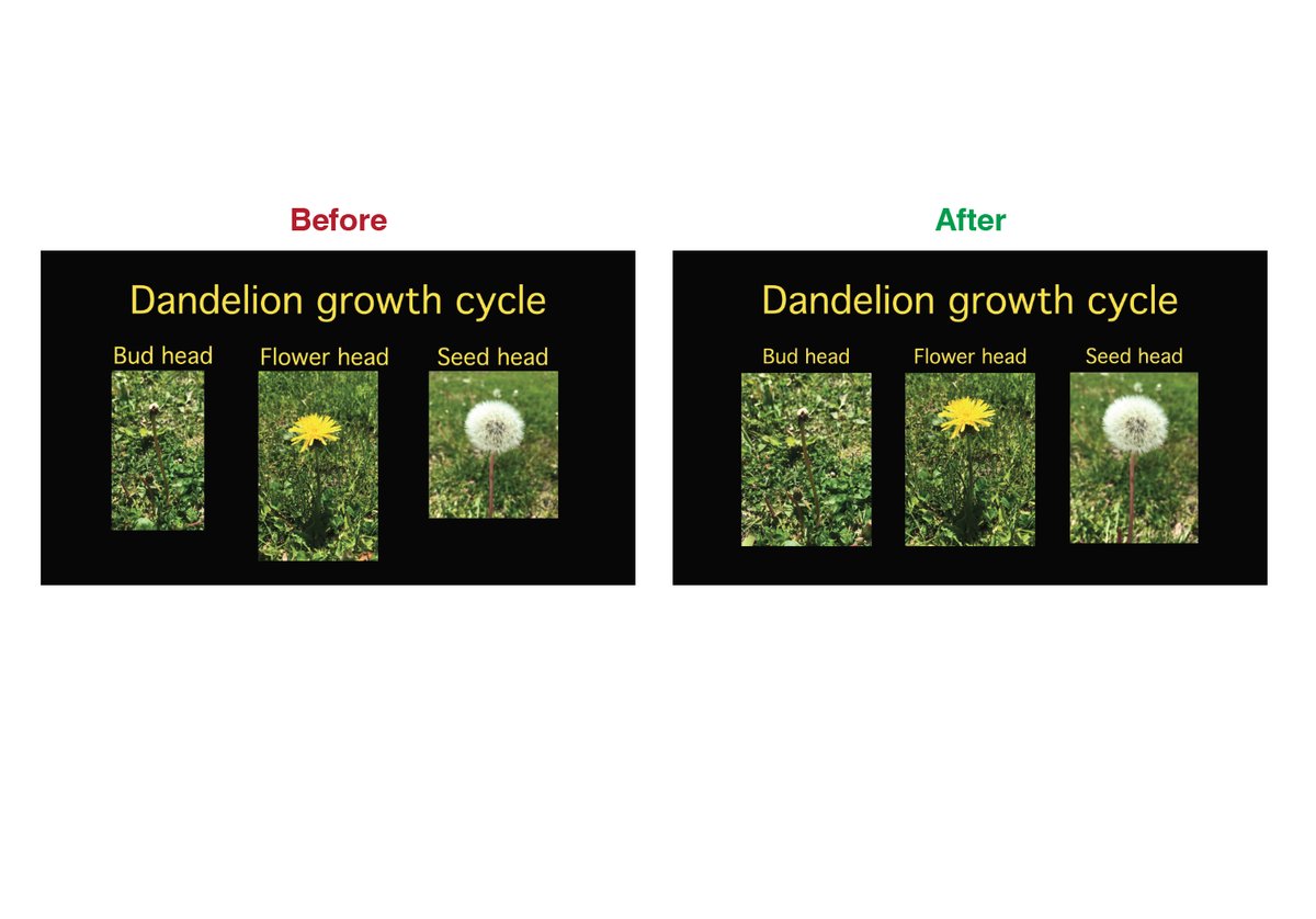
Align visual elements for harmony. The human eye is remarkably good at perceiving the proper alignment of visual elements. When objects re not aligned, it can take longer for audiences to perceive information.  https://abs.twimg.com/emoji/v2/... draggable="false" alt="🧵" title="collectie" aria-label="Emoji: collectie">18/25
Consider aligning visual elements using a grid. Applying an imaginary 3x3 or 4x4 grid and then aligning visual elements along the grid can help establish a sense of harmony that allows visual information to be more accessible.  https://abs.twimg.com/emoji/v2/... draggable="false" alt="🧵" title="collectie" aria-label="Emoji: collectie">19/25
Don’t be an animation show off. Good design never calls attention to itself, it focuses on the content. Presentation effects should always be used in service of your content and not to show off cool tricks.  https://abs.twimg.com/emoji/v2/... draggable="false" alt="🧵" title="collectie" aria-label="Emoji: collectie">20/25
Embrace simplicity. Remove any unnecessary information, reduce clutter, and don’t be afraid of empty white space—they allow important visual information to have “breathing room” and better draw an audience’s attention.  https://abs.twimg.com/emoji/v2/... draggable="false" alt="🧵" title="collectie" aria-label="Emoji: collectie">21/25
Remember that not all information you present needs to be communicated visually. Cutting text that you can easily convey orally allows you to emphasize visual information that is most important.  https://abs.twimg.com/emoji/v2/... draggable="false" alt="🧵" title="collectie" aria-label="Emoji: collectie">22/25
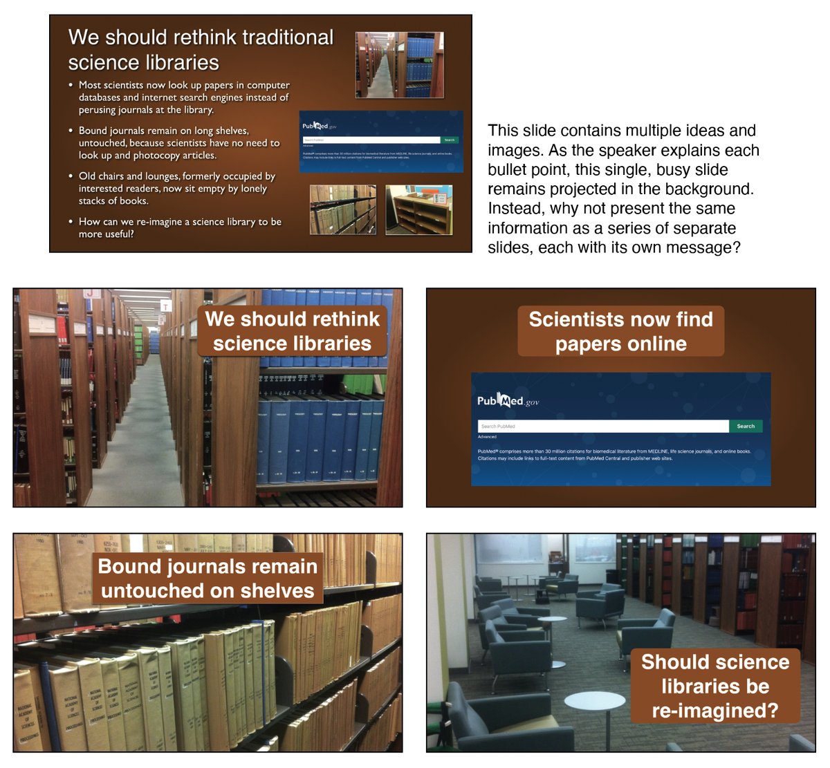
Split busy slides into multiple slides. It probably takes less time to present four ideas on four slides compared with four ideas on one busy slide.  https://abs.twimg.com/emoji/v2/... draggable="false" alt="🧵" title="collectie" aria-label="Emoji: collectie">23/25
Final piece of advice: instead of designing slides one-at-a-time, consider focusing on ideas first and then applying them to slides. Idea-centric presentation design usually achieves much better communication than slide-centric design.  https://abs.twimg.com/emoji/v2/... draggable="false" alt="🧵" title="collectie" aria-label="Emoji: collectie">24/25
Would love to hear your own ideas about visual presentation design. Feel free to also contact me on my personal twitter account @__Matt_Carter__ . These ideas were selectively taken from Designing Science Presentations.  https://abs.twimg.com/emoji/v2/... draggable="false" alt="🧵" title="collectie" aria-label="Emoji: collectie">25/25 https://www.amazon.com/Designing-Science-Presentations-Figures-Posters/dp/0128153776/ref=sr_1_1?crid=WZWVCRPWOKTN&keywords=designing+science+presentations&qid=1654217447&sprefix=%2Caps%2C67&sr=8-1">https://www.amazon.com/Designing...

 Read on Twitter
 1/25" title="A thread on designing visually appealing slides. There are lots of great books/websites/videos about making slide presentations—this thread will focus on quick visual design tips that are easy to employ. Compiled by @__Matt_Carter__ . https://abs.twimg.com/emoji/v2/... draggable="false" alt="🧵" title="collectie" aria-label="Emoji: collectie">1/25" class="img-responsive" style="max-width:100%;"/>
 2/25" title="The power of slides as presentation tools is that they allow you to show your audience whatever you want them to see whenever you want them to see it. This is a powerful advantage over a paper, poster, or handout. https://abs.twimg.com/emoji/v2/... draggable="false" alt="🧵" title="collectie" aria-label="Emoji: collectie">2/25" class="img-responsive" style="max-width:100%;"/>
 3/25" title="Because there are only a modest number of elements that constitute a slide, the design choices you make about each can greatly affect the clarity of your information and tone of your presentation. https://abs.twimg.com/emoji/v2/... draggable="false" alt="🧵" title="collectie" aria-label="Emoji: collectie">3/25" class="img-responsive" style="max-width:100%;"/>
 4/25" title="The key tip is to add design instead of decoration. Designing a slide to convey information to an audience adds meaning and value. In contrast, slides that are “decorated” are missed opportunities to convey information. https://abs.twimg.com/emoji/v2/... draggable="false" alt="🧵" title="collectie" aria-label="Emoji: collectie">4/25" class="img-responsive" style="max-width:100%;"/>
 5/25" title="When possible, choose inconspicuous slide backgrounds. The best backgrounds are just that: backgrounds that, by themselves, lack visual content. https://abs.twimg.com/emoji/v2/... draggable="false" alt="🧵" title="collectie" aria-label="Emoji: collectie">5/25" class="img-responsive" style="max-width:100%;"/>
 6/25" title="When choosing a background, consider how your charts and photographs will appear when placed in the foreground. (It is for this reason I almost always choose a white background for academic presentations). https://abs.twimg.com/emoji/v2/... draggable="false" alt="🧵" title="collectie" aria-label="Emoji: collectie">6/25" class="img-responsive" style="max-width:100%;"/>
 7/25" title="Use color deliberately to emphasize important information. Make sure to also use color sparingly so the audience knows what to look at. If color is used sparingly, it will also be visible to colorblind individuals. https://abs.twimg.com/emoji/v2/... draggable="false" alt="🧵" title="collectie" aria-label="Emoji: collectie">7/25" class="img-responsive" style="max-width:100%;"/>
 8/25" title="Most font decisions on slides should be about optimizing legibility, especially ensuring that text is legible in the back of a presentation room. Sans serif fonts are always a great choice. https://abs.twimg.com/emoji/v2/... draggable="false" alt="🧵" title="collectie" aria-label="Emoji: collectie">8/25" class="img-responsive" style="max-width:100%;"/>
 9/25" title="Try your best to keep text to a minimum. Adding more and more words to a slide increases the likelihood that your audience will stop paying attention. https://abs.twimg.com/emoji/v2/... draggable="false" alt="🧵" title="collectie" aria-label="Emoji: collectie">9/25" class="img-responsive" style="max-width:100%;"/>
 10/25" title="Minimize the use of lists and outlines. They aren’t fun to look at and can cause audience members to become distracted. https://abs.twimg.com/emoji/v2/... draggable="false" alt="🧵" title="collectie" aria-label="Emoji: collectie">10/25" class="img-responsive" style="max-width:100%;"/>
 11/25" title="Instead of presenting multiple items in one long list, consider splitting them up into different categories that are more manageable for an audience to comprehend. https://abs.twimg.com/emoji/v2/... draggable="false" alt="🧵" title="collectie" aria-label="Emoji: collectie">11/25" class="img-responsive" style="max-width:100%;"/>
 12/25" title="Instead of thinking of slide titles as simply titles, think of slide titles as an opportunity to make a point. Say something deliberately that presents a clear, unmistakable conclusion. https://abs.twimg.com/emoji/v2/... draggable="false" alt="🧵" title="collectie" aria-label="Emoji: collectie">12/25" class="img-responsive" style="max-width:100%;"/>
 13/25" title="Audiences can only meaningfully reflect on one piece of information at a time. Therefore, try to only place one meaningful table or graph per slide unless you have a good reason. https://abs.twimg.com/emoji/v2/... draggable="false" alt="🧵" title="collectie" aria-label="Emoji: collectie">13/25" class="img-responsive" style="max-width:100%;"/>
 14/25" title="Photographs are much more engaging than text. Consider replacing long sections of text with a representative photograph that will instantly communicate a concept. If your photo has high resolution, make it as large as possible. https://abs.twimg.com/emoji/v2/... draggable="false" alt="🧵" title="collectie" aria-label="Emoji: collectie">14/25" class="img-responsive" style="max-width:100%;"/>
 15/25" title="If a photograph is too small to fill the entire slide, place it within a frame so it stands out from the background. When presenting fluorescent images, use a dark background so the signal is the brightest aspect of the visual scene. https://abs.twimg.com/emoji/v2/... draggable="false" alt="🧵" title="collectie" aria-label="Emoji: collectie">15/25" class="img-responsive" style="max-width:100%;"/>
 16/25" title="Make sure your audience knows exactly what they are looking at. Explain a photograph or diagram, either using oral narration or subtle labels/references. https://abs.twimg.com/emoji/v2/... draggable="false" alt="🧵" title="collectie" aria-label="Emoji: collectie">16/25" class="img-responsive" style="max-width:100%;"/>
 17/25" title="Design a natural flow of information. For example, Western audiences have a natural tendency to read a slide as they would read a book (from left to right and top to bottom). https://abs.twimg.com/emoji/v2/... draggable="false" alt="🧵" title="collectie" aria-label="Emoji: collectie">17/25" class="img-responsive" style="max-width:100%;"/>
 18/25" title="Align visual elements for harmony. The human eye is remarkably good at perceiving the proper alignment of visual elements. When objects re not aligned, it can take longer for audiences to perceive information. https://abs.twimg.com/emoji/v2/... draggable="false" alt="🧵" title="collectie" aria-label="Emoji: collectie">18/25" class="img-responsive" style="max-width:100%;"/>
 19/25" title="Consider aligning visual elements using a grid. Applying an imaginary 3x3 or 4x4 grid and then aligning visual elements along the grid can help establish a sense of harmony that allows visual information to be more accessible. https://abs.twimg.com/emoji/v2/... draggable="false" alt="🧵" title="collectie" aria-label="Emoji: collectie">19/25" class="img-responsive" style="max-width:100%;"/>
 20/25" title="Don’t be an animation show off. Good design never calls attention to itself, it focuses on the content. Presentation effects should always be used in service of your content and not to show off cool tricks. https://abs.twimg.com/emoji/v2/... draggable="false" alt="🧵" title="collectie" aria-label="Emoji: collectie">20/25" class="img-responsive" style="max-width:100%;"/>
 21/25" title="Embrace simplicity. Remove any unnecessary information, reduce clutter, and don’t be afraid of empty white space—they allow important visual information to have “breathing room” and better draw an audience’s attention. https://abs.twimg.com/emoji/v2/... draggable="false" alt="🧵" title="collectie" aria-label="Emoji: collectie">21/25" class="img-responsive" style="max-width:100%;"/>
 22/25" title="Remember that not all information you present needs to be communicated visually. Cutting text that you can easily convey orally allows you to emphasize visual information that is most important. https://abs.twimg.com/emoji/v2/... draggable="false" alt="🧵" title="collectie" aria-label="Emoji: collectie">22/25" class="img-responsive" style="max-width:100%;"/>
 23/25" title="Split busy slides into multiple slides. It probably takes less time to present four ideas on four slides compared with four ideas on one busy slide. https://abs.twimg.com/emoji/v2/... draggable="false" alt="🧵" title="collectie" aria-label="Emoji: collectie">23/25" class="img-responsive" style="max-width:100%;"/>
 24/25" title="Final piece of advice: instead of designing slides one-at-a-time, consider focusing on ideas first and then applying them to slides. Idea-centric presentation design usually achieves much better communication than slide-centric design. https://abs.twimg.com/emoji/v2/... draggable="false" alt="🧵" title="collectie" aria-label="Emoji: collectie">24/25" class="img-responsive" style="max-width:100%;"/>


