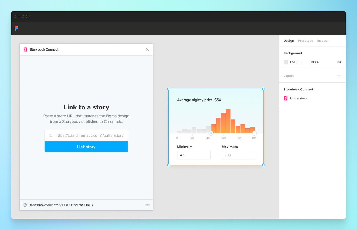
Figma plugin beta is here!
It streamlines design handoff & review by connecting stories to variants.
 https://abs.twimg.com/emoji/v2/... draggable="false" alt="🔗" title="Link symbool" aria-label="Emoji: Link symbool"> Link stories to designs
 https://abs.twimg.com/emoji/v2/... draggable="false" alt="🕹" title="Joystick" aria-label="Emoji: Joystick"> Interact w stories in Figma
 https://abs.twimg.com/emoji/v2/... draggable="false" alt="📐" title="Driehoekige liniaal" aria-label="Emoji: Driehoekige liniaal"> Compare design to implementation
 https://abs.twimg.com/emoji/v2/... draggable="false" alt="🔐" title="Gesloten slot met sleutel" aria-label="Emoji: Gesloten slot met sleutel"> Private projects + access control
Try it now » https://storybook.js.org/blog/figma-plugin-beta/
https://storybook.js.org/blog/figm... class="Emoji" style="height:16px;" src=" https://abs.twimg.com/emoji/v2/... draggable="false" alt="🧵" title="collectie" aria-label="Emoji: collectie">1/
It streamlines design handoff & review by connecting stories to variants.
Try it now » https://storybook.js.org/blog/figma-plugin-beta/
Link stories to corresponding Figma components or variants.
This creates a persistent connection between code and design that propagates to every component instance across Figma files.
When you link once, you never have to do it again.
• Designers confirm the nuances of how a component is expected to behave before committing to using it.
• Devs can reference an implementation without tabbing between windows.
Jump to the complete Storybook with addons, tests, and auto-generated docs.
Every connected component has a handy link to “Open story in browser”.
Components with links to stories are called out in the Figma sidebar.
That helps you identify which component you can reuse and which components you need to build anew.
When you& #39;re done with implementation, check that the rendered UI matches the design.
Use Measure addon shows the dimensions and spacing of DOM elements.
Use the Outline addon to visualize the boundaries of each DOM element. This helps you debug CSS alignment.
Accessibility addon provides filters that simulate different forms of colorblindness.
This helps you verify whether a component’s color palette is palatable to users with disabilities.
Join the Figma plugin beta here https://storybook.js.org/blog/figma-plugin-beta/">https://storybook.js.org/blog/figm...

 Read on Twitter
 Link stories to designLink stories to corresponding Figma components or variants. This creates a persistent connection between code and design that propagates to every component instance across Figma files. When you link once, you never have to do it again." title="https://abs.twimg.com/emoji/v2/... draggable="false" alt="🔗" title="Link symbool" aria-label="Emoji: Link symbool"> Link stories to designLink stories to corresponding Figma components or variants. This creates a persistent connection between code and design that propagates to every component instance across Figma files. When you link once, you never have to do it again." class="img-responsive" style="max-width:100%;"/>
 Pinpoint components during design handoffComponents with links to stories are called out in the Figma sidebar. That helps you identify which component you can reuse and which components you need to build anew." title="https://abs.twimg.com/emoji/v2/... draggable="false" alt="📌" title="Punaise" aria-label="Emoji: Punaise"> Pinpoint components during design handoffComponents with links to stories are called out in the Figma sidebar. That helps you identify which component you can reuse and which components you need to build anew." class="img-responsive" style="max-width:100%;"/>


