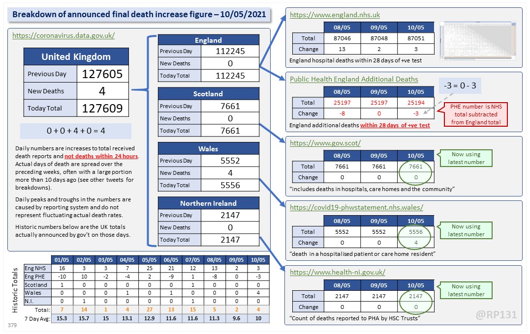
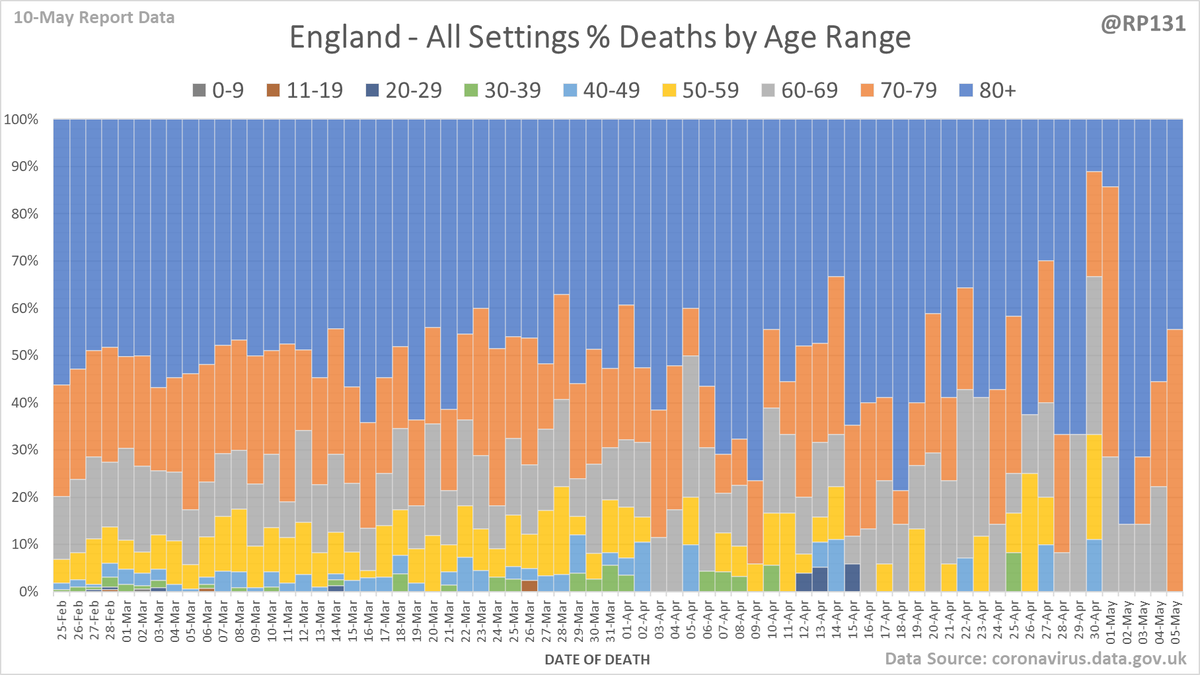
Dashboard for 10-May to explain the #covid19uk total death increase figure of 4.
For England, NHS data is merged by PHE for a net total of 0 (reduction due to PHE already knowing about some of the deaths).
This moves the UK 7 day rolling average up by 0.4 to 10.
For England, NHS data is merged by PHE for a net total of 0 (reduction due to PHE already knowing about some of the deaths).
This moves the UK 7 day rolling average up by 0.4 to 10.
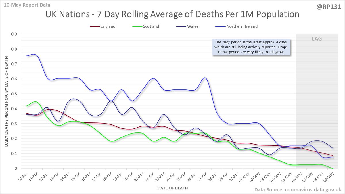
Date of death chart for England regions drawn with 7 day rolling averages of deaths per 1M population.
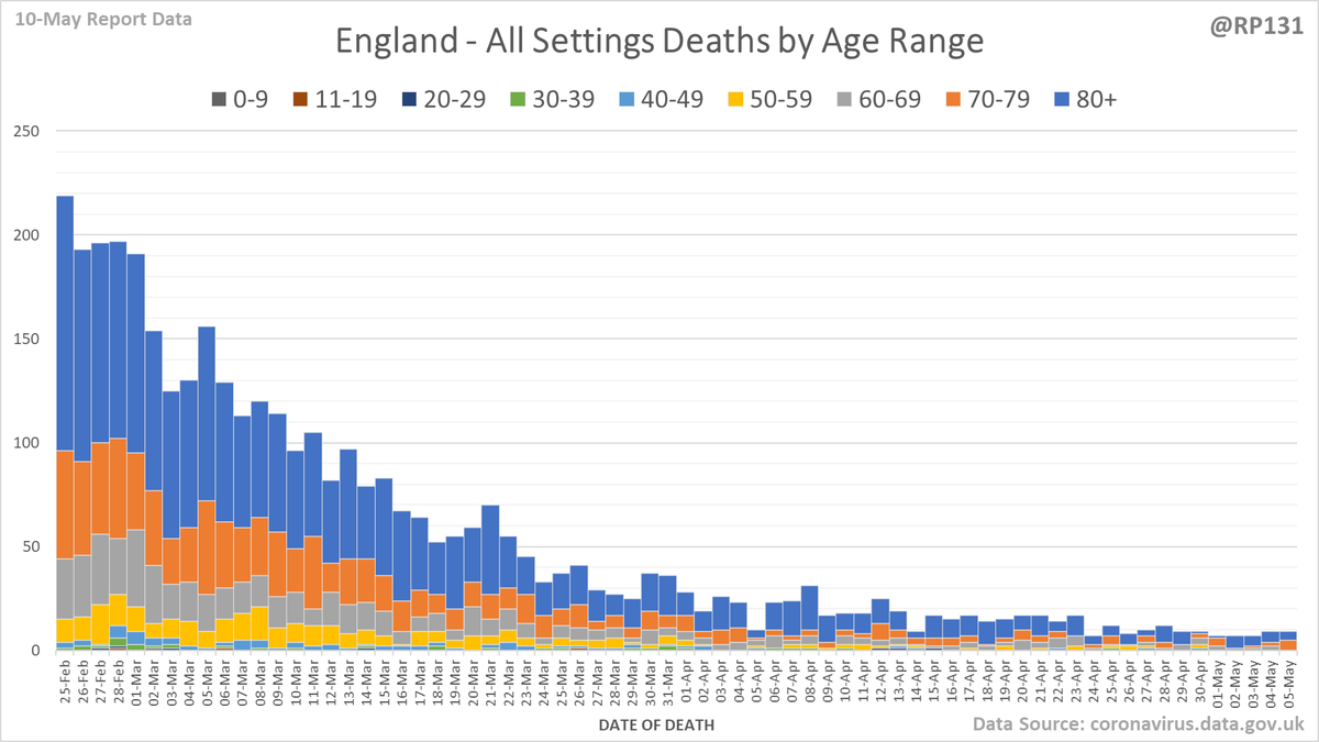
England date-of-death vs. announcement chart. Note that the numbers drop at the end as data is still being actively reported for those dates.
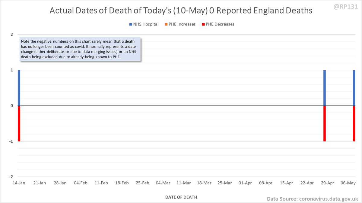
Pivot for 10-May to show breakdown of both 3 NHS and -3 (net) PHE deaths by date of death. The negatives are a combination of date of death corrections and accounting for NHS deaths that were already known to PHE. Small version for twitter first:
Chart form of today& #39;s dates of death for England (most of the noise earlier in the year is likely due to dataset merge errors and/or corrections).
Some of the more detailed content from this thread has been moved to an external page to try and make the twitter updates a bit more manageable. You can still see the full version here: …https://coviddatashare.s3-eu-west-1.amazonaws.com/Deaths/Deaths_20210510.html">https://coviddatashare.s3-eu-west-1.amazonaws.com/Deaths/De...

 Read on Twitter