Complete introduction of CSS media queries for beginners
Thread https://abs.twimg.com/emoji/v2/... draggable="false" alt="🧵" title="Thread" aria-label="Emoji: Thread">
Thread
The biggest misconception among beginners are they think that media queries are for making a website responsive.
Though that& #39;s the one use case of media queries. You can use them modifying your site according to device media type. Let& #39;s see this in bit more details
Though that& #39;s the one use case of media queries. You can use them modifying your site according to device media type. Let& #39;s see this in bit more details
Media types describe the general category of a device.
They are useful when you want to modify your site or app depending on a device& #39;s general type (such as print vs. screen) or specific characteristics and parameters (such as screen resolution or browser viewport width).
They are useful when you want to modify your site or app depending on a device& #39;s general type (such as print vs. screen) or specific characteristics and parameters (such as screen resolution or browser viewport width).
Let& #39;s see the media types first  https://abs.twimg.com/emoji/v2/... draggable="false" alt="👇🏻" title="Rückhand Zeigefinger nach unten (heller Hautton)" aria-label="Emoji: Rückhand Zeigefinger nach unten (heller Hautton)">
1. all
2. Print
3. Screen
4. Speech
1. all
2. Print
3. Screen
4. Speech
There are some deprecated media types as well but they are not in use nowadays like tty, tv, projection, embossed, aural etc...
Alright moving forward, next thing we need to understand is media features.
As the tern suggests, they are features of a particular media. They specifies the characteristic of the output device.
For example, width, height, color, aspect-ratio etc...
As the tern suggests, they are features of a particular media. They specifies the characteristic of the output device.
For example, width, height, color, aspect-ratio etc...
I hope this helped you understand that media queries are not just to make websites responsive. Although this is the biggest use case of media queries. when I was first learning it, I found some difficulties. Let see how can we use it in order to create a responsive website  https://abs.twimg.com/emoji/v2/... draggable="false" alt="👇🏻" title="Rückhand Zeigefinger nach unten (heller Hautton)" aria-label="Emoji: Rückhand Zeigefinger nach unten (heller Hautton)">
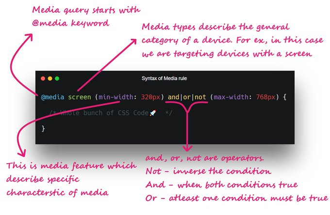
Let& #39;s start with the syntax first (See attached image)
Let& #39;s see an example into action. So that we can build strong hold on the concept
"""
@ media screen and (min-width: 600px) {
div {
background: green;
}
}
"""
In this case the background will be green whenever the screen width is 600px of greater than 600px;
"""
@ media screen and (min-width: 600px) {
div {
background: green;
}
}
"""
In this case the background will be green whenever the screen width is 600px of greater than 600px;
You can also combine two media features using "And", "Not" or ","
For example:
"""
@ media screen and (min-width: 600px) and (max-width: 900px) {
div {
background: green;
}
}
"""
In this case, the background will be green between 600px to 900px width
For example:
"""
@ media screen and (min-width: 600px) and (max-width: 900px) {
div {
background: green;
}
}
"""
In this case, the background will be green between 600px to 900px width
You can try bunch of media features
- any-hover
- color
- height
- width
- grid
- aspect-ratio
- orientation
- resolution, etc...
- any-hover
- color
- height
- width
- grid
- aspect-ratio
- orientation
- resolution, etc...
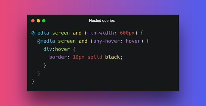
We can also write the nested media queries:
When min-width = 600px and user hover over element then solid black will create around div.
When min-width = 600px and user hover over element then solid black will create around div.
You can check my other thread if you want to learn more about how to make website responsive https://twitter.com/Prathkum/status/1380834198039171073?s=20">https://twitter.com/Prathkum/...
I guess that& #39;s pretty much it for quick overview. I hope you like it. Share this thread with your connection if you like it  https://abs.twimg.com/emoji/v2/... draggable="false" alt="❤️" title="Rotes Herz" aria-label="Emoji: Rotes Herz">
Peace out https://abs.twimg.com/emoji/v2/... draggable="false" alt="😉" title="Zwinkerndes Gesicht" aria-label="Emoji: Zwinkerndes Gesicht">
Peace out

 Read on Twitter
 " title="Complete introduction of CSS media queries for beginnersThread https://abs.twimg.com/emoji/v2/... draggable="false" alt="🧵" title="Thread" aria-label="Emoji: Thread">" class="img-responsive" style="max-width:100%;"/>


