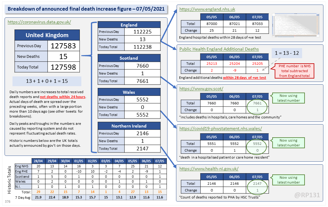
Dashboard for 07-May to explain the #covid19uk total death increase figure of 15.
For England, NHS data is merged by PHE for a net total of 13.
This keeps the UK 7 day rolling average the same at 11.6.
For England, NHS data is merged by PHE for a net total of 13.
This keeps the UK 7 day rolling average the same at 11.6.
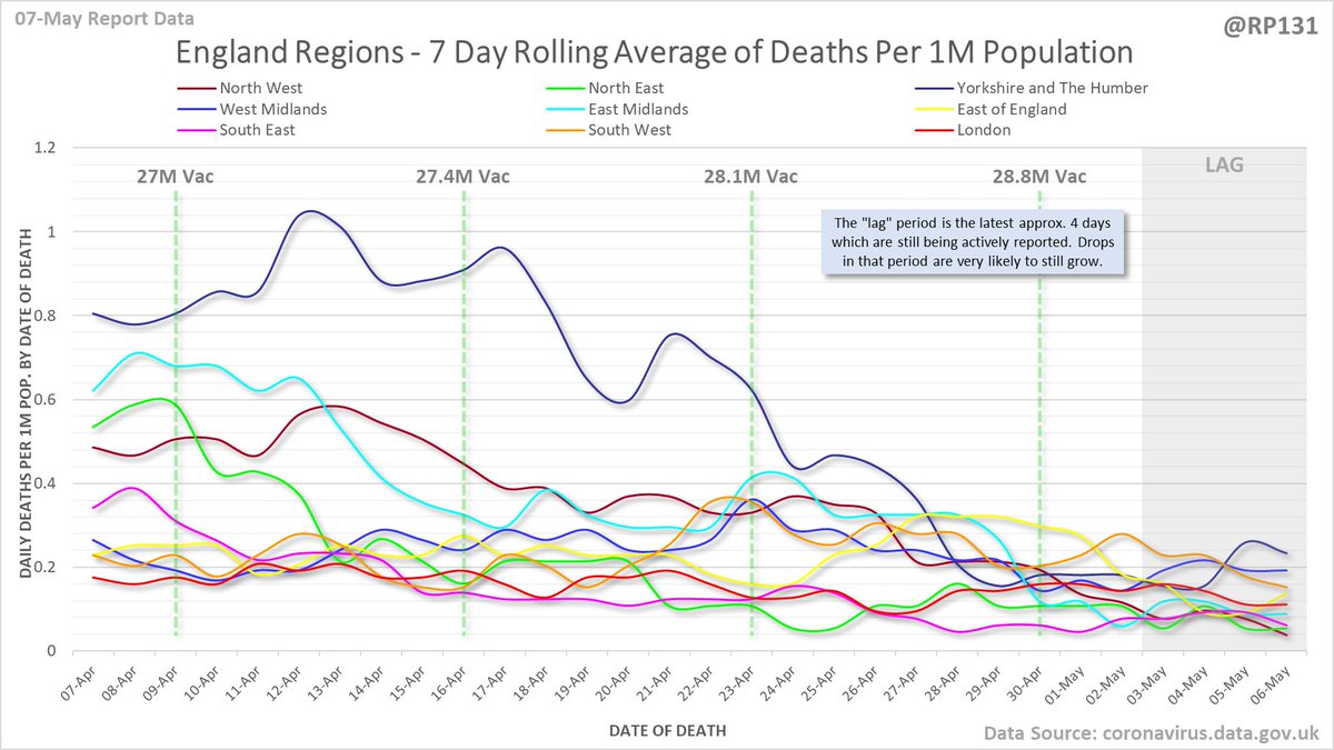
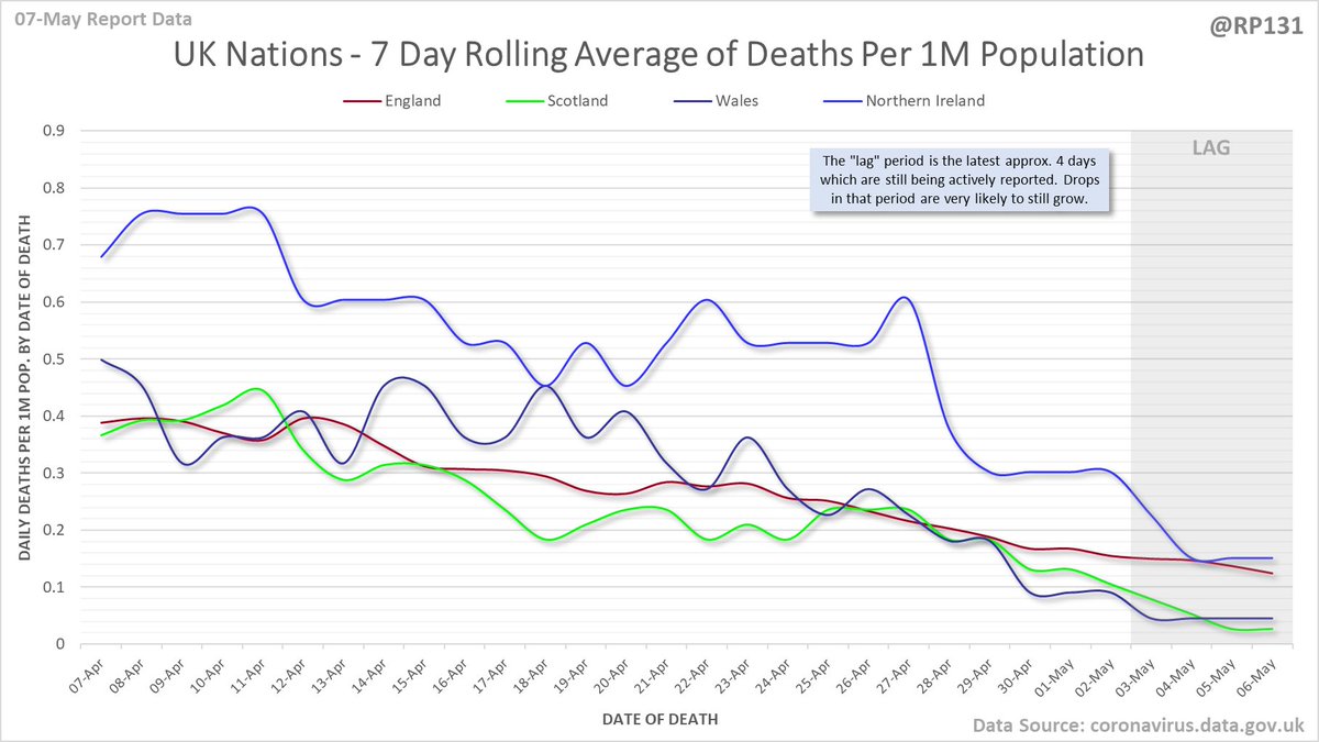
Date of death chart for England regions drawn with 7 day rolling averages of deaths per 1M population.
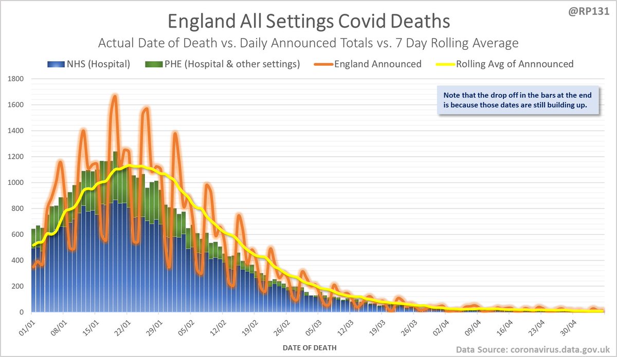
England date-of-death vs. announcement chart. Note that the numbers drop at the end as data is still being actively reported for those dates.
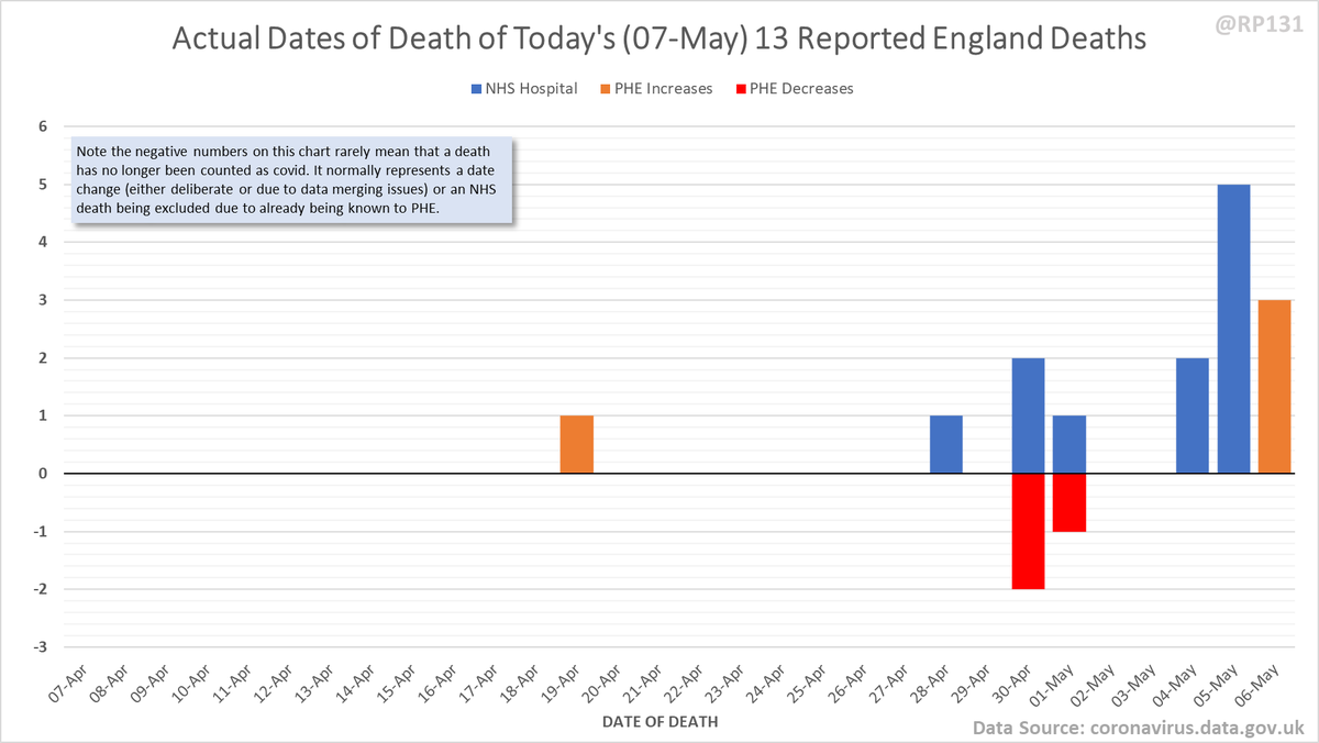
Pivot for 07-May to show breakdown of both 12 NHS and 1 (net) PHE deaths by date of death. The negatives are a combination of date of death corrections and accounting for NHS deaths that were already known to PHE. Small version for twitter first:
Chart form of dates of death in the last 30 days (ignoring some of the corrections noise from earlier in the year).
Some of the more detailed content from this thread has been moved to an external page to try and make the twitter updates a bit more manageable. You can still see the full version here: …https://coviddatashare.s3-eu-west-1.amazonaws.com/Deaths/Deaths_20210507.html">https://coviddatashare.s3-eu-west-1.amazonaws.com/Deaths/De...

 Read on Twitter