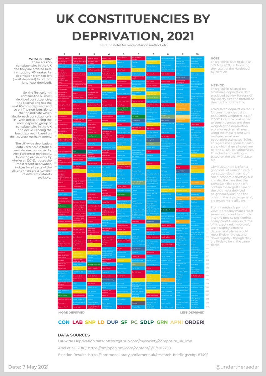
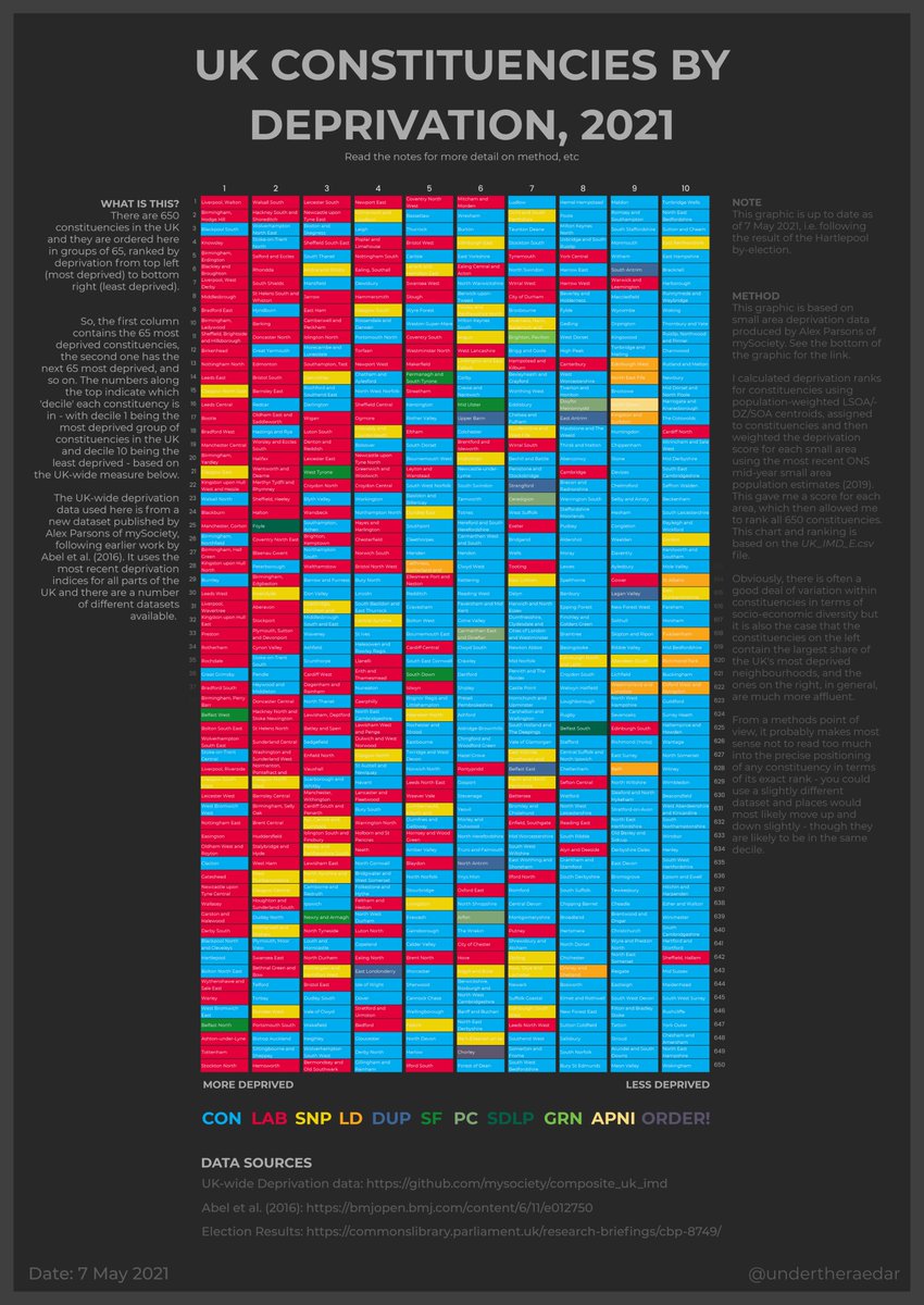
While I& #39;m waiting for the next round of election results, I decided to update my UK-wide & #39;deprivation/constituency& #39; chart using new data.
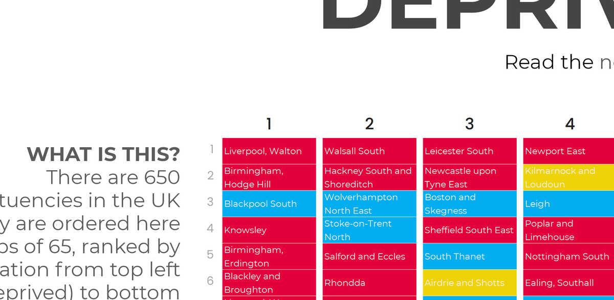
It& #39;s up to date following the Hartlepool result, and has constituency names on the graphic this time.
It& #39;s up to date following the Hartlepool result, and has constituency names on the graphic this time.
I& #39;ve put a full resolution version here if anyone really wants a closer look than you can get on twitter
http://automaticknowledge.org/images/uk-deprivation-constituency-2021-v1-border.png">https://automaticknowledge.org/images/uk...
http://automaticknowledge.org/images/uk-deprivation-constituency-2021-v1-border.png">https://automaticknowledge.org/images/uk...
previous versions that I did (for England only) https://twitter.com/undertheraedar/status/1192727840216829957?s=20">https://twitter.com/underther...
there are notes on the chart, but I& #39;ll just add here that the UK-wide deprivation data is from a new dataset published recently by @alexparsons https://github.com/mysociety/composite_uk_imd">https://github.com/mysociety...
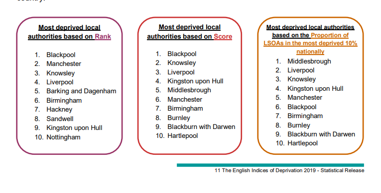
one final nerd note: the position of Hartlepool on the UK wide ranking of 650 constits will of course be different from its rank using 2019 IMD data (of 317 areas) but see p.11 of this English IMD report for more on that kind of thing
https://assets.publishing.service.gov.uk/government/uploads/system/uploads/attachment_data/file/835115/IoD2019_Statistical_Release.pdf">https://assets.publishing.service.gov.uk/governmen...
https://assets.publishing.service.gov.uk/government/uploads/system/uploads/attachment_data/file/835115/IoD2019_Statistical_Release.pdf">https://assets.publishing.service.gov.uk/governmen...
(or, to put this kind of inherent statistical uncertainty in meme-speak, "Different frogs, different times.")
© Gareth Keenan
© Gareth Keenan
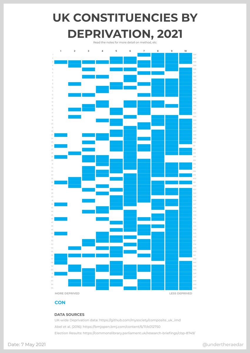
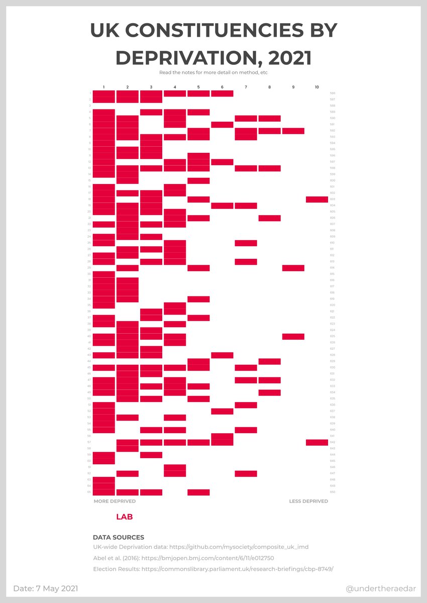
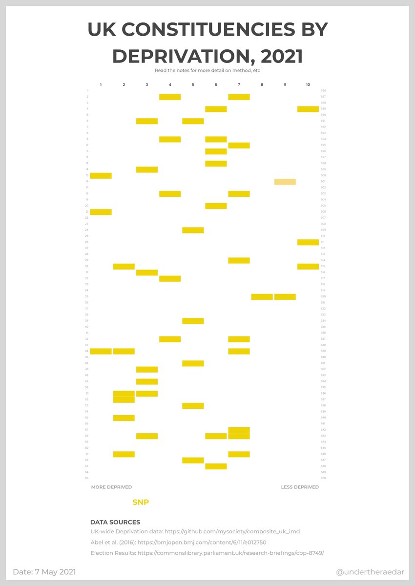
it& #39;s also quite useful to separate out the individual colours - e.g. here for Con, Lab and SNP - for a clearer view of the distribution across the deprivation deciles (left is most deprived, as in original graphic above)
I also did a dark-mode version of the new graphic, more in keeping with the hours worked by election data boffins
Full resolution: http://automaticknowledge.org/images/uk-dep-pcon-dark.png">https://automaticknowledge.org/images/uk...
Full resolution: http://automaticknowledge.org/images/uk-dep-pcon-dark.png">https://automaticknowledge.org/images/uk...
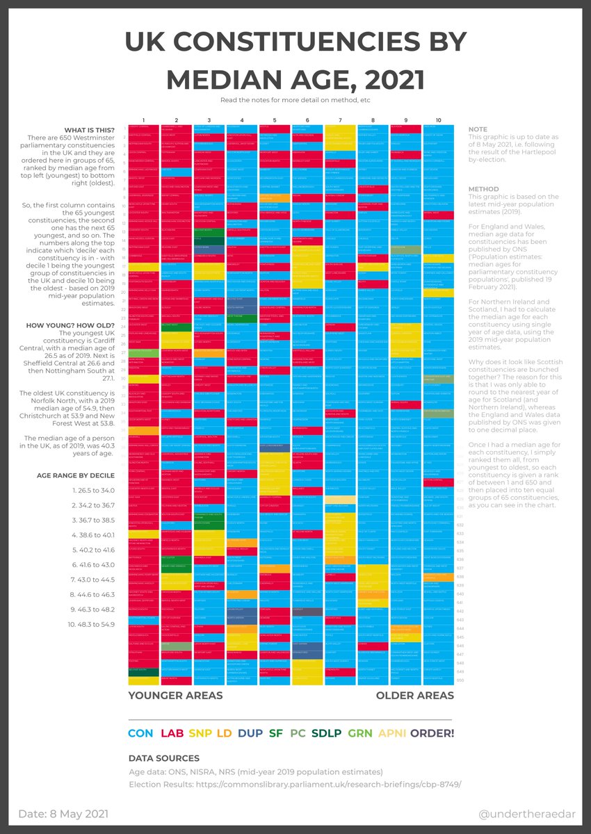
same chart type as above, but this time *median age* by constituency, ranked from youngest (Cardiff Central - median age 26.5) to oldest (Norfolk North, 54.9) - youngest areas on the left, oldest on the right, coloured by party as before
full res: http://automaticknowledge.org/images/age_and_constituencies_uk_2021_v1_border.png">https://automaticknowledge.org/images/ag...
full res: http://automaticknowledge.org/images/age_and_constituencies_uk_2021_v1_border.png">https://automaticknowledge.org/images/ag...

 Read on Twitter