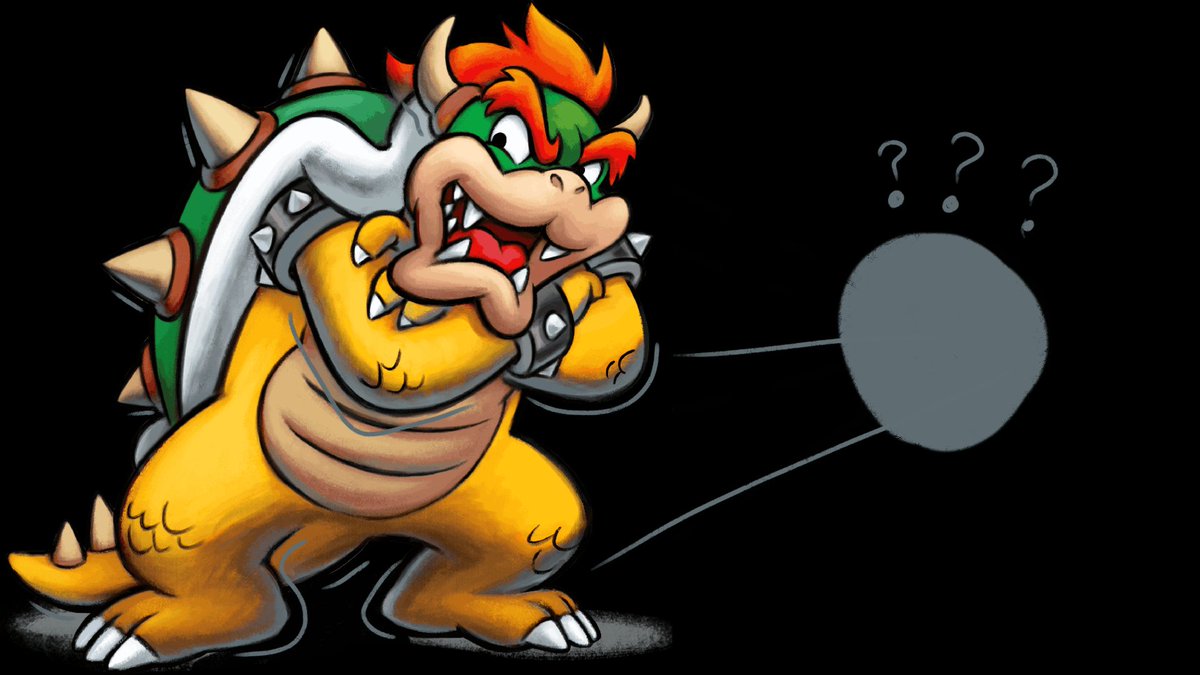
Okay, let& #39;s begin dissecting and nitpicking this one piece of Bowser art, because I feel like it.
Alternate Title:
Everything Wrong With Bowser& #39;s art from Mario & Luigi: Bowser& #39;s Inside Story + Bowser& #39;s Jr.& #39;s Journey in 15 Tweets Or Less
#marioandluigi
Alternate Title:
Everything Wrong With Bowser& #39;s art from Mario & Luigi: Bowser& #39;s Inside Story + Bowser& #39;s Jr.& #39;s Journey in 15 Tweets Or Less
#marioandluigi
1.) The face
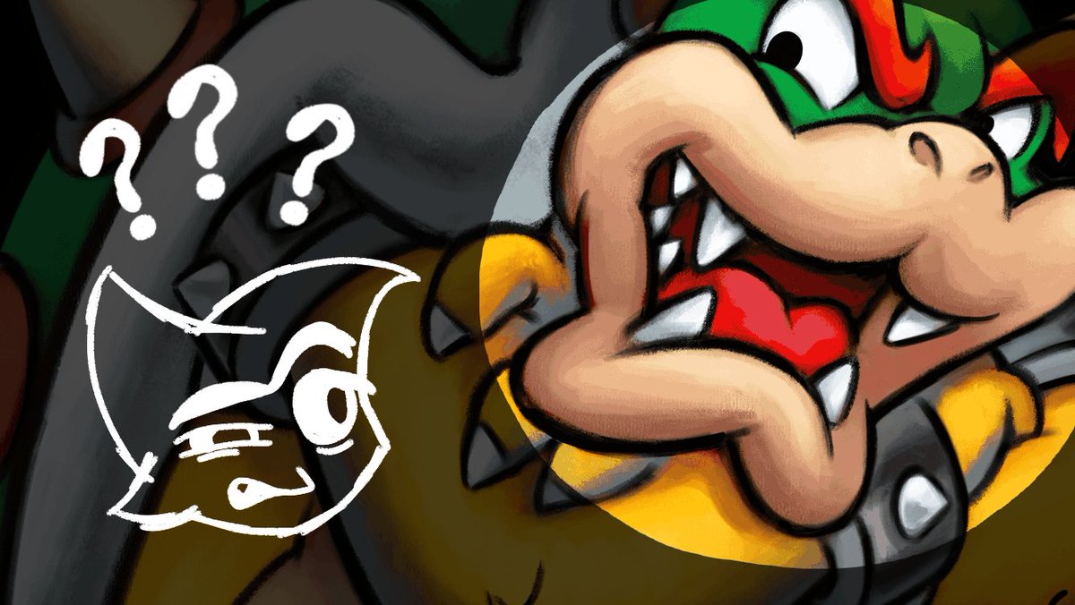
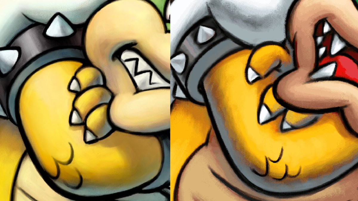
Let& #39;s start with the obvious: Bowser& #39;s face. Or to be more precise, his mouth.
What is going on here? Why does his mouth look distorted?
Let& #39;s start with the obvious: Bowser& #39;s face. Or to be more precise, his mouth.
What is going on here? Why does his mouth look distorted?
At first, I thought maybe the artist didn& #39;t flip the canvas frequently, and only flipped it once they& #39;re done with the art.
However, flipping the art doesn& #39;t make much of a difference; it might look worse, actually!
However, flipping the art doesn& #39;t make much of a difference; it might look worse, actually!
2.) Iffy proportions & details
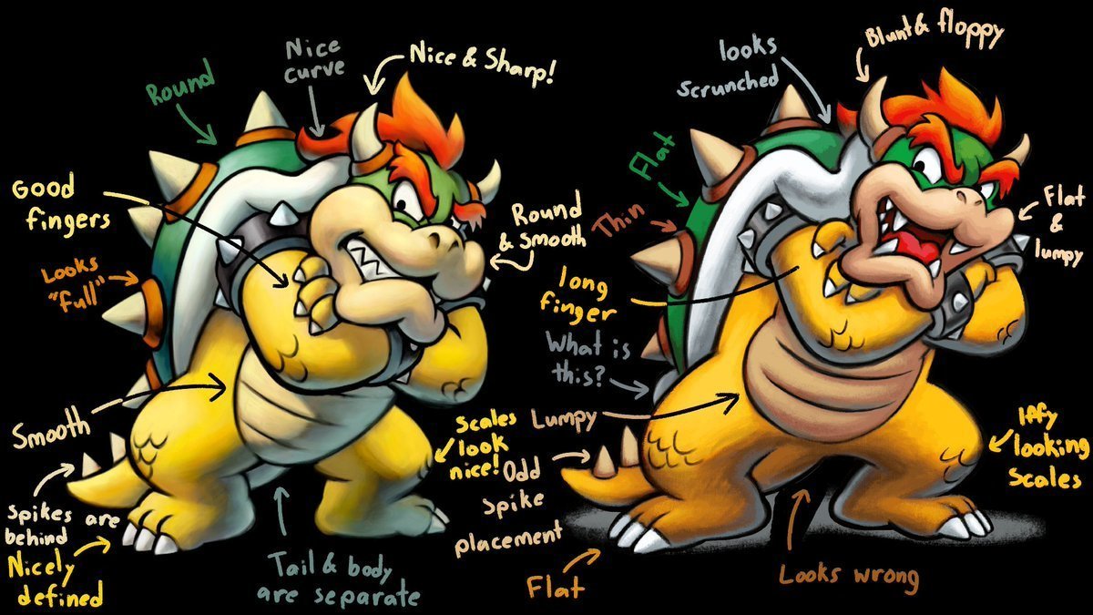
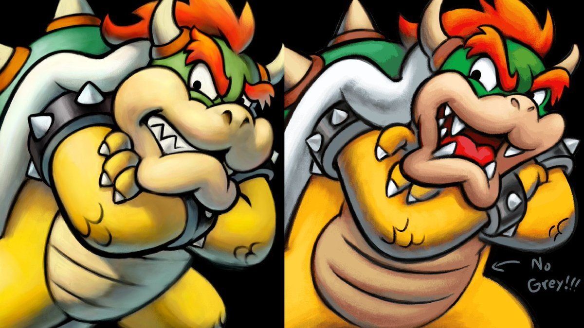
Generally speaking, the new art is not as solid as the original. It looks more flat and "lumpy"; it doesn& #39;t have the same sense of depth as the original.
Generally speaking, the new art is not as solid as the original. It looks more flat and "lumpy"; it doesn& #39;t have the same sense of depth as the original.
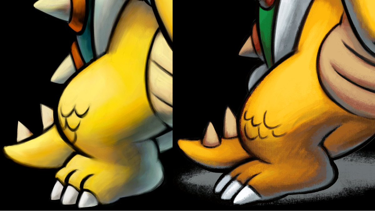
Bowser& #39;s feet in the new art looks flatter than the original, and looks too long.
Also, the scales on his knees and elbows look less consistent; they look randomly placed, instead of following a clean pattern like the original.
The spikes on his tail look weird.
Also, the scales on his knees and elbows look less consistent; they look randomly placed, instead of following a clean pattern like the original.
The spikes on his tail look weird.
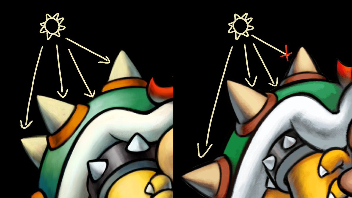
The lighting on the top spike doesn& #39;t match with the light source; it should be brighter on the left, not right.
Same can be said for the top spike on the arm bracelet.
Same can be said for the top spike on the arm bracelet.
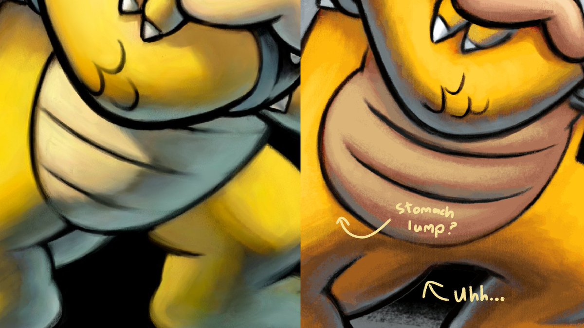
For some reason, Bowser has a lump in his stomach? I don& #39;t think his stomach can do that, correct me if I& #39;m wrong.
Also, the way his tail is drawn is... questionable. I don& #39;t want to discuss any further.
Also, the way his tail is drawn is... questionable. I don& #39;t want to discuss any further.
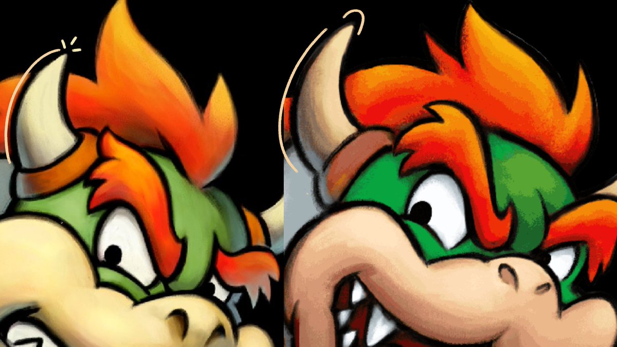
Bowser& #39;s horn looks strange; it& #39;s looks too long, the tip is blunt, and the curve doesn& #39;t look as natural.
3.) Shading and Texture
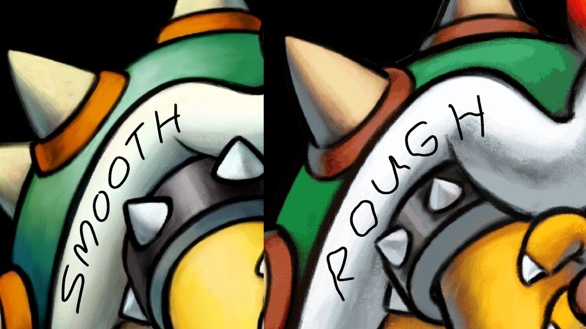
The new art looks rough; the line work is less consistent, and the color blending is muddy.
Compare how the shell is shaded in the original vs the remake: the shell looks flatter in the latter.
The new art looks rough; the line work is less consistent, and the color blending is muddy.
Compare how the shell is shaded in the original vs the remake: the shell looks flatter in the latter.
Some of the lines also look sharp for this artstyle? Look at the scales on his elbow; looks like it was drawn with a sharpie. Doesn& #39;t blend with the grey at all.
Speaking of which...
Speaking of which...
A distinct characteristic of the artstyle is the use of grey as a form of rim lighting.
Look how in the original art, the grey is largely found on the bottom right side of Bowser.
Looks nice, right? It does a good job of giving him a sense of depth.
Look how in the original art, the grey is largely found on the bottom right side of Bowser.
Looks nice, right? It does a good job of giving him a sense of depth.
Now in the redone art, the grey... makes no sense.
What& #39;s going on here!?
The grey is all over the place, and some parts don& #39;t even have grey!
Honestly, this is my least favorite aspect of the art, moreso than the distorted mouth; the inconsistent use of grey.
What& #39;s going on here!?
The grey is all over the place, and some parts don& #39;t even have grey!
Honestly, this is my least favorite aspect of the art, moreso than the distorted mouth; the inconsistent use of grey.
Why is the grey wrapped all around his arm? That& #39;s just looks bad.
And what& #39;s with the grey gunk between Bowser& #39;s chin and hand? Why is that there?
And what& #39;s with the grey gunk between Bowser& #39;s chin and hand? Why is that there?
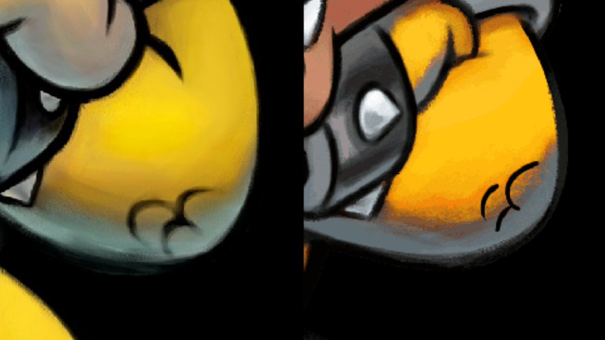
There& #39;s no grey on Bowser& #39;s stomach or face. Not only is that inconsistent, it also makes both features look flat.
Uuughh...
Uuughh...
That will be it for this thread. I& #39;m sorry for wasting your time.
This was fun to make, though!
This was fun to make, though!

 Read on Twitter