This morning I found some odd results. Then I spent several hours finding a typo in my program. Then I found some interesting results. Then I had to think about how to explain counterfactuals (CF)… Let me tell you about it
The Q: We know there’s been big differences in job losses across groups - gender, earnings, etc. How much of those differences merely reflect the fact that COVID-related closures affected different industries and occupations differently?
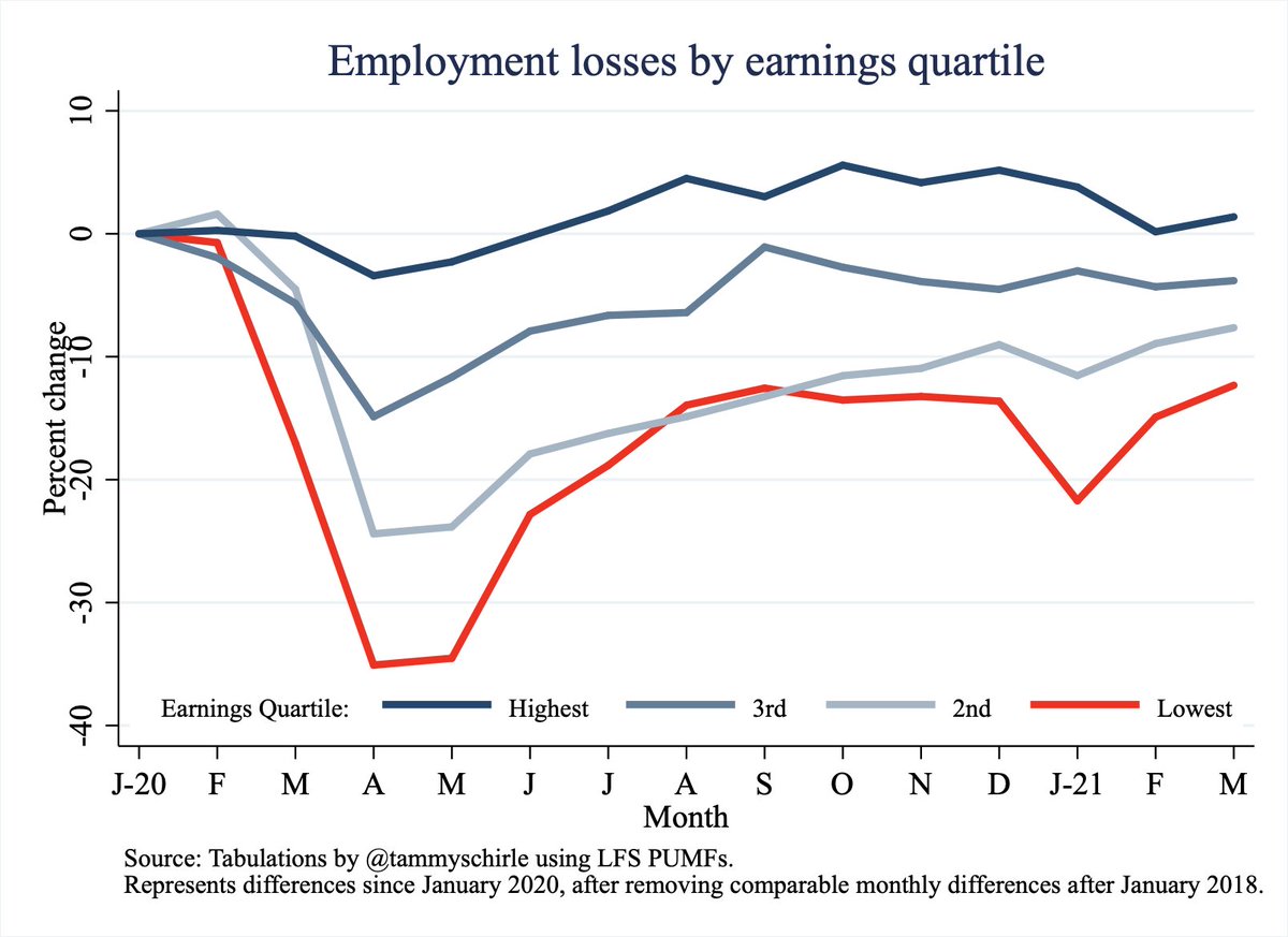
Here’s employment losses within each earnings quartile, relative to January 2020 and taking out normal changes (using months since January 2018 as a benchmark). This isn’t news - lowest earners have been hit hardest and continue to struggle
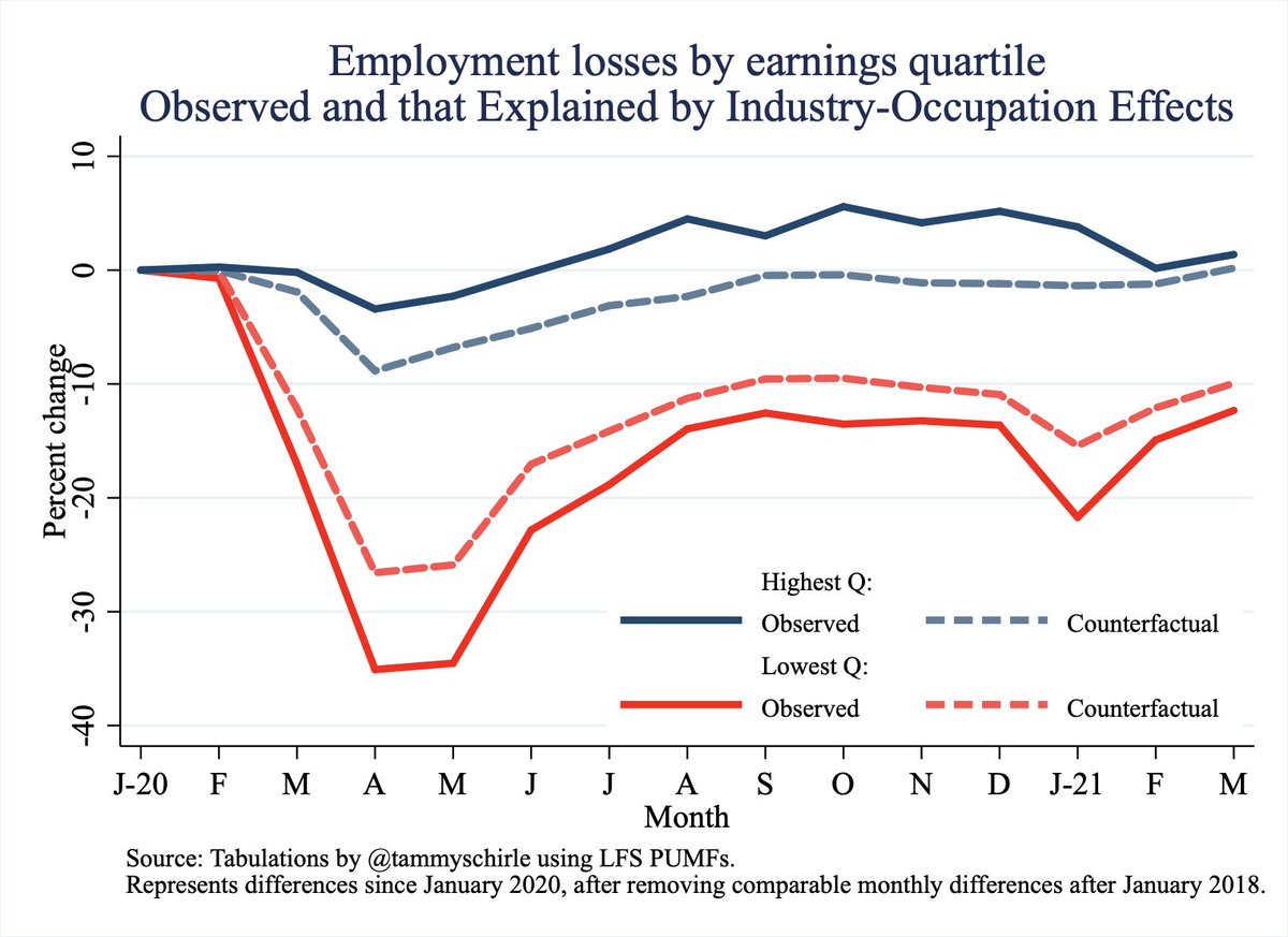
So how much of that Q1/Q4 difference can be explained by the industries/occupation represented in each group? Loosely put, the dashed line here represent the job losses that would have happened if the covid effects on industries were quartile-neutral…
How to interpret? (It can be confusing, bear with me.)
Q1 CF line is higher than observed -> within an industry, more job losses targeted the lower wage workers. If it was all quartile-neutral, these lines would be the same
Q1 CF line is higher than observed -> within an industry, more job losses targeted the lower wage workers. If it was all quartile-neutral, these lines would be the same
Q4 CF is lower than observed -> within industry fewer job losses targeted the higher wage workers. If it was all quartile-neutral, these lines would be the same
How to interpret?
The big difference between Q1 & Q4 CF is what’s leftover -> there were more job losses among Q1 workers because the industries they work in were hit harder. So, a lot of the Q1/Q4 difference here is explained by COVID-effect differences across industries.
The big difference between Q1 & Q4 CF is what’s leftover -> there were more job losses among Q1 workers because the industries they work in were hit harder. So, a lot of the Q1/Q4 difference here is explained by COVID-effect differences across industries.
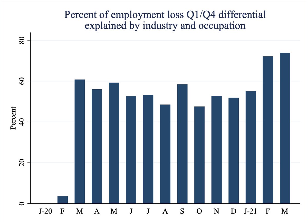
So, all this tells us industry-specific effects explain a lot of the gap between highest and lowest earners’ job losses. Here, I map out how much of the difference in employment losses across low/high quartiles is explained by this difference in COVID effects across industries
Note: To construct the CF, I closely followed the work published in Lemieux et at in Canadian Public Policy last summer. My benchmark and sample is a bit different. Find that here (see table 6): https://www.utpjournals.press/doi/full/10.3138/cpp.2020-049">https://www.utpjournals.press/doi/full/...
Ok, round 2. Same thing, new groups - men and women
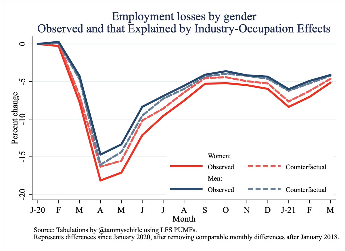
Now look at gender differences in employment losses since January 2020. Here’s employment losses of men and women, again taking out normal changes using the months after January 2018 as a benchmark.
Here, I bring in the same type of counterfactuals as dashed lines - how large would the losses be if the effects of COVID on industries were entirely gender neutral within industry. Let’s interpret this again…
How to interpret? The women’s CF line is higher than observed -> within an industry, more job losses targeted women. If it was all gender-neutral, these observed & CF would be the same
How to interpret? The men’s CF line is lower than observed -> within an industry, fewer job losses targeted men. If it was all gender-neutral, these observed & CF would be the same
But here’s where I was surprised: Notice there are many months the men’s and women’s counterfactuals are really really close.
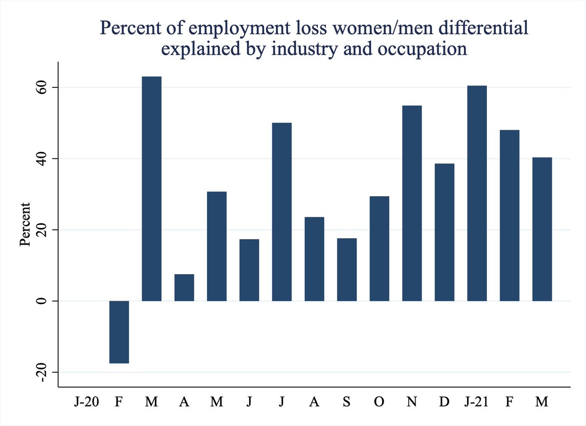
This tells us industry effects often explain very little of the gap between men’s and women’s job losses.
This tells us industry effects often explain very little of the gap between men’s and women’s job losses.
I thought it would be more. Really.
Here, I map out how much of the women-men difference in employment losses is explained by this difference in COVID effects across industries. Some months, it& #39;s not that much. There’s just other things going on.
What other things? We’ve seen plenty of tabulations over the past year about caregiving and parents. I’ll work on that next.
Gotta go, family is calling
Gotta go, family is calling
There’s a mistake in a legend way back in this thread… will correct it all later

 Read on Twitter