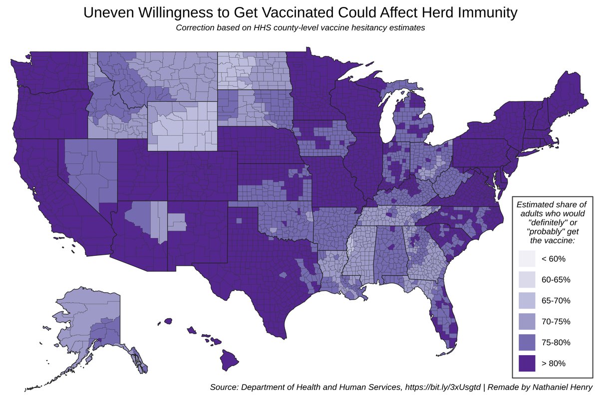
Is it just me, or does this widely-shared figure from Monday& #39;s @nytimes cover story on herd immunity WAY overstate actual COVID-19 vaccine hesitancy in the US?
 https://abs.twimg.com/emoji/v2/... draggable="false" alt="🧵" title="Thread" aria-label="Emoji: Thread">: https://twitter.com/AdamUren/status/1389188406731706371">https://twitter.com/AdamUren/...
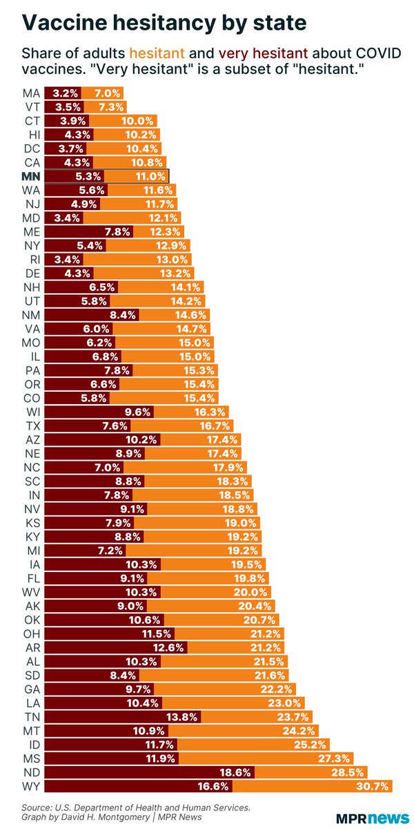
The figure just cites Health and Human Services, but the data source seems to be the same one used in this @MPRnews article by @dhmontgomery: https://bit.ly/3tiECHP .">https://bit.ly/3tiECHP&q... Note that at the state level, vaccine hesitancy never exceeds 31% (2/)
The underlying HHS data is at https://aspe.hhs.gov/pdf-report/vaccine-hesitancy.">https://aspe.hhs.gov/pdf-repor... There were only 4 survey responses—the NYT map is supposed to capture the first 2 (& #39;def/prob& #39;), and the HHS definition of "hesitancy" includes the last 2 (& #39;prob/def not& #39;). That is, NYT definition = 1 - hesitancy... (3/)
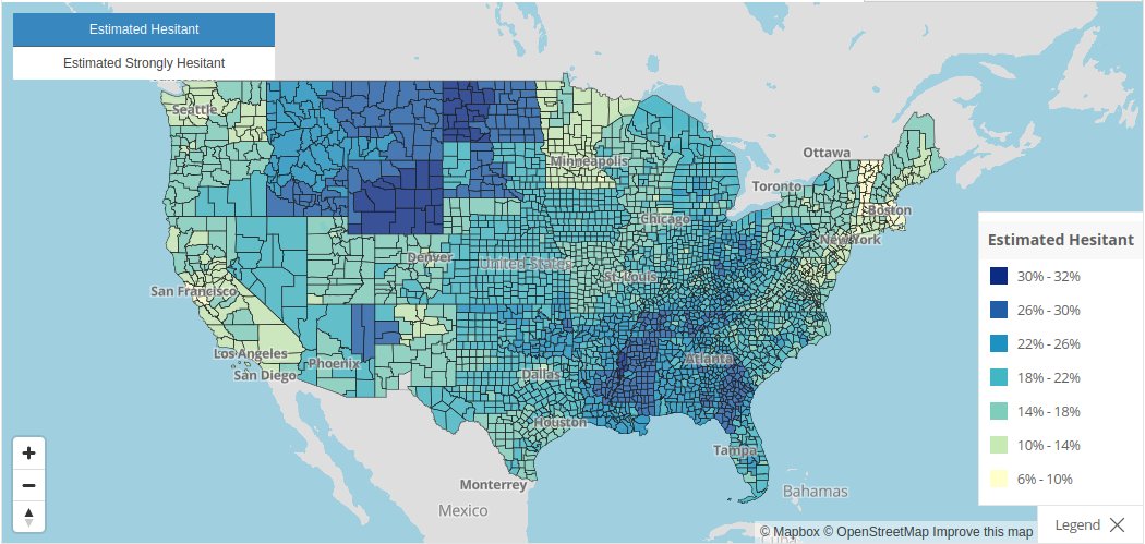
... but this isn& #39;t borne out in the data! HHS estimates a max of 32% vaccine hesitancy across all US counties.
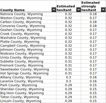
Take Wyoming: no counties should fall in the lightest color bin. The data only matches if you double-count "strongly hesitant" (already included in "hesitant"). (4/)
Take Wyoming: no counties should fall in the lightest color bin. The data only matches if you double-count "strongly hesitant" (already included in "hesitant"). (4/)
You can take a look at the original (often less grim) HHS county map of vaccine hesitancy here: https://data.cdc.gov/stories/s/Vaccine-Hesitancy-for-COVID-19/cnd2-a6zw">https://data.cdc.gov/stories/s... And for more info on the limitations behind these estimates, see this thread: https://twitter.com/dhmontgomery/status/1389223136189501444">https://twitter.com/dhmontgom... (5/5)

 Read on Twitter


