Compelling copy with complementing visuals is a cheat code.
Together, it helps a consumer understand and visualize your product.
No one does this better than Apple.
Here are 10 examples from Apple& #39;s site https://abs.twimg.com/emoji/v2/... draggable="false" alt="🧵" title="Thread" aria-label="Emoji: Thread">
Together, it helps a consumer understand and visualize your product.
No one does this better than Apple.
Here are 10 examples from Apple& #39;s site
Apple announced the release of their new iMacs.
Unlike the previous editions, these come in seven "vibrant" colors.
And you get to choose the color that matches your personality.
A fun play on words + killer creative (it& #39;s actually a vid) = ENGAGED.
Unlike the previous editions, these come in seven "vibrant" colors.
And you get to choose the color that matches your personality.
A fun play on words + killer creative (it& #39;s actually a vid) = ENGAGED.
This headline lives over the screen.
The placement is intentional.
Your eyes shift to the headline. And automatically you see the visual and register how thin it is.
All the white space around the screen help illustrate the width even more.
The placement is intentional.
Your eyes shift to the headline. And automatically you see the visual and register how thin it is.
All the white space around the screen help illustrate the width even more.
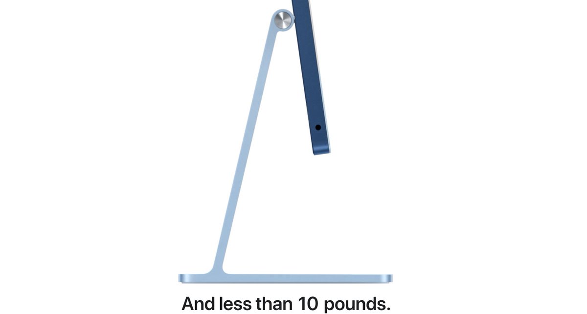
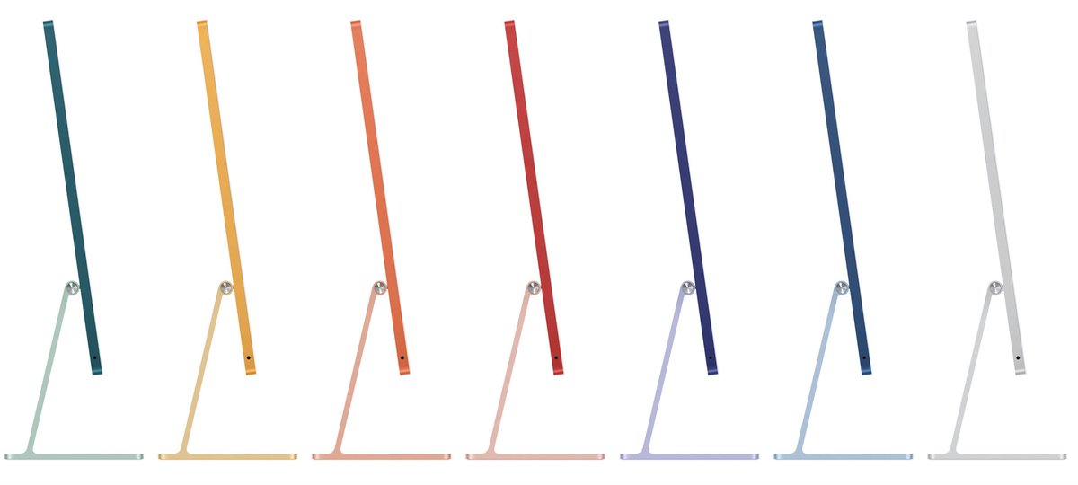
As you scroll, it takes you to the base of the computer.
Where a headline appears that tells you how light the computer is.
A clear product shot from the side with dominant white space continues to illustrate how minimal the computer is.
Where a headline appears that tells you how light the computer is.
A clear product shot from the side with dominant white space continues to illustrate how minimal the computer is.
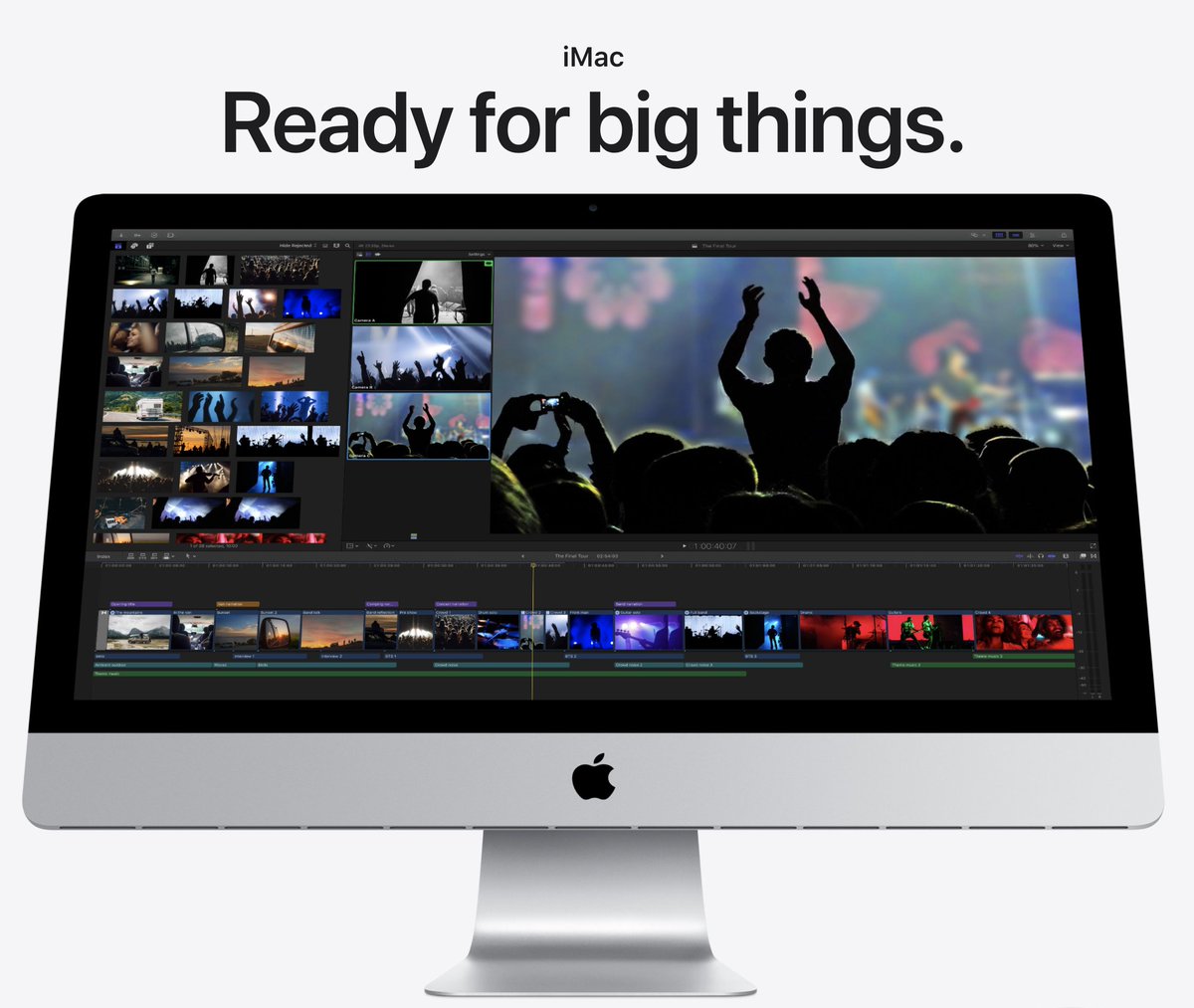
On the other end -- Apple& #39;s 27" mac.
The biggest iMac of them all.
Product shot angled from the bottom to give you this bigger-than-life feel.
They also do this in movies.
The biggest iMac of them all.
Product shot angled from the bottom to give you this bigger-than-life feel.
They also do this in movies.
Off a hot release -- Apple announced two new iPhone 12s.
One with a larger screen (6.1 in)
One with a small screen (5.4 in)
One product image with two headlines paints a clear picture of the difference.
One with a larger screen (6.1 in)
One with a small screen (5.4 in)
One product image with two headlines paints a clear picture of the difference.
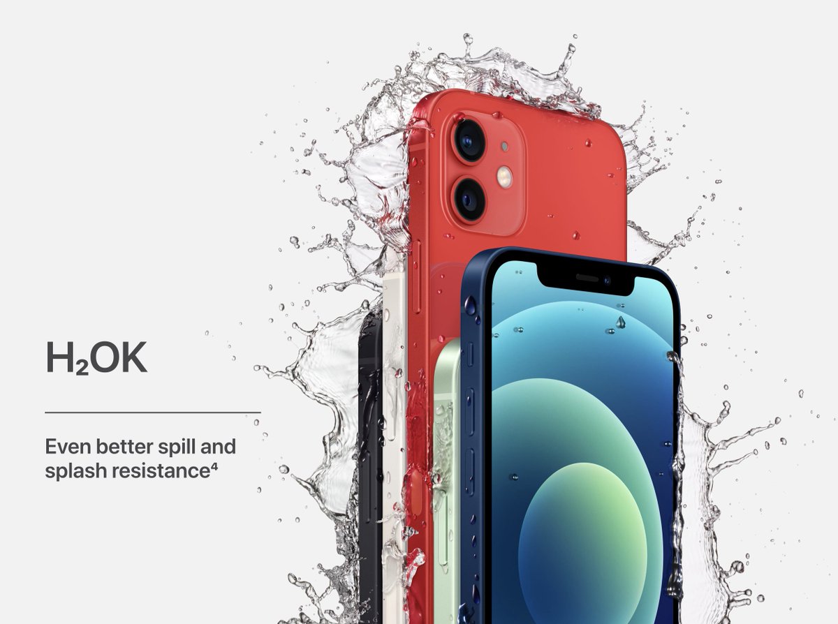
We all know H20 is the chemical formula for water.
One additional letter, and you now know the iPhones are water-resistant.
The complimenting image helps you visualize what could happen to your iPhone, and it would still be okay.
One additional letter, and you now know the iPhones are water-resistant.
The complimenting image helps you visualize what could happen to your iPhone, and it would still be okay.
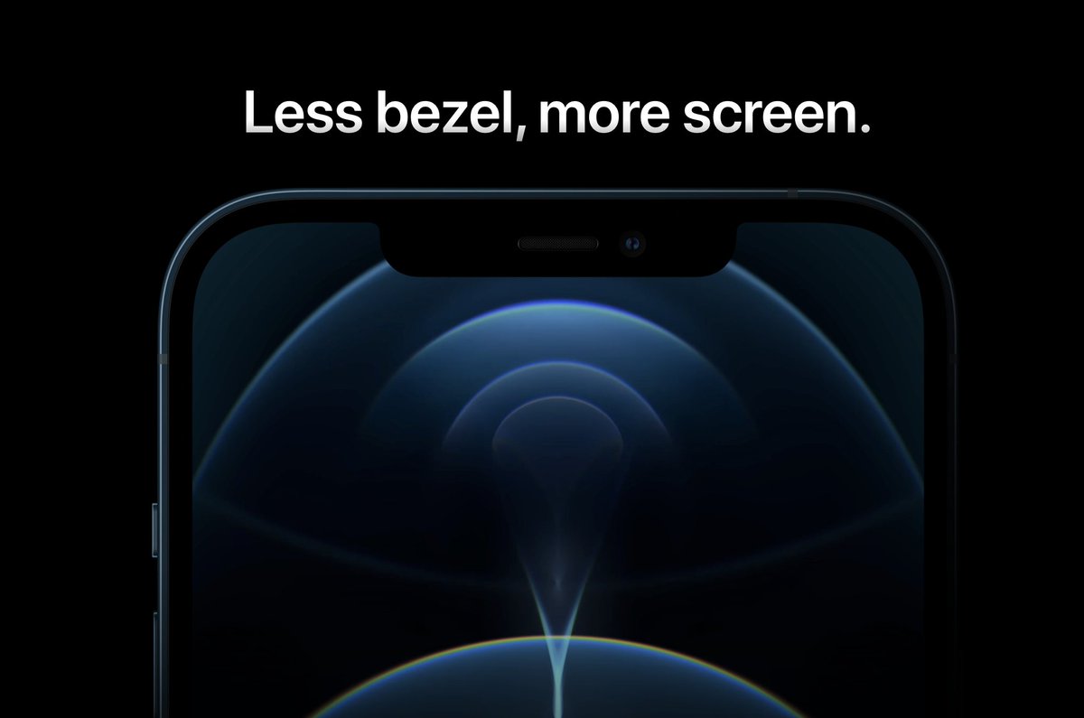
Headlines should articulate one idea.
The idea here?
Less bezel. Meaning, less of a border between the screen and phone.
For you, this is a bigger screen.
A smart product photo and consumers know exactly what Apple means.
The idea here?
Less bezel. Meaning, less of a border between the screen and phone.
For you, this is a bigger screen.
A smart product photo and consumers know exactly what Apple means.
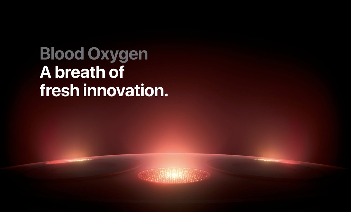
The Apple Watch Series 6 puts an emphasis on your health.
Primarily, the addition of measuring your blood oxygen level.
To help you visualize this, Apple:
- used a red watch (blood)
- portrayed the sensors as blood oxygen
Freakin& #39; genius
Primarily, the addition of measuring your blood oxygen level.
To help you visualize this, Apple:
- used a red watch (blood)
- portrayed the sensors as blood oxygen
Freakin& #39; genius
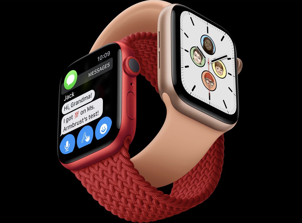
Family cares about family.
With their new feature, your family can be "joined at the wrist."
To help illustrate this, two Apple watches intertwined.
Avatars on one watch (your fam)
Text messages between you and grandma on the other.
With their new feature, your family can be "joined at the wrist."
To help illustrate this, two Apple watches intertwined.
Avatars on one watch (your fam)
Text messages between you and grandma on the other.
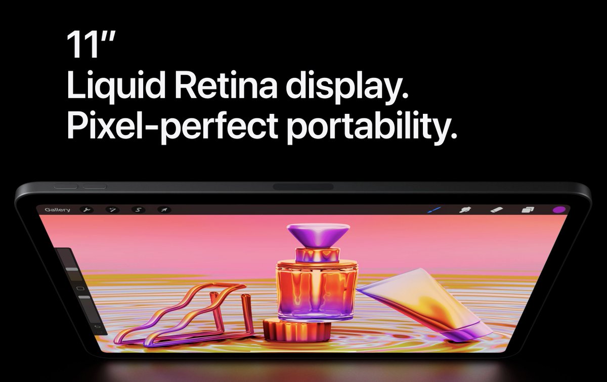
Wondering if the new iPad was portable?
The angle overhead shot leaves no doubt how thin it is.
Plus, it helps illustrate the size of the screen.
A vibrant photo and you know what quality visuals to expect from the "liquid retina display."
The angle overhead shot leaves no doubt how thin it is.
Plus, it helps illustrate the size of the screen.
A vibrant photo and you know what quality visuals to expect from the "liquid retina display."
Want to become a better marketer every day?
Then follow @alexgarcia_atx to make sure a marketing thread shows up on your feed for the next 5 days :)
Then follow @alexgarcia_atx to make sure a marketing thread shows up on your feed for the next 5 days :)
It& #39;s also a newsletter that I send to 5400+ marketers. (over 50% of them open it daily)
Join them https://abs.twimg.com/emoji/v2/... draggable="false" alt="👇" title="Rückhand Zeigefinger nach unten" aria-label="Emoji: Rückhand Zeigefinger nach unten">
http://bit.ly/3flYp6b ">https://bit.ly/3flYp6b&q...
Join them
http://bit.ly/3flYp6b ">https://bit.ly/3flYp6b&q...
Main Takeaways:
1. When you can -- use plays on words to help illustrate your idea (ex: H2ok or you do hue)
2. Your copy and creative should work together to persuade consumers
3. The more they complement each other -- the more your consumers will understand
1. When you can -- use plays on words to help illustrate your idea (ex: H2ok or you do hue)
2. Your copy and creative should work together to persuade consumers
3. The more they complement each other -- the more your consumers will understand

 Read on Twitter
 " title="Compelling copy with complementing visuals is a cheat code.Together, it helps a consumer understand and visualize your product.No one does this better than Apple.Here are 10 examples from Apple& #39;s site https://abs.twimg.com/emoji/v2/... draggable="false" alt="🧵" title="Thread" aria-label="Emoji: Thread">" class="img-responsive" style="max-width:100%;"/>


