1/40 I haven’t done anything like this in a while for obvious reasons (READ: Fanboys and tripe). But hell, I have a few hours spare, so let’s have a little dive into the good, the bad... and the odd questions about the visual presentation of Halo Infinite& #39;s latest media.
2/40 First off this is not intended to be used for bashing the developers or for hiding issues others see. As an artist myself I have respect for the team and all they are doing. Regardless of if you agree/disagree with myself or their vision, please respect that.
3/40 So we have new campaign images and something a little closer to a final visual look. Not final, because it’s the last few months that polishing can take your game from a 7/10 to a 10/10. So everything you see, remember it could, and will, change.
4/40 Diving in with the first image then. An indoor shot, showing the return of classic inspired structures and visual themes. This image has several points I want to talk about and point out, and they will be lettered up below:
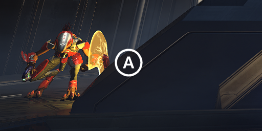
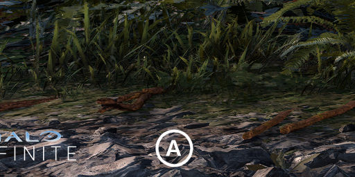
5/40 A) Right off the bat, I notice what could possibly be VRS Tier 1 artefacts. This could however be texture compression artefacts, maybe in the specular or bump stage. But this looks very much like classic tier 1, which is odd.
6/40 Tier 1 is an odd choice, and I would have thought if anybody would be implementing Tier 2 by now it would be 343 with Halo. Very strange.
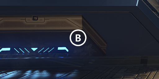
7/40 B) If you look close, you can see various spots where atmospherics (particles) are displayed. Here, by the beam in the middle of the screen etc. They blend in well, and let the scene come a bit more alive.
8/40 You can also see the blue light is casting its own light source onto the ground, using its own texture, rather than just a standard “light”. Hopefully this is an actual shadow caster and not just cosmetic (But I doubt that).
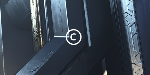
9/40 C) This one makes me happy. An old trick to save on resources that past Halo games did was to use basic geometry of various shapes, and slap a tiling texture on it. It resulted in harsh edges that, while cheap, looked bad.
10/40 Here, you can see they are using control chamfering on these edges, which massively reduces the harshness of an edge and looking much nicer and more attractive when the specular hits at the sides.
11/40 Now it’s possible they are using a shader based implementation that will take a harsh edge and apply directional normals to their edges to keep geometry the same, but still allow a softer edge. This was used in the 2009 Wolfenstein.
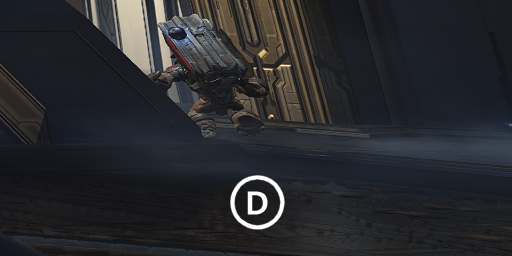
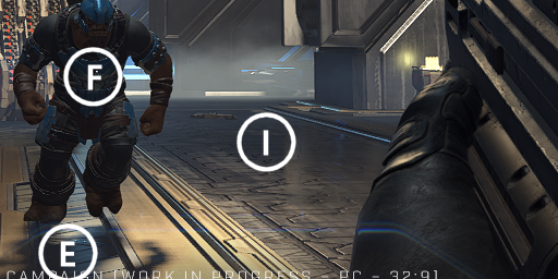
12/40 D) I’m not sure what the issue is here on the ground. VRS noise issue? SSR reflection a bit iffy? Possibly shadow stipple not playing nice? But I wanted to point it out as it’s a bit… Odd.
13/40 E) Yes. The shadow resolution is poor, as well as the noise sample being used (and thus softness applied) for this distance. I can’t dodge around this as its quite simply far too low for this distance.
14/40 One thing I will say is that while it appears the foot is clipping through the geo, it’s actually toe spacing. So, those of you saying this, that’s wrong. In fact that floor is likely perfectly flat for collision reasons (Even if visually its not.)
15/40 F) Oh no… CRAIG. Well, ok. This looks better in terms of secularity level and roughness compared to the original showing. At this distance, it wouldn’t be fair to crit it more than that, as you can’t see him close enough.
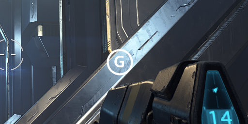
16/40 G) Surfaces that have an angle to visible light sources usually display the nicest specular effect, in this case, you can see the roughness much clearer. Much improved over the at times specular absent original reveal.
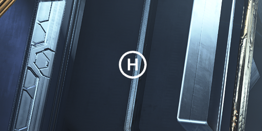
17/40 H) At first glance I wanted to say this is shadow noise however on further looking it actually looks like it could be a finer diagonal texture that’s simply not playing nice with such a poor resolution screenshot?
18/40 (It’s worth noting that 343 seem to be releasing all their images as direct ingame captures and not at a higher resolution downscaled (Super sampled). What you see here is what you will get, no bullshots).
19/40 I) You may blink and miss it but this is evidence of either SSR, or RTR. I was hoping with the delay RT would be in for launch. It really needs to be, there’s no excuse really now after the delay. Next gen NEEDS this.
20/40 J) Just for shits and giggles, the enemies on the radar don’t represent their position in the world from what I can tell. I might be wrong on this one, but yeah, lol.
21/40 All in all this is a nice pic to look at, as it does show a substantial boost in quality over previous pics. However, I can see why if you don’t know what you’re looking at, it can appear a bit bland. People really…
22/40 …need to see that this isn’t God Of War. This isn’t Last Of Us. This isn’t Ratchet. So moaning its not the same fidelity is stupid. This is an openworld game that runs 4k/120 in MP. It NEEDS to look like… Halo.
23/40 I won’ be going as in-depth into the other pics, but there a few things I want to point out. So, next up…
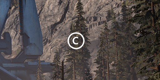
24/40 A) Near ground detail looks to be substantially higher density than first thought, though texture resolution appears last gen still here. But it looks far nice than simple flat geo.
25/40 B) This is something that always irked me, and still isn’t fixed. Where geometry meets a ground plane. This isn’t even something I have to contend with myself now, as it’s easy to hide harsh transitions with various tricks.
26/40 I’m a bit surprised to see this here still. Classic foliage placement can even hide this. Alpha masked plane fading can hide this. Painting it out via texture splatting or an alternative can hide this. This looks… Bad.
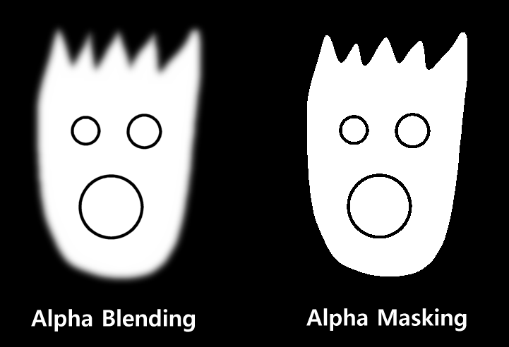
27/40 C) Ok we need to talk about the trees and why they look bad. Foliage and trees usually use heavy alpha masking, that is, transparencies with no blending in the alpha mask channel (That would be alpha BLENDing).
28/40 Alpha mask looks worse, because it’s on/off for a pixel. Alpha blend looks better, as it can fade. However alpha blending is very slow to light correctly, and even worse to accurately render in the correct order.
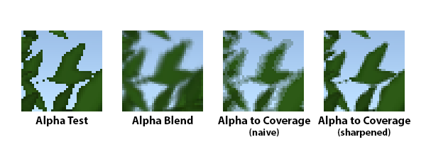
29/40 So, using alpha masking is fine. However, it needs a decent resolution combined with a decent AA solution, as well as a good alpha to coverage effect. With Alpha to Coverage, you can actually create a slight softness…
30/40 …to an alpha mask, that when viewed with a good AA solution will actually result in a soft edged alpha mask plane. When sharpened, it looks decent. Soft edges, all the speed for lighting and ordering, spot on.
31/40 However if your base resolution isn’t there (Or viewed at distance), the result can be a little pver sharp and blobby. The solution is that with distance you apply a negative alphaTest value, to keep size in check.
32/40 Halo doesn’t appear to be doing this. That’s why at distance, alpha test tree billboards/imposters (i.e. when the LOD value is too great and the model is removed for a billboard) look quite poor.
33/40 D) Seriously 343 this is a flagship title you should be using at LEAST 8xAF. I can’t understand why this keeps being ignored. Upping AF doesn’t add that much to memory usage per scene.
34/40 The other pics, I can’t comment on too much. It’s nice to see the hexagonal structures now have some actual texture and softness to them, which is a bit crit from before. It’s also nice to see some decent…
35/40 …lighting changes and what not. It looks like the word actually has an atmosphere, it looks alive. So that’s brilliant to see! I will stress this point again however… Halo Infinite is NOT a corridor shooter. It’s an open world title.
36/40 A corridor shooter has to worry about far, far less. Even those that seem to have vistas that stretch for miles… You’re still contained to a small box in front of you. Halo Infinite has a HUGE open world. Not only…
37/40 …that, but it’s also dynamic. Lighting changes with a day to night cycle. So you can’t just light a scene the same way you could in some games. VERY hard to get looking right all the time. Lastly, this game is, sadly…
38/40 …a cross gen game. It is NOT a next gen title. If it was my call, it would have been crossgen for MP, and the campaign exclusive to next gen. I will ask again that the developers are given RESPECT. They are building…
39/40 …a massive title that will be played and explored for years to come, at the most impossible time you can image. Please don’t go off comparing it to games like Ratchet, Demon’s Souls etc… It’s not even…
40/40 …in the same ballpark for the type of game. This is a 4k/60 (120 in MP) game. Let’s show them a little respect yeah? I’m going to wrap this up. If anybody has additional questions or observations, please feel free to post them and I’ll get onto them! Thanks!
One other thing that @klobrille’s post reminded me of that I forgot to mention. It looks far better now than it did at reveal, 7-8 months ago. And it still has another 7-8 months of dev time left.
This last bit is where the real polish happens. So who knows! https://abs.twimg.com/emoji/v2/... draggable="false" alt="❤️" title="Rotes Herz" aria-label="Emoji: Rotes Herz">
This last bit is where the real polish happens. So who knows!

 Read on Twitter

