Some fascinating histories behind the car logos we see every day. — Top Gear
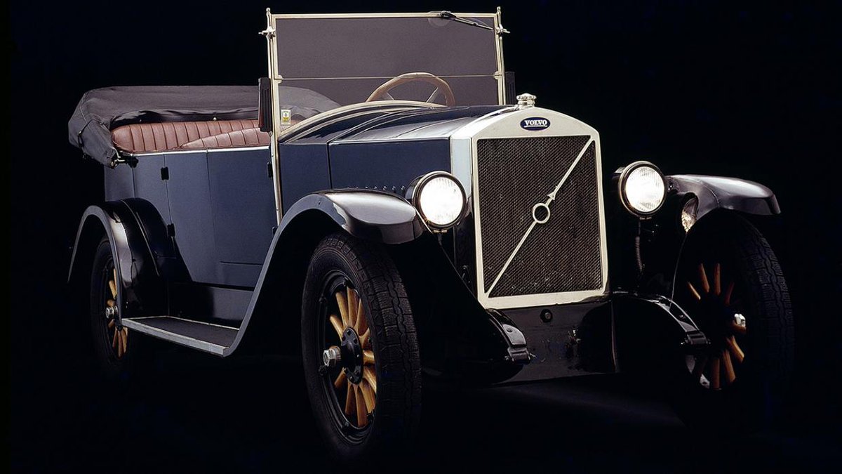
1. Volvo (1926): Volvo uses the chemical symbol for iron to symbolise the ‘strength and power’ of its cars. The company was started by Swedish firm SKF, which made bearings for the automotive industry.
1. Volvo (1926): Volvo uses the chemical symbol for iron to symbolise the ‘strength and power’ of its cars. The company was started by Swedish firm SKF, which made bearings for the automotive industry.
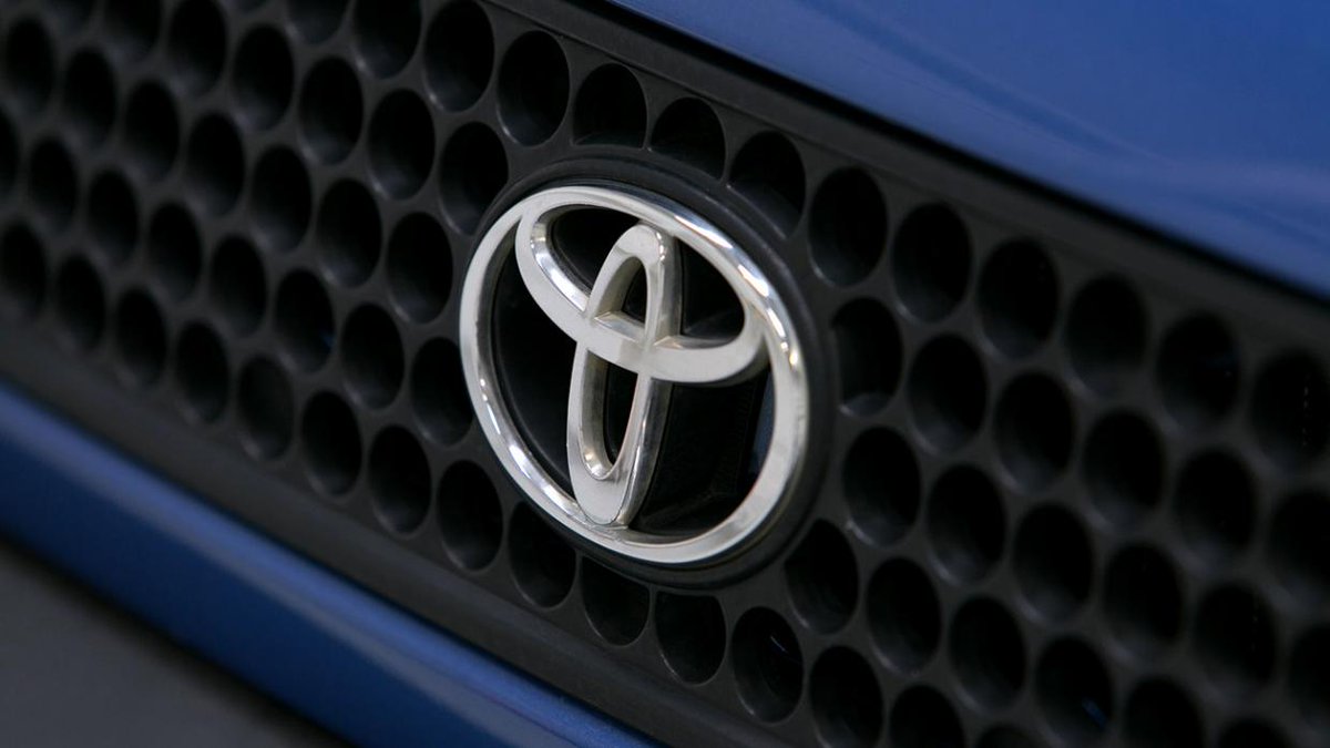
2. Toyota (1989): Toyota’s logo was only introduced back in 1989 to celebrate the firm’s 80th anniversary. The firm describes its badge as three interlocking ovals, which were designed to be recognisable ‘both head-on and when seen in a rear-view mirror’.
You might think it’s just a T, but each oval has been designed with a different thickness, tribute to Japan’s calligraphy culture. The overlapping shapes in the middle stand for trust and the outer oval signifies the world embracing Toyota.
Even the space in-between is significant, ‘exhibiting the infinite values’ of the company.
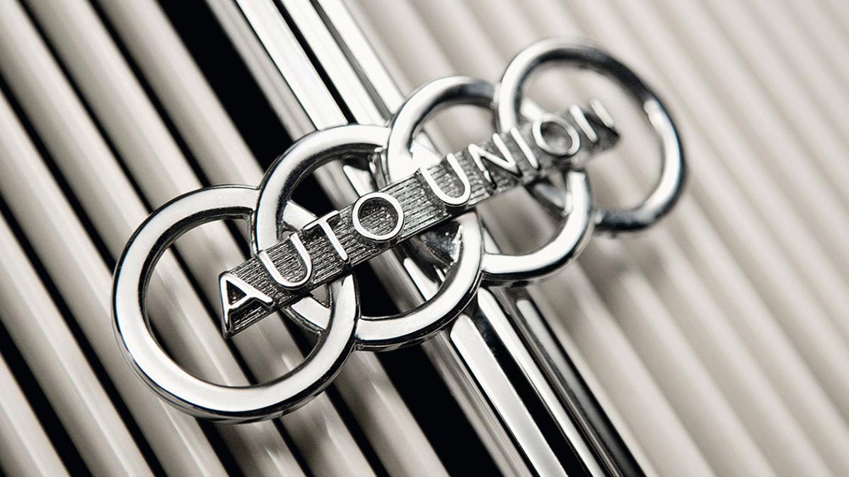
3. Audi (1932): Audi, DKW, Horch and Wanderer merged to form the Auto Union in 1932, the circles representing each of the four manufacturers coming together.
There’s a great story behind the Audi name – August Horch founded his eponymous car company in 1899, quitting in 1909 over an internal squabble with his CFO.
Starting his new company in 1910, he suddenly found he didn’t have the rights to use his own name, but hit upon Audi in an apparent stroke of genius.
You see Horch is close to the German command for ‘listen’, which is what Audi means in Latin – it’s not even a German word. Gasp. The Auto Union 1000, which went off sale in 1965, was the last of the alliance’s cars, new owner Volkswagen instead preferring to use the Audi name.
The four rings weren’t properly taken over by Audi until a 1994 company rebrand.
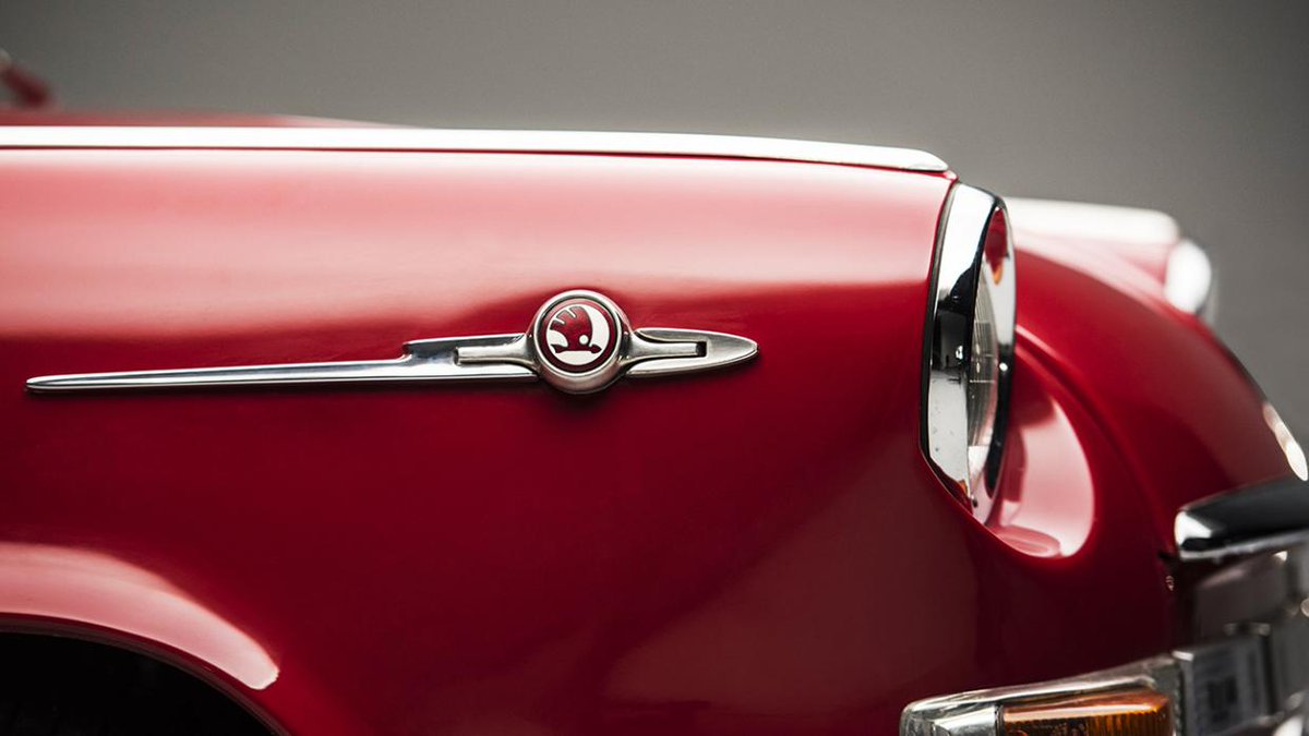
4. Skoda (1926): Skoda was founded back in 1859, in what was then the kingdom of Bohemia, now known as the Czech Republic. Known as Skoda Works, it grew to become a massive industrial conglomerate, swallowing up the Laurin-Klement car company in 1924.
In 1926 Skoda’s car making arm adopted the logo we know today (but in blue) – interpreted in many different ways (chicken in fancy dress, anyone?) but actually representing a Native American headdress, with feathers and an arrow.
The different parts of the works were hived off after World War 2, the car section now known as Skoda Auto. Volkswagen took over the company in 1991 and swapped the colour to green when the new Felicia was launched in 1993.
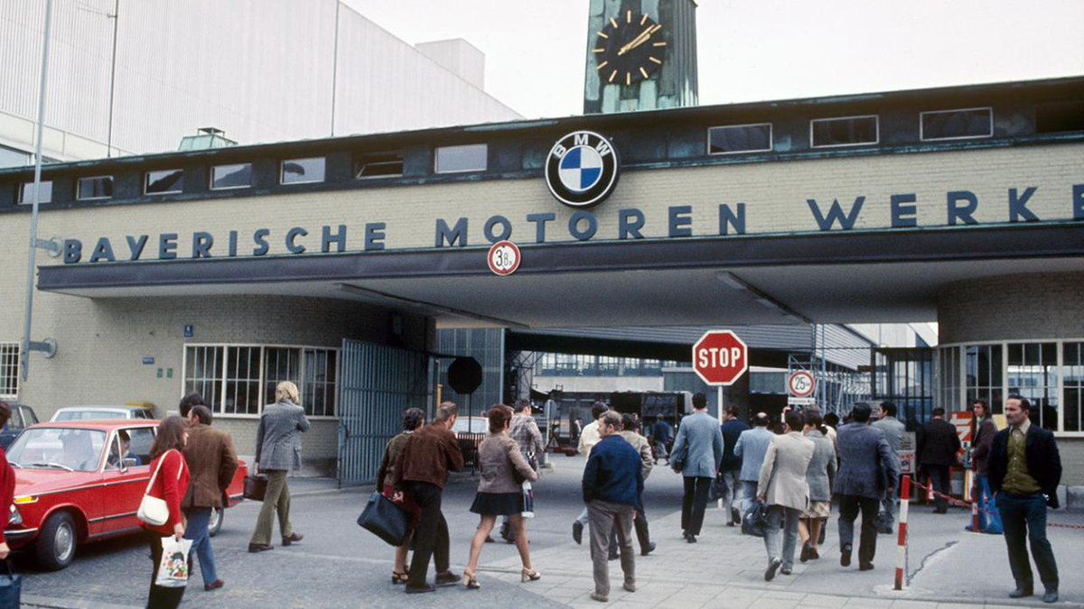
5. BMW (1917): There’s a lot of heated discussion about the BMW logo. The company emerged out of the renaming of aircraft engine maker Rapp Motorenwerke in 1917, its first logo featuring the blue and white circle quarters.
BMW’s official recounting of this hallowed rebranding confirms that it was indeed intended to use the Bavarian state colours, but that they had to be reversed so as not to infringe a local copyright law at the time which banned the use of any state coats of arms on logos.
So where does the aeroplane propeller notion come from? That dates to a 1929 advert for the company’s plane engines, which featured the BMW logo on the rotating propellers of the planes in the illustration.
BMW didn’t do a great deal to discourage the myth in the early years, which meant it took hold in the popular consciousness.
6. Alfa Romeo (1910): Did you know that Alfa was an acronym? The Anonima Lombarda Fabbrica Automobili (literally translates to Lombard Car Factory plc) was founded in June 1910, before it was bought by engineer Nicola Romeo in 1915.
The firm used two symbols associated with Milan, a red cross on a white background and the serpent from the coat of arms of the Visconti family, which ruled Milan in the 14th century.
The snake is called the biscione in Italian, or grass snake, and is shown eating a child, commonly thought to be Moorish (maybe the snake will have a second) and relating to the Crusades of the Middle Ages.
That’s all very distasteful these days, of course, so the official Alfa line is that it’s actually a man coming out of a snake and symbolises rebirth. Or good PR.  https://abs.twimg.com/emoji/v2/... draggable="false" alt="😂" title="Gesicht mit Freudentränen" aria-label="Emoji: Gesicht mit Freudentränen">
 https://abs.twimg.com/emoji/v2/... draggable="false" alt="😂" title="Gesicht mit Freudentränen" aria-label="Emoji: Gesicht mit Freudentränen">
 https://abs.twimg.com/emoji/v2/... draggable="false" alt="😂" title="Gesicht mit Freudentränen" aria-label="Emoji: Gesicht mit Freudentränen">
 https://abs.twimg.com/emoji/v2/... draggable="false" alt="😂" title="Gesicht mit Freudentränen" aria-label="Emoji: Gesicht mit Freudentränen">
 https://abs.twimg.com/emoji/v2/... draggable="false" alt="😂" title="Gesicht mit Freudentränen" aria-label="Emoji: Gesicht mit Freudentränen">
 https://abs.twimg.com/emoji/v2/... draggable="false" alt="😂" title="Gesicht mit Freudentränen" aria-label="Emoji: Gesicht mit Freudentränen">
7. Ford (1927): It’s often thought that the Ford logo must be Henry Ford’s signature, but it was actually created in 1907 by the firm’s chief engineer Childe Harold Wills using a stencil set that belonged to his grandfather.
We didn’t get a blue oval from the company until as late as 1927. An attempt to modernise the badge in 1966 fell flat, Ford opting to retain its trusted badge with swooping letters. Somehow the Blue Rounded Rectangle just isn’t as catchy.
8. Ferrari (1929): The Cavallino Rampante, or Prancing Horse, stands unmistakeably for Ferrari throughout the world, but it didn’t always belong to Ferrari.
The design, which dates back to the Royal Piedmont Regiment in 1692, was painted on the plane of WW1 fighter ace Francesco Baracca, who died in 1918.
When Italian racing driver Enzo Ferrari met Baracca’s mother after his death, she said that he should paint the horse on his racing cars for luck. The yellow was tribute to Ferrari’s birthplace, Modena.
That was 1923. In 1929 he started his racing team, which became a carmaker in 1947.
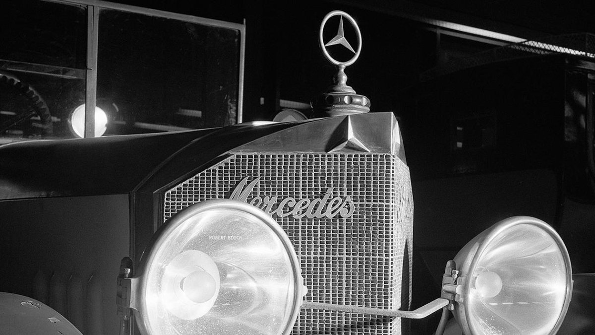
9. Mercedes-Benz (1925): The Mercedes logo first came about after the 1925 merger of the Daimler Motoren Gesellschaft and Benz & Cie. It was supposed to symbolise the dominance of the company over land, sea and air.
Daimler built engines for planes and boats at the time, but it was originally chosen by Paul and Adolf Daimler, inspired by the marks their father Gottlieb Daimler used to make on postcards of the town of Deutz to show people where his house was.
The firm also copyrighted a four-pointed star, presumably with a view to taking over space, but that one was never used by Mercedes.
The firm did let Deutsche Aerospace use it in the 1980s, the body which became the European Aeronautic and Defence Company (EADS), since rebranded as Airbus SE.
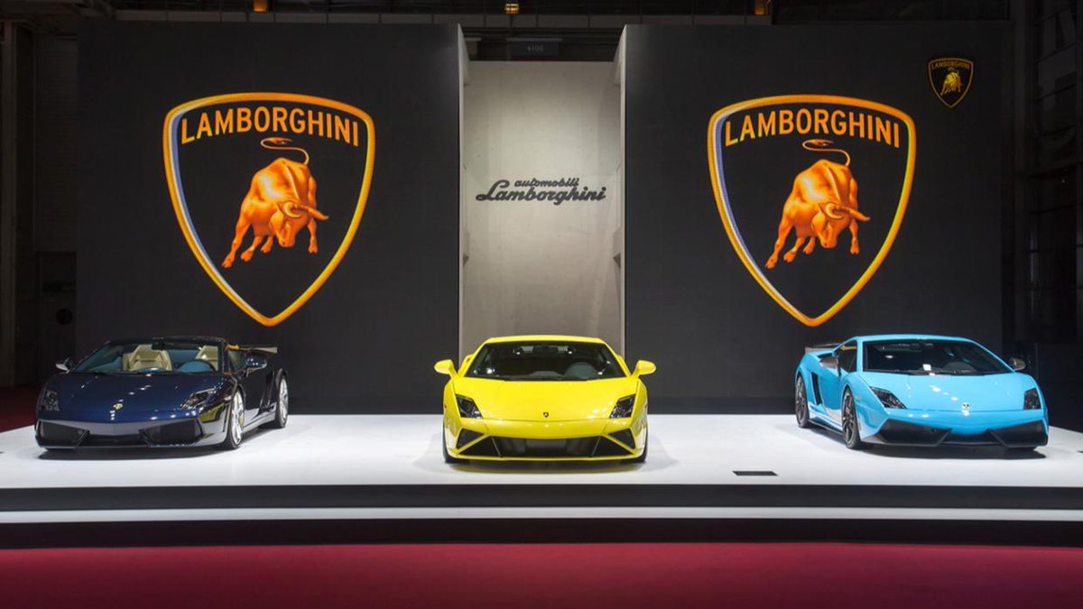
10. Lamborghini (1963): When tractor builder Ferruccio Lamborghini first started his business making agricultural machinery, his logo was a triangle with the initials of his company splashed about the place.
Obviously he wanted something cooler for his car company, when he started that in 1963, so he came up with the raging bull.
Some say it was down to Lamborghini’s star sign – he was a Taurus – while others say that he was obsessed with bullfighting and wanted to use the animal for his cars’ badges because of the danger and thrill of the sport.
At any rate, when it comes to bonnet-based animal top trumps, a raging bull certainly beats a prancing horse.
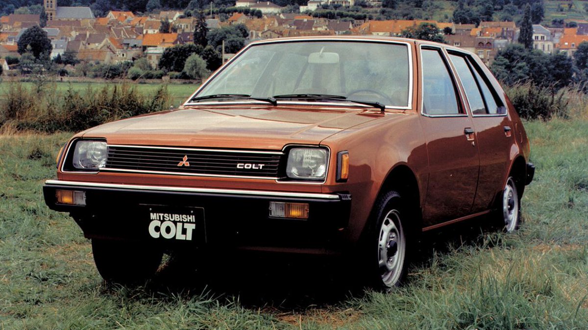
11. Mitsubishi (1873): Buckle up, badge fans, this one is complicated. The company was founded by Yataro Iwasaki in 1873 as a shipping firm.
He formed the badge by combining the three stacked diamonds of his own family crest with the three oak leaves of the Tosa clan, his first employer.
The word Mitsubishi is a combination of the words mitsu (three) and hishi (water chestnut). The word ‘hishi’ is often used in Japan to refer to the diamond shape. Putting the two together via some quirks of Japanese pronounciation resulted in Mitsubishi, the three diamonds.
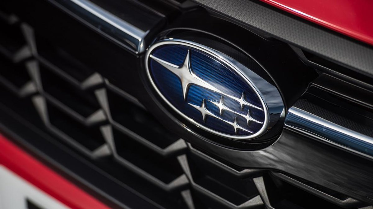
12. Subaru (1953): The stars in the Subaru badge are actually from a real constellation, the Pleiades cluster. It was chosen for two reasons – the five small stars represent the five companies that came together to make up Fuji Heavy Industries, the parent company of Subaru.
Neatly, the company’s first president happened to like the Japanese word for the Pleiades stars – Subaru, which means ‘to gather together’.

 Read on Twitter