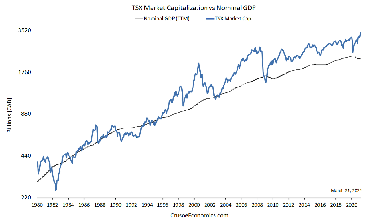
1/ One of the things people often get hung up on is valuation. Not to say that it doesn& #39;t matter, but investor preferences change over time. Sometimes permanently. The following chart shows the TSX price index overlaid with nominal GDP from 1980 to present.
2/ The chart is log scale, so that each increment on the y-axis represents a doubling in price. Notice that prior to the mid-90s, the TSX index tracked nominal GDP fairly tightly. Starting in 1995, however, when the dot-com boom was getting started, valuations moved much higher.
3/ This of course makes sense. The dot-com bubble sucked in lots of money into the stock market, driving up relative prices. No surprise there. What is surprising is that even after the bubble burst, the TSX continued to consistently trade well above nominal GDP.
4/ Had you held to the fact that the TSX was trading at a 25% premium to the pre-1990 levels and waited for historic valuations to return, you would have been out of the market since the mid-90& #39;s. "Fundamentals" still mattered - economic growth was the tailwind pushing up prices.
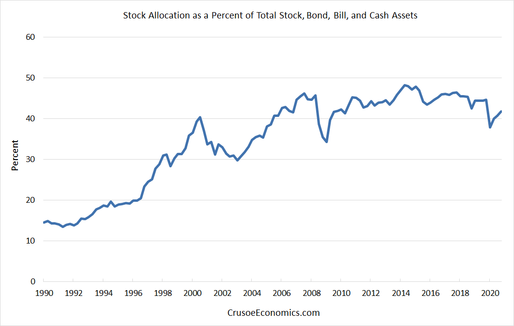
5/ However, what investors were willing to pay for those fundamentals have also changed. Preferences of Canadian households clearly have shifted. Here we see the asset allocation of households to equity markets, as a percent of total stock/bond/cash assets.

 Read on Twitter


