I still use Times New Roman as the default font in Office and I& #39;ll continue to do so. https://www.cnn.com/2021/04/28/business/microsoft-font-default-calibri/index.html">https://www.cnn.com/2021/04/2...
Academic publishers prefer standard serif fonts like Times New Roman for submissions, if you& #39;re wondering why. And I& #39;m not a fan of sans serifs, to be honest. They look too webby. I like the print look. https://twitter.com/varadmehta/status/1387553606983983109">https://twitter.com/varadmeht...
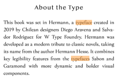
Since we& #39;re on the subject of fonts, Del Rey is using a brand new font called Hermann for its "Star Wars: The High Republic" books. As soon as I cracked open the first one, I thought, "This font looks new and different and interesting."
So I looked in the back to see if they included the typeface information, which some publishers do. And lo and behold, there it was.
Yes, I& #39;m one of those people who pays attention to the type a book is set in and checks if the publisher has included that info in the book. Some people judge a book by its cover. I judge it by its type. And with my eyes, type and font size are very important.

 Read on Twitter


