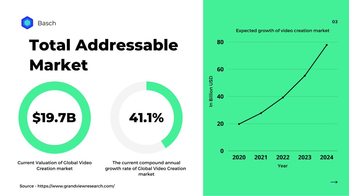
Pitching something can be difficult, This thread explains how we designed a pitch that looks aesthetic and contains the right information in less than 5 hours:
Our pitch focused on 4 important aspects:
1. Copy-writing
2. Design & Aesthetics
3. Psychology
4. Flow
1. Copy-writing
2. Design & Aesthetics
3. Psychology
4. Flow
For stunning and fast copywriting, we used @copy_ai which is an absolutely stunning tool.
We designed the whole pitch on @canva which is another great tool.
Canva has some stunning templates, yet we decided to create a custom one that matches our brand vibe.
Canva has some stunning templates, yet we decided to create a custom one that matches our brand vibe.
If you are not a designer, educate yourself on the basics of spacing, color theory, and typography to create good designs.
1. For color theory use color palettes. There are many good color palettes to know what color goes well together.
2. Don& #39;t use multiple fonts, stick to just 1 or max 2 that goes well together.
3. For spacing match the spacing of multiple elements so that it doesn& #39;t look odd.
2. Don& #39;t use multiple fonts, stick to just 1 or max 2 that goes well together.
3. For spacing match the spacing of multiple elements so that it doesn& #39;t look odd.
Psychology
We wanted the pitch to look friendly and not filled with jargon as we were not extremely confident with the numbers. Therefore we created a friendly vibe with less and readable text.
We used 3D illustrations to make the pitch stand out and grab attention.
We wanted the pitch to look friendly and not filled with jargon as we were not extremely confident with the numbers. Therefore we created a friendly vibe with less and readable text.
We used 3D illustrations to make the pitch stand out and grab attention.
Flow
Your first and the next slide should be somewhere related, if you are talking about x then slowly move towards y.
Don& #39;t move to unrelated topics quickly, the flow should be in such a manner that people can quickly understand your whole plan.
Your first and the next slide should be somewhere related, if you are talking about x then slowly move towards y.
Don& #39;t move to unrelated topics quickly, the flow should be in such a manner that people can quickly understand your whole plan.

 Read on Twitter


