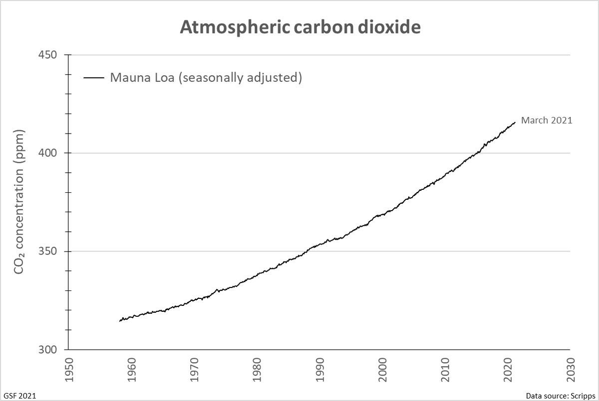
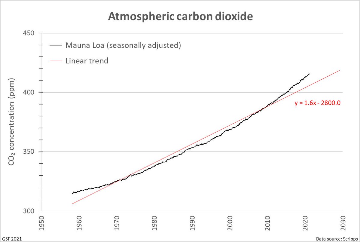
It& #39;s an interesting dataset, the & #39;Keeling Curve& #39;, tweeted about here all the time. It& #39;s one of the most important to the future of the planet, yet how hard have we looked at it?
https://keelingcurve.ucsd.edu/ ">https://keelingcurve.ucsd.edu/">...
https://keelingcurve.ucsd.edu/ ">https://keelingcurve.ucsd.edu/">...
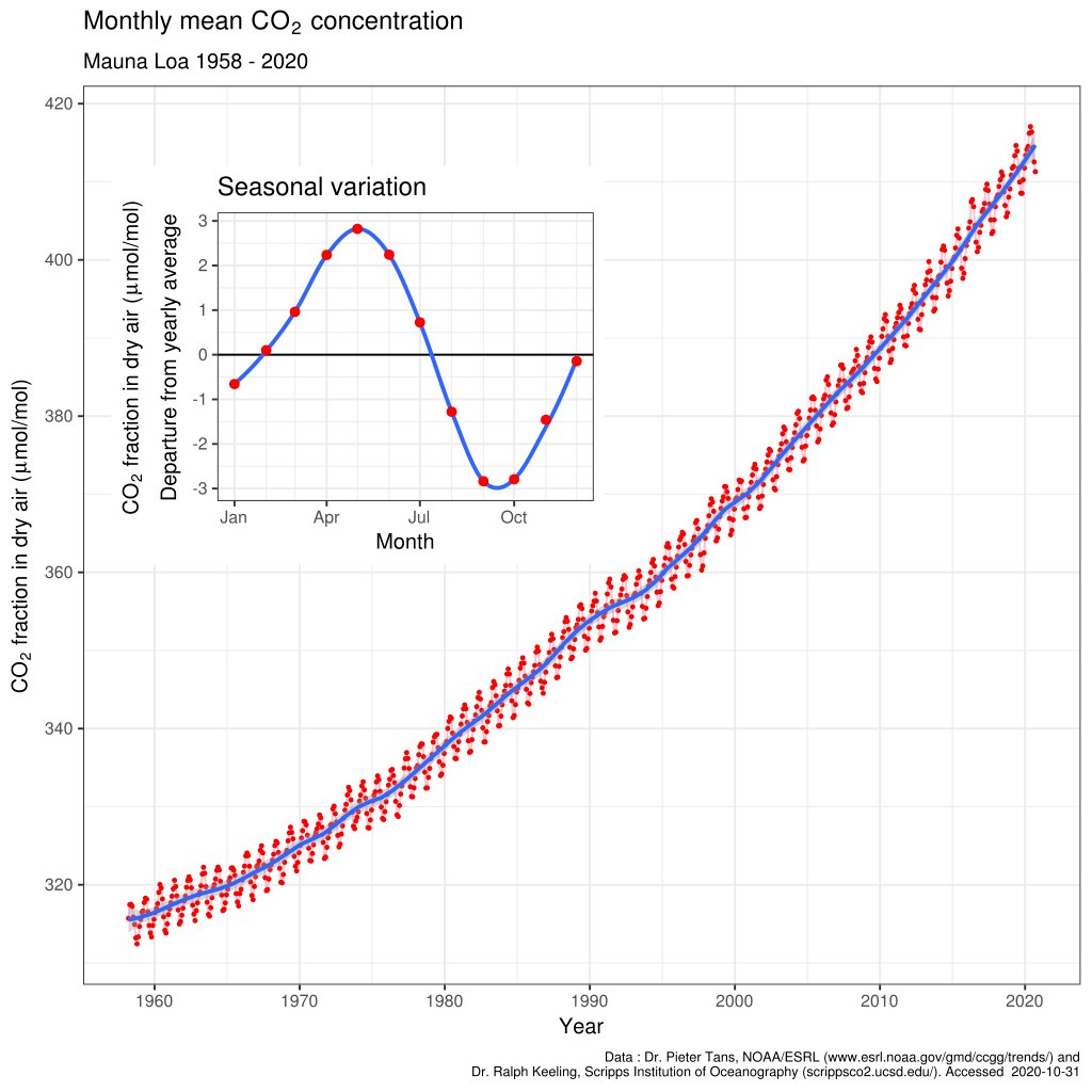
It measures our atmosphere& #39;s carbon dioxide concentration, very precisely, atop a volcano in Hawaii, continuously* since 1958, run for the duration by one father and son team.
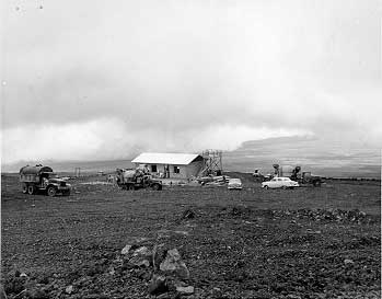
* By infrared gas spectrometer, originally on paper chart recorders, in a tin shed. Construction, 1956:
* By infrared gas spectrometer, originally on paper chart recorders, in a tin shed. Construction, 1956:
Why on top of a volcano in the middle of a huge ocean? Because that& #39;s up in the northeast trade winds, blowing clean air, far from sources of pollution, from vegetation (and up above the thermal inversion to limit volcanic contamination on rare occasions wind doesn& #39;t blow).
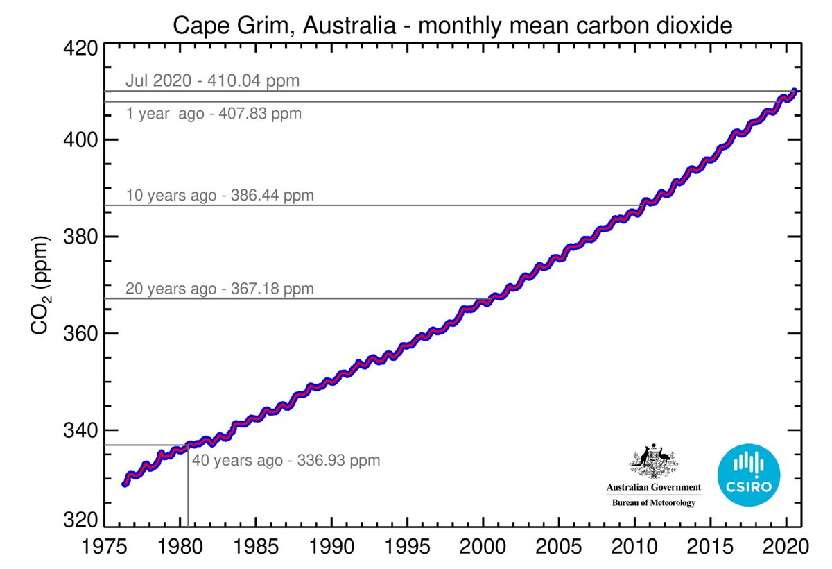
We measure at other places as well now of course, including our own Cape Grim in Tasmania (nice & #39;roaring forties& #39; air), but Mauna Loa has the long record. Our atmosphere is a windy place, & #39;well mixed& #39;, so it matters little where you measure, as long as your air is & #39;clean& #39;.
But the data: There& #39;s a long, steady accelerating increase ... with just a few slight multi-year wiggles, particularly one around 1990-95. And there& #39;s an obvious annual cycle, which interestingly is smaller in Cape Grim data (tweet above).
That& #39;s the Northern Hemisphere terrestrial vegetation & #39;breathing& #39;. There& #39;s much more land in the mid-latitude north, where vegetation only really grows in summer -- in July, when the annual dip in CO₂ concentration is most rapid. Cape Grim is further away, so sees less signal.
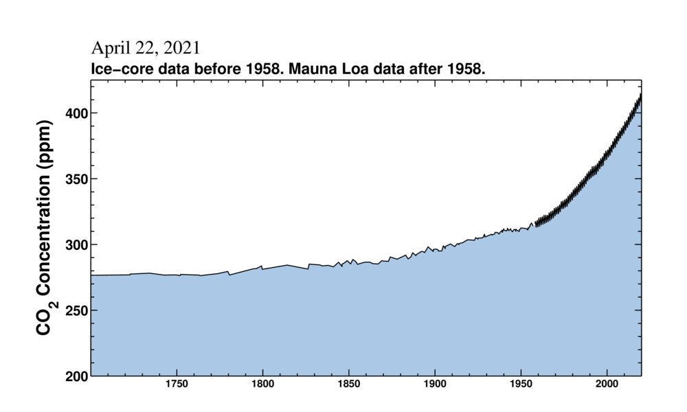
But we came in late, despite Charles Keeling& #39;s best efforts -- the CO₂ concentration was already rising rapidly by 1958. The data can be extended, less precisely, with measurements on & #39;air samples& #39; (bubbles) trapped in Antarctic ice (not Greenland ice -- complex reasons).
We started out at about 275 ppm before about 1750 (below). & #39;ppm& #39; is parts per million, measured by volume (not mass) because that& #39;s how we do gasses. In a gas, volume = molecular count, so 275 ppm means 275 CO₂ molecules in every million gas molecules.
https://keelingcurve.ucsd.edu/ ">https://keelingcurve.ucsd.edu/">...
https://keelingcurve.ucsd.edu/ ">https://keelingcurve.ucsd.edu/">...
Not much, but enough. We& #39;d have been a 100% ice world without that original 275 ppm.
But the data: If you& #39;re a statistician, first thing you want to do is remove that annual cycle -- you & #39;seasonally adjust& #39; the data. The famous Scripps Institution of Oceanography in La Jolla, California has already done that for us:
https://scrippsco2.ucsd.edu/data/atmospheric_co2/primary_mlo_co2_record.html">https://scrippsco2.ucsd.edu/data/atmo...
https://scrippsco2.ucsd.edu/data/atmospheric_co2/primary_mlo_co2_record.html">https://scrippsco2.ucsd.edu/data/atmo...

 Read on Twitter
