Short thread on my recent paper on hot spot mapping and climate security for @ssrc_org. Special thanks to @TCarayannis @Alejandrag1042 & Francisca Aguayo for shepherding this over the finish line. 1/ https://www.ssrc.org/publications/view/prevention-and-climate-security-a-survey-of-hotspot-mapping-approaches-to-climate-related-security-risks/">https://www.ssrc.org/publicati...
I& #39;ve been involved in efforts to visualize climate security risks for more than a decade including projects supported by the US Department of Defense & USAID. Hot spot maps can potentially help decision-makers identify locations of concern at the national or subnational level. 2/
However, modeling choices and data sources shape the maps and outcomes which also have to be interpreted. Maps are compelling simplifications of a complex reality but can distort and distract unless we& #39;re mindful of assumptions and the purposes they are intended for. 3/
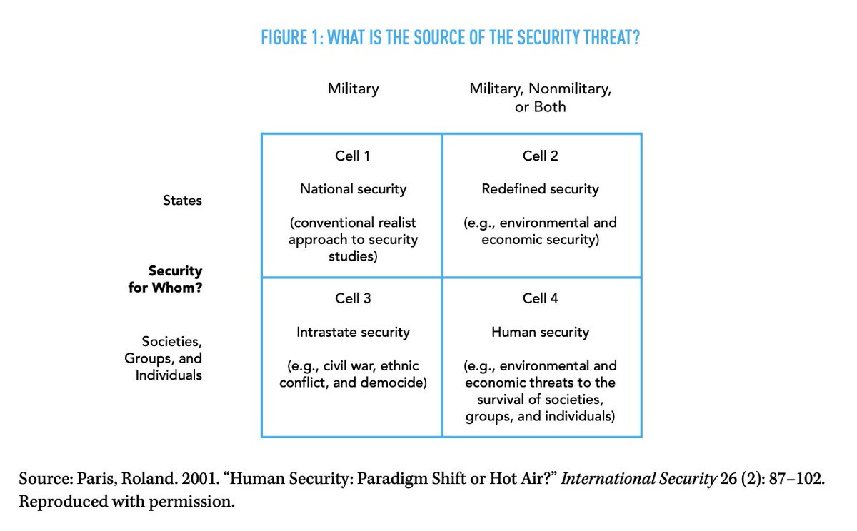
To this point, what do we mean by security and whose security matters? Here, I review the foundational work from @rolandparis on the distinctions between state security and human security and the distinctions between military and non-military threats. 4/
In the climate security space, we& #39;re interested in conflict(+), the ways in which climate change can lead to the increased risk of conflict 𝘱𝘭𝘶𝘴 other severe negative security outcomes, notably the risk of loss of life during humanitarian emergencies. 5/
This is a broadening in both directions, away from states as being the only objects of concern, and away from security threats emanating solely from human agents towards what
@mbazilian and @cullenhendrix have called actorless threats. 6/ https://www.justsecurity.org/72939/an-age-of-actorless-threats-re-thinking-national-security-in-light-of-covid-and-climate/">https://www.justsecurity.org/72939/an-...
@mbazilian and @cullenhendrix have called actorless threats. 6/ https://www.justsecurity.org/72939/an-age-of-actorless-threats-re-thinking-national-security-in-light-of-covid-and-climate/">https://www.justsecurity.org/72939/an-...
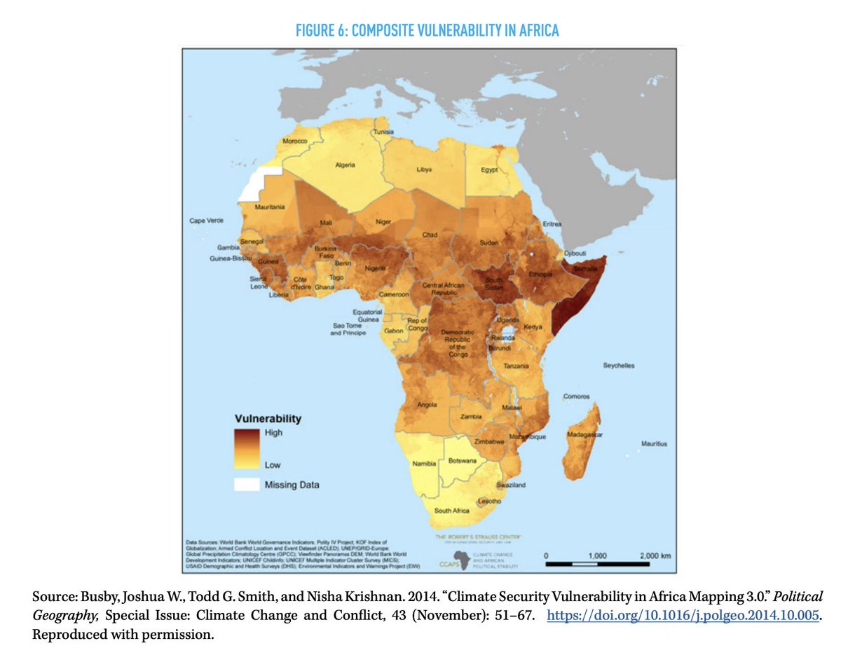
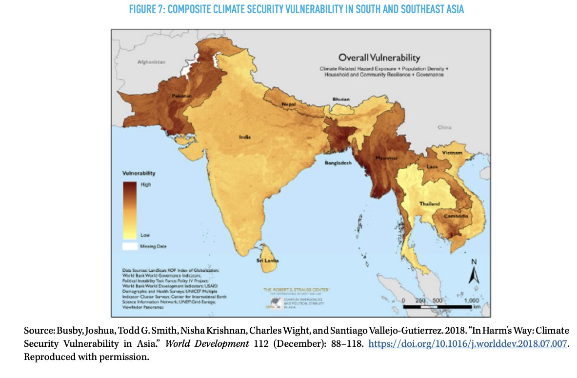
There are different ways to visualize climate security risks. You can combine all indicators in a single composite index. Another way is overlaying different indicators on top of each other to see the spatial overlap, often combining data features of shapes with point data. 7/
Composite indices are attractive because they combine all indicators of interest in a single map - physical exposure, population, household resilience, governance. Some examples of maps we made of Africa and SE and S Asia for DOD. 8/
Composite indices require conversion of all data into the same scale and choices about weights (weigh all indicators equally?) and how the functional form (do you add them together, multiply). What indicators to include? What scale to represent the data, stretched, quantiles? 9/
There is often limited empirical evidence to guide these choices but many kitchen sink indicators which I think is bad practice. Indicators should only be included if they are thought or known to be important. 10/
You also have to stress test these maps to see how resilient they are to different model weights and functional form. You can have more confidence if the maps do not change much with different assumptions. 11/
You can layer point data on top of composite indices but one risk is potential double counting if you already have an indicator in the index. For example, the maps above had conflict indicators in them already such as @ACLEDINFO. 12/
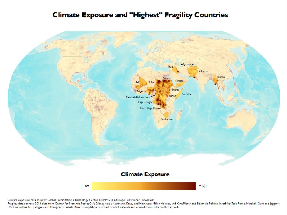
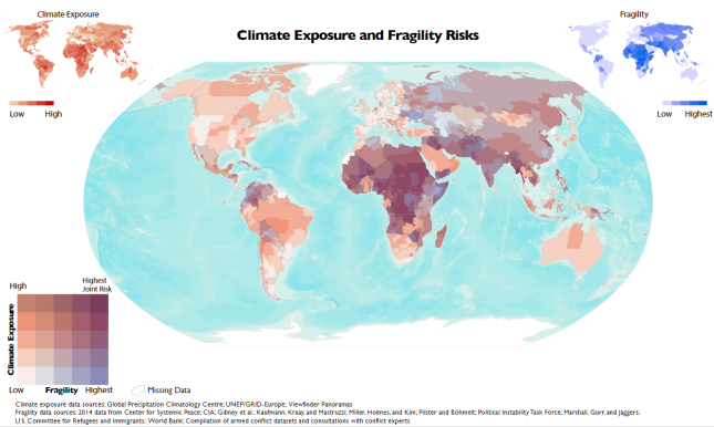
In the climate security space, policymakers often want to see the intersection of some physical indicator(s) with security/governance indicators of interest. For USAID, we mapped historic measures of exposure to climate extremes and state fragility. 13/ https://www.newsecuritybeat.org/2018/10/double-burden-climate-exposure-state-fragility/">https://www.newsecuritybeat.org/2018/10/d...
This yielded global maps which we displayed in different ways, showing just the highest fragility maps in some places and trying to show the combined risks at the same time in others. Visualizations by @tgsmitty @wight_water & Nisha Krishnan. 14/
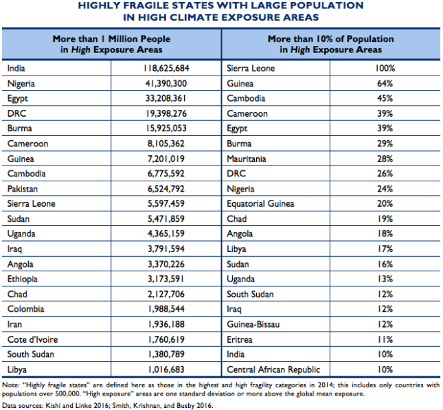
These maps are interesting but looking at landscapes makes it harder to see countries that have large numbers of people or a high percentage of their population facing heavy exposure to climate risks. You can look at the most fragile countries or even less fragile countries. 15/
You can& #39;t easily see small island countries on these global maps. If they have a pop. of <500,000, they don& #39;t have data on many of the fragility indicators. But, in terms of physical exposure, islands often have a high proportion of their populations in harm& #39;s way. 16/
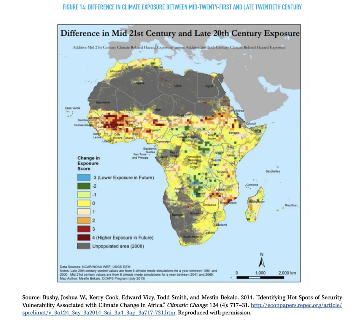
Data on historic climate exposure is helpful but what if the geography of future climate risks is likely to be different from past exposure? As downscaled climate models get better and nearer term, we can start to anticipate where future risks are likely to be located. 17/
For example, in these maps with Kerry Cook and Ned Vizy, we identified the places likely to face worsening exposure to heat wave events, extreme rainfall, and dry days by 2050. Can show individual risk or combine them, using raw data or change from some baseline. 18/
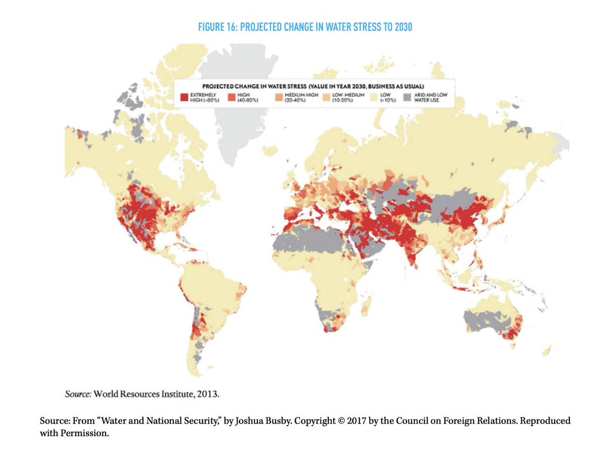
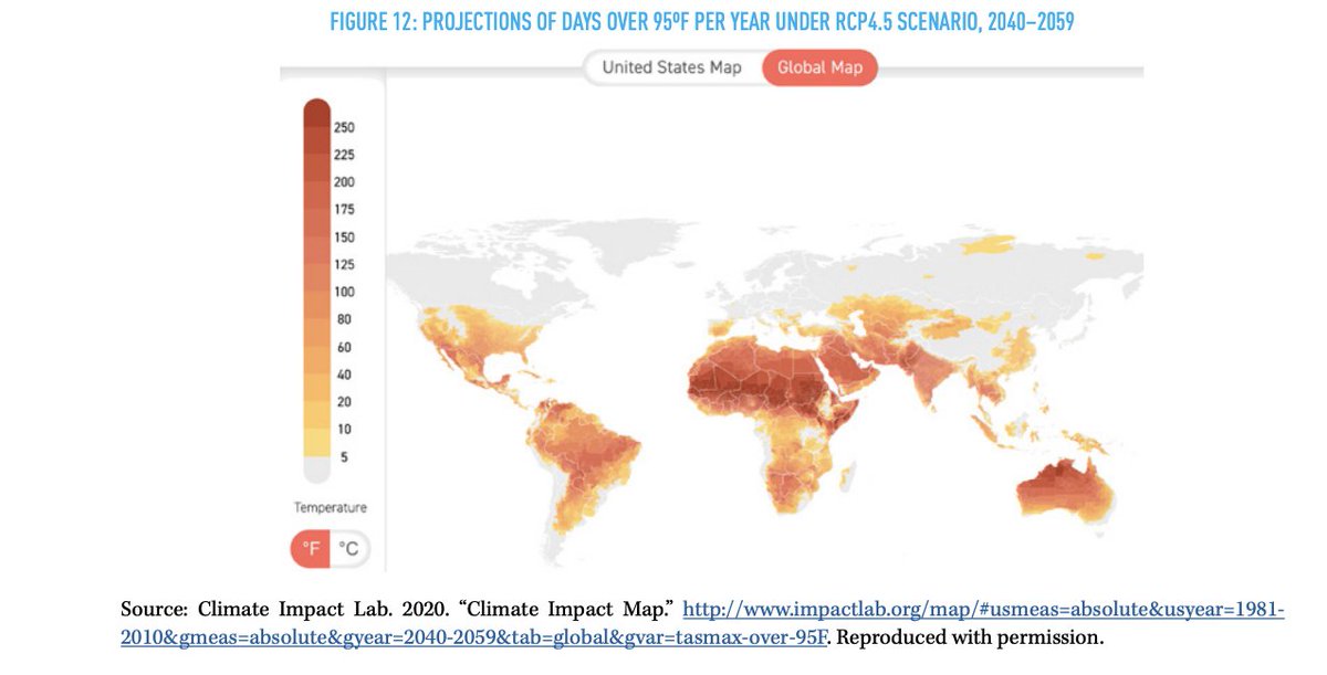
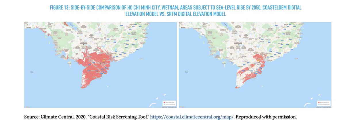
There are other mapping and modeling projects that have done tremendous work visualizing specific hazards such as future water stress, heat waves, and sea-level rise. 19/ @WRIAqueduct @impact_lab @ClimateCentral
Here, I& #39;m mindful of what scenarios to show policymakers. These projects typically model both mid-range (RCP4.5) and worst case scenarios for climate change (RCP 8.5). Because the latter are unlikely, mid-range scenarios, which are bad enough, are more helpful for analysis. 20/
I& #39;m also increasingly partial to sparer models that show a limited number of indicators and focus on particular hazards and risks. This will help us get beyond the threat multiplier framing which is useful but an insufficient guide to action. 21/ https://www.newsecuritybeat.org/2020/01/its-time-threat-multiplier-address-climate-security/">https://www.newsecuritybeat.org/2020/01/i...

 Read on Twitter