ahead of their annual drubbing in the ANZAC match against the Storm, here are the Warriors ANZAC strips ranked from worst to somehow even more the worst
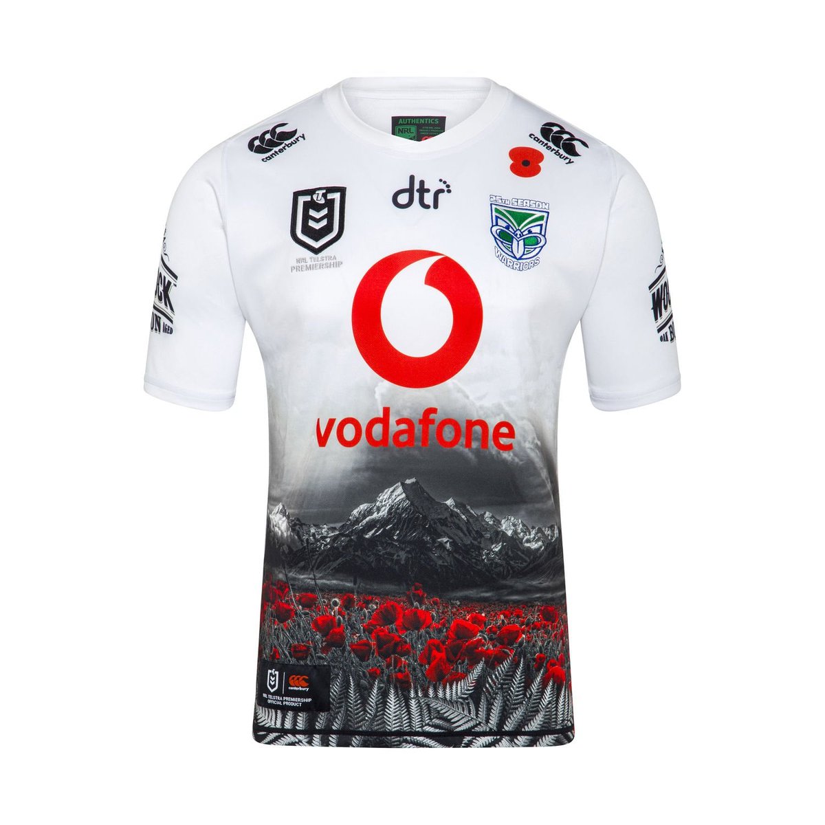
2019: the limited colour palette makes it look ok from a distance, but when you get closer, it gets messed up. It looks like three stock photos superimposed on each other.
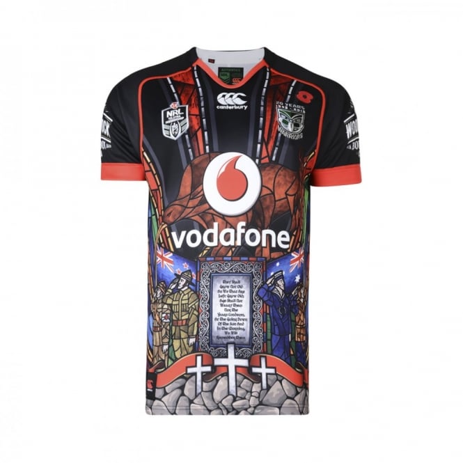
2015: incredibly busy, with NZ and Australian flags, crosses, a plaque covered in text, two giant kiwis and all lovingly rendered in fake stained glass. An atrocity, but one that has some merit
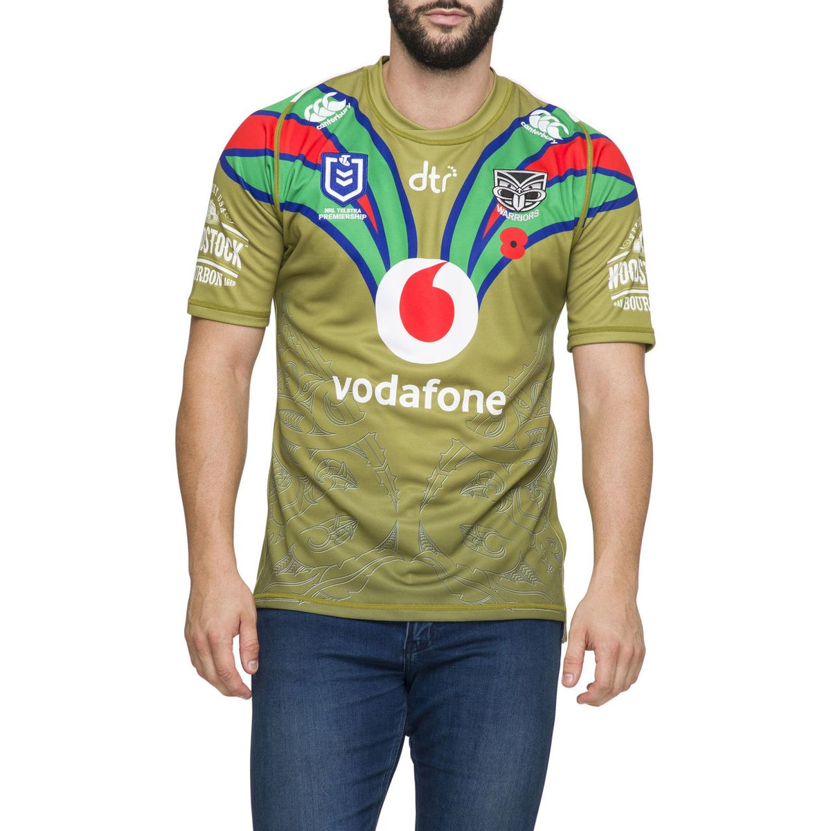
2020: Just the pits. The idea of using the muted, autumnal khaki of a WWI uniform was a pretty good one, but they just butchered it entirely by putting not one but 3 clashing primary colours on the collar. They could have used the greys and blacks of the 2019 away collar, but no
if you are into more Warriors jersey nerdery, then do check out my Power Rankings of all the strips for @TheSpinoffTV (not quite up to date any more, but still good) https://thespinoff.co.nz/sports/30-03-2019/the-definitive-ranking-of-all-59-warriors-jerseys/">https://thespinoff.co.nz/sports/30...

 Read on Twitter


