Let& #39;s see what the Canada/US/Western Europe death comparison chart can tell us for this week.
- The pandemic is not over in America just because younger people are vaccinated
- 3rd wave affecting European jurisdictions differently depending on policies
- The pandemic is not over in America just because younger people are vaccinated
- 3rd wave affecting European jurisdictions differently depending on policies
B.C. is back to a lower place on this chart than the previous two weeks ( https://twitter.com/j_mcelroy/status/1382930165961920512),">https://twitter.com/j_mcelroy... but that& #39;s more of a function of other places being hit a bit worse by the 3rd wave.
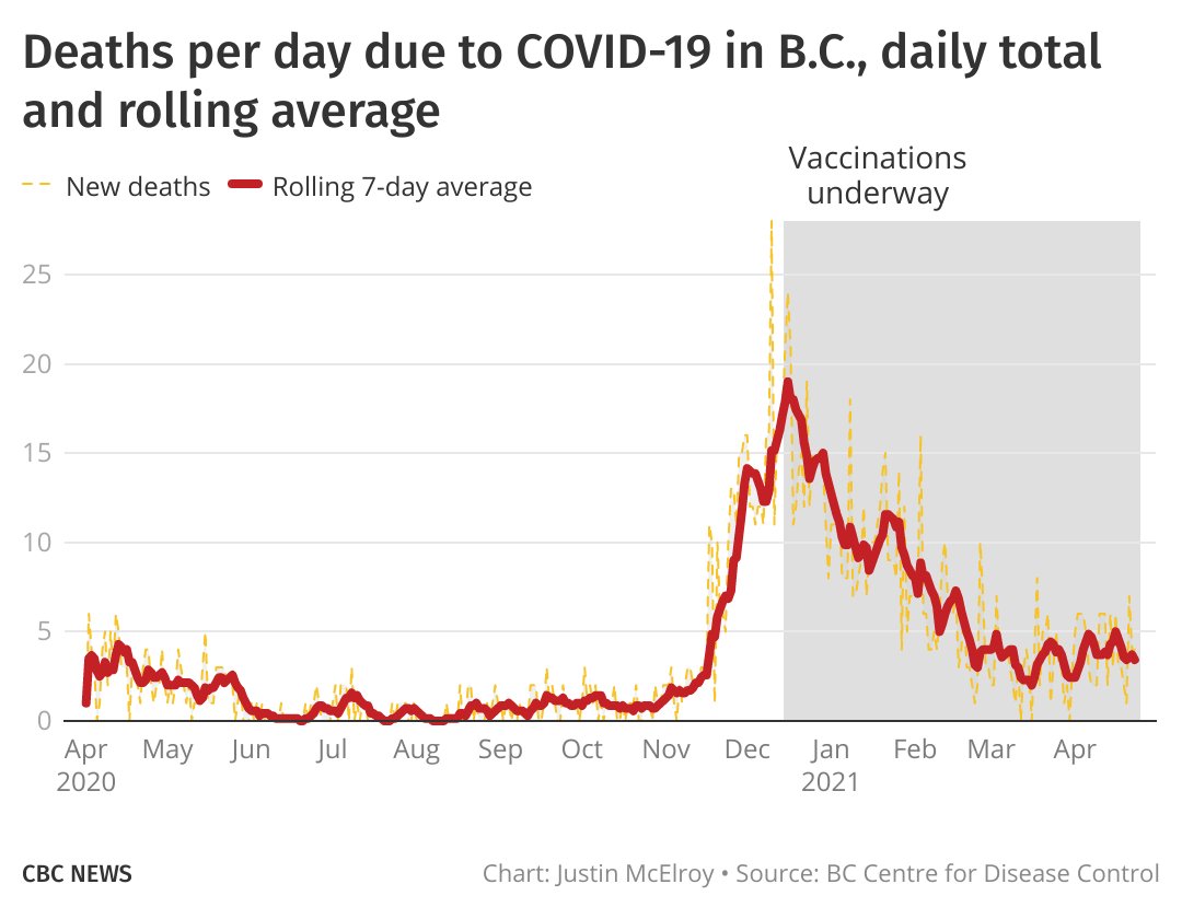
Our vaccination strategy/uptake has had benefits in protecting the most vulnerable.
Our vaccination strategy/uptake has had benefits in protecting the most vulnerable.
My answer has be the same as to people who have asked or demanded that I include other jurisdictions that I didn& #39;t originally include — the geographical consistency of the chart helps tell but one story, and it& #39;s a snapshot. https://twitter.com/Mikeazariah/status/1386067963833245698">https://twitter.com/Mikeazari...
It has actually been 365 days since I first did this chart, which showed death rates during the 1st wave.
Since then, some have argued B.C.& #39;s got lucky at the start and has been just as bad as everyone else since.
The data doesn& #39;t really bear this out.
Since then, some have argued B.C.& #39;s got lucky at the start and has been just as bad as everyone else since.
The data doesn& #39;t really bear this out.
At the same time, B.C.& #39;s hospitals are under a strain they haven& #39;t seen this entire pandemic.
Salim& #39;s numbers are for Coastal Health, but the situation is even worse in Fraser Health.
Best case, we still have 4-6 weeks of intense stress to go. https://twitter.com/realreporter/status/1385810756122210309">https://twitter.com/realrepor...
Salim& #39;s numbers are for Coastal Health, but the situation is even worse in Fraser Health.
Best case, we still have 4-6 weeks of intense stress to go. https://twitter.com/realreporter/status/1385810756122210309">https://twitter.com/realrepor...

 Read on Twitter


