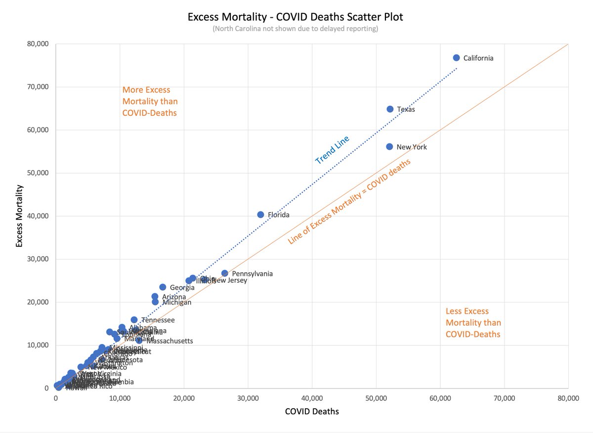
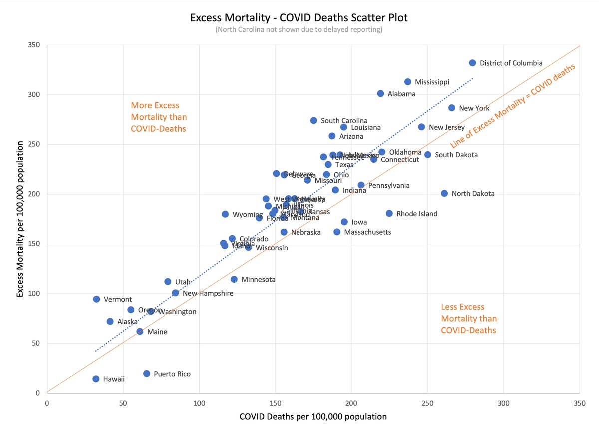
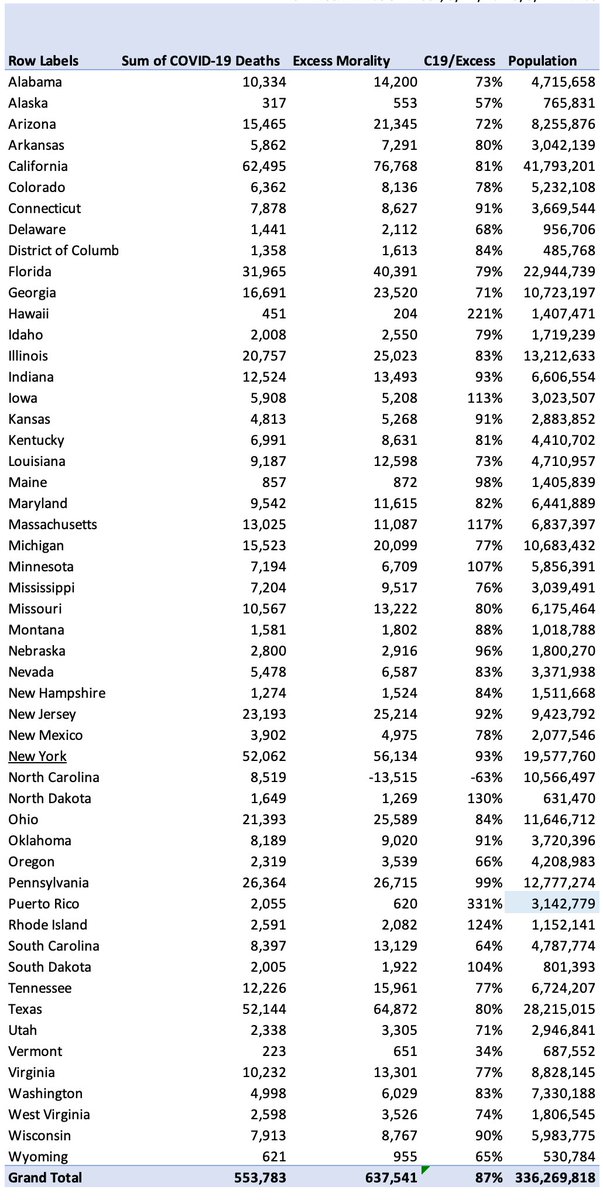
A presentation of state-wise excess mortality versus reported COVID-19 deaths:
The biggest 4 states seem reasonably consistent with each other. NY is a little further away from the trend than the others.
The biggest 4 states seem reasonably consistent with each other. NY is a little further away from the trend than the others.
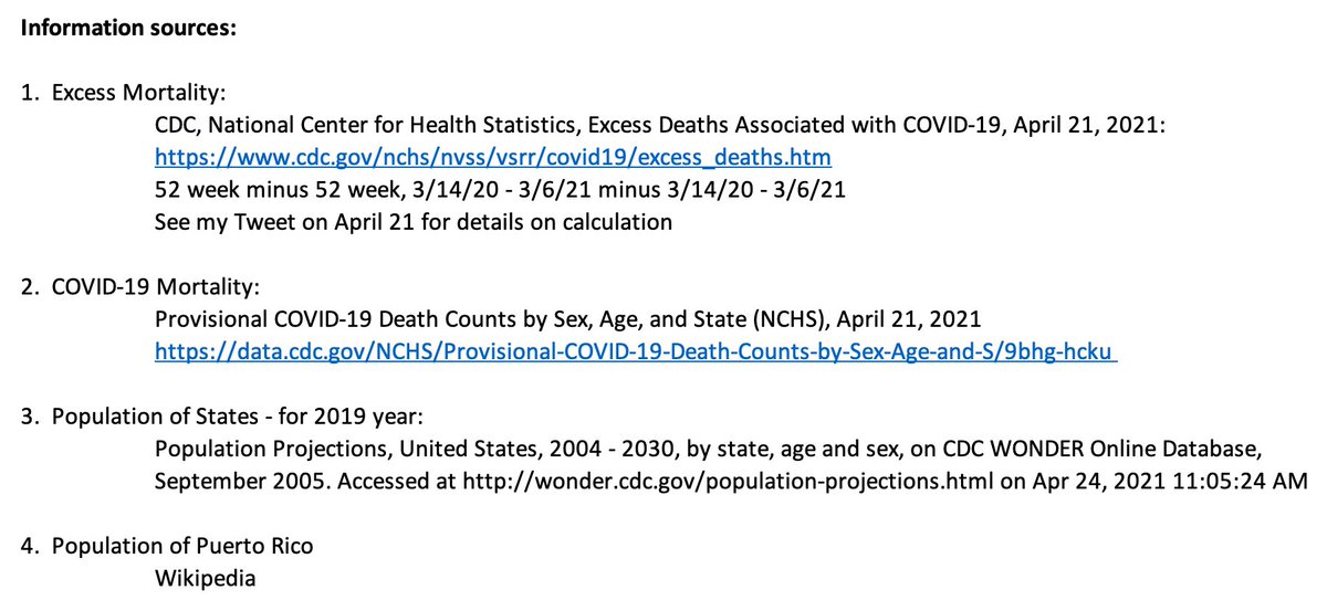
The above plot uses excess mortality defined as the total mortality in a 52 week period ending 3/6/21 minus the prior 52 week period.
COVID-19 mortality from the CDC.
North Carolina is hidden from the plots because their reporting is so far behind.
COVID-19 mortality from the CDC.
North Carolina is hidden from the plots because their reporting is so far behind.
I looked at this expecting to find something interesting to report. It is not obvious to me that there is any meaningful signal in this noisy data set.
That itself is interesting to a minor degree.
That itself is interesting to a minor degree.
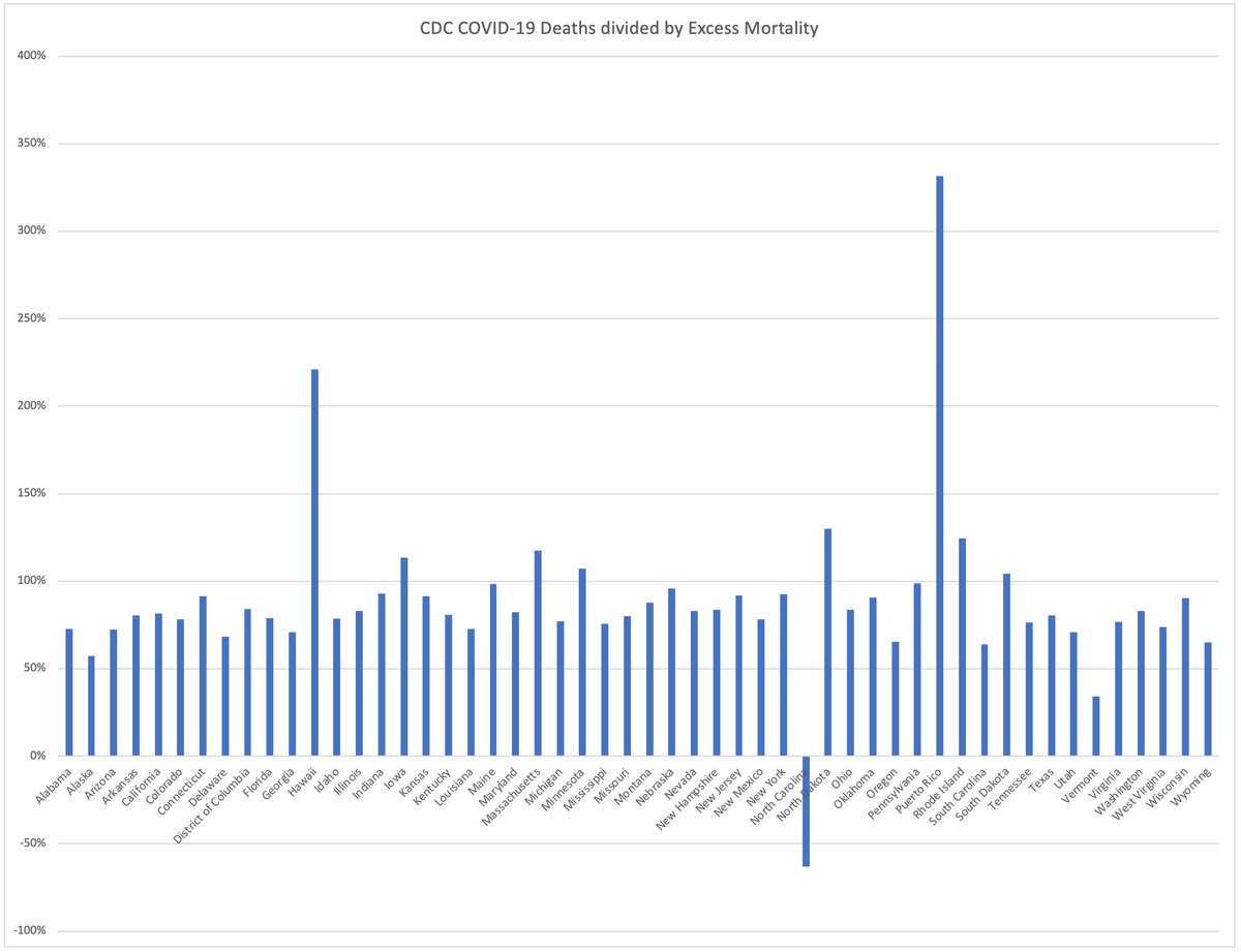
A plot of this, which shows Puerto Rico and North Carolina as wildly out of line. NC has some reporting issues. I have not examined PR carefully but I assume this is also a reporting issue rather than an interesting result.

 Read on Twitter