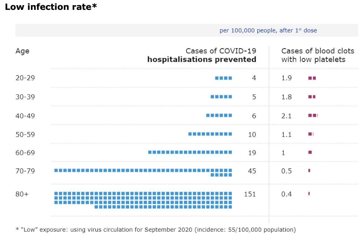
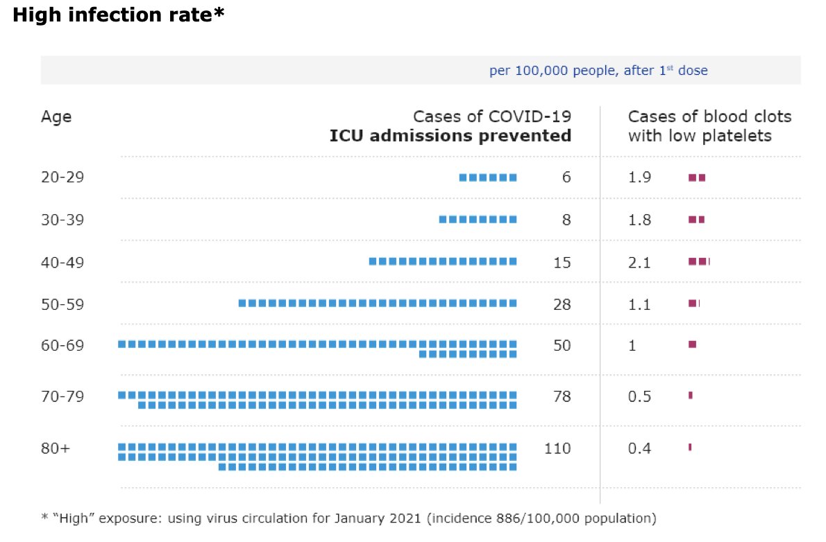
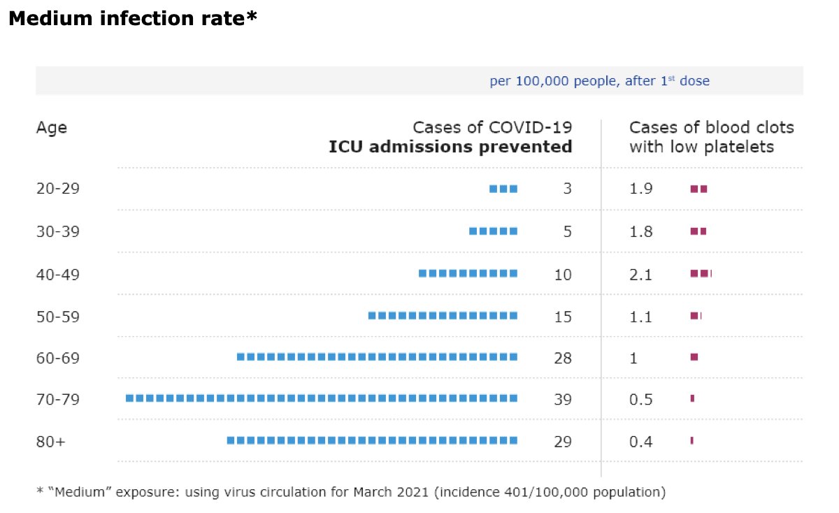
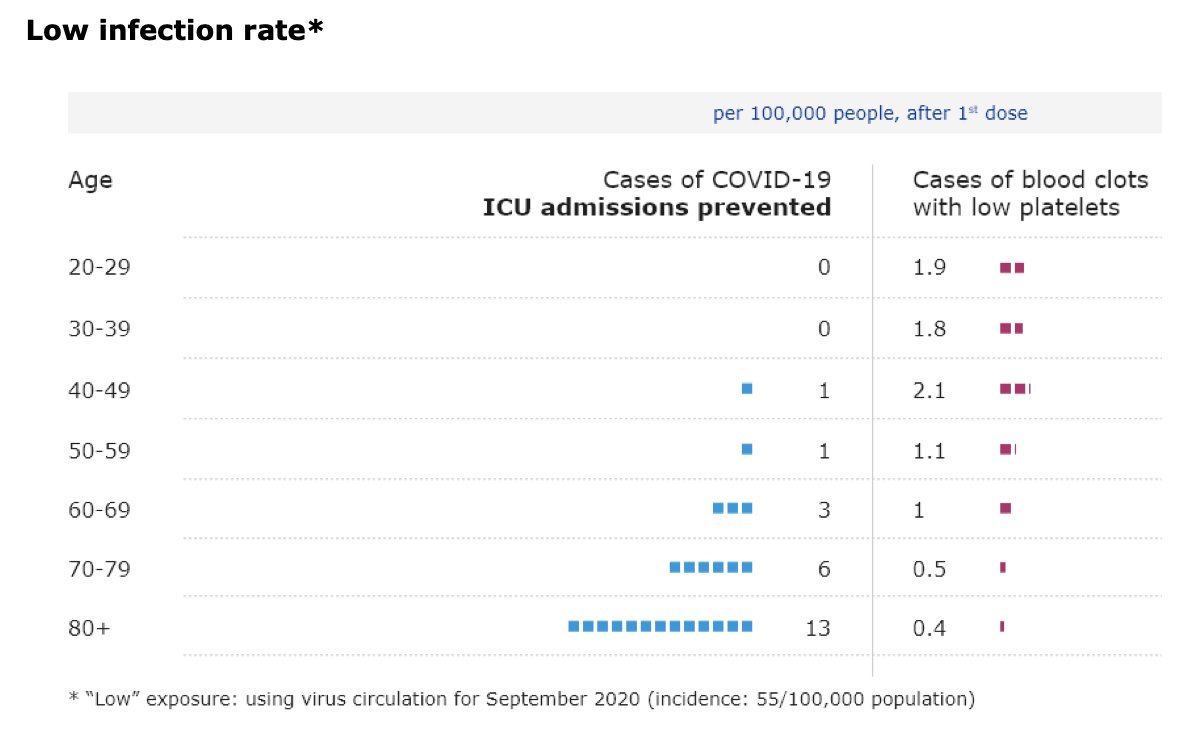
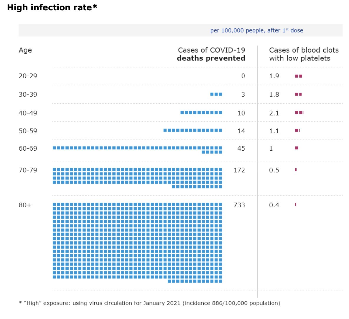
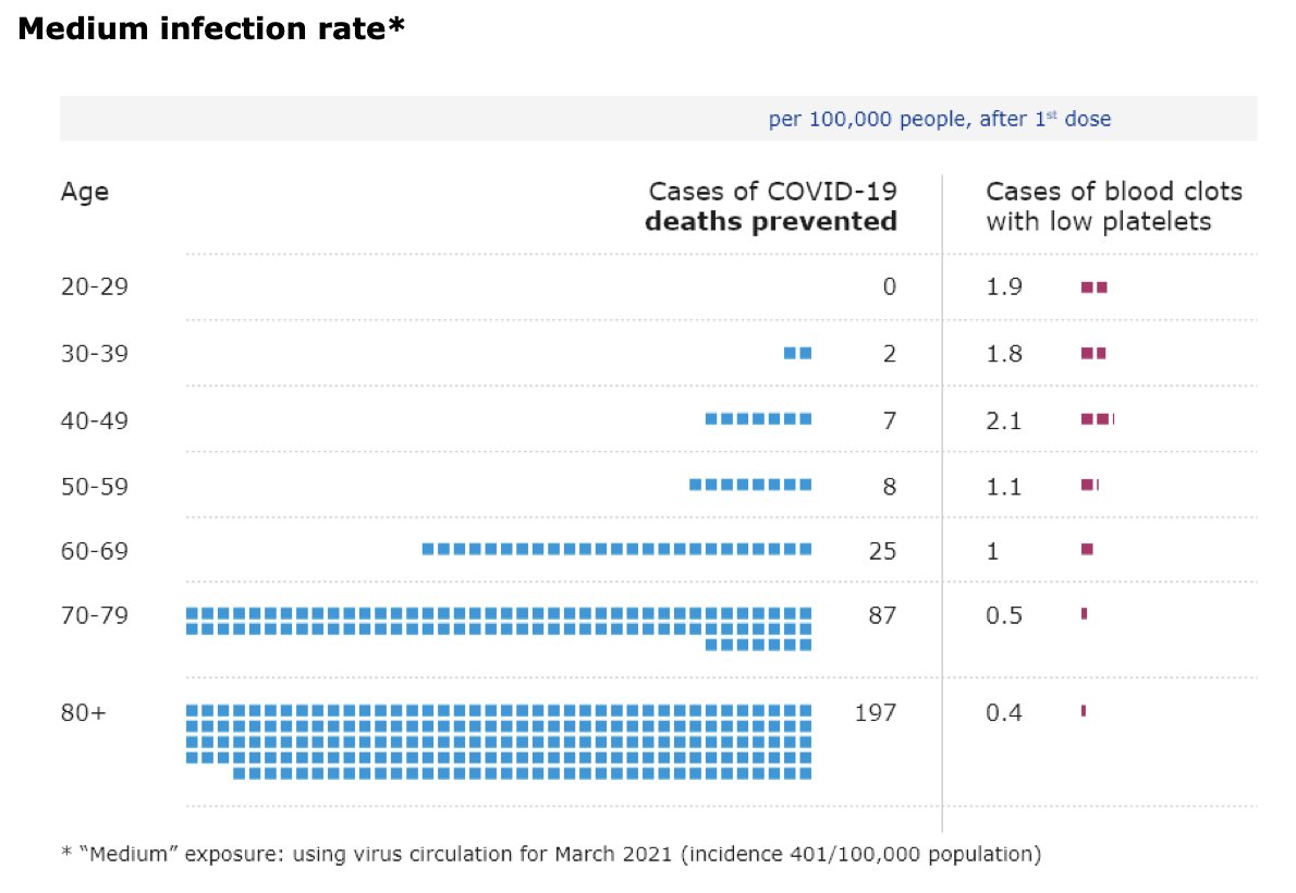
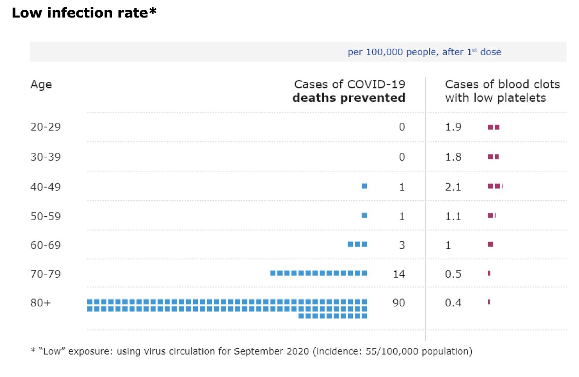
So @EMA_News is finally doing some decent communication/visualization of risks/benefits of vaccination with AstraZeneca’s #covid19 shot.
Quick thread with their graphs:
Quick thread with their graphs:
They looked at hospitalisations, ICU admissions and deaths from #covid19 separately.
Also 3 scenarios for monthly infection rates:
low (55 per 100,000 people)
medium (401 per 100,000 people) high (886 per 100,000 people)
Here are the graphs for hospitalisations:
Also 3 scenarios for monthly infection rates:
low (55 per 100,000 people)
medium (401 per 100,000 people) high (886 per 100,000 people)
Here are the graphs for hospitalisations:
The graphs show very clearly how the benefits of the vaccine outweigh the risks much more clearly the higher the infection rates and the older the recipients.
This is not new.
But these graphs are exactly what I wanted people to have to understand risk-benefit calculations.
This is not new.
But these graphs are exactly what I wanted people to have to understand risk-benefit calculations.
As I’ve said before:
These decisions are highly context dependent.
For young people in countries with low infection rates or with other vaccines available, the risk-benefit balance is a lot worse than for older people or younger people in countries with high-infections rates.
These decisions are highly context dependent.
For young people in countries with low infection rates or with other vaccines available, the risk-benefit balance is a lot worse than for older people or younger people in countries with high-infections rates.

 Read on Twitter

