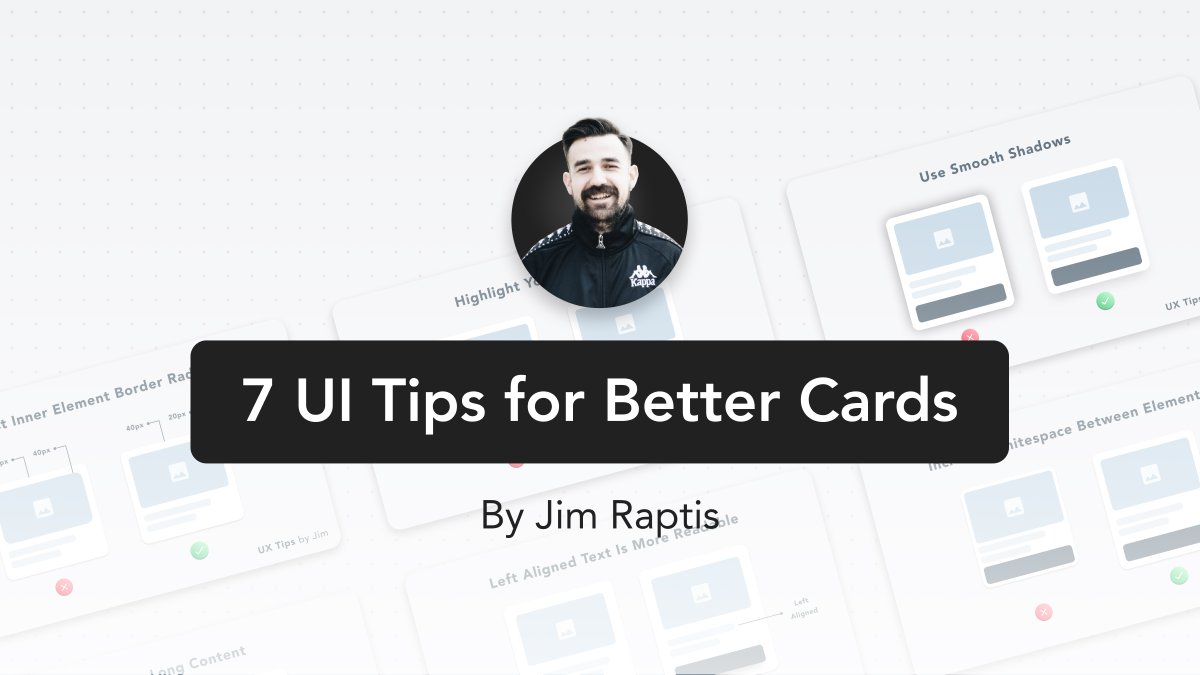
7 UI Tips for beautiful & usable card designs
A Visual Thread https://abs.twimg.com/emoji/v2/... draggable="false" alt="👇" title="Rückhand Zeigefinger nach unten" aria-label="Emoji: Rückhand Zeigefinger nach unten">
A Visual Thread
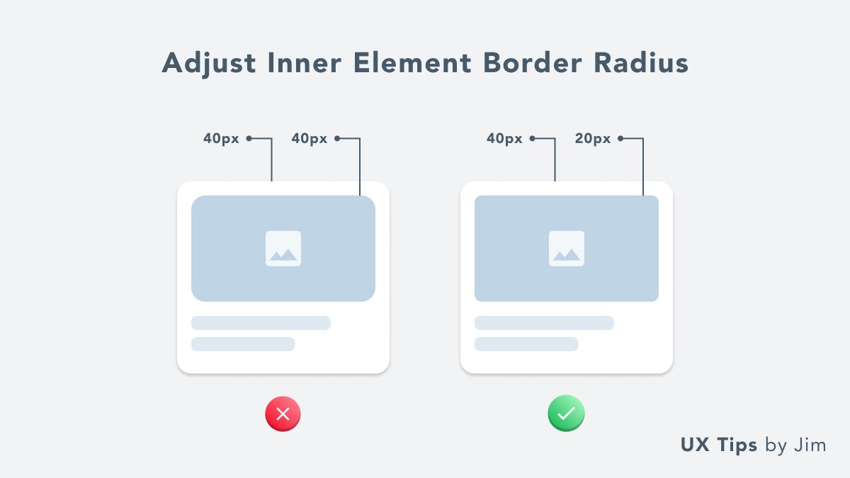
1. Adjust Border Radius
Avoid using the same border radius for both the card and the inner elements
A rule of thumb is to use for the inner border-radius half the size of the outer element
Avoid using the same border radius for both the card and the inner elements
A rule of thumb is to use for the inner border-radius half the size of the outer element
2. Highlight Your Main CTA
A common mistake is to use too many primary CTA
You need to force users to take a single action & don& #39;t confuse them
Have a single primary CTA in your card
A common mistake is to use too many primary CTA
You need to force users to take a single action & don& #39;t confuse them
Have a single primary CTA in your card
3. Use Smooth Shadows
Avoid too strong shadows to show elevation. Make them feel natural and smoother
Tip: Make the shadows stronger/bigger on hover to add a nice animation effect
Avoid too strong shadows to show elevation. Make them feel natural and smoother
Tip: Make the shadows stronger/bigger on hover to add a nice animation effect
4. Avoid Too Long Content
Include only the necessary information on your card preview
Too long content (or too much) confuses the user. Especially if you display multiple cards in a grid
Include only the necessary information on your card preview
Too long content (or too much) confuses the user. Especially if you display multiple cards in a grid
5. Left Align Text
Many times we center text to make our UI look symmetric.
However, it& #39;s a fact that left-aligned text is far more readable, and allows your user to scan the card easier.
Many times we center text to make our UI look symmetric.
However, it& #39;s a fact that left-aligned text is far more readable, and allows your user to scan the card easier.
6. Increase Whitespace
Whitespace lets elements & #39;breath& #39;. Be generous with space around & between element
A rule of thumb is to use the same space value for the padding around the card and the space between elements
Whitespace lets elements & #39;breath& #39;. Be generous with space around & between element
A rule of thumb is to use the same space value for the padding around the card and the space between elements
7. Elevation Effects Can Be Tricky
When you add "shadows over shadows" avoid using the exact same shadow.
I advise you to use a small shadow for the card and a larger one for the element on top of the card.
In that way, the button looks like it& #39;s a layer on top of the card.
When you add "shadows over shadows" avoid using the exact same shadow.
I advise you to use a small shadow for the card and a larger one for the element on top of the card.
In that way, the button looks like it& #39;s a layer on top of the card.
Thanks for listening to my UI ted talk  https://abs.twimg.com/emoji/v2/... draggable="false" alt="✌️" title="Siegeshand" aria-label="Emoji: Siegeshand">
If you like these UI tips and want to support me, you can like and/or RT the first tweet https://abs.twimg.com/emoji/v2/... draggable="false" alt="👇" title="Rückhand Zeigefinger nach unten" aria-label="Emoji: Rückhand Zeigefinger nach unten"> https://twitter.com/d__raptis/status/1385572926200688641">https://twitter.com/d__raptis...
If you like these UI tips and want to support me, you can like and/or RT the first tweet

 Read on Twitter
 " title="7 UI Tips for beautiful & usable card designsA Visual Thread https://abs.twimg.com/emoji/v2/... draggable="false" alt="👇" title="Rückhand Zeigefinger nach unten" aria-label="Emoji: Rückhand Zeigefinger nach unten">" class="img-responsive" style="max-width:100%;"/>


