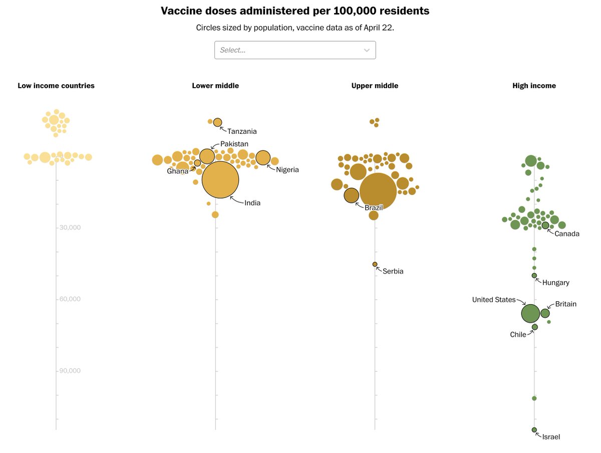
I just published my first interactive data visualization for @washingtonpost! Working with @emilyrauhala, I took a look at the widening gap in vaccination rates between high and low income countries.
Read and explore the story here:
https://www.washingtonpost.com/world/interactive/2021/coronavirus-vaccine-inequality-global/">https://www.washingtonpost.com/world/int...
Read and explore the story here:
https://www.washingtonpost.com/world/interactive/2021/coronavirus-vaccine-inequality-global/">https://www.washingtonpost.com/world/int...
The first step was testing our hypothesis and prototyping the graphic. I made a scatter plot in @observablehq, which confirmed the trend. Then, I started playing with a more creative and clear way of showing it. https://observablehq.com/@attharmirza/wealthier-countries-have-higher-vaccination-rates">https://observablehq.com/@attharmi...
Next came the hard part. I had to learn React (and more specifically, how to get D3 and React to talk) in order to build this chart into an article page. At first, it was extremely intimidating. Now, I don& #39;t know how I& #39;ve ever built a website without components.
One of my favorite features of the interactive chart is the tooltip, which has a miniature chart composed of tiny people.
Figuring out how to dynamically place the annotations was also pretty tricky and a fun time. A shout out to @Harry_Stevens and his awesome, lightweight library for generating curves. It really came in handy. Check it out here: https://observablehq.com/@harrystevens/swoopy-arc">https://observablehq.com/@harryste...
Finally, I really want to thank @emamd, @helloeujin and @AdrianBlancoR. They are all better coders than me and patiently helped me while I climbed the steep learning curve on this project.

 Read on Twitter


