US all-cause mortality data - an update.
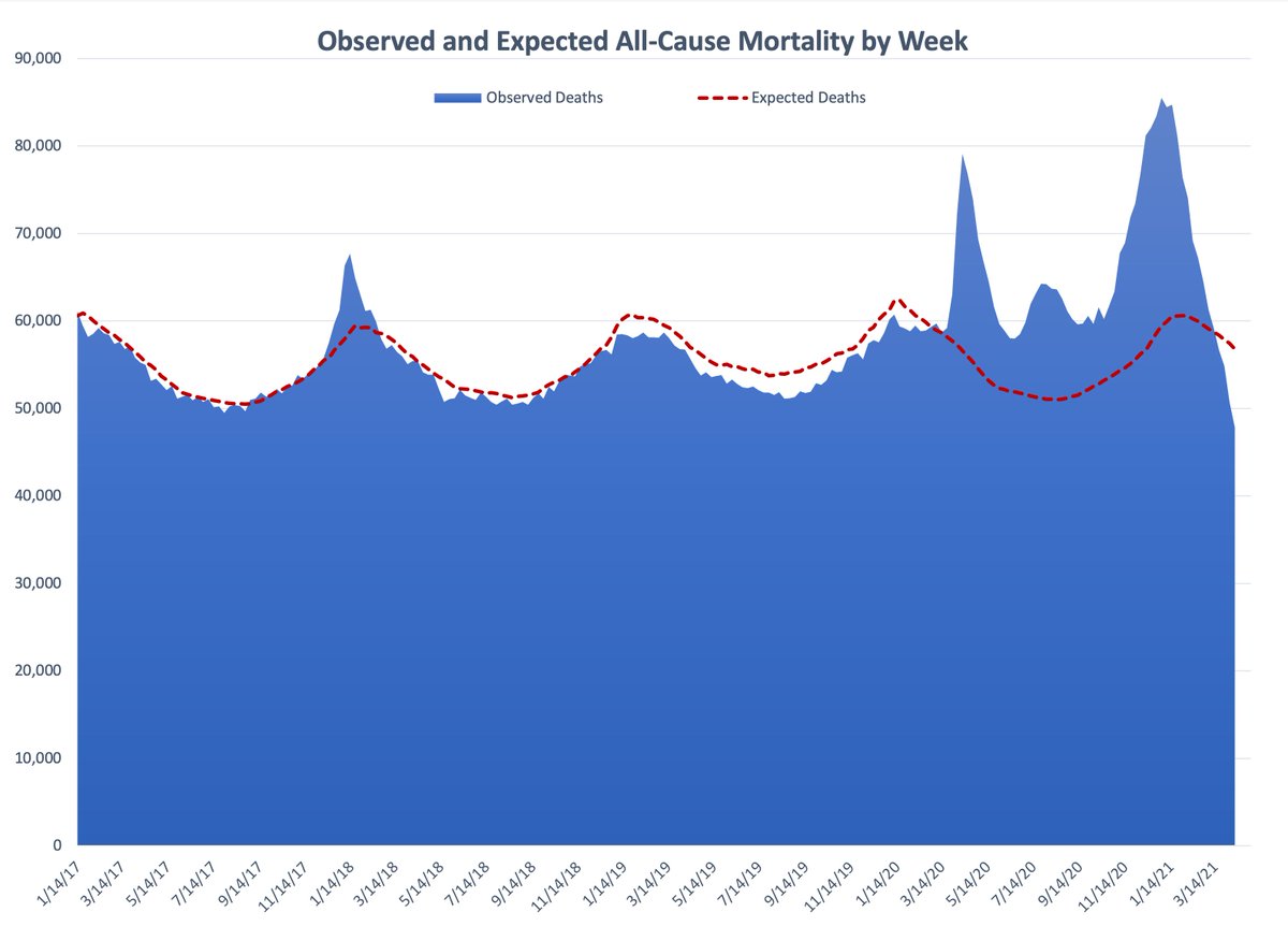
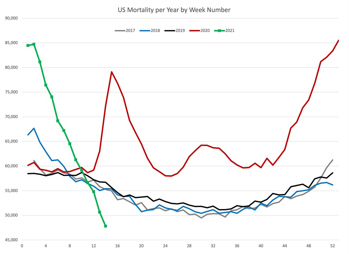
Here is the big picture over the last ~4 years. Substantial excess mortality.
Here is the big picture over the last ~4 years. Substantial excess mortality.
The data comes in extremely slowly. Hence, the last ~ 2 months is subject to meaningful revision upwards. So please don& #39;t get too excited about how the 2021 curve dips below the other curves.
I am hopeful that for week ending 4/3 we might - might! - have gotten back to normal.
I am hopeful that for week ending 4/3 we might - might! - have gotten back to normal.
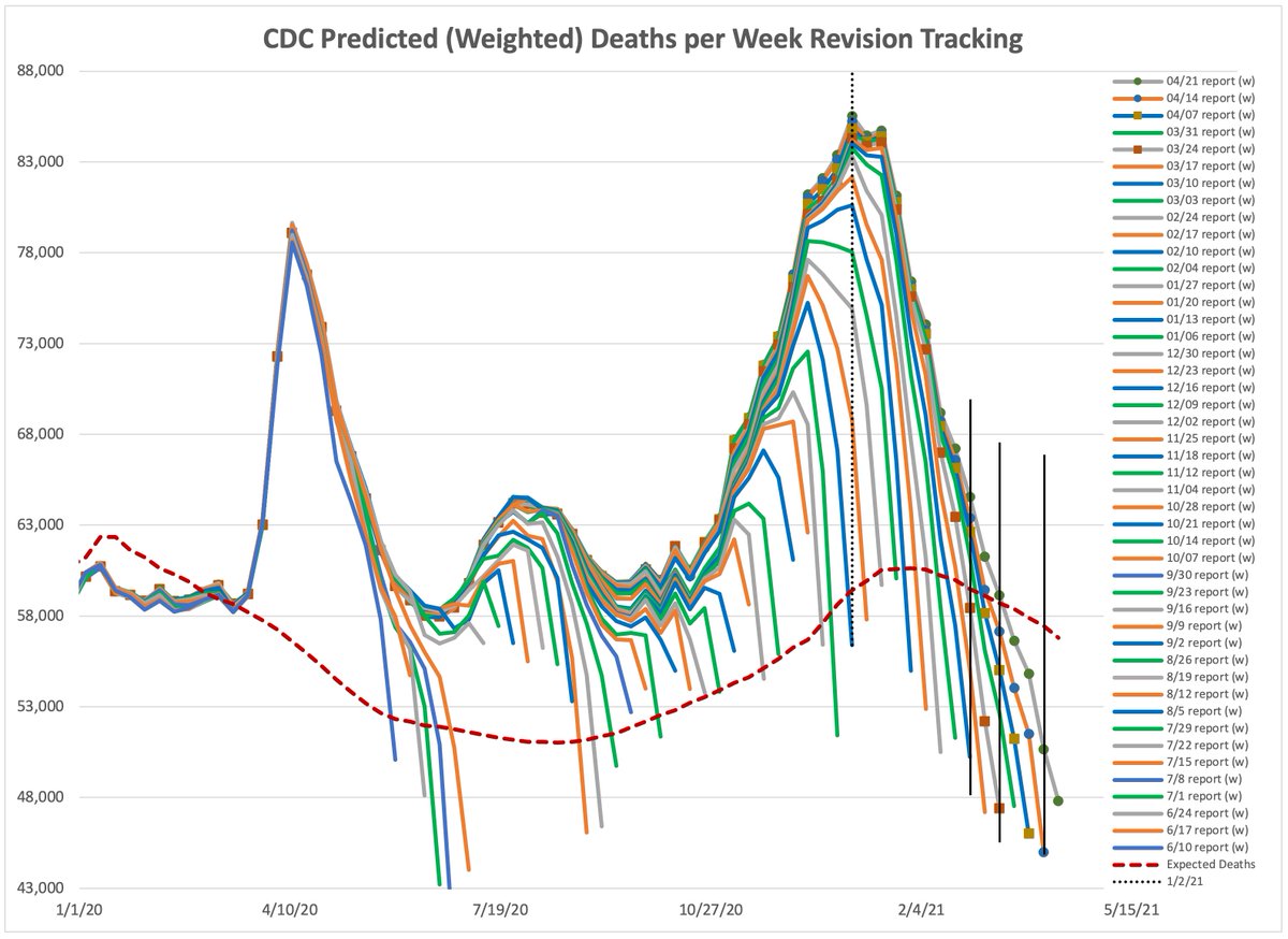
The ugliness that is below is tracking revisions. The first time week ending 1/2 was reported, the total was ~ 56,000. Current total for week ending 1/2 is ~ 86,000.
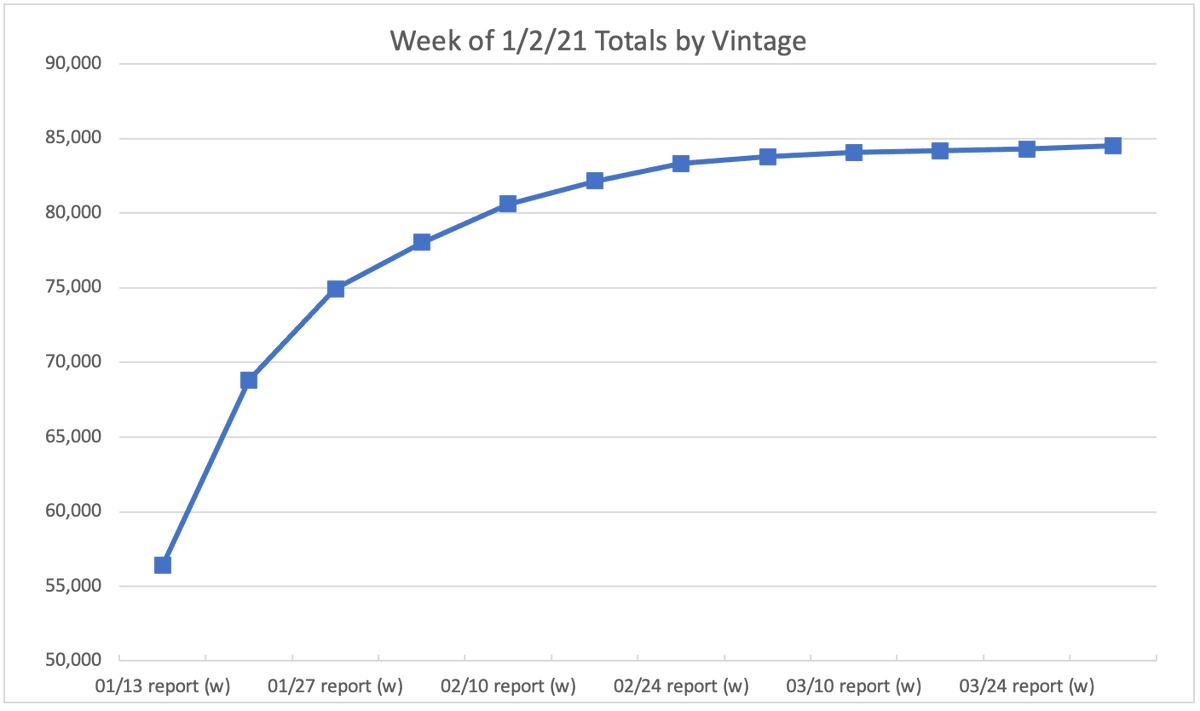
Here is an easier way to see how the week ending 1/2/21 has been revised over time with each report date.
I am just using this week as an example. Note that essentially all revisions are upward.
I am just using this week as an example. Note that essentially all revisions are upward.
Some states report more quickly, some more slowly. North Carolina has not reported any data after 1/2/21. They are exceptional in this regards. Most are much, much better than this.
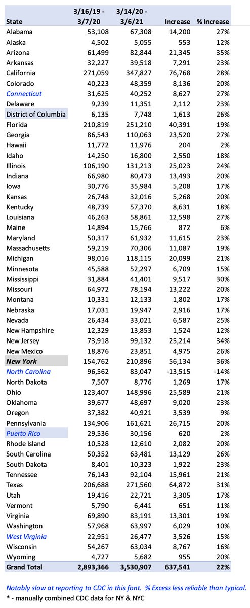
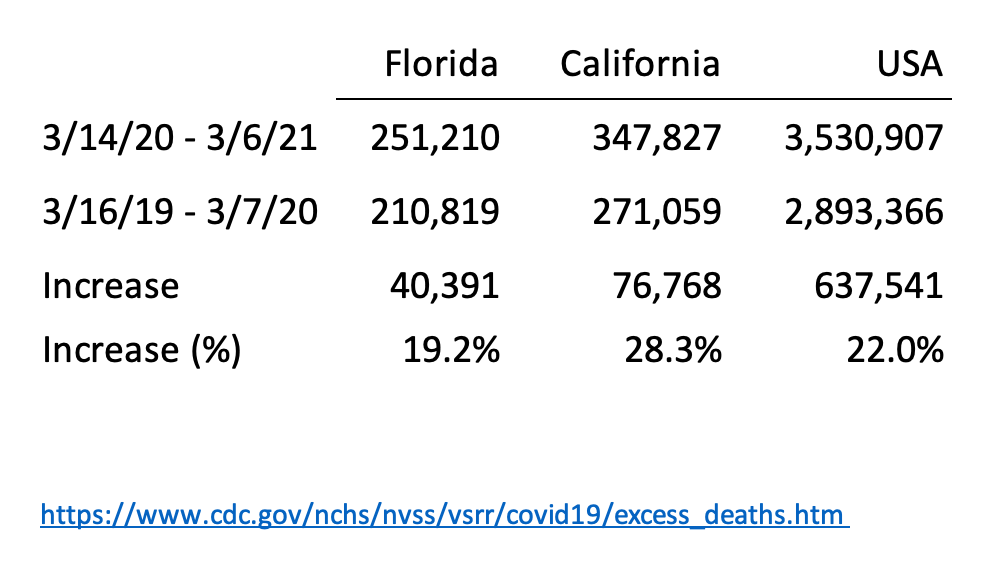
We can calculate the increase in mortality year over year. For instance, we can calculate 2020 over 2019. We can also calculate it for any 2 rolling 52 week periods.
The 52 week rolling period with the greatest increase in mortality (so far) ends 3/6/21
The 52 week rolling period with the greatest increase in mortality (so far) ends 3/6/21
Year 1: weeks ending 3/16/19 to 3/7/20 (52 weeks)
Year 2: weeks ending 3/14/20 to 3/6/21 (52 weeks)
US mortality:
Year 1: 2,893,366
Year 2: 3,530,907
Increase: 637,541 (22%)
Year 2: weeks ending 3/14/20 to 3/6/21 (52 weeks)
US mortality:
Year 1: 2,893,366
Year 2: 3,530,907
Increase: 637,541 (22%)
We can make similar calculations for states. Leave aside discussion of NPI effectiveness, these are meaningful measures of the health impact on a state.
Here is the one that generates the most arguments: https://abs.twimg.com/emoji/v2/... draggable="false" alt="😉" title="Zwinkerndes Gesicht" aria-label="Emoji: Zwinkerndes Gesicht">
Here is the one that generates the most arguments:
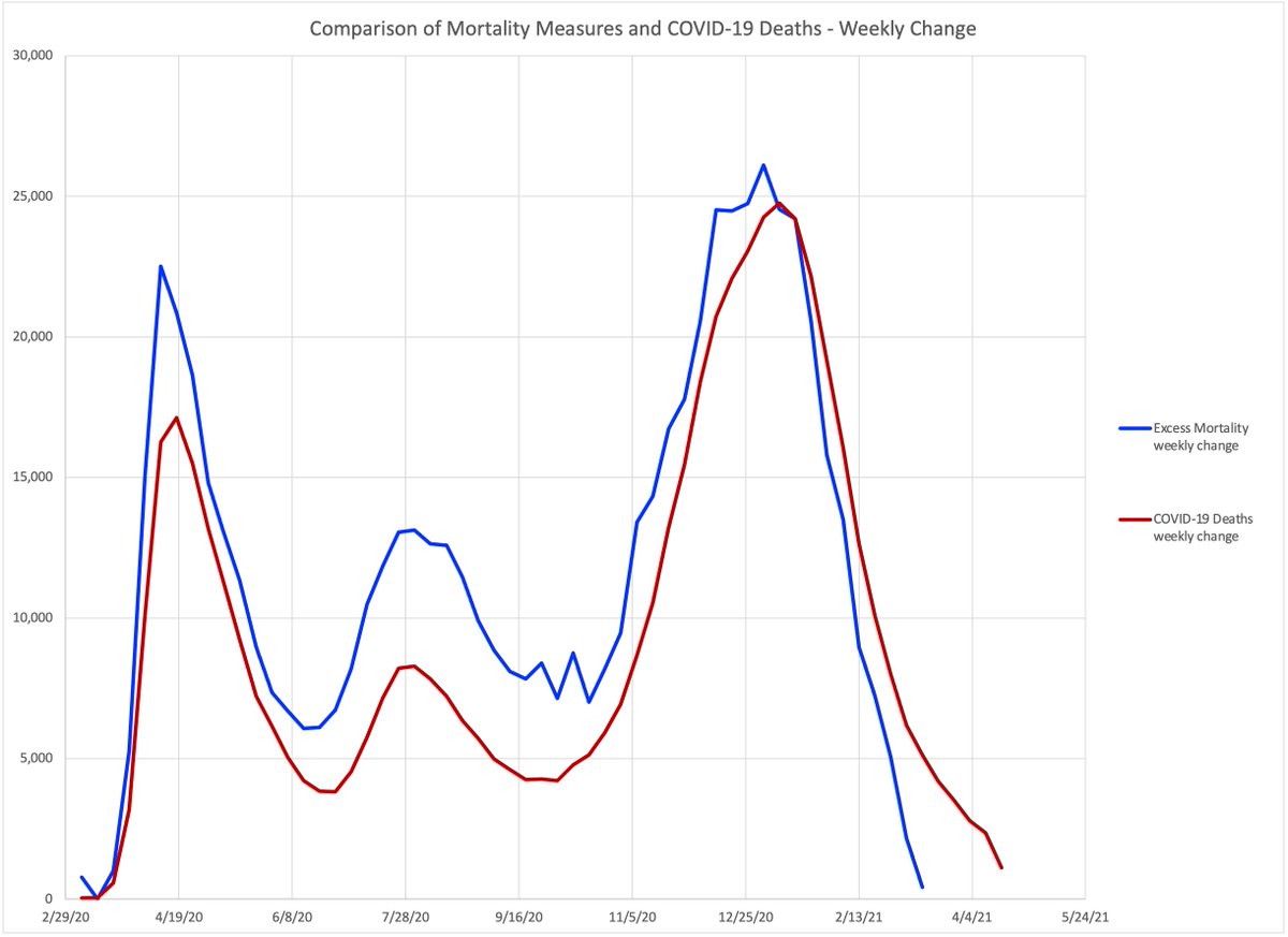
An examination of COVID mortality versus excess mortality shows that total excess mortality has been greater than reported COVID mortality.
Most likely, COVID deaths have been undercounted.
@numbers_truth has done some incredible work in this regards. Please see him for more
Most likely, COVID deaths have been undercounted.
@numbers_truth has done some incredible work in this regards. Please see him for more
However, lately, weekly excess mortality has been less than COVID mortality. I don& #39;t know if this is an artifact of reporting or an actual reality. It will take time to figure that out.
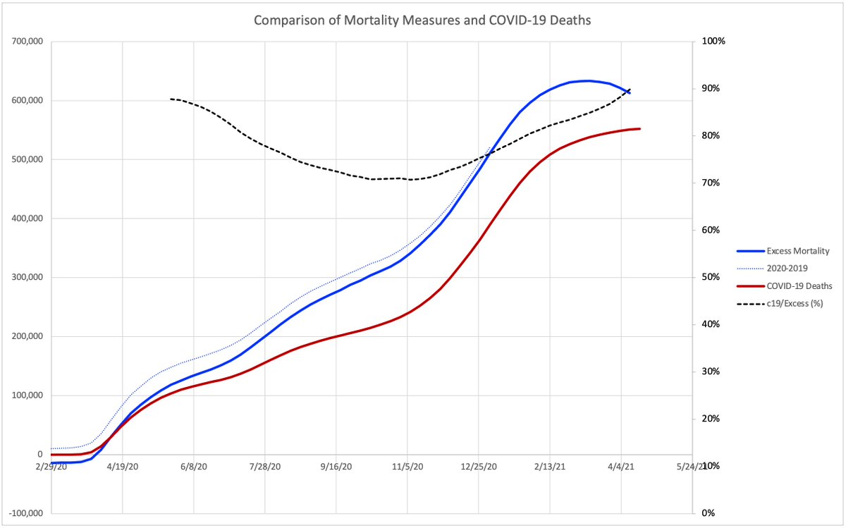
The data source for the above is the CDC. The blue line is excess mortality, calculated as total minus expected.
The red line is "Provisional COVID-19 Death Counts by Sex, Age, and Week NCHS"
https://data.cdc.gov/NCHS/Provisional-COVID-19-Death-Counts-by-Sex-Age-and-W/vsak-wrfu">https://data.cdc.gov/NCHS/Prov...
The red line is "Provisional COVID-19 Death Counts by Sex, Age, and Week NCHS"
https://data.cdc.gov/NCHS/Provisional-COVID-19-Death-Counts-by-Sex-Age-and-W/vsak-wrfu">https://data.cdc.gov/NCHS/Prov...
Aside from the weekly plot shown above, we can also look at cumulative totals.
I have not drawn any conclusions about this, just sharing. Perhaps someone else can figure out what it means, if anything.
I have not drawn any conclusions about this, just sharing. Perhaps someone else can figure out what it means, if anything.

 Read on Twitter
 " title="We can make similar calculations for states. Leave aside discussion of NPI effectiveness, these are meaningful measures of the health impact on a state. Here is the one that generates the most arguments: https://abs.twimg.com/emoji/v2/... draggable="false" alt="😉" title="Zwinkerndes Gesicht" aria-label="Emoji: Zwinkerndes Gesicht">" class="img-responsive" style="max-width:100%;"/>
