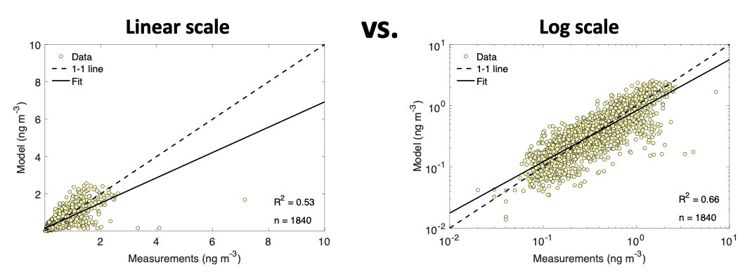
Did anyone else ever hear the phrase “log-log plots are cheating” during your science education? Where does this come from and why is it wrong? A thread  https://abs.twimg.com/emoji/v2/... draggable="false" alt="🧵" title="Thread" aria-label="Emoji: Thread">.
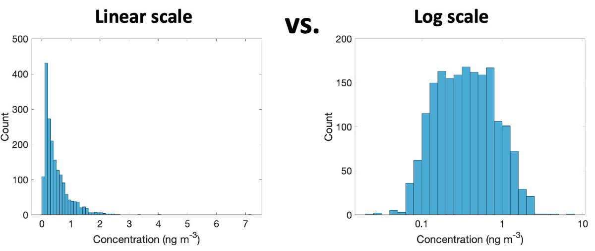
Lognormal distributions are everywhere in science, including atmospheric chemistry. Aerosol concentrations vary logarithmically. Deposition fluxes vary logarithmically. Concentrations of short-lived gases vary logarithmically.
The first part of any analysis should be to plot histograms of your data on linear and logarithmic scales to see which fits the variability better. Many statistical methods require that data are log-transformed before analysis to ensure that residuals aren’t skewed.
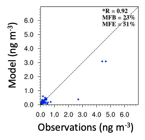
It’s still so common to see linear scale observation-model comparison plots where the bulk of the data is at low values, and a couple outliers at higher values determine the correlation. These data from a high profile journal would be much better visualized on a log-log axis.
This paper from Limpert et al. gives a great background on normal vs. log-normal distributions and how they arise in nature. Normal variability comes from processes that are additive and log-normal variability comes from processes that are multiplicative. https://academic.oup.com/bioscience/article/51/5/341/243981">https://academic.oup.com/bioscienc...
For example, repeatedly rolling two dice and adding the numbers would result in a symmetric distribution with mean 7. On the other hand, multiplying the two numbers would result in a right skewed distribution.
In atmospheric chemistry, many variables come from multiplicative processes. For example, deposition can be thought of as (concentration) × (precipitation flux). Concentrations are (emissions) × (dilution factor).
TLDR: more often than not, lin-lin plots are just wrong in atmospheric chemistry

 Read on Twitter
 ." title="Did anyone else ever hear the phrase “log-log plots are cheating” during your science education? Where does this come from and why is it wrong? A thread https://abs.twimg.com/emoji/v2/... draggable="false" alt="🧵" title="Thread" aria-label="Emoji: Thread">." class="img-responsive" style="max-width:100%;"/>


