i& #39;ve done a little ui/ux stuff and (more importantly?) played card games at a high level for the last 20 years.
thread of my impressions of what is "standard" practice for good card game ui/ux.
non-negotiables first, maybe malleables in a later thread:
thread of my impressions of what is "standard" practice for good card game ui/ux.
non-negotiables first, maybe malleables in a later thread:
1) a card can be in hand, hovered, selected or played.
1a) a card in hand is easily recognizable and has information about what would be required to play is prominently featured.
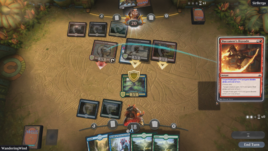
i. mtga cards showing name, art, and mana cost
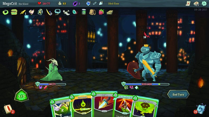
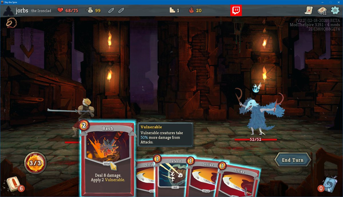
ii. sts. same idea
1a) a card in hand is easily recognizable and has information about what would be required to play is prominently featured.
i. mtga cards showing name, art, and mana cost
ii. sts. same idea
a couple of examples of cards in hand that i don& #39;t think are done as well
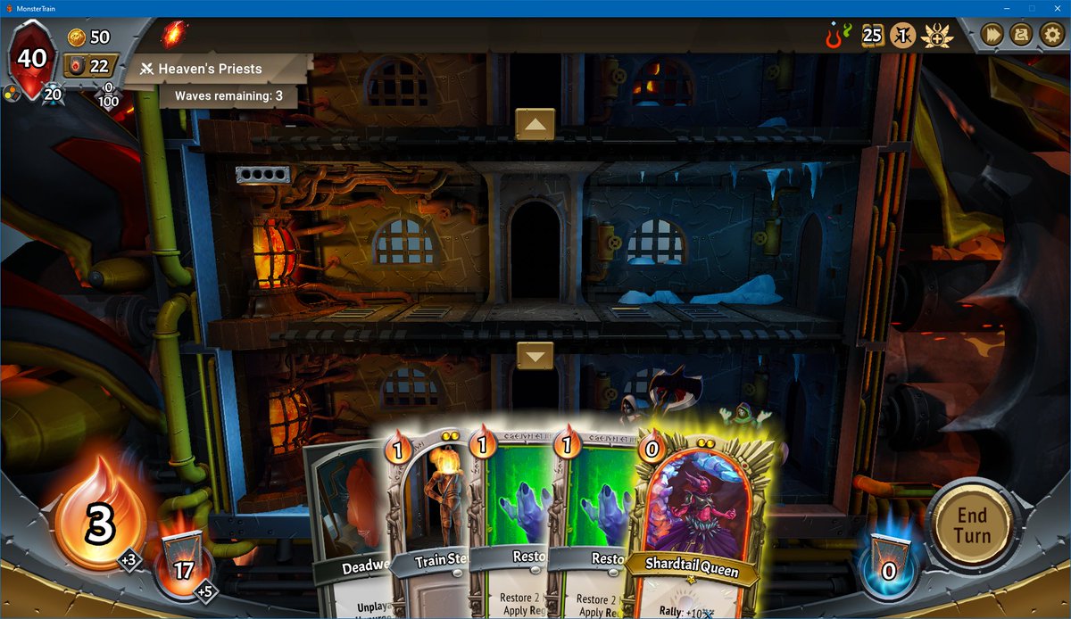
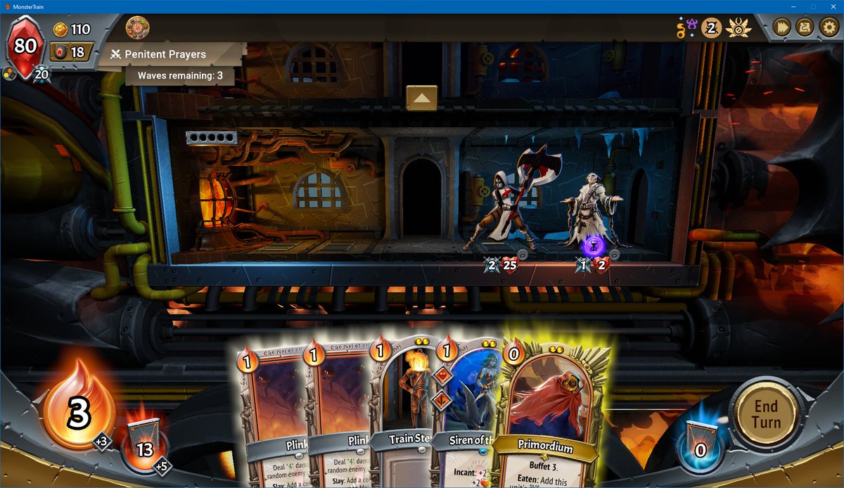
iii. monster train. these cards are taking up more UI space than they need to. ALSO monster train cards are malleable. some might have extra abilities, but i can& #39;t tell from art/name/cost.
iii. monster train. these cards are taking up more UI space than they need to. ALSO monster train cards are malleable. some might have extra abilities, but i can& #39;t tell from art/name/cost.
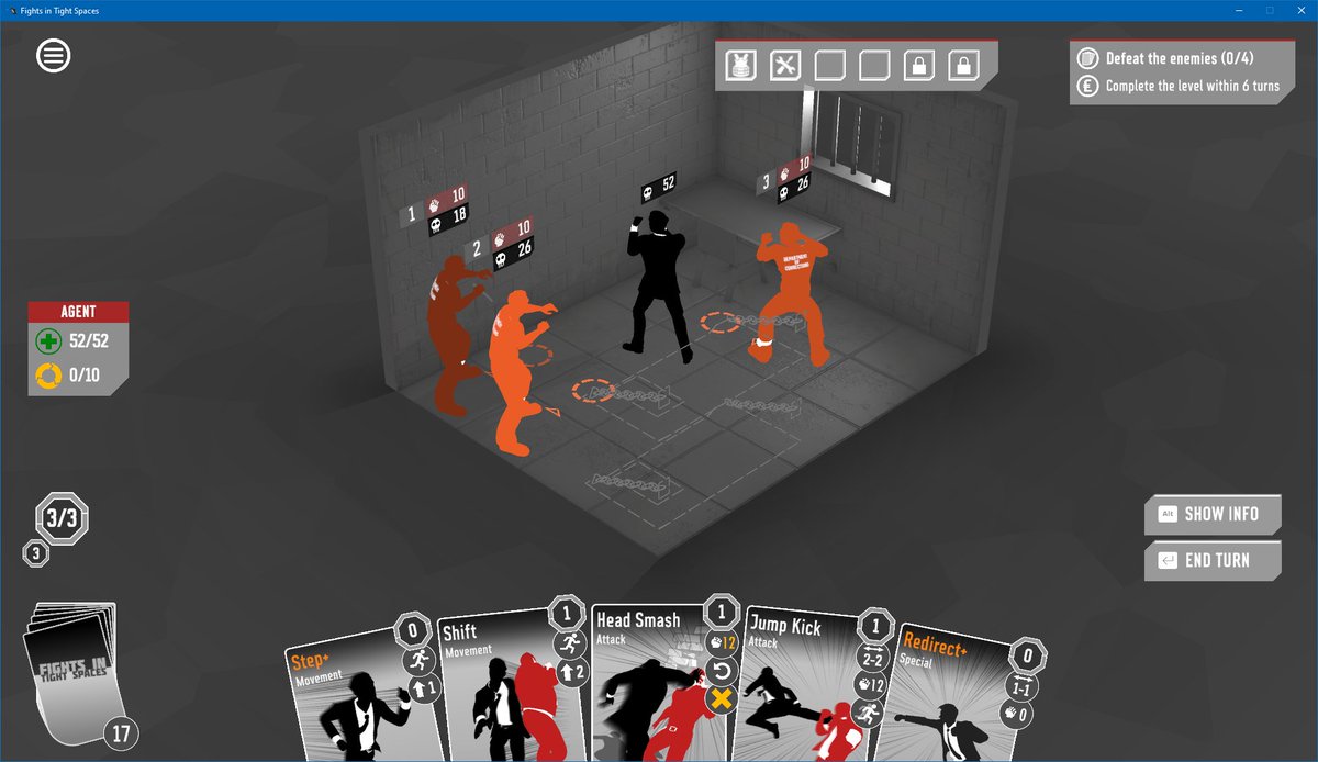
iv. fights in tight spaces. these cards in hand aren& #39;t communicating succinctly which object they are to me, they& #39;re instead giving me every detail about themselves. CLUTTER. ALSO: the art is largely indistinguishable and half cut off.
my hope as a player is that my cards in hand look nice and clearly communicate WHICH CARDS THEY ARE to me. i do NOT want them to communicate every aspect of what they do, it is 1) too much, 2) unnecessary once i& #39;m familiar with the cards.
a big problem here is that card games keep trying to have malleable cards.
my super simple advice: don& #39;t modify individual cards in a way that isn& #39;t easily communicated on cards in hand without overloading the player; it makes the game feel bad to play.
my super simple advice: don& #39;t modify individual cards in a way that isn& #39;t easily communicated on cards in hand without overloading the player; it makes the game feel bad to play.
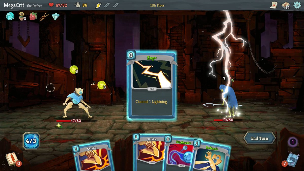
v. dualcast+, defend+. these are fine, they become separate entities from dualcast/defend in the player& #39;s brain.
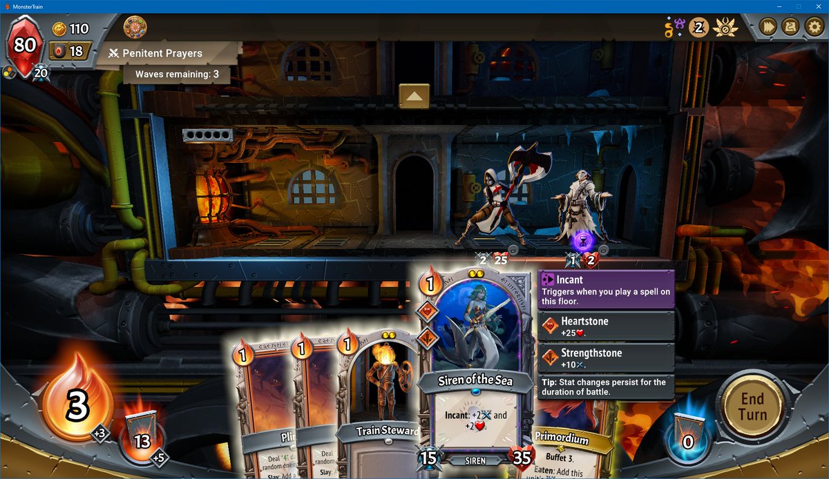
vi. that siren of the sea is PUSHING IT. monster train manages to just barely pull it off though i think. definitely toeing the line.
vi. that siren of the sea is PUSHING IT. monster train manages to just barely pull it off though i think. definitely toeing the line.
1b) a card which is hovered will clearly show you relevant information about what happens when you use it.
that means you can see all the card text, and pop-ups explaining keywords on the card, and ideally its targets and effects are made obvious.
that means you can see all the card text, and pop-ups explaining keywords on the card, and ideally its targets and effects are made obvious.
vii. hovering bash in slay the spire clearly presents its full text and explanatory keyword info.
viii. monster train. same idea.
ix. loop hero, same thing mostly.
this is the main interface used when thinking about plays and a huge part of whether the game feels fun or not.
viii. monster train. same idea.
ix. loop hero, same thing mostly.
this is the main interface used when thinking about plays and a huge part of whether the game feels fun or not.
this tends to fail when the game gets too complex. if interactions between things aren& #39;t clear in this interface i get removed from thinking about how to win at your game and instead spend time trying to work out how your game works. huge barrier to entry.
simple answer: don& #39;t make the cards so complicated that this much information isn& #39;t enough for the player to clearly understand what they& #39;re doing.
also: if you& #39;re going to make them complex make sure you support that with tooltips etc.
also: if you& #39;re going to make them complex make sure you support that with tooltips etc.
slight aside, i think slay the spire is the gold standard for this stuff, and there are a few things that it doesn& #39;t bother to explain in this way (i.e. can blasphemy be cleansed with orange pellets?), and i have been asked how those things work by viewers thousands of times each
1c) selecting a card allows your to preview what would happen if you played it by moving it around the play area.
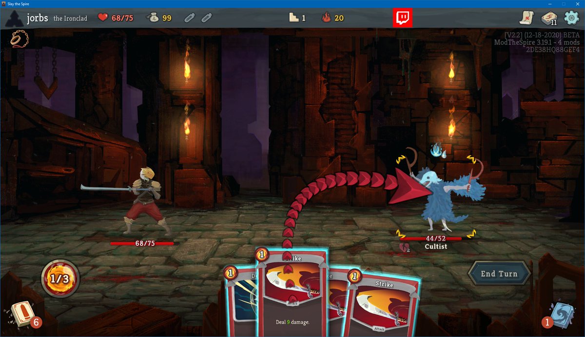
x. strike deals 9, not 6, against a vulnerable enemy!
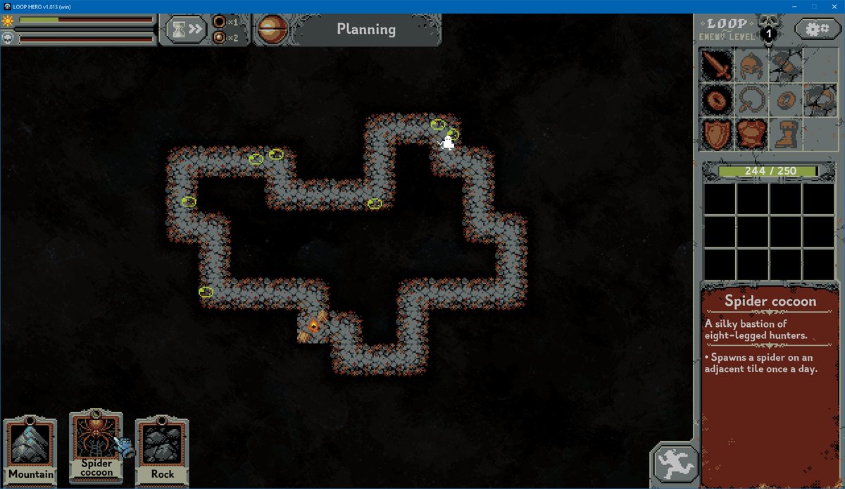
xi. these are the places i can put spider cocoon. interactions with adjacent placements would be highlighted.
x. strike deals 9, not 6, against a vulnerable enemy!
xi. these are the places i can put spider cocoon. interactions with adjacent placements would be highlighted.
i play games that don& #39;t even have this step for playing cards. it feels weird. it& #39;s like a fighting game but you can& #39;t jump or something. i have a cultural expectation that it will exist as a card game player.
1d) when i play the card it crisply does the thing i wanted it to do. NO TEN-SECOND ANIMATIONS PLEASE. as cards get more complex they will sometimes ask for input during resolution where i have to choose a different mode, that& #39;s fine but i don& #39;t want tons of things like that.
xii. here& #39;s the animation when i play strike. it hits the enemy i chose, for the damage it told me it& #39;d deal, and then goes in my discard pile, all in less than a second. SUBLIME. MAGNIFIQUE. spire even lets you start selecting your next card while that resolves.
SO MANY games kill themselves with repeated lengthy animations. i DON& #39;T CARE. i& #39;m here to play your card game!
it& #39;s like going to a party and trying to get your vibe on and then the host gets out his acoustic and tells everyone to stop talking and listen to him play wonderwall.
it& #39;s like going to a party and trying to get your vibe on and then the host gets out his acoustic and tells everyone to stop talking and listen to him play wonderwall.
that& #39;s all, in my opinion, non-negotiable. it& #39;s also a LOT harder to do well than it might seem like from this thread, and absolutely a LOT more COMPLICATED to do well. as you introduce new mechanics and keywords and interactions the ui/ux spirals out of control.
the pillar that slay the spire& #39;s success is built on is its succinct and transparent ui. its central conceit is simple. its balance isn& #39;t actually that good. its graphics are bad. BUT: every attempt to make its successor has been DoA because its ui is worse.
i would love to play games that were better than slay the spire someday, so here& #39;s me pleading for someone to stop making new games with interactions requiring a calculus degree to understand and start making better *thud* sounds when your punch card gets played.

 Read on Twitter