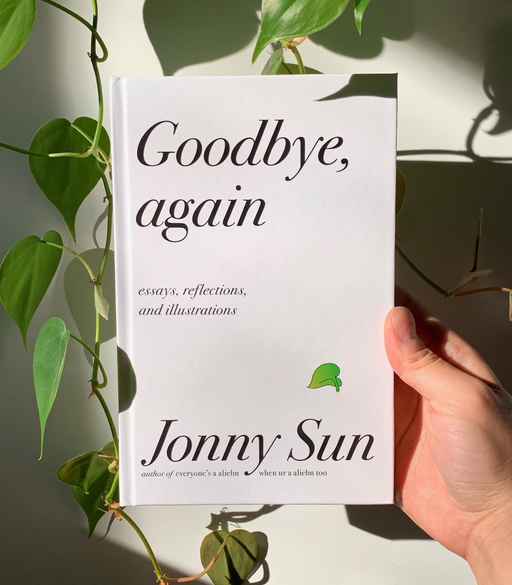
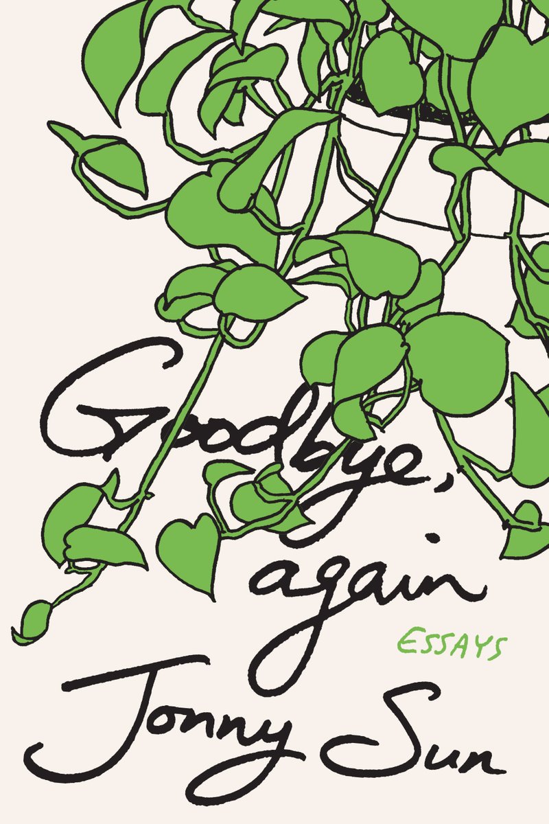
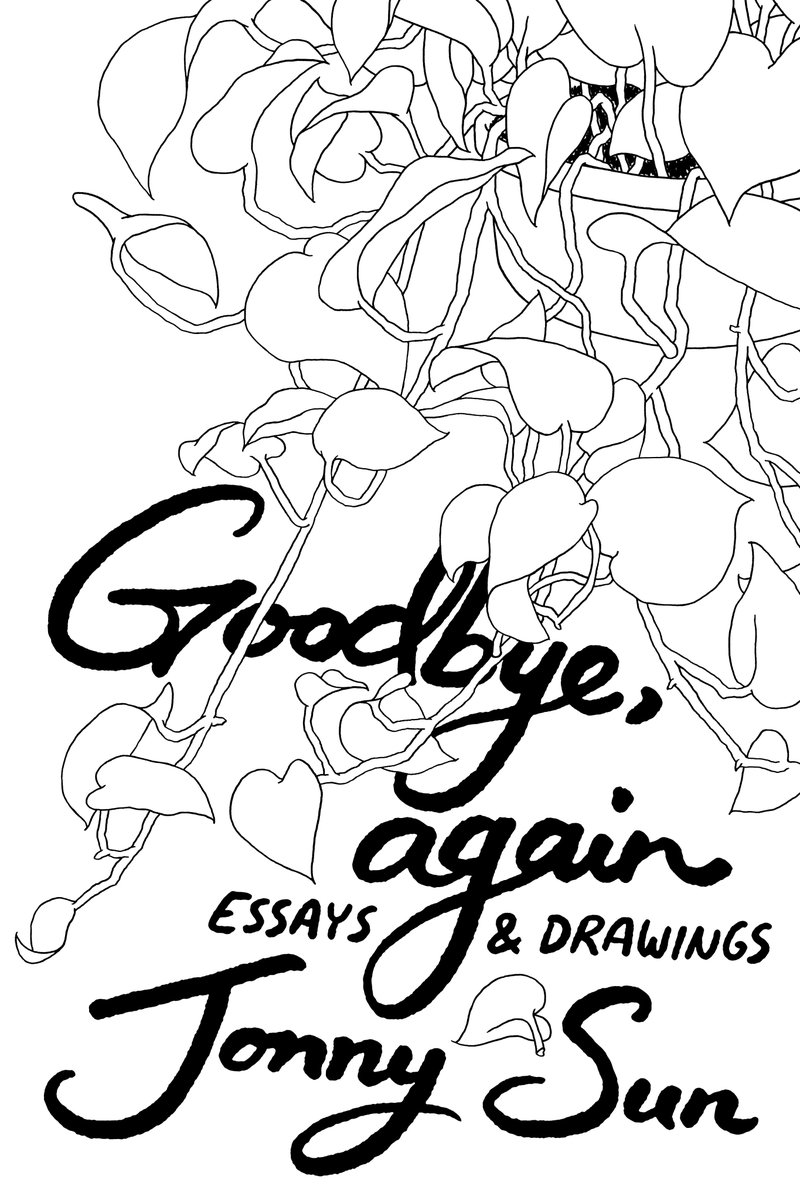
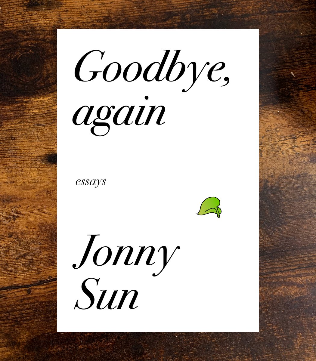
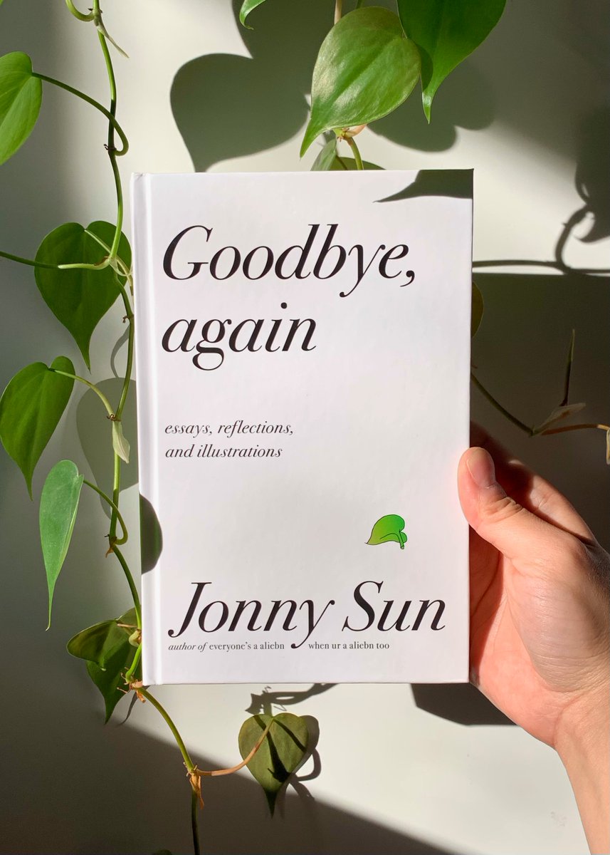
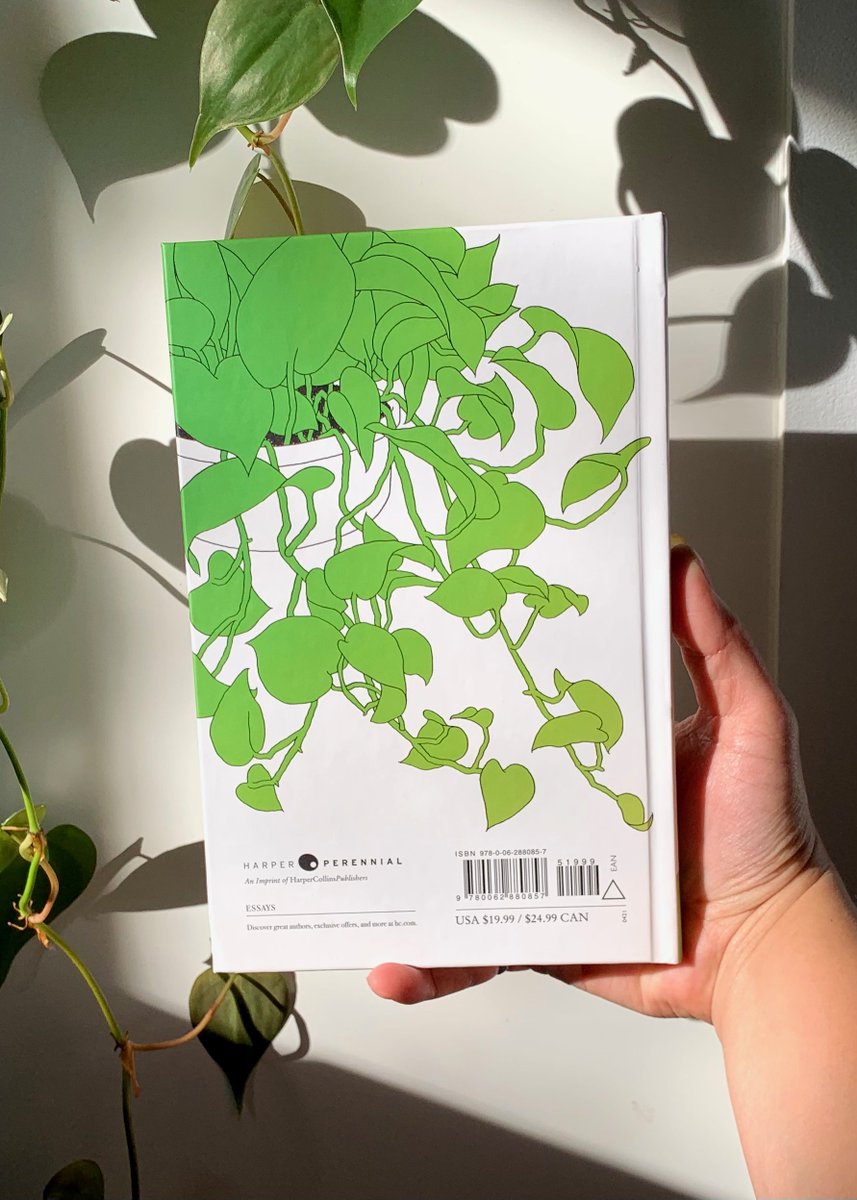
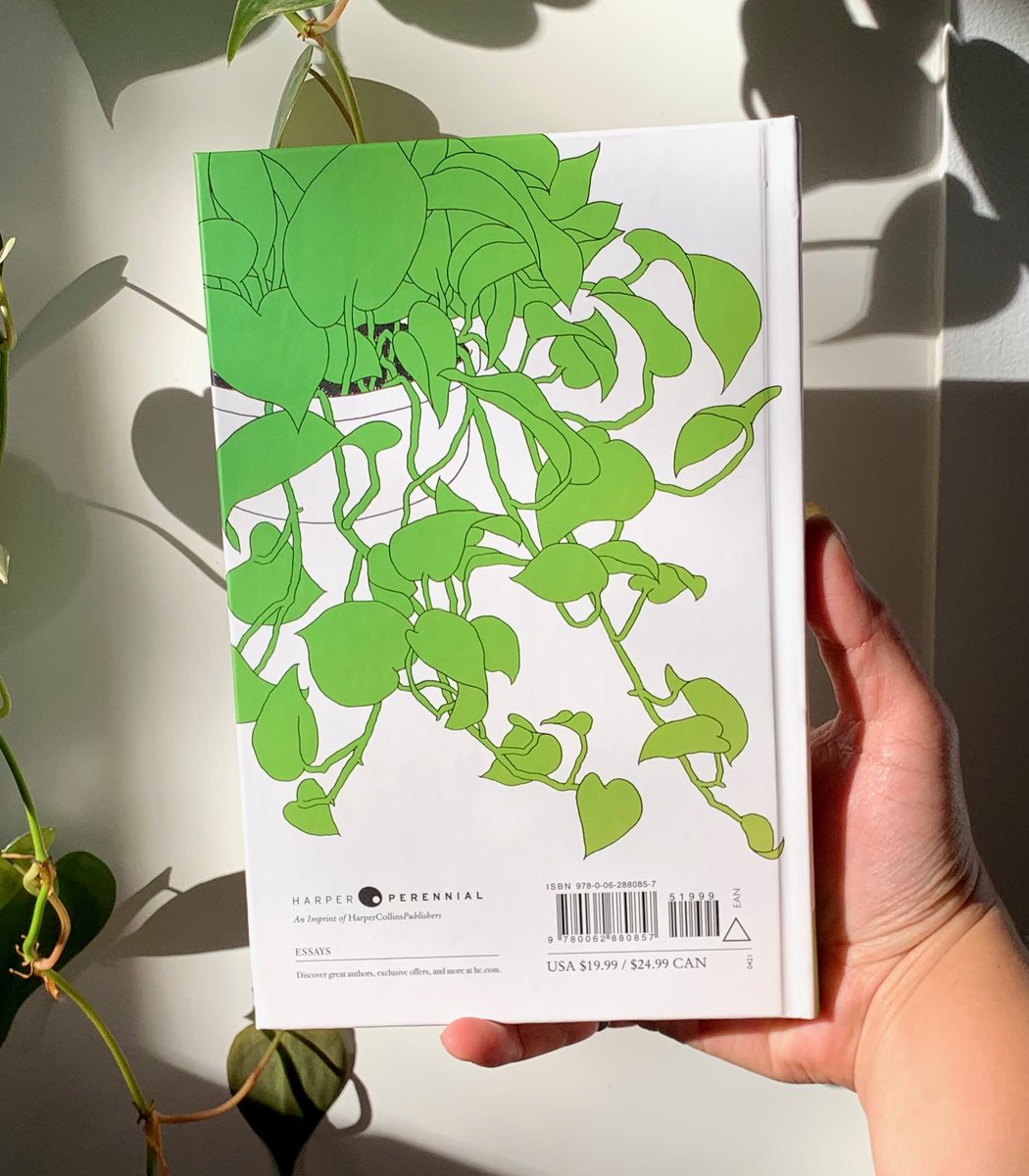
hi my new book comes out in 9 DAYS! i’m especially proud of the back cover and how the intricate illustration completes the lone leaf on the front cover, suggesting displacement — a central theme of the book.
i wanted to make this thread to show some of the cover design process!
i wanted to make this thread to show some of the cover design process!
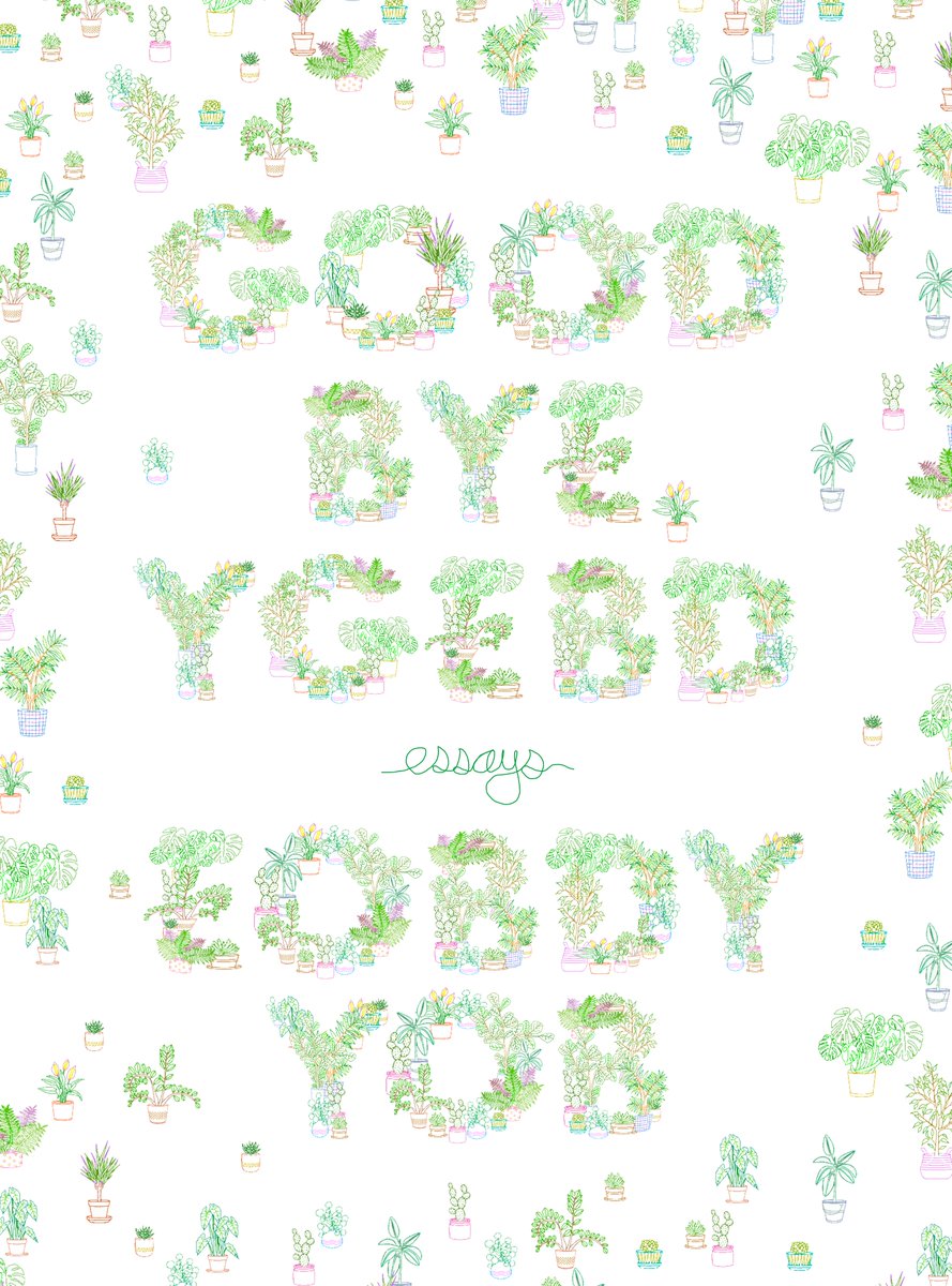
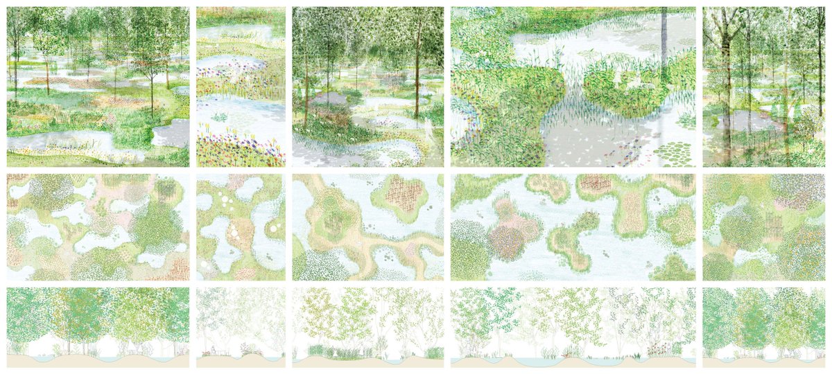
sept 2019: my first mockup was to use tiny potted plants (representing tiny essays) to spell the title. i was inspired by junya ishigami architectural drawings. i gave up halfway through (hence the placeholder text) because it felt too busy for a quiet & contemplative collection.
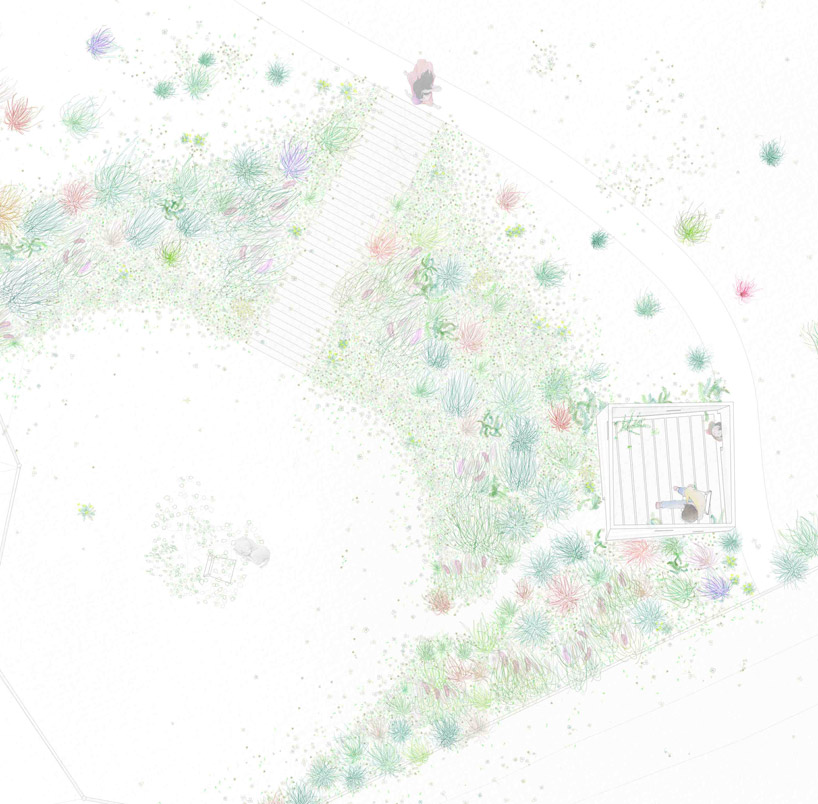
i also really love this landscape architectre drawing from shingo masuda+katsuhisa otsubo architects. holdover precedents from my architecture days. but it didn& #39;t work for the book cover!
i tried to mockup something with the potted plants still, over what was to become handwritten text, but i felt this a little too cutesy for the book& #39;s content. it didn& #39;t get the sort of lonely, thoughtful feeling i wanted!
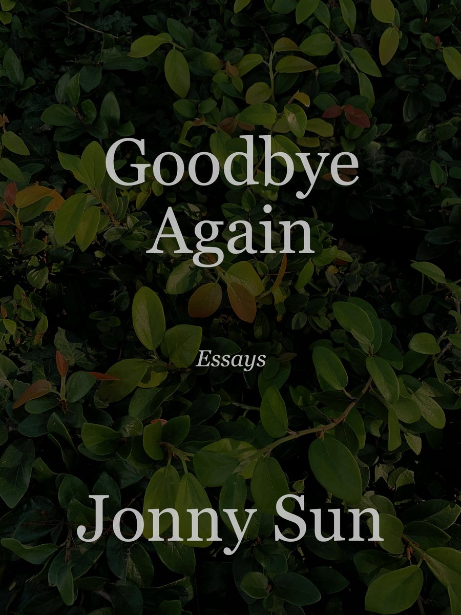
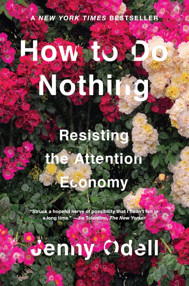
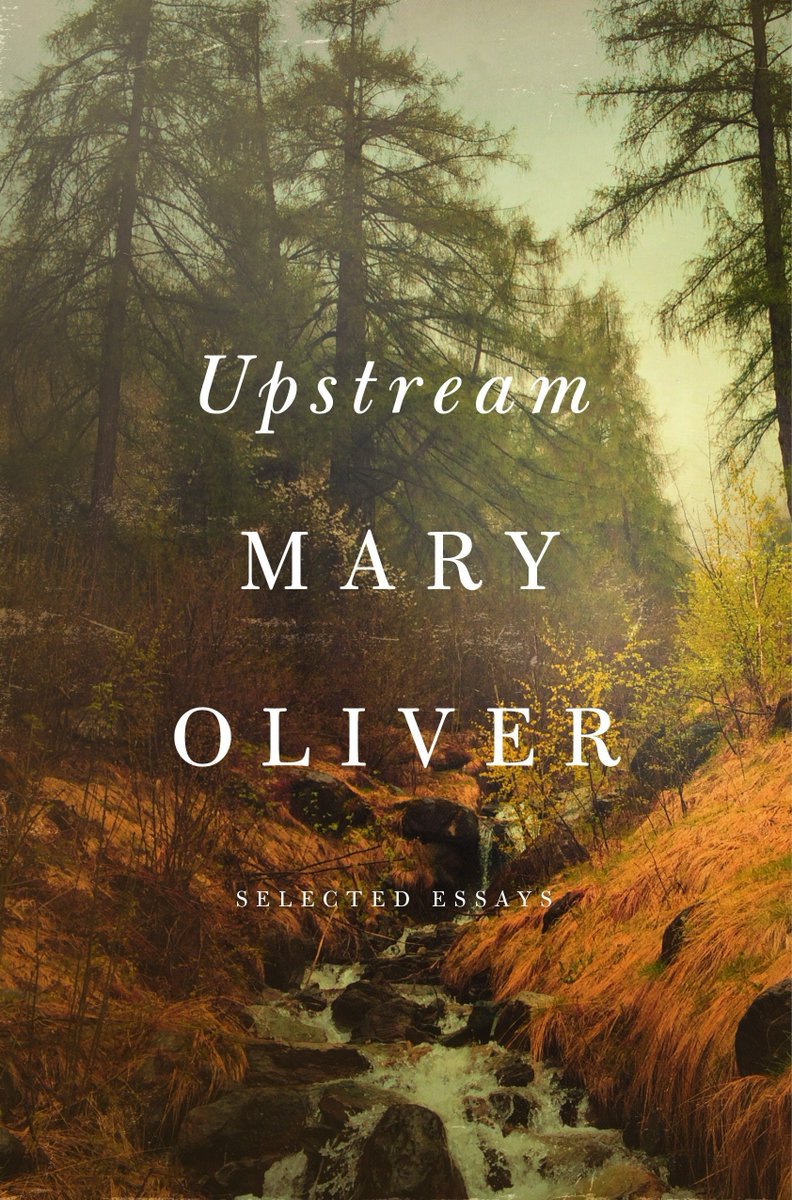
jan 2020: i tried a very different mockup - text set over a photo of some nice leaves i took. it felt more thoughtful, but we decided this looked too close to other covers (particularly jenny odell’s brilliant HOW TO DO NOTHING & mary oliver’s UPSTREAM) so i tried something else.
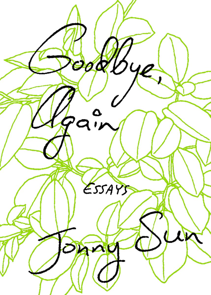
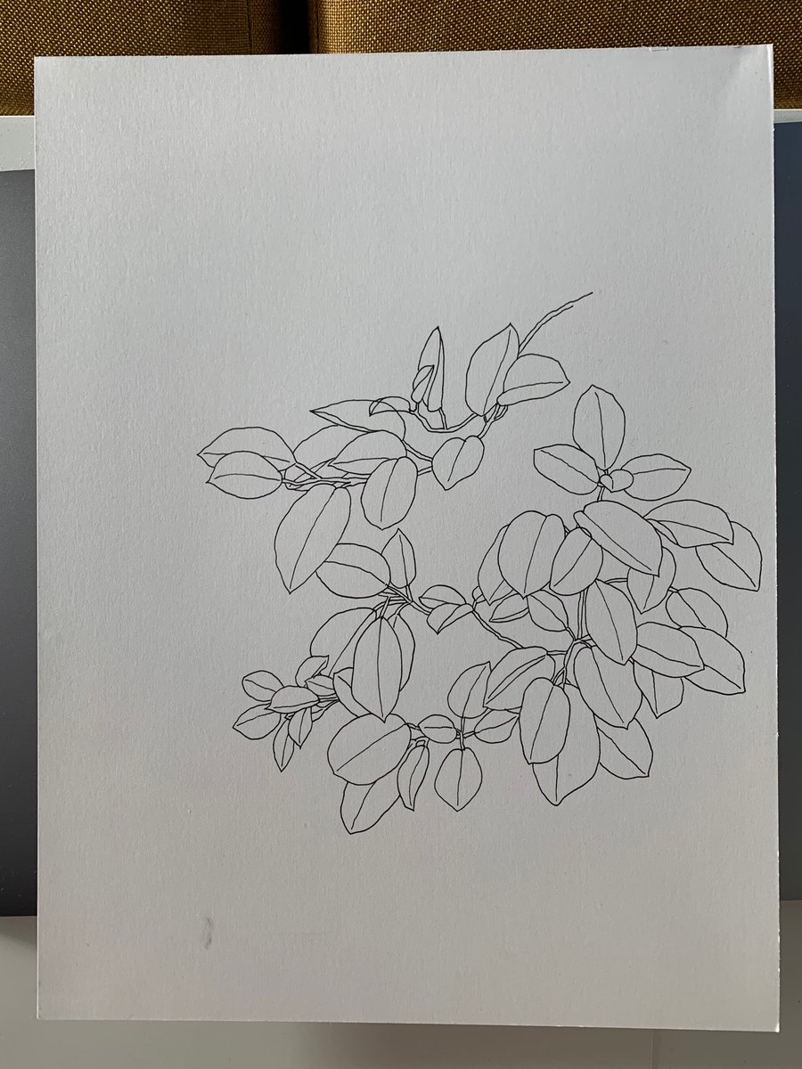
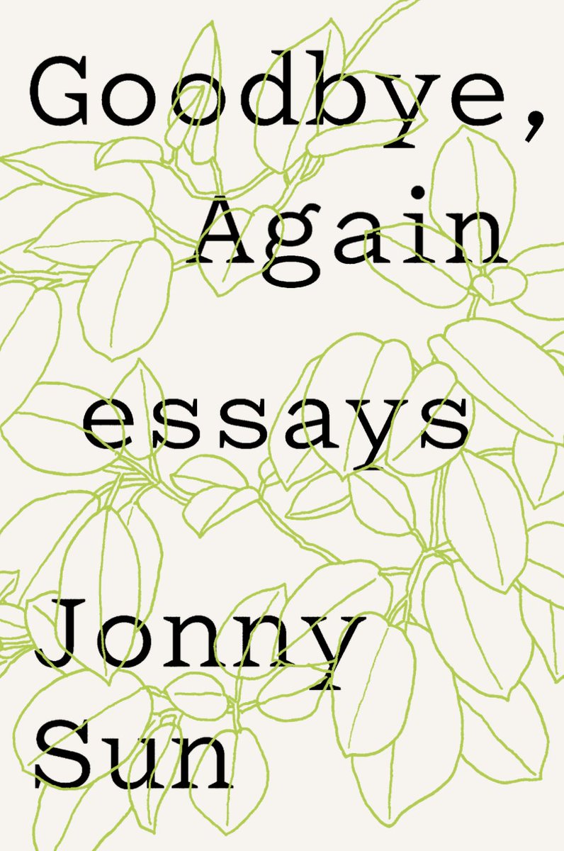
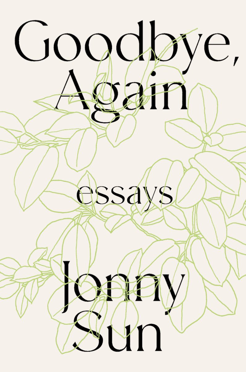
feb 2020: this idea of text over leaves lead to the next sketch — handwritten text over an illustration of leaves. i though an intricate line drawing could almost feel the same as handwriting across a page. here is also a photo of the sketch i used and another sketch i considered
milan božić, senior art director at harpercollins and my main point person and collaborator on this process (he also guided me through my design of the “everyone’s a aliebn” cover!), also set text over this drawing. we liked these directions and took them to the larger team.
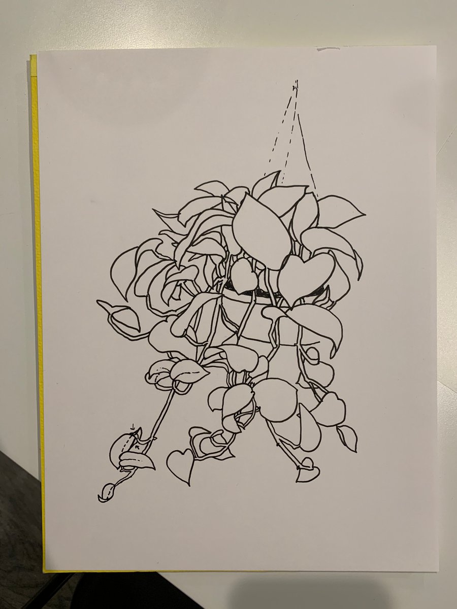
the marketing team liked this but thought that the leaves needed to be grounded in a pot. i felt that a pot at the bottom of the page would be too obvious so i sketched a hanging plant. i switched to a pothos because i liked the heart-shaped leaves, suggesting love & sadness.
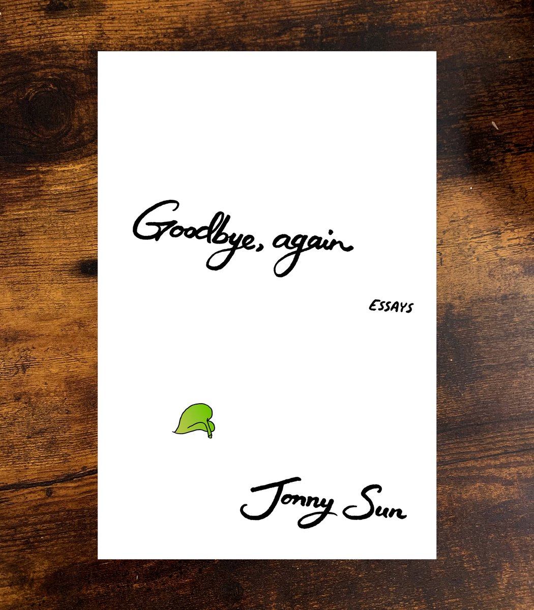
apr 2020: this felt good so i drew a new version with a finer line and more careful handwriting. i also added the single fallen leaf at the bottom of the page because i liked the quiet subtle sadness of it. and i did a few quick coloring mockups and thought this felt pretty good!
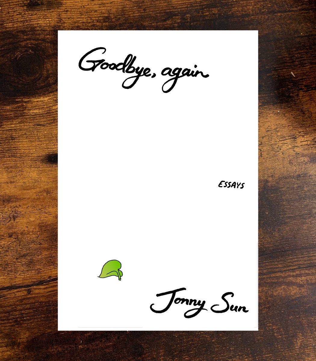
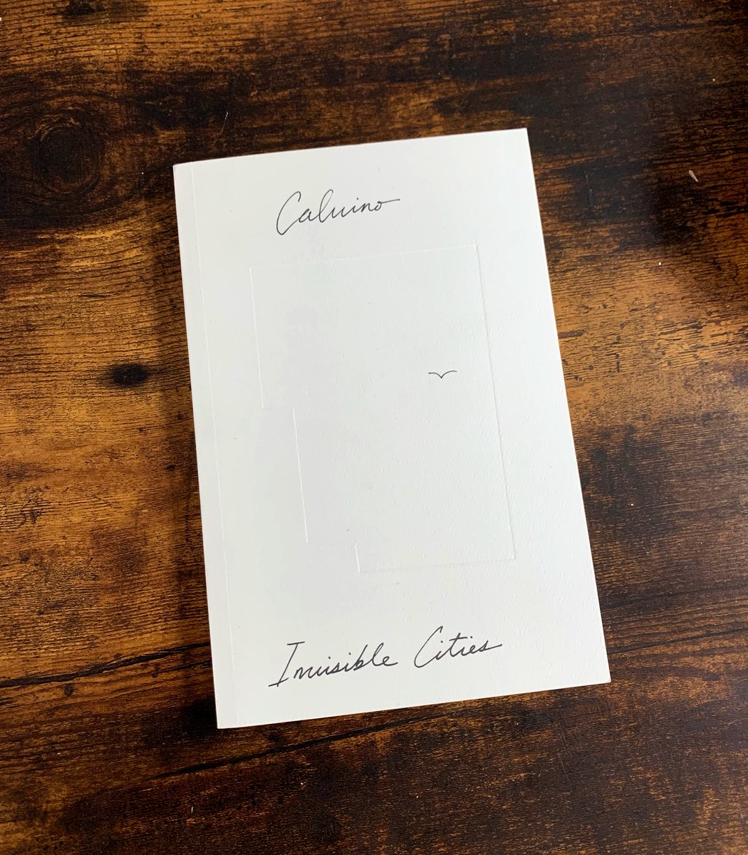
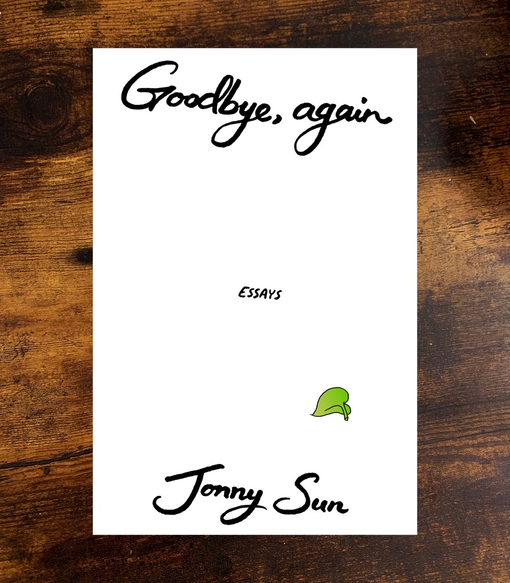
ultimately, we agreed we wanted something more quiet & minimal. i grabbed the fallen leaf from the previous idea, isolated it, and used the same calligraphic text from before. i really love this cover of calvino& #39;s INVISIBLE CITIES and wanted to nod to that (perhaps too closely).
a few other layouts with this general idea. (i think the one on the left is my personal favorite cover design, by the way!). with the one on the right, i wanted to try to see if suggesting a subtle hourglass shape would be nice.
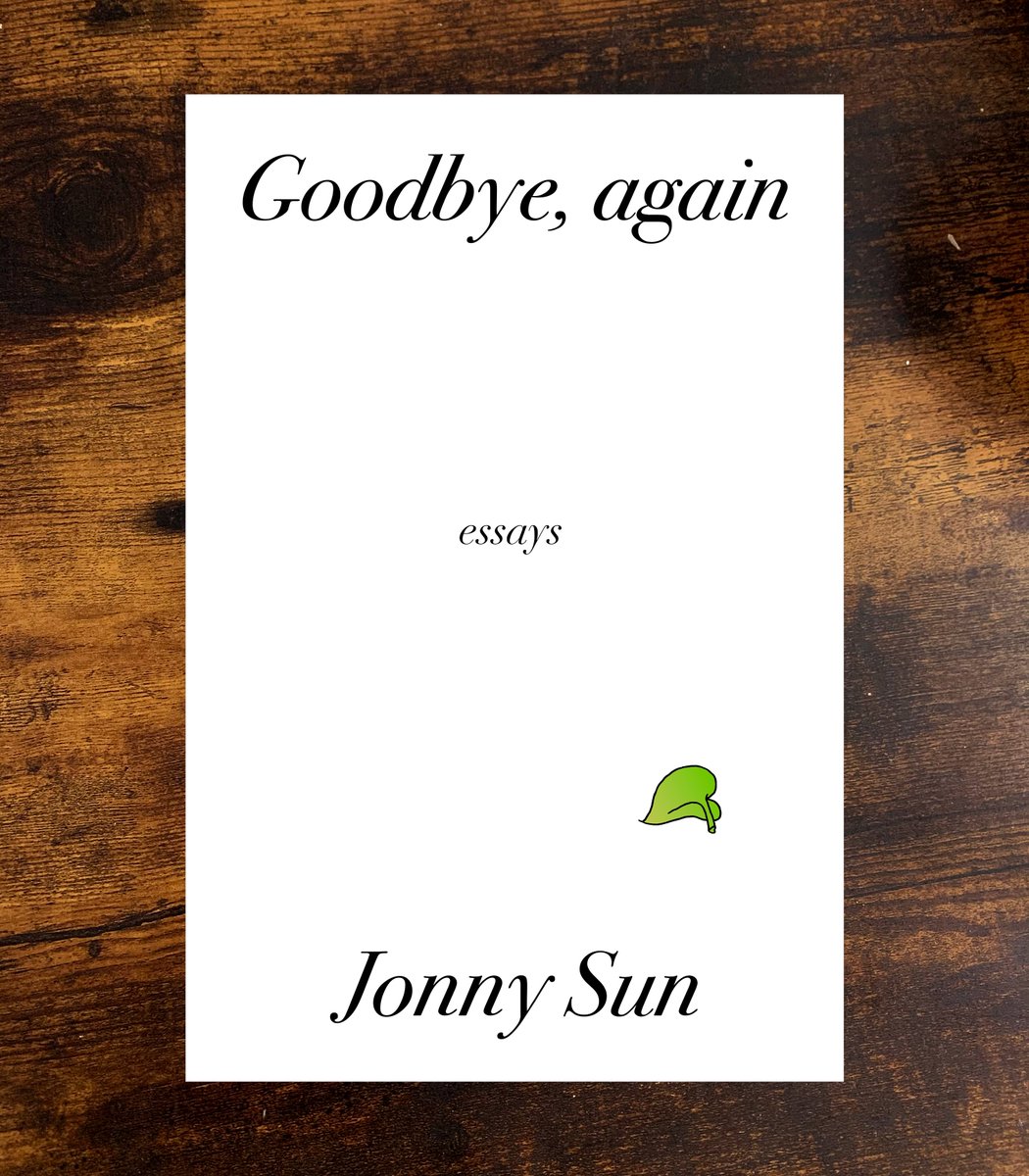
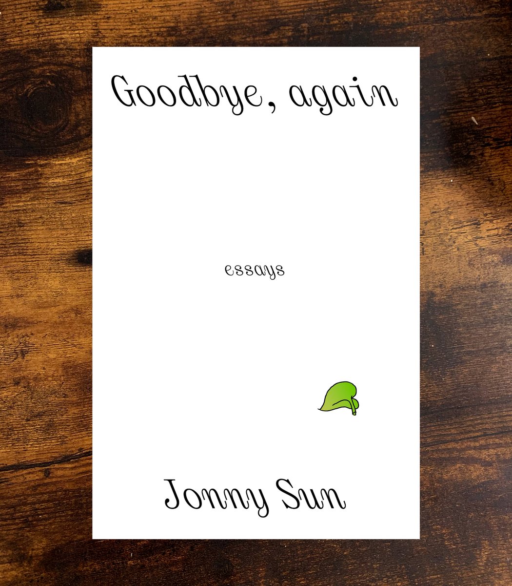
may 2020: the larger team wasn& #39;t sold on the handwriting and asked for typeset options. i set one draft in italic and one in iranic and continued using the hourglass layout to suggest looking forward or backward in time. i particularly liked the iranic!
the feedback was the text needed to be as large & legible as possible (so a small thumbnail would be legible online—i think this hurts design in general but it is what it is). we made the italic bigger and dropped the hourglass. some tweaking led to the final cover in june 2020!
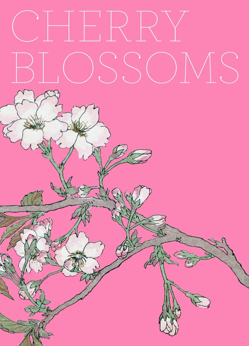
for the back cover, i still wanted to use the intricate pothos illustration from before. i have always really adored this book cover from a collection of japanese floral art from the smithsonian& #39;s freer and sackler galleries, and wanted to evoke a similar feeling.
and that& #39;s the process of how the covers came to be! i& #39;m thrilled the back cover has no text, and just lets the illustration do the work of describing the book.
thank you for reading this! i love seeing process stuff so i hope this was interesting!
thank you for reading this! i love seeing process stuff so i hope this was interesting!
i should also mention that i believe it’s rare that the author gets to be so involved in their book covers like this. i’m grateful to harper perennial for handing me the reins on both my book cover designs!
and if i could make a small ask -- if you were planning to get a copy of the book, would you consider pre-ordering it? it would help the book out so much.
and there are signed first editions available for pre-order from the indie bookstores listed at http://jonnysun.com/signed !">https://jonnysun.com/signed&qu...
and there are signed first editions available for pre-order from the indie bookstores listed at http://jonnysun.com/signed !">https://jonnysun.com/signed&qu...
also here is the book tour! i get to be in conversation with so many heroes and icons. come hang out!! more info at http://jonnysun.com/tour !!
thank">https://jonnysun.com/tour"... you thank you!! okay bye!! back to my pre-book-release anxiety hole!! thank you!!
thank">https://jonnysun.com/tour"... you thank you!! okay bye!! back to my pre-book-release anxiety hole!! thank you!!

 Read on Twitter
