Regarding these "Chop suey" fonts, (example below) one wonders if the wedge-shaped strokes are the product of a person trying to write Latin characters using a Chinese brush 毛筆, which, in untrained hands, tends to produce such strokes? https://edition.cnn.com/style/article/chop-suey-fonts-hyphenated/index.html">https://edition.cnn.com/style/art...
Another interesting thing to consider is that proper handwritten Chinese characters are never in this jagged, pointy style. Here& #39;s an eg. of Kaishu- which is the & #39;standard& #39; hand of the Chinese. None of the strokes are exaggeratedly wedge-shaped: https://twitter.com/ukd_YanZhenqing/status/1378947992913203201">https://twitter.com/ukd_YanZh...
Here& #39;s another example. Most of the strokes end with rounded, rather than tapered tips. https://twitter.com/unkaido_kaisho/status/1380310814184206336">https://twitter.com/unkaido_k...
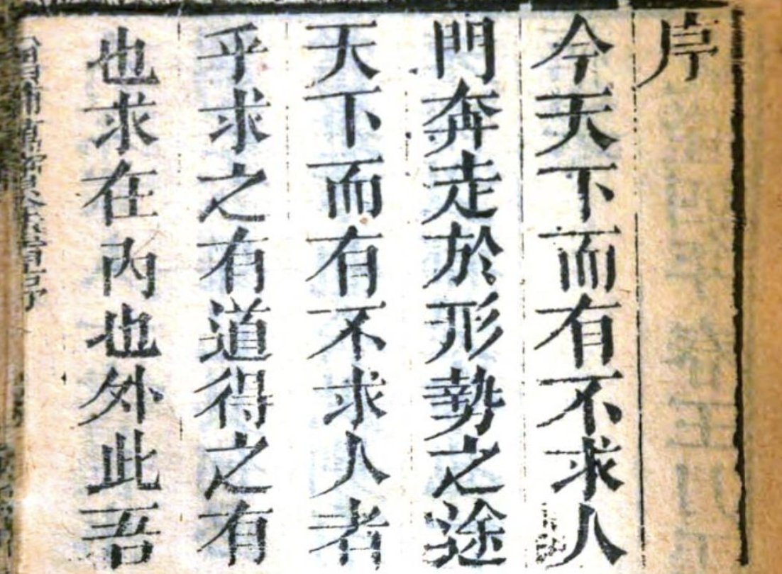
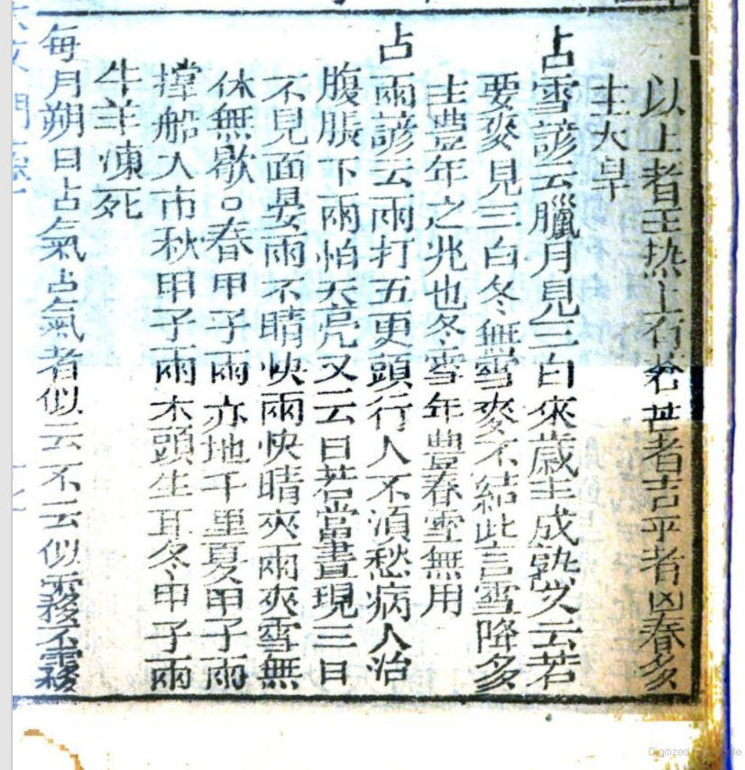
Where you *do* find characters with markedly more jagged strokes are in the letterforms used in printed books, as you can see below. #v=onepage&q&f=false">https://books.google.com/books?id=fO4pAAAAYAAJ&dq=%E8%90%AC%E5%AF%B6%E5%85%A8%E6%9B%B8&pg=PP47 #v=onepage&q&f=false">https://books.google.com/books...
I suspect, therefore, that the chop suey fonts may have more to do with the printed letterforms-- or rather exaggerations of them, than they do with handwritten ones.
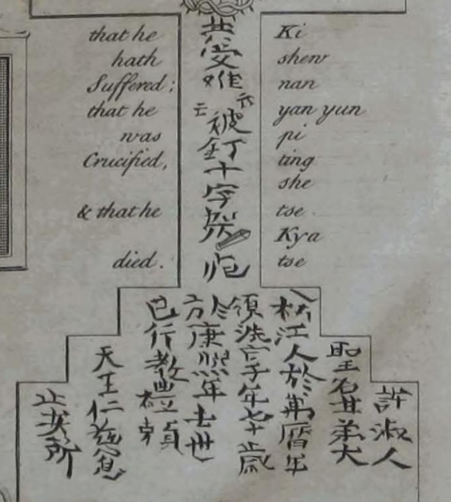
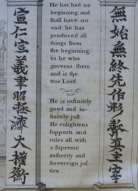
As @Echo_Heo pointed out, Chinese characters pre 20thc european books, (which are several generation copies) tend to have precisely such exaggerated strokes
Another: https://twitter.com/schrift_sprache/status/1296259107004067841">https://twitter.com/schrift_s...
Bayer& #39;s museum sinicum #v=onepage&q=museum%20sinicum&f=false">https://books.google.com/books?id=ubUPAAAAQAAJ&dq=museum%20sinicum&pg=PA27 #v=onepage&q=museum%20sinicum&f=false">https://books.google.com/books...
Now, if the only chinese characters you have ever seen resemble the ones above-- mind you, this is before the days of the internet and photographic facsimiles-- it is highly likely that when you want to design a "Chinese" font, you will end up with those exaggerated strokes
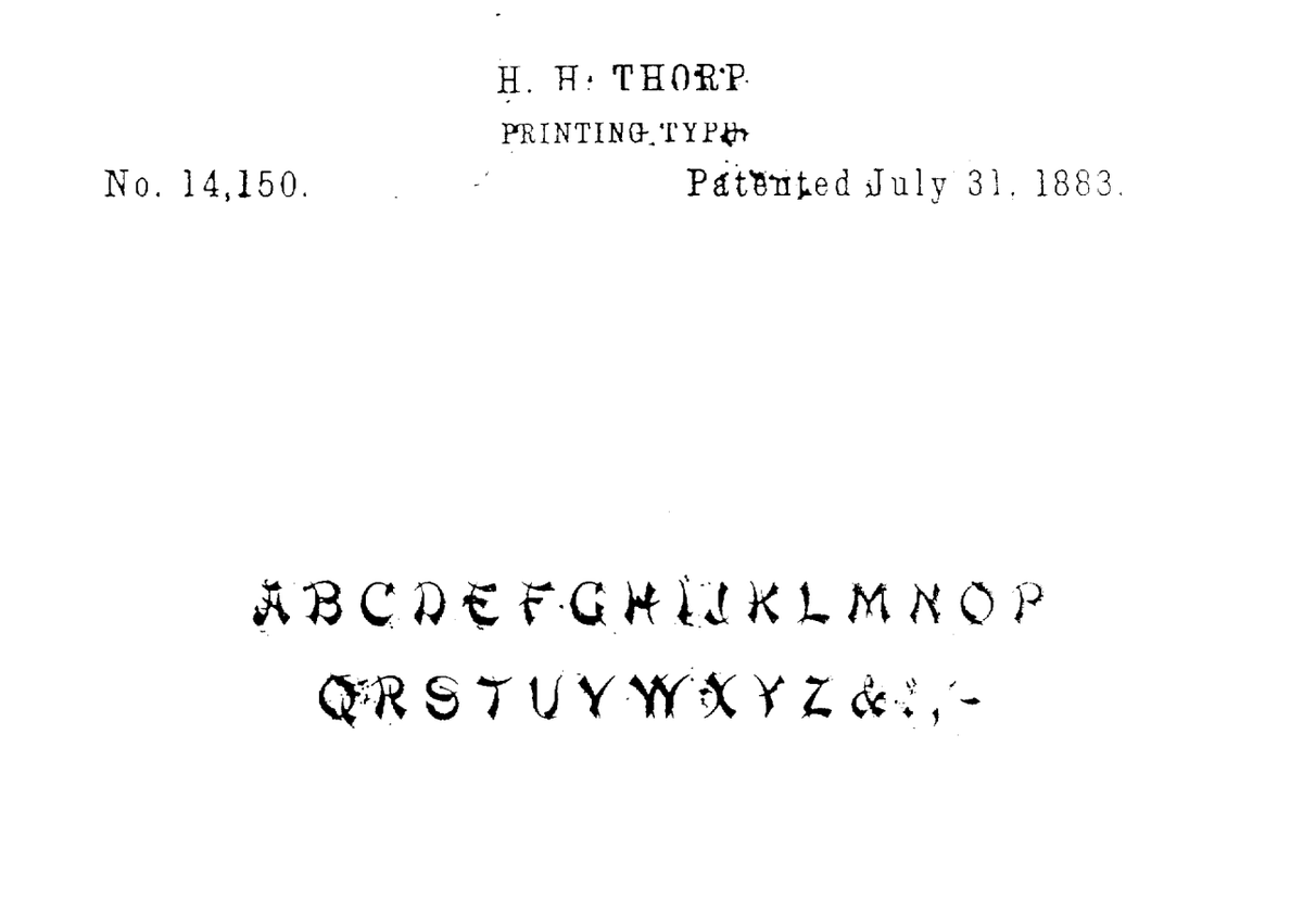
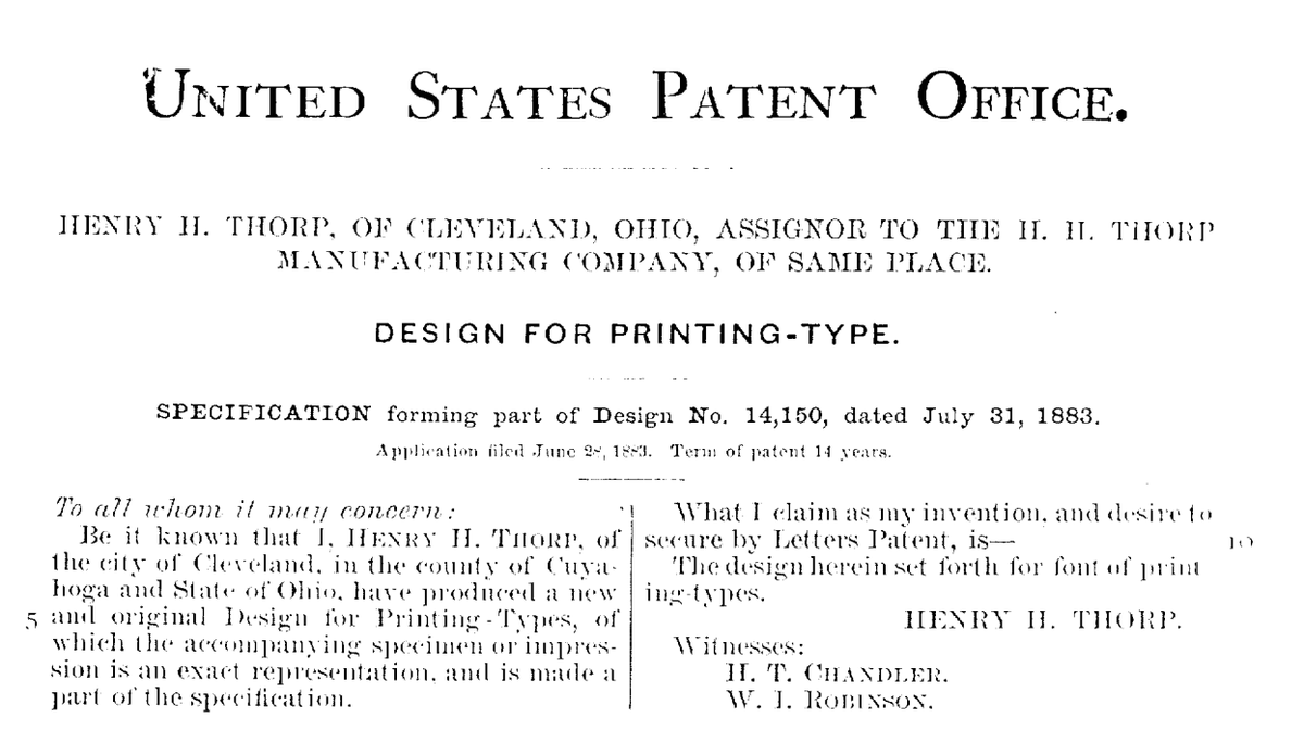
A final thing: The CNN article above states that the following font is the earliest progenitor of the "Chop Suey" fonts. However, it does not look very much like the later ones at all... https://pdfpiw.uspto.gov/.piw?PageNum=0&docid=D0014150&IDKey=&HomeUrl=http%3A%2F%2Fpdfpiw.uspto.gov%2F">https://pdfpiw.uspto.gov/.piw...
Notice that a variety of strokes are used to form the letters whilst the later ones exclusively use wedge-shaped strokes throughout.
They also tellingly note that this font was only *later* called "Mandarin", a name that was not attached to the font initially (see above).
They also tellingly note that this font was only *later* called "Mandarin", a name that was not attached to the font initially (see above).
therefore, could it be that this font- which for all we know, was a one-off decorative whimsy- was subsequently looked at by a salesman who thought "Hm; looks like the chinese writing i saw in that book the other day- perhaps we shall call it & #39;Mandarin& #39;?"
Again, as @speechleyish points out, a Japanese ifluence may be present- specifically in the form of Katakana. Recall that the Katakana characters are highly angular; as are the letters of the CS font: also notice how all the strokes used have minimal curvature (see "C" and "O")
It should be noted that this kind of "one script imitating another" also is found in China. You often see, for example, Chinese typefaces imitating Tibetan script:
https://detail.tmall.com/item.htm?spm=a230r.1.14.6.34174354tnF89h&id=615111457938&cm_id=140105335569ed55e27b&abbucket=11">https://detail.tmall.com/item.htm... (Tibetan Beef jerky)
https://detail.tmall.com/item.htm?spm=a230r.1.14.61.34174354tnF89h&id=615734600104&ns=1&abbucket=11">https://detail.tmall.com/item.htm... (Tibetan incense)

 Read on Twitter