if I had just one shot to share an important idea https://abs.twimg.com/emoji/v2/... draggable="false" alt="💡" title="Elektrische Glühbirne" aria-label="Emoji: Elektrische Glühbirne">here it is. No joke. Look
  https://abs.twimg.com/emoji/v2/... draggable="false" alt="👀" title="Augen" aria-label="Emoji: Augen">
RATIOS DEMAND LOG SCALE
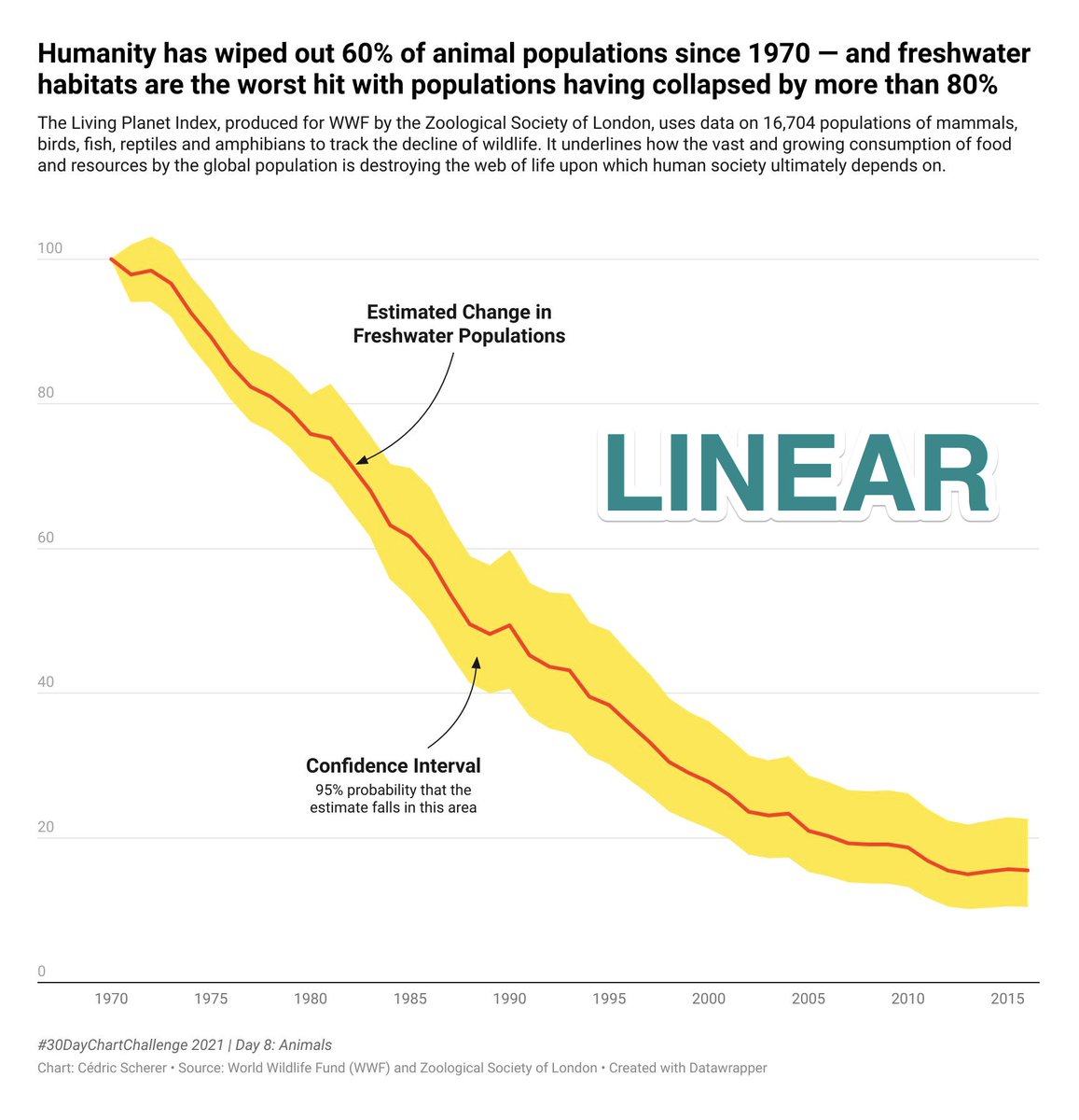
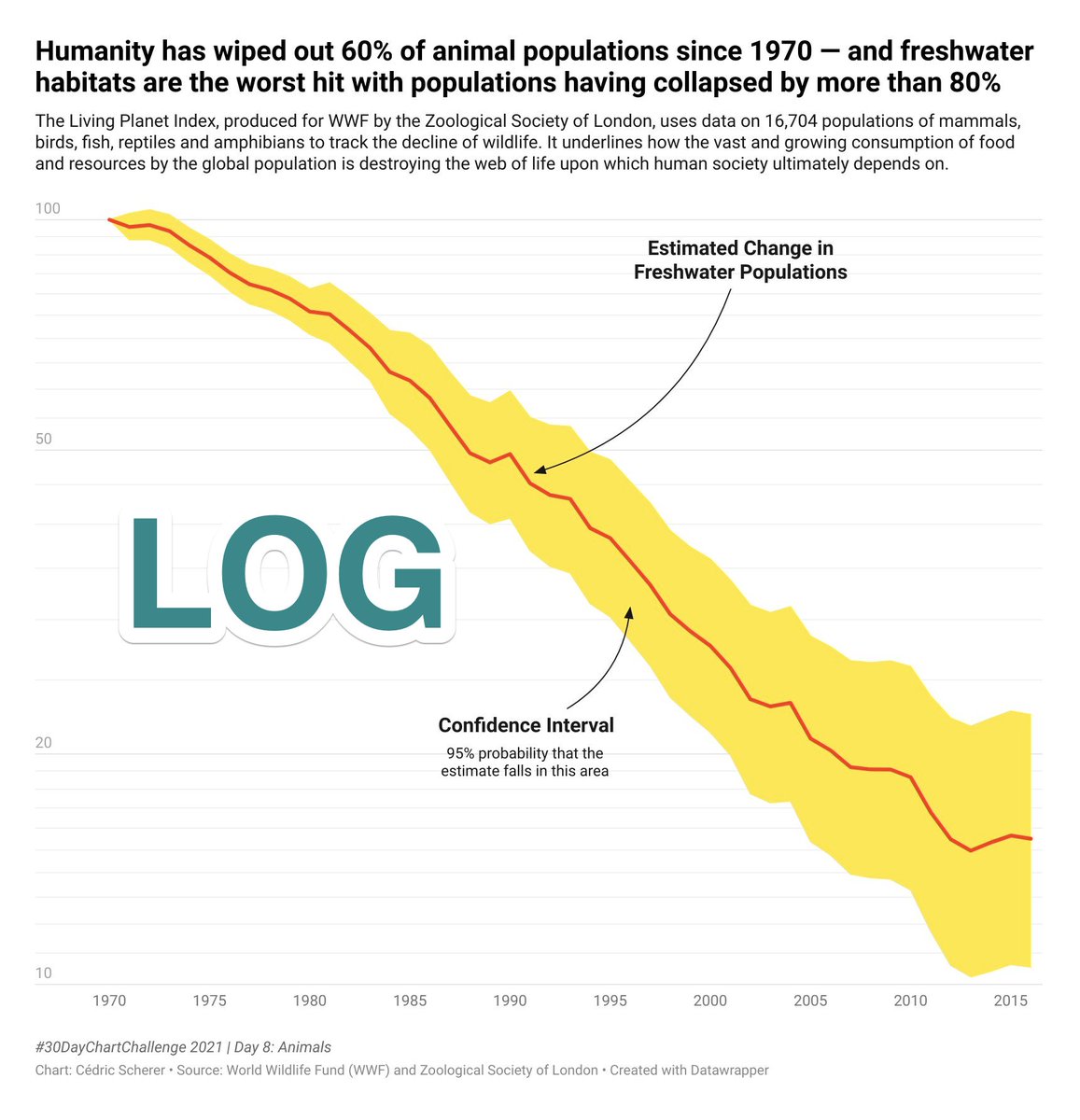
 https://abs.twimg.com/emoji/v2/... draggable="false" alt="👇" title="Rückhand Zeigefinger nach unten" aria-label="Emoji: Rückhand Zeigefinger nach unten"> the coolest non-trivial example when a log Y-axis is required to represent ratios
going from 50 in ~1988 to 25 in ~2001 is as bad as going from 100 in 1970 to 50 in ~1988
RATIOS DEMAND LOG SCALE
going from 50 in ~1988 to 25 in ~2001 is as bad as going from 100 in 1970 to 50 in ~1988
Fascinating how the data story is changing – the seeming recent plateau is no longer there. And log *is* the *right* way to represent the nature of the data and tell the story.
The plots above are made by @CedScherer using @WWF data via @OurWorldInData https://ourworldindata.org/grapher/global-living-planet-index?country=~Freshwater">https://ourworldindata.org/grapher/g...
The plots above are made by @CedScherer using @WWF data via @OurWorldInData https://ourworldindata.org/grapher/global-living-planet-index?country=~Freshwater">https://ourworldindata.org/grapher/g...
Here are the two tweets by @CedScherer prepared for today& #39;s #30DayChartChallenge https://twitter.com/CedScherer/status/1380223704811106308">https://twitter.com/CedSchere...
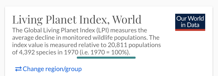
RATIOS appear whenever you divide something by something else of a similar class/nature. Ratios are dimensionless. The most common "hidden" case is time series standardisation when some year is taken for 100%, like 1970 in the example above
The thing is: the story (the shape of the line) will change depending on the arbitrary choice of the year taken as 100%. We divide all other years by this standard effectively creating *ratios*
I genuinely believe this is *the* most common #dataviz issue
It also often becomes a problem in statistical analysis – log transformation of the ratios are required before regression/correlation analysis is performed on the data
It also often becomes a problem in statistical analysis – log transformation of the ratios are required before regression/correlation analysis is performed on the data
[side note]
It& #39;s even more important than the ones coming right after:
– #RotateTheDamnPlot
– #IncreaseTheDamnFont
It& #39;s even more important than the ones coming right after:
– #RotateTheDamnPlot
– #IncreaseTheDamnFont
The realisation of this simple data visualization and analysis rule literally took me ages of slow mind walk: from odds ratios through other explicit ratios to the "hidden" ones like here. Even color bars in the plot legends should be log transformed if they colorcode ratios!
I lost track how many times I& #39;ve pointed this out  https://abs.twimg.com/emoji/v2/... draggable="false" alt="😅" title="Lächelndes Gesicht mit offenem Mund und Angstschweiß" aria-label="Emoji: Lächelndes Gesicht mit offenem Mund und Angstschweiß">
RATIOS DEMAND LOG SCALE
The idea to write a blog post on visualizing ratios correctly lives in my head and to-do list for well over a year now
Let me use this thread to legally bind myself to write it up soon https://abs.twimg.com/emoji/v2/... draggable="false" alt="🔗" title="Link Symbol" aria-label="Emoji: Link Symbol">
RATIOS DEMAND LOG SCALE
The idea to write a blog post on visualizing ratios correctly lives in my head and to-do list for well over a year now
Let me use this thread to legally bind myself to write it up soon

 Read on Twitter
 here it is. No joke. Look https://abs.twimg.com/emoji/v2/... draggable="false" alt="👀" title="Augen" aria-label="Emoji: Augen">RATIOS DEMAND LOG SCALEhttps://abs.twimg.com/emoji/v2/... draggable="false" alt="👇" title="Rückhand Zeigefinger nach unten" aria-label="Emoji: Rückhand Zeigefinger nach unten"> the coolest non-trivial example when a log Y-axis is required to represent ratiosgoing from 50 in ~1988 to 25 in ~2001 is as bad as going from 100 in 1970 to 50 in ~1988" title="if I had just one shot to share an important ideahttps://abs.twimg.com/emoji/v2/... draggable="false" alt="💡" title="Elektrische Glühbirne" aria-label="Emoji: Elektrische Glühbirne">here it is. No joke. Look https://abs.twimg.com/emoji/v2/... draggable="false" alt="👀" title="Augen" aria-label="Emoji: Augen">RATIOS DEMAND LOG SCALEhttps://abs.twimg.com/emoji/v2/... draggable="false" alt="👇" title="Rückhand Zeigefinger nach unten" aria-label="Emoji: Rückhand Zeigefinger nach unten"> the coolest non-trivial example when a log Y-axis is required to represent ratiosgoing from 50 in ~1988 to 25 in ~2001 is as bad as going from 100 in 1970 to 50 in ~1988">
 here it is. No joke. Look https://abs.twimg.com/emoji/v2/... draggable="false" alt="👀" title="Augen" aria-label="Emoji: Augen">RATIOS DEMAND LOG SCALEhttps://abs.twimg.com/emoji/v2/... draggable="false" alt="👇" title="Rückhand Zeigefinger nach unten" aria-label="Emoji: Rückhand Zeigefinger nach unten"> the coolest non-trivial example when a log Y-axis is required to represent ratiosgoing from 50 in ~1988 to 25 in ~2001 is as bad as going from 100 in 1970 to 50 in ~1988" title="if I had just one shot to share an important ideahttps://abs.twimg.com/emoji/v2/... draggable="false" alt="💡" title="Elektrische Glühbirne" aria-label="Emoji: Elektrische Glühbirne">here it is. No joke. Look https://abs.twimg.com/emoji/v2/... draggable="false" alt="👀" title="Augen" aria-label="Emoji: Augen">RATIOS DEMAND LOG SCALEhttps://abs.twimg.com/emoji/v2/... draggable="false" alt="👇" title="Rückhand Zeigefinger nach unten" aria-label="Emoji: Rückhand Zeigefinger nach unten"> the coolest non-trivial example when a log Y-axis is required to represent ratiosgoing from 50 in ~1988 to 25 in ~2001 is as bad as going from 100 in 1970 to 50 in ~1988">

![[side note]It& #39;s even more important than the ones coming right after:– #RotateTheDamnPlot– #IncreaseTheDamnFont [side note]It& #39;s even more important than the ones coming right after:– #RotateTheDamnPlot– #IncreaseTheDamnFont](https://pbs.twimg.com/media/EyeZQtdWUAUlBbR.png)
![[side note]It& #39;s even more important than the ones coming right after:– #RotateTheDamnPlot– #IncreaseTheDamnFont [side note]It& #39;s even more important than the ones coming right after:– #RotateTheDamnPlot– #IncreaseTheDamnFont](https://pbs.twimg.com/media/EyeZRl_XEAELLvu.jpg)


