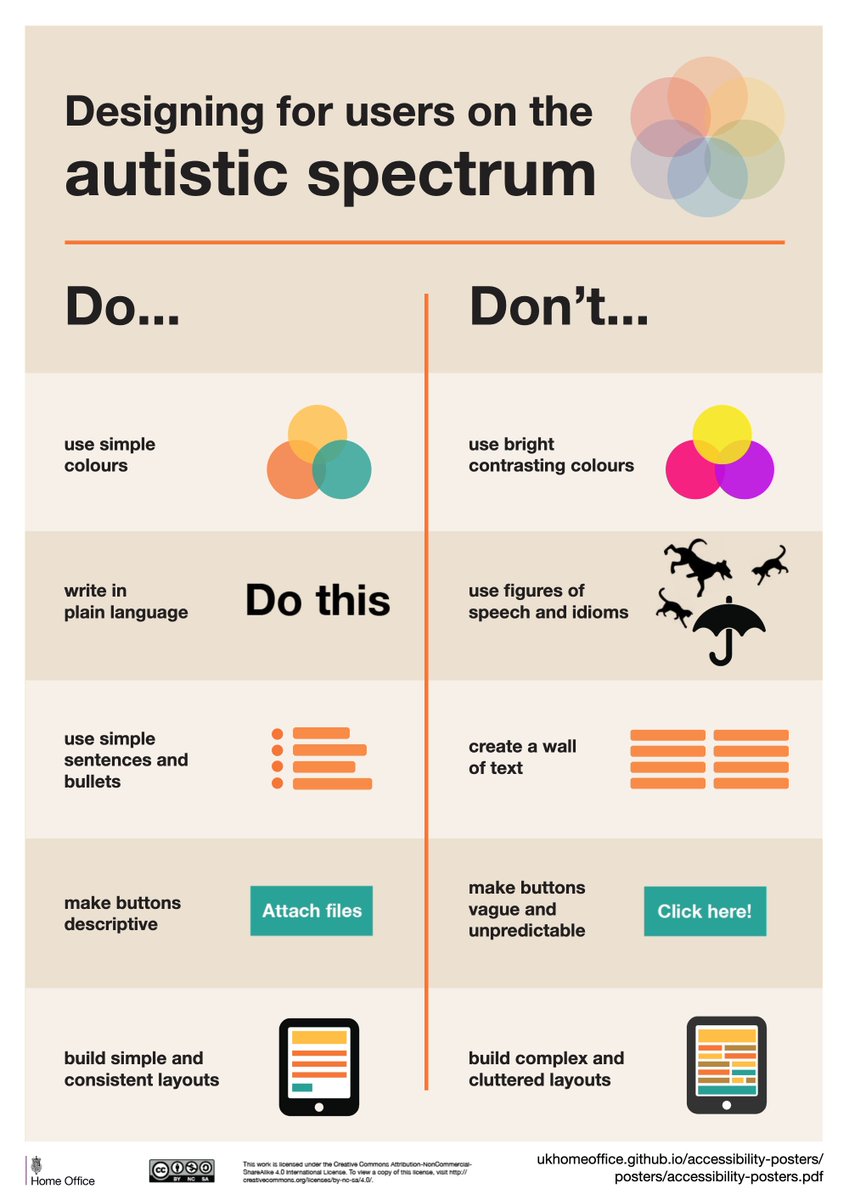
Oh, since it& #39;s #AutismAcceptanceMonth  https://abs.twimg.com/hashflags... draggable="false" alt=""> and I& #39;m an autistic person working in graphic design, I want to once again bring back the excellent Designing for Accessibility posters by Karwai Pun. Here& #39;s the one on autism, and you can find the rest here; https://github.com/UKHomeOffice/posters/blob/master/accessibility/dos-donts/posters_en-UK/accessibility-posters-set.pdf">https://github.com/UKHomeOff...
Link above contains posters autism, screen readers, low vision, dyslexia, motor disabilities, deaf/hoh and anxiety. They don& #39;t cover everything, but they& #39;re good for basic rule of thumb stuff.
(*looks at the very first point on the poster*
*looks at the little symbol accompanying the twitter tag*
...............)
*looks at the little symbol accompanying the twitter tag*
...............)
hold up, i remember asking around about the autism infinity symbol last year and i have a vague recollection of making my own variant? because the ones i found were either choppy or very vibrant
yep, dug through my files and found it. i based the colours on the pastel version on the autism right movement wiki page, but made the shape smoother and more clear
you can find it in various file formats here; https://drive.google.com/drive/folders/10hbnuCogEiBkGdfOva04KfTo3cTfhbhj?usp=sharing">https://drive.google.com/drive/fol... use if you want for whatever you want (so long as it& #39;s respectful to autistic people)
also don& #39;t worry about the "solid pantone coated" versions, i don& #39;t remember why i made those
also don& #39;t worry about the "solid pantone coated" versions, i don& #39;t remember why i made those
note to the non-autistic people who are asking questions; there are no one-glove-fits-all for these kinds of things, because every autistic person has a unique experience. the above poster only covers what often applies, but not always. best you can do (if you have the option)>>
>> is make sure your users have the ability to customize their experience. so long as you follow gerenall rules for user-friendly design, things like being able to adjust text appearance, audio levels and brightness/contrast will go a long way.
i forgot to mention i muted this thread; the constant notifications got a bit stressful. also i& #39;m sorry i forgot about alt text, that& #39;s on me. Here& #39;s an article containing the points from most of the posters in text; https://accessibility.blog.gov.uk/2016/09/02/dos-and-donts-on-designing-for-accessibility/">https://accessibility.blog.gov.uk/2016/09/0...

 Read on Twitter
 and I& #39;m an autistic person working in graphic design, I want to once again bring back the excellent Designing for Accessibility posters by Karwai Pun. Here& #39;s the one on autism, and you can find the rest here; https://github.com/UKHomeOff..." title="Oh, since it& #39;s #AutismAcceptanceMonth https://abs.twimg.com/hashflags... draggable="false" alt=""> and I& #39;m an autistic person working in graphic design, I want to once again bring back the excellent Designing for Accessibility posters by Karwai Pun. Here& #39;s the one on autism, and you can find the rest here; https://github.com/UKHomeOff..." class="img-responsive" style="max-width:100%;"/>


