Let& #39;s go!
13 UI/UX tips from real-life examples
A visual thread https://abs.twimg.com/emoji/v2/... draggable="false" alt="👇" title="Rückhand Zeigefinger nach unten" aria-label="Emoji: Rückhand Zeigefinger nach unten">
13 UI/UX tips from real-life examples
A visual thread
Llama Life by @threehourcoffee
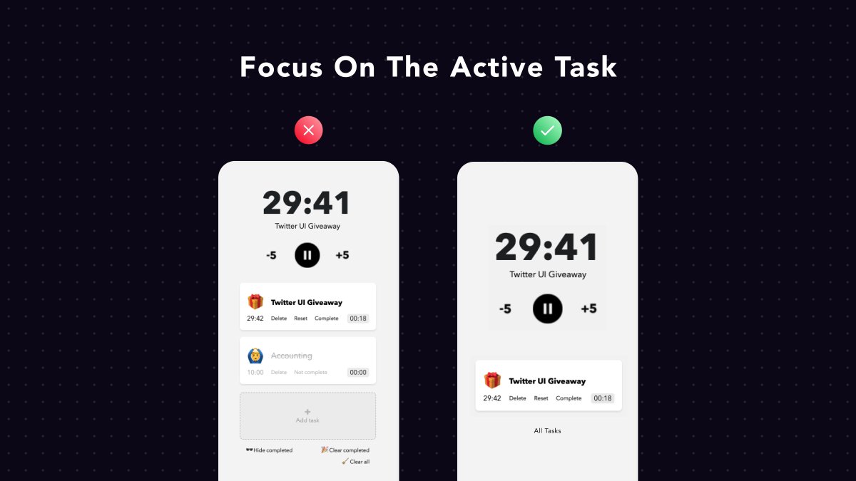
What a beautiful product! A quick UX tip for their focus mode...
Since users are in their "deep-focus" zone, I& #39;d hide from them all the other tasks.
Let& #39;s focus on the active task now!
What a beautiful product! A quick UX tip for their focus mode...
Since users are in their "deep-focus" zone, I& #39;d hide from them all the other tasks.
Let& #39;s focus on the active task now!
BlockSurveys by @wlsnbr
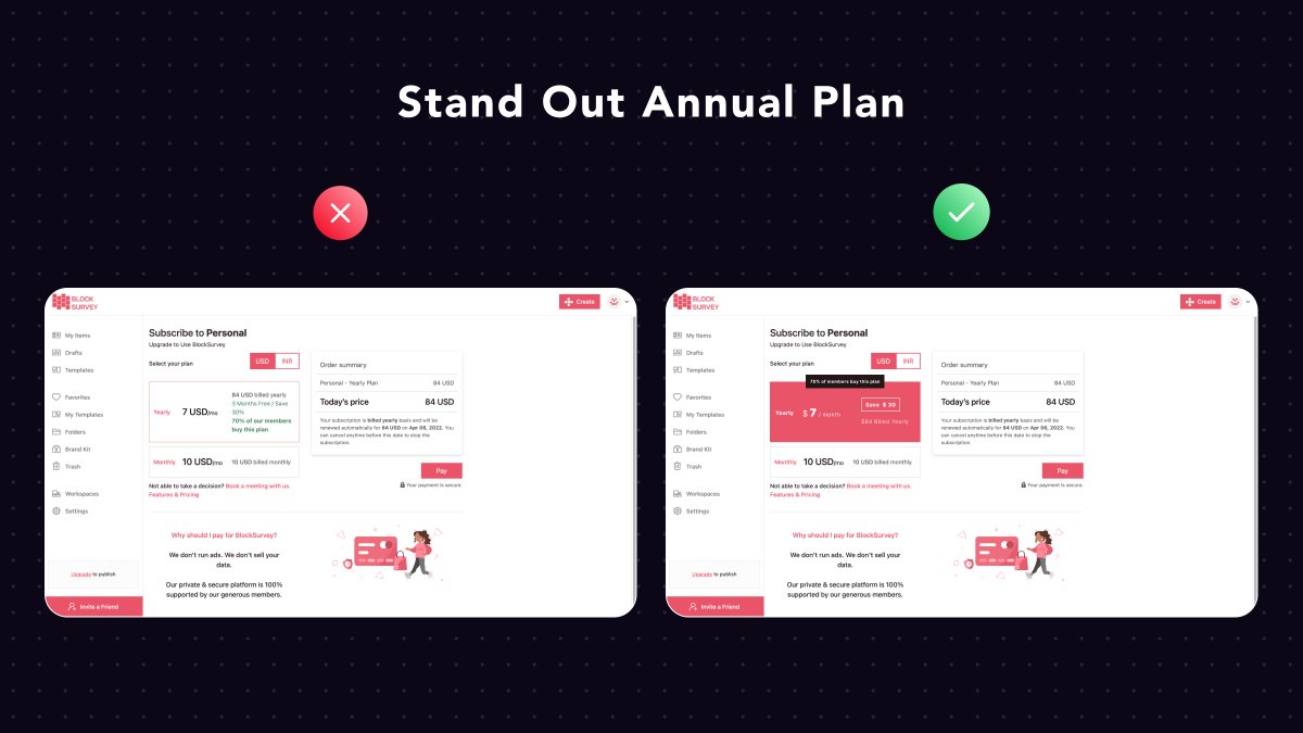
It& #39;s a common practice for SaaS founders to promote their annual plan (upfront revenue + less
churn).
So, make your annual plan stand out visually and prompt people to go for it.
It& #39;s a common practice for SaaS founders to promote their annual plan (upfront revenue + less
churn).
So, make your annual plan stand out visually and prompt people to go for it.
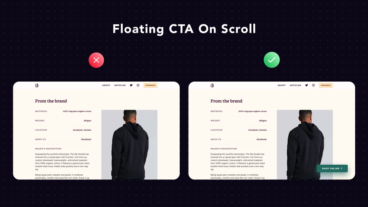
GoodGarms by @Bryntaylor99
A clever hack to boost your conversion is this...
Add a floating & #39;Shop Online& #39; button on every product page to make it dead-simple for visitors to convert, even if they& #39;ve scrolled a lot.
A clever hack to boost your conversion is this...
Add a floating & #39;Shop Online& #39; button on every product page to make it dead-simple for visitors to convert, even if they& #39;ve scrolled a lot.
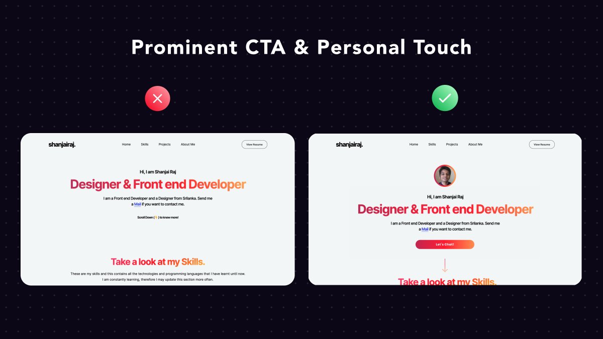
Dev Portfolio by the hacker @shanjai_raj
1. Add your photo. It helps potential clients connect your work with your real face and adds a personal touch
2. Have a prominent CTA to help clients contact you immediately.
1. Add your photo. It helps potential clients connect your work with your real face and adds a personal touch
2. Have a prominent CTA to help clients contact you immediately.
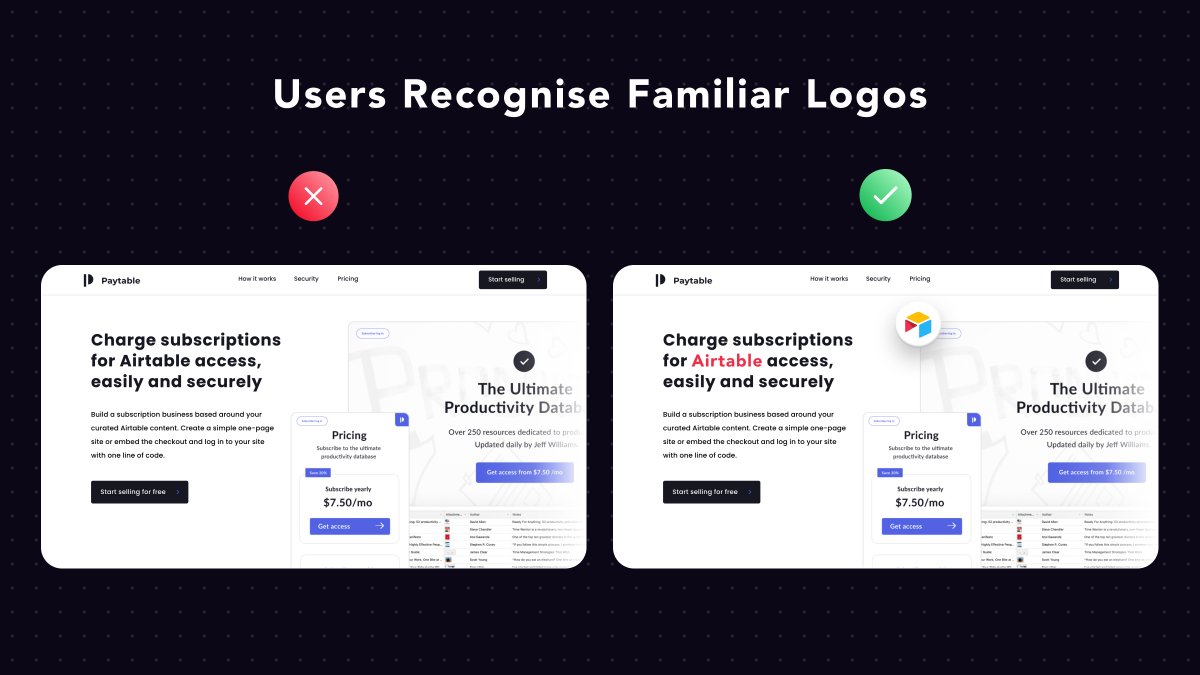
Paytable by @J__Rosen
It provides a secure reader for @airtable bases and the ability to monetize them
Potential users are familiar with Airtable and its logo.
By displaying Airtable& #39;s logo, we help them understand that the product is about them!
It provides a secure reader for @airtable bases and the ability to monetize them
Potential users are familiar with Airtable and its logo.
By displaying Airtable& #39;s logo, we help them understand that the product is about them!
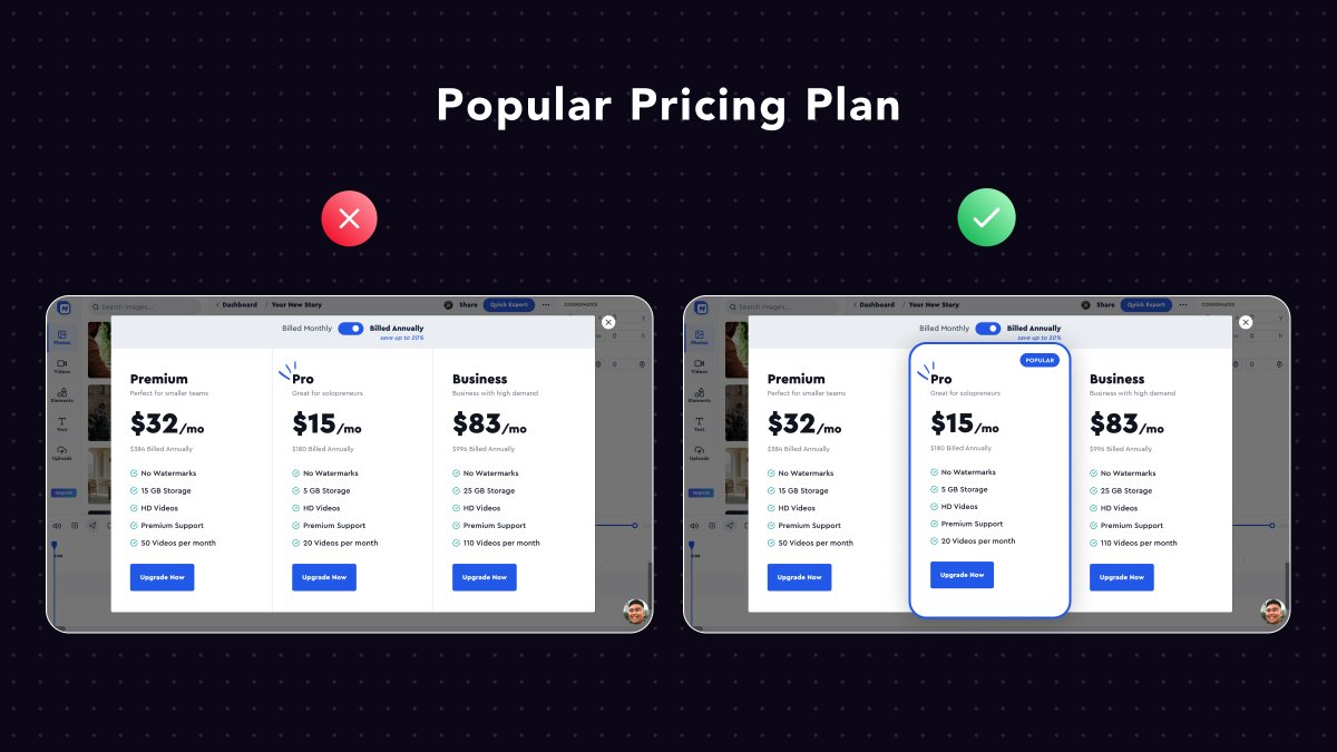
MotionBox by the one & only @michaelaubry
It took me a while to find a flaw, then I& #39;ll go with a small pricing optimization...
Make your most common-used plan prominent, to leave fewer options for your users.
We often enjoy it when others make a selection for us...
It took me a while to find a flaw, then I& #39;ll go with a small pricing optimization...
Make your most common-used plan prominent, to leave fewer options for your users.
We often enjoy it when others make a selection for us...
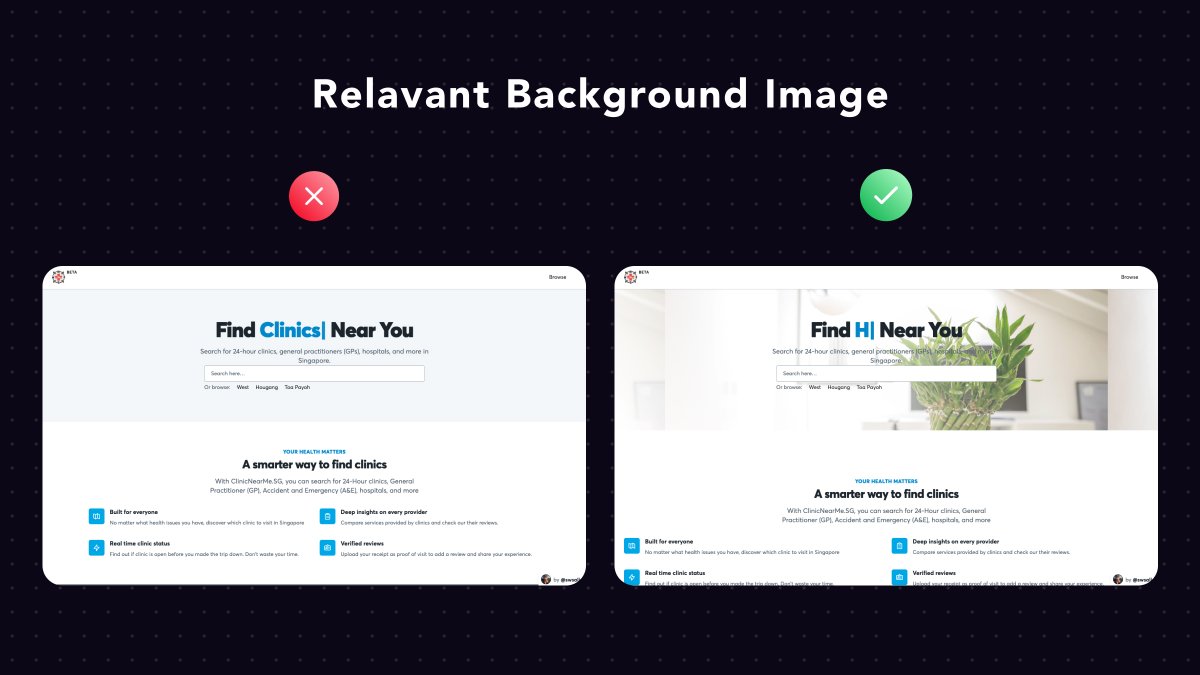
ClinicNearMe. A very impactful project by @swSalim
The main landing page looks pretty empty. How can we fix it?
Add a relevant background header image, or even better...
Add a separate section with some recommended clinics based on the visitor& #39;s location https://abs.twimg.com/emoji/v2/... draggable="false" alt="🤯" title="Explodierender Kopf" aria-label="Emoji: Explodierender Kopf">
The main landing page looks pretty empty. How can we fix it?
Add a relevant background header image, or even better...
Add a separate section with some recommended clinics based on the visitor& #39;s location
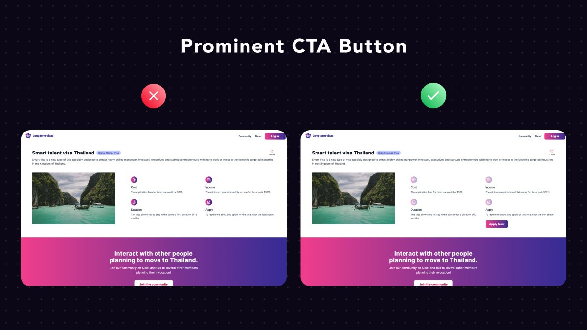
LongTermVisas by @FarazPatankar13
Consistency across our interface must be a priority.
Icons need to look and behave like icons. The same goes for buttons etc.
That& #39;s why I& #39;d advise Faraz to add a submit button instead of a clickable icon
* BTW it& #39;s a beautiful website.
Consistency across our interface must be a priority.
Icons need to look and behave like icons. The same goes for buttons etc.
That& #39;s why I& #39;d advise Faraz to add a submit button instead of a clickable icon
* BTW it& #39;s a beautiful website.
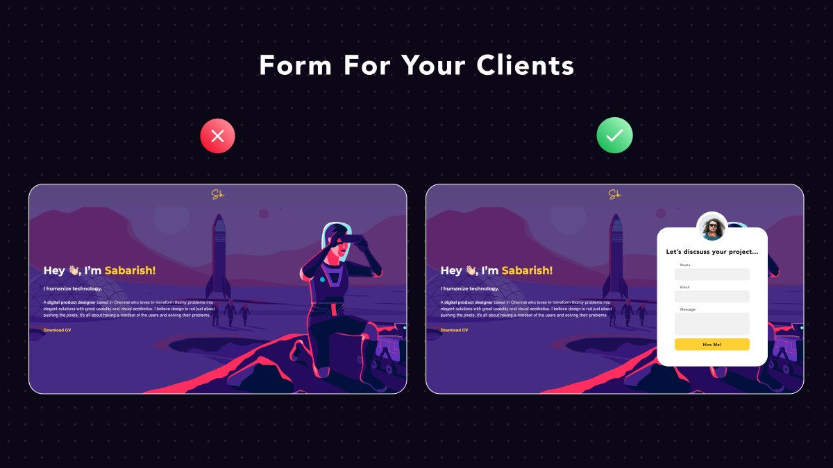
Product design portfolio by @sabarishkanna
The purpose of a digital portfolio is to attract clients
Your #1 goal is to make it easy for potential clients to show their interest
So, a form to collect their interest is always a must-have element on your portfolio page
The purpose of a digital portfolio is to attract clients
Your #1 goal is to make it easy for potential clients to show their interest
So, a form to collect their interest is always a must-have element on your portfolio page
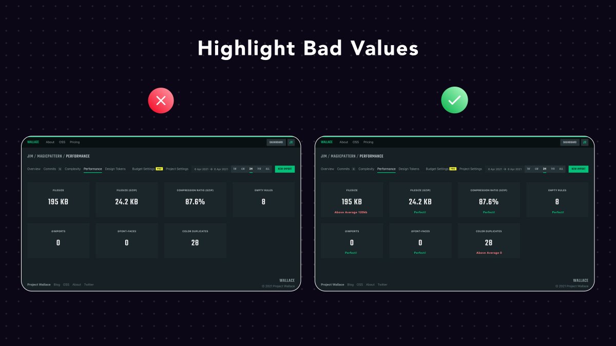
Project Wallace by @bartveneman
Most times our users won& #39;t know everything we know.
The 200kb filesize stat might be useless for our end-user.
To make it useful, they need to know what& #39;s the average CSS bundle size and if this number is above or below it.
Most times our users won& #39;t know everything we know.
The 200kb filesize stat might be useless for our end-user.
To make it useful, they need to know what& #39;s the average CSS bundle size and if this number is above or below it.
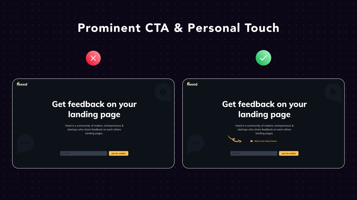
Heed by @_kprkr
Such a meta UI review lol
It& #39;s a product, in the pre-beta phase, without real screenshots.
Personally, I& #39;d create a very rough Figma prototype, record it and display it above the fold.
It would give visitors a sense of what to expect from Heed
Such a meta UI review lol
It& #39;s a product, in the pre-beta phase, without real screenshots.
Personally, I& #39;d create a very rough Figma prototype, record it and display it above the fold.
It would give visitors a sense of what to expect from Heed
Photograph hiring app by @AlheehFatima
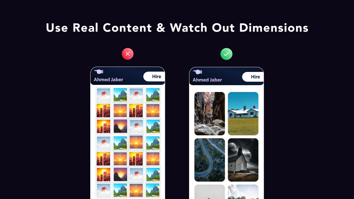
Mobile design is tricky.
You have limited space and you need to take into account these two simple rules:
• Elements should be visible
• Elements should be clickable (>42 pixels)
PS. Prefer real-life content for your designs
Mobile design is tricky.
You have limited space and you need to take into account these two simple rules:
• Elements should be visible
• Elements should be clickable (>42 pixels)
PS. Prefer real-life content for your designs
Devisto by @klaasgeldof
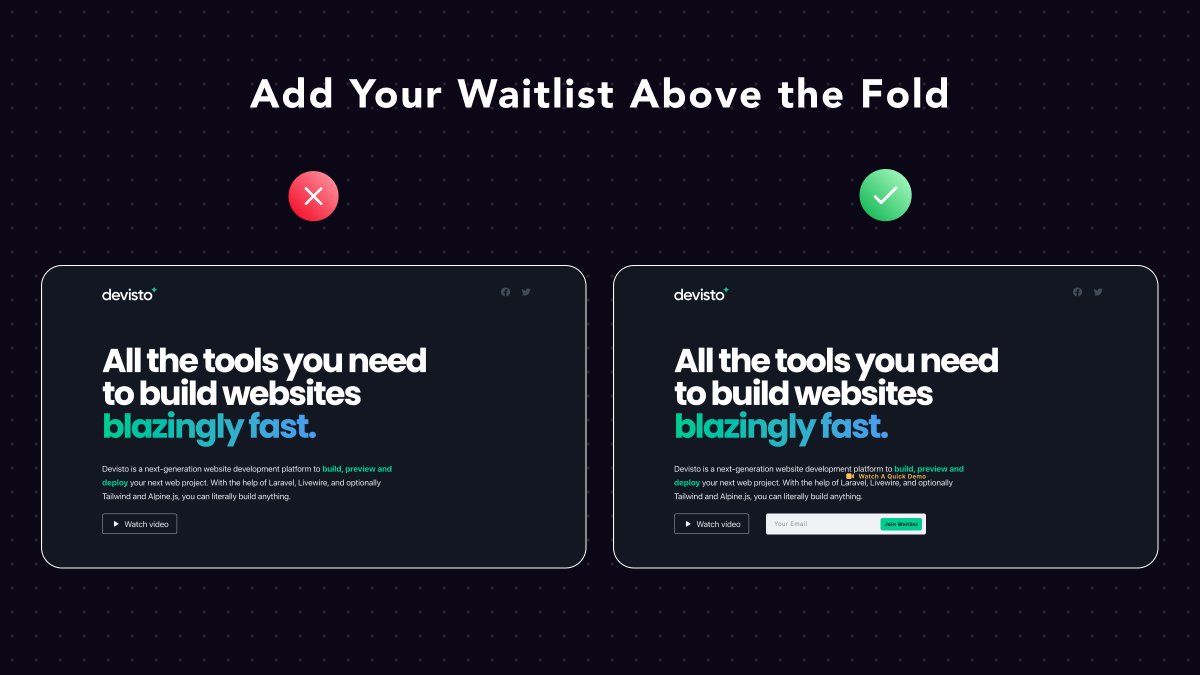
An all-around solution for building websites
The product is not released yet, then the landing page& #39;s purpose is to collect early user emails
So, adding a form to collect their email above the fold can be valuable!
An all-around solution for building websites
The product is not released yet, then the landing page& #39;s purpose is to collect early user emails
So, adding a form to collect their email above the fold can be valuable!
That& #39;s all for now folks!
Hope you learned a useful UI/UX lesson today.
Always happy to check your creations that were inspired by these tips :)
Hope you learned a useful UI/UX lesson today.
Always happy to check your creations that were inspired by these tips :)

 Read on Twitter
 " title="Let& #39;s go! 13 UI/UX tips from real-life examplesA visual thread https://abs.twimg.com/emoji/v2/... draggable="false" alt="👇" title="Rückhand Zeigefinger nach unten" aria-label="Emoji: Rückhand Zeigefinger nach unten">" class="img-responsive" style="max-width:100%;"/>
 " title="ClinicNearMe. A very impactful project by @swSalim The main landing page looks pretty empty. How can we fix it?Add a relevant background header image, or even better...Add a separate section with some recommended clinics based on the visitor& #39;s location https://abs.twimg.com/emoji/v2/... draggable="false" alt="🤯" title="Explodierender Kopf" aria-label="Emoji: Explodierender Kopf">" class="img-responsive" style="max-width:100%;"/>
