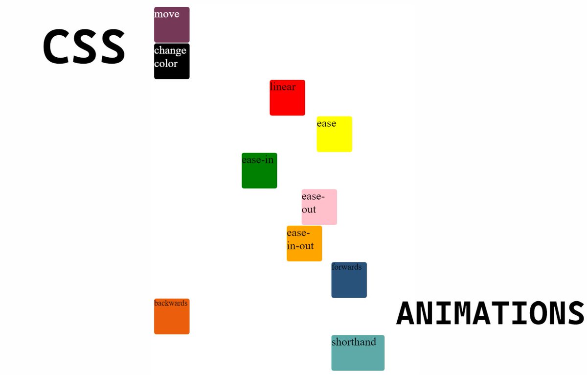
A quick start guide to CSS animations  https://abs.twimg.com/emoji/v2/... draggable="false" alt="👇🏻" title="Rückhand Zeigefinger nach unten (heller Hautton)" aria-label="Emoji: Rückhand Zeigefinger nach unten (heller Hautton)">
Thread https://abs.twimg.com/emoji/v2/... draggable="false" alt="🧵" title="Thread" aria-label="Emoji: Thread">
Thread
Animations on your web pages or website can catch more audience
You can create some amazing animation using CSS itself. In this thread, we will try to learn some decent knowledge about it
Let& #39;s start https://abs.twimg.com/emoji/v2/... draggable="false" alt="👇🏻" title="Rückhand Zeigefinger nach unten (heller Hautton)" aria-label="Emoji: Rückhand Zeigefinger nach unten (heller Hautton)">
{ 2 / 19 }
You can create some amazing animation using CSS itself. In this thread, we will try to learn some decent knowledge about it
Let& #39;s start
{ 2 / 19 }
Animation is all about changing one style to another at certain intervals or times
For doing that, first and foremost thing which we need to learn is @ keyframes at rule
{ 3 / 19 }
For doing that, first and foremost thing which we need to learn is @ keyframes at rule
{ 3 / 19 }
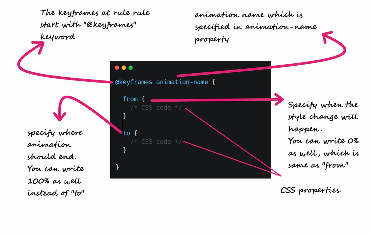
Let& #39;s understand the keyframes syntax first (See attached image)
Confusing? Don& #39;t worry! Let& #39;s move further everything will be crystal clear
{ 4 / 19 }
Confusing? Don& #39;t worry! Let& #39;s move further everything will be crystal clear
{ 4 / 19 }
animation property is used to bind keyframes with a particular element
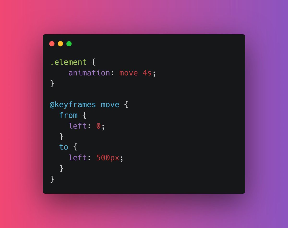
For example, suppose I want to move my element 500px left in four seconds. It& #39;s very easy (check video in next tweet)
{ 5 / 19 }
For example, suppose I want to move my element 500px left in four seconds. It& #39;s very easy (check video in next tweet)
{ 5 / 19 }
The output of the above code
Play with code here https://codepen.io/prathamkumar/pen/OJbvOoZ
{">https://codepen.io/prathamku... 6 / 19 }
Play with code here https://codepen.io/prathamkumar/pen/OJbvOoZ
{">https://codepen.io/prathamku... 6 / 19 }
Alright moving further, we can also pass percentage in keyframes rule and make some amazing animations
For example, suppose I want on change the background-color of an element
{ 7 / 19 }
For example, suppose I want on change the background-color of an element
{ 7 / 19 }
One thing you might noticed here is that I& #39;m using animation property only and passing multiple values in that. Like
animation: move 4s;
This is because animation is a shorthanf for setting all animation properties
{ 8 / 19 }
animation: move 4s;
This is because animation is a shorthanf for setting all animation properties
{ 8 / 19 }
You can also specify the delay in your animation using animation delay property.
It specifies a delay before the start of an animation
{ 9 / 19 }
It specifies a delay before the start of an animation
{ 9 / 19 }
So far we have noticed that our animation only happens only once.
This is becuase we haven& #39;t applied the animation-iteration-count property
It specifies the number of times an animation should run.
For ex, animation-iteration-count: 5
(You can also pass infinite)
{10 / 19}
This is becuase we haven& #39;t applied the animation-iteration-count property
It specifies the number of times an animation should run.
For ex, animation-iteration-count: 5
(You can also pass infinite)
{10 / 19}
Creating a smooth animation is important and we have
animation-timing-function property for that.
This property specifies the speed curve of an animation. There are many functions that you can pass in this
{ 11 / 19 }
animation-timing-function property for that.
This property specifies the speed curve of an animation. There are many functions that you can pass in this
{ 11 / 19 }
You can pass following values in animation-timing function
- ease (slow start, then fast, then slow)
- linear (same speed)
- ease-in (slow start)
- ease-out (slow end)
- ease-in-out (slow start and slow end)
- cubic-bezier (customizable)
{ 12 / 19 }
- ease (slow start, then fast, then slow)
- linear (same speed)
- ease-in (slow start)
- ease-out (slow end)
- ease-in-out (slow start and slow end)
- cubic-bezier (customizable)
{ 12 / 19 }
Check out this code and output for better understanding
https://codepen.io/prathamkumar/pen/OJbvOoZ
{">https://codepen.io/prathamku... 13 / 19 }
https://codepen.io/prathamkumar/pen/OJbvOoZ
{">https://codepen.io/prathamku... 13 / 19 }
One thing to note here is that animation do not affect element before or after the keyframes.
In order to persist the styling based on last or first keyframe, we have animation-fill-mode
{ 14 / 19 }
In order to persist the styling based on last or first keyframe, we have animation-fill-mode
{ 14 / 19 }
It accepts following value
- forwards (element will retain last keyframe styling)
- backwards (element will get the first keyframe value even in animation-delay period)
- both (both of the above)
{ 15 / 19 }
- forwards (element will retain last keyframe styling)
- backwards (element will get the first keyframe value even in animation-delay period)
- both (both of the above)
{ 15 / 19 }
Let& #39;s play with animation-fill-mode
As you can blue box stopped at left: 500px becuase forwards is begin applied on it
And orange box has black background even it& #39;s in a delay period of 2 seconds
Check code for better understanding
https://codepen.io/prathamkumar/pen/OJbvOoZ
{">https://codepen.io/prathamku... 16 / 19 }
As you can blue box stopped at left: 500px becuase forwards is begin applied on it
And orange box has black background even it& #39;s in a delay period of 2 seconds
Check code for better understanding
https://codepen.io/prathamkumar/pen/OJbvOoZ
{">https://codepen.io/prathamku... 16 / 19 }
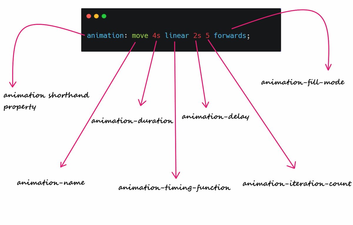
Instead for using different animation properties you can use shorthand "animation" only
For example https://abs.twimg.com/emoji/v2/... draggable="false" alt="👇🏻" title="Rückhand Zeigefinger nach unten (heller Hautton)" aria-label="Emoji: Rückhand Zeigefinger nach unten (heller Hautton)">
{ 17 / 19 }
For example
{ 17 / 19 }
This may seems little tough initially but practice of 2 - 3 days can make it easier.
Play around with code and try to write code by your own. This will definitely help you
https://codepen.io/prathamkumar/pen/OJbvOoZ
{">https://codepen.io/prathamku... 18 / 19 }
Play around with code and try to write code by your own. This will definitely help you
https://codepen.io/prathamkumar/pen/OJbvOoZ
{">https://codepen.io/prathamku... 18 / 19 }
This is pretty much it I guess. I hope you get some knowledge from this thread.
If you like it, share this thread with your connections, it means a lot to me https://abs.twimg.com/emoji/v2/... draggable="false" alt="❤️" title="Rotes Herz" aria-label="Emoji: Rotes Herz">
And thank for reading it https://abs.twimg.com/emoji/v2/... draggable="false" alt="😄" title="Lächelndes Gesicht mit geöffnetem Mund und lächelnden Augen" aria-label="Emoji: Lächelndes Gesicht mit geöffnetem Mund und lächelnden Augen">
*** END ***
If you like it, share this thread with your connections, it means a lot to me
And thank for reading it
*** END ***

 Read on Twitter
 Thread https://abs.twimg.com/emoji/v2/... draggable="false" alt="🧵" title="Thread" aria-label="Emoji: Thread">" title="A quick start guide to CSS animations https://abs.twimg.com/emoji/v2/... draggable="false" alt="👇🏻" title="Rückhand Zeigefinger nach unten (heller Hautton)" aria-label="Emoji: Rückhand Zeigefinger nach unten (heller Hautton)"> Thread https://abs.twimg.com/emoji/v2/... draggable="false" alt="🧵" title="Thread" aria-label="Emoji: Thread">" class="img-responsive" style="max-width:100%;"/>


 { 17 / 19 }" title="Instead for using different animation properties you can use shorthand "animation" only For example https://abs.twimg.com/emoji/v2/... draggable="false" alt="👇🏻" title="Rückhand Zeigefinger nach unten (heller Hautton)" aria-label="Emoji: Rückhand Zeigefinger nach unten (heller Hautton)"> { 17 / 19 }" class="img-responsive" style="max-width:100%;"/>


