And I& #39;ll do just that! This is gonna be brief.
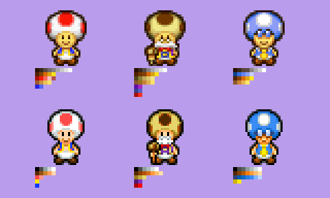
As expected, PiT Toads are more detailed than in BIS. Though, I don& #39;t understand what& #39;s going on with BIS Toadbert; he has so many shades of blue. Those darker shades don& #39;t contrast well, so I don& #39;t know why they bothered. https://twitter.com/Rifter8Rocks/status/1352900207952809986">https://twitter.com/Rifter8Ro...
As expected, PiT Toads are more detailed than in BIS. Though, I don& #39;t understand what& #39;s going on with BIS Toadbert; he has so many shades of blue. Those darker shades don& #39;t contrast well, so I don& #39;t know why they bothered. https://twitter.com/Rifter8Rocks/status/1352900207952809986">https://twitter.com/Rifter8Ro...
The most noticeable difference for me is the detailing of the heads. The anti-aliasing of the spots in PiT frankly does a better job of blending colors than BIS, which is borderline non-existent. PiT Toadbert does have some weird use of banding on his spots, though.
And if I& #39;m being honest, Toadsworth looks a lot better in PiT. I dunno, he seems more polished than his BIS counterpart. The latter doesn& #39;t look bad, but some details like his spots and glasses doesn& #39;t read as well as PiT. It& #39;s hard to notice on a small screen, but still.
Otherwise, BIS Toads are a little slimmer, have simpler detail all around, and... that& #39;s about it.
Yeah, there isn& #39;t much to say. I think Toads look better in PiT, but I understand why they reduce the detail in BiS; again, it& #39;s hard to notice on a small screen.
Yeah, there isn& #39;t much to say. I think Toads look better in PiT, but I understand why they reduce the detail in BiS; again, it& #39;s hard to notice on a small screen.
Next time, I& #39;ll cover some random enemies that appear in both games. See ya.

 Read on Twitter


