Interesting thread on what academics can take away from FiveThirtyEight viz. I& #39;ve learned SO MUCH about viz from our amazing team. Some of the lessons that stuck with me: https://twitter.com/Kunkakom/status/1341062966397923328">https://twitter.com/Kunkakom/...
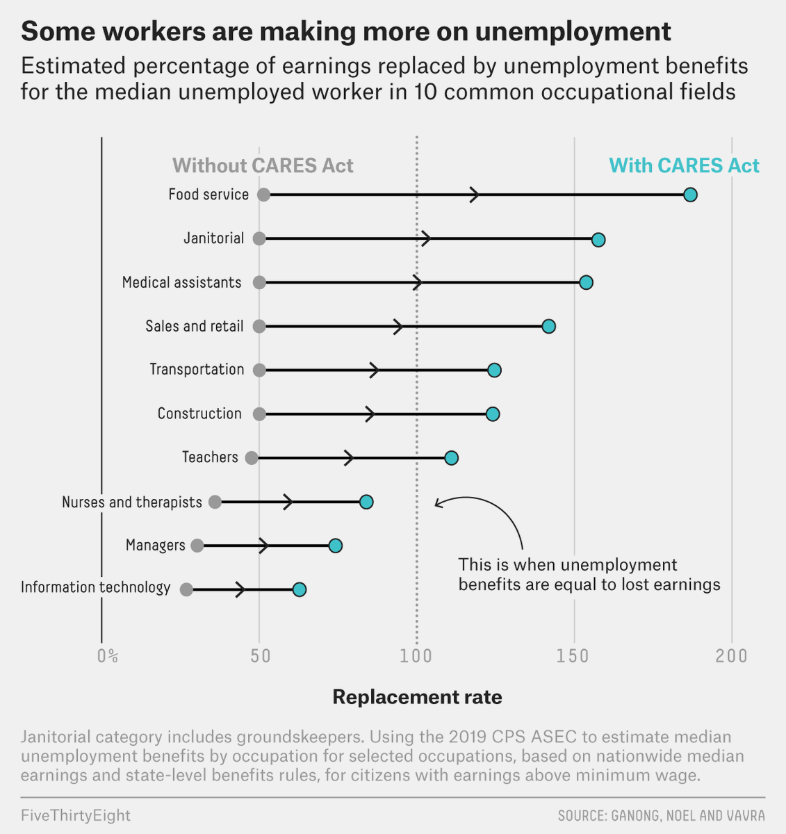
1. We generally try to ensure that charts can stand alone, e.g. if they get circulated without the article they& #39;re in. This means writing meaningful headlines and subheads (and footnotes), but it also means trying to explain the takeaway on the chart itself.
This often means more text on the chart itself: here, the lines are labeled directly, the key (with/without CARES Act) is on the chart and uses color, arrows show direction of change, and a label explains a baseline of sorts. Result: a complicated concept becomes more digestible.
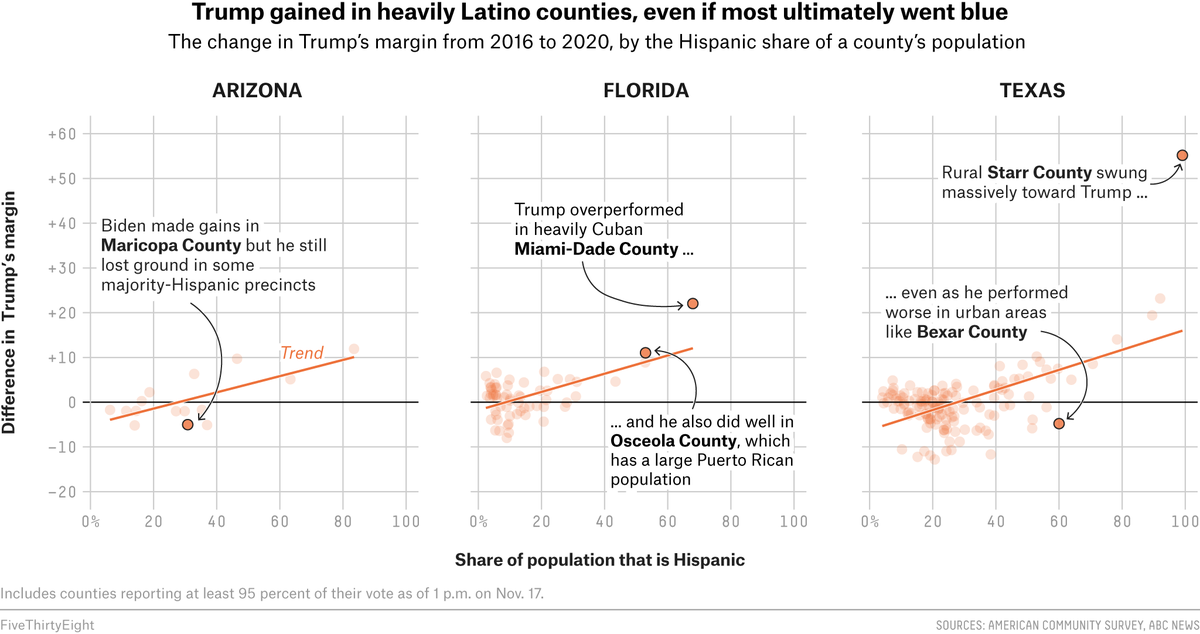
2. I have become a huge appreciator of labels directly on charts; they let you draw attention to where you want it to go, and explain what& #39;s interesting even if it& #39;s not super straightforward.
Labelling also lets you do two things simultaneously: show a trend, and explain/provide context for outliers.
(Yes, I know labelling in R is kind of annoying. It really does help, though!)
(Yes, I know labelling in R is kind of annoying. It really does help, though!)
3. Another trick I learned: labeling axes by explaining what each direction means, with arrows, rather than using the context. e.g. here, using "more liberal" and "more conservative" rather than the less useful "ideology".
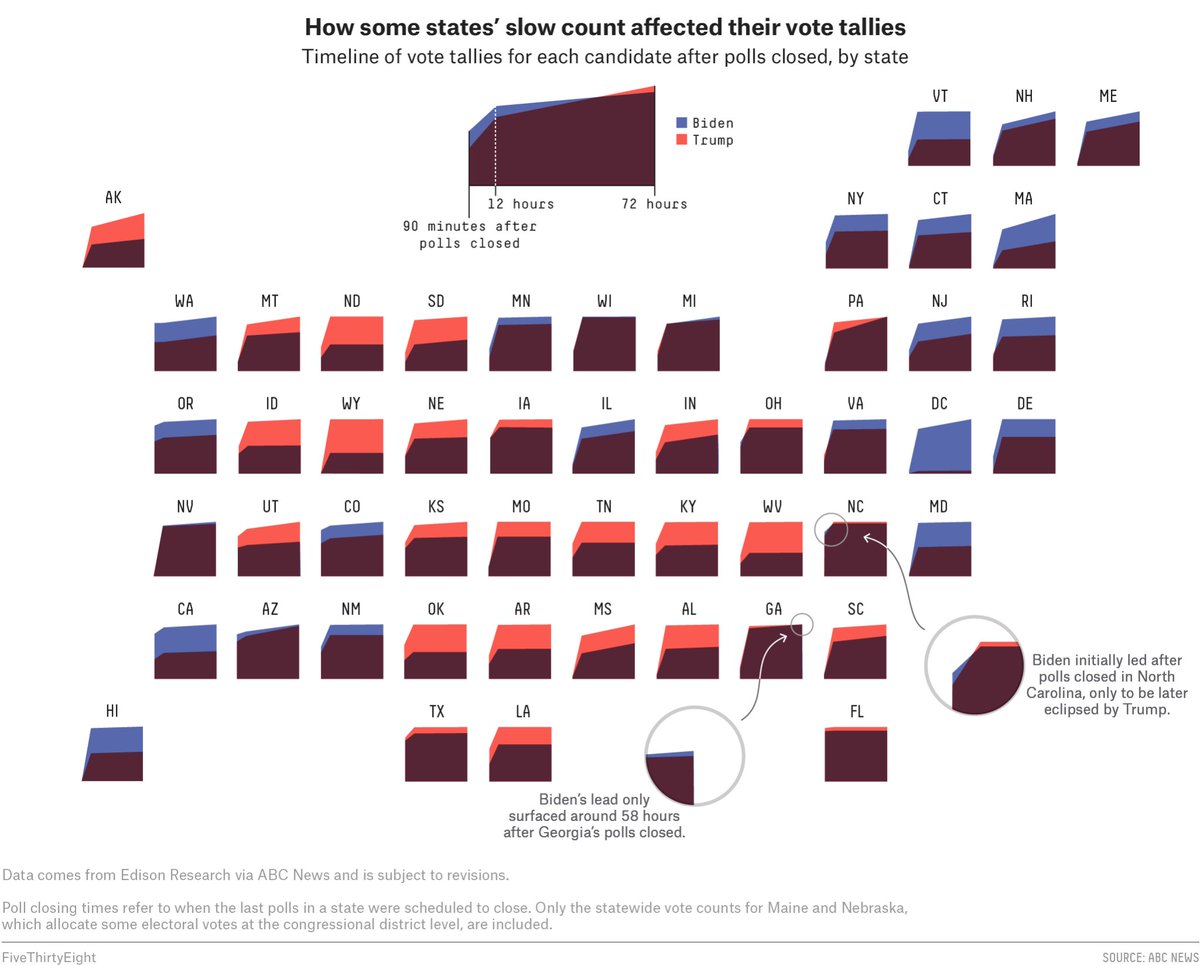
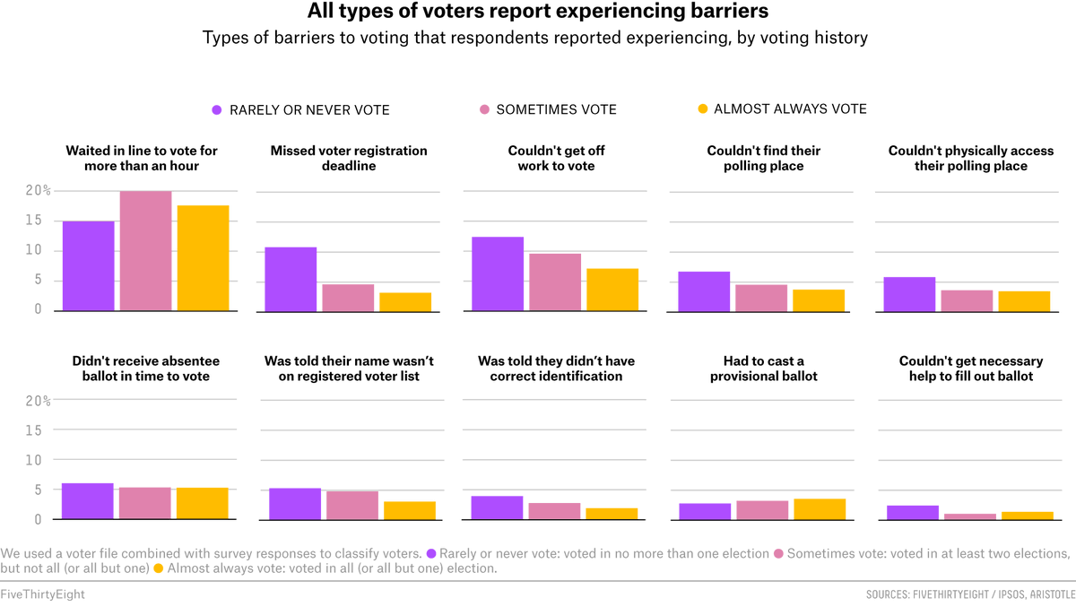
4. If you have small multiples, sort them! If it& #39;s not chronological, sort by the value you& #39;re interested in.
Not sure how useful this is for academia, but I definitely wish I& #39;d known some of them back in the day! I should say I& #39;m obviously not a viz person... I hope I haven& #39;t said anything the brilliant @juruwolfe @wiederkehra @jazzmyth @ryanabest @elena___mejia would disagree with!

 Read on Twitter


