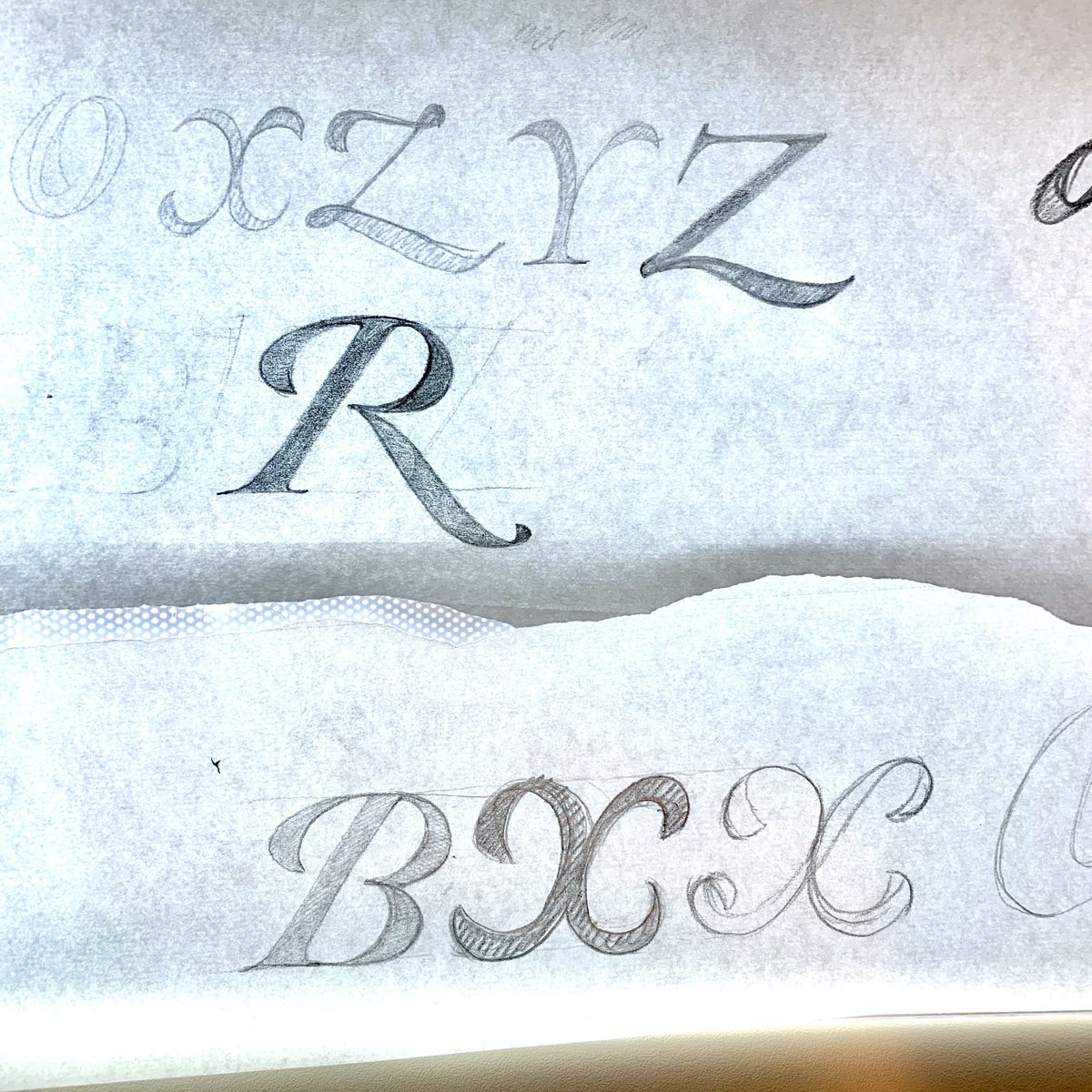
An afternoon well spent. Pilcrow and section. Not sure if they are going together all that well yet. But it& #39;s a start.
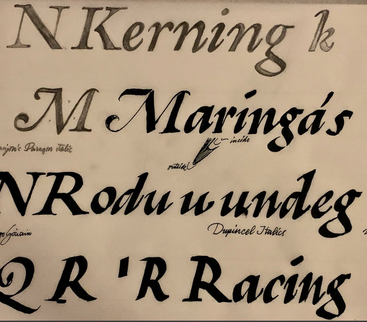
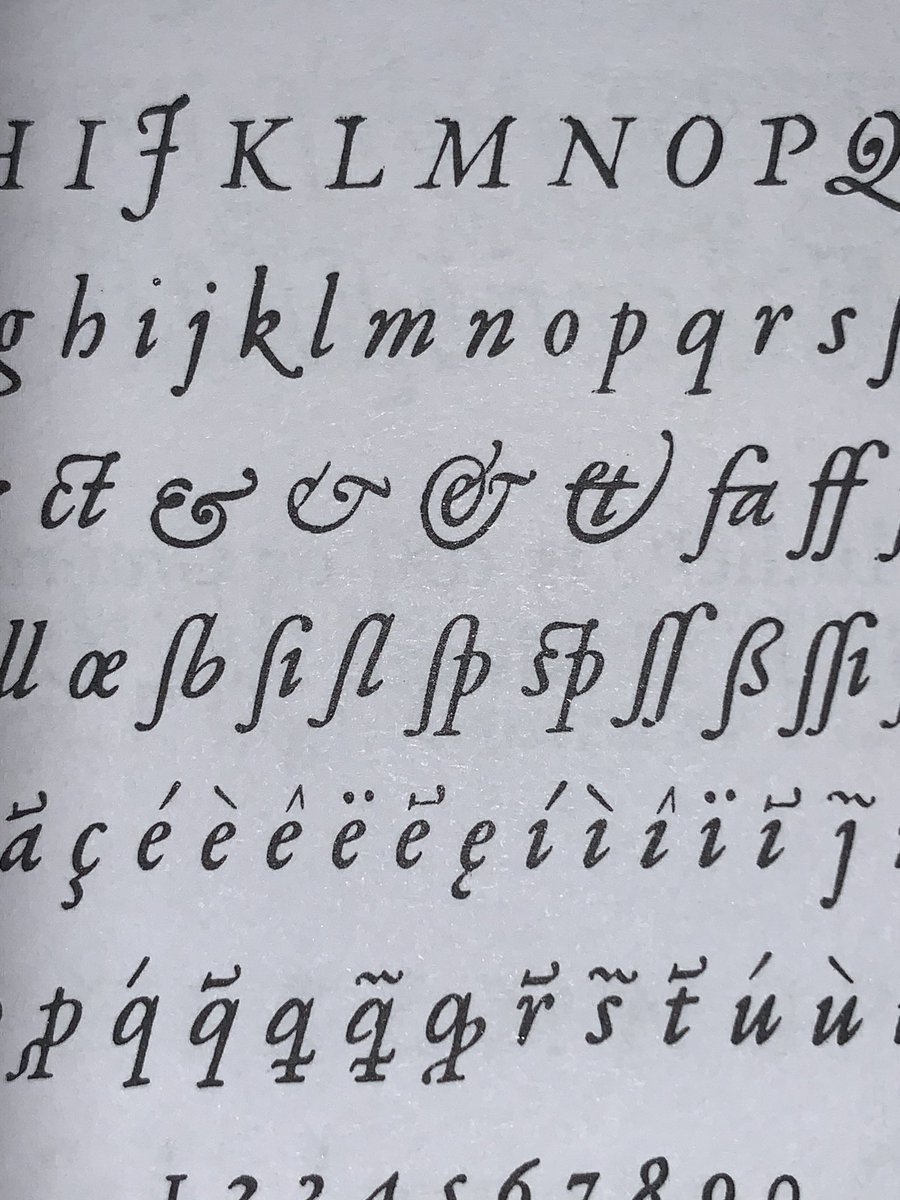
I am looking at Vervliet& #39;s compilation of French Renaissance type (most of it seems to come from the Plantin Moretus collection) and drawing it, sometimes from very small specimen. Also a bit of broad nib calligraphy (if you can call it that) to get a sense of the real thing.
I& #39;m currently wondering about the entry/exit strokes in the lc n, for example. The angles in those vary quite a bit from size to size. Since I& #39;m making an optical size axis, I need to decide what to do when they go from small to large.
http://www.bibsoc.org.uk/publications/vervliet_printing_types">https://www.bibsoc.org.uk/publicati... - This is the book.
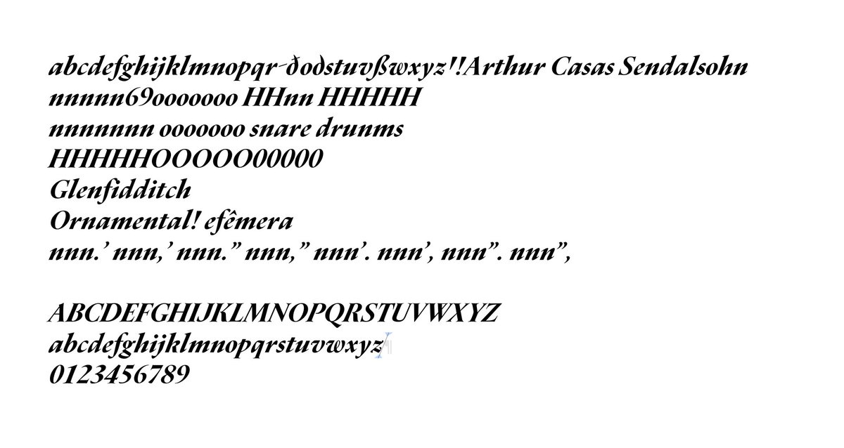
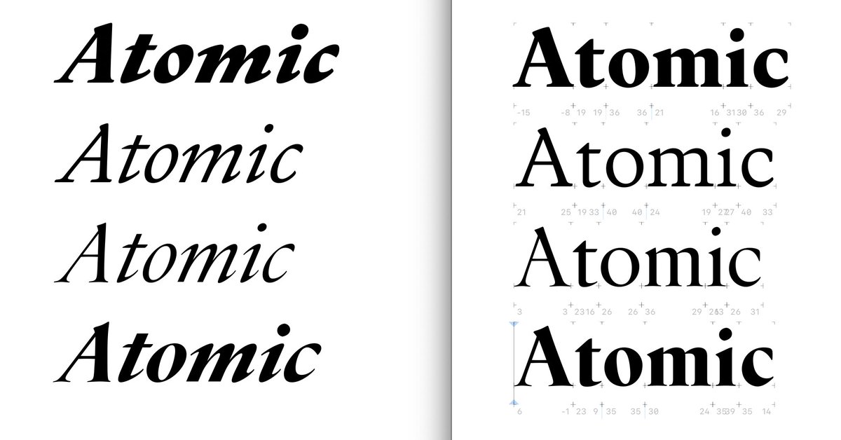
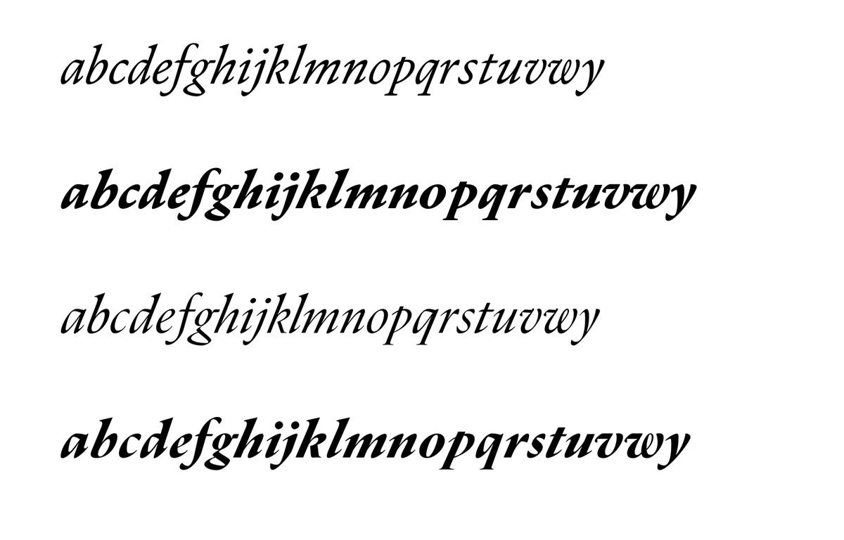
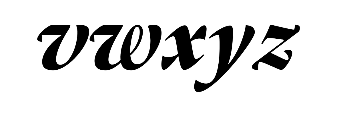
A quick and dirty screenshot on how the italic is shaping up in #DuPincel. I particularly like the way the lc g and vwy are looking. There are many counter and stem weight adjustments still, even angles (see u in the first line, w in the third.
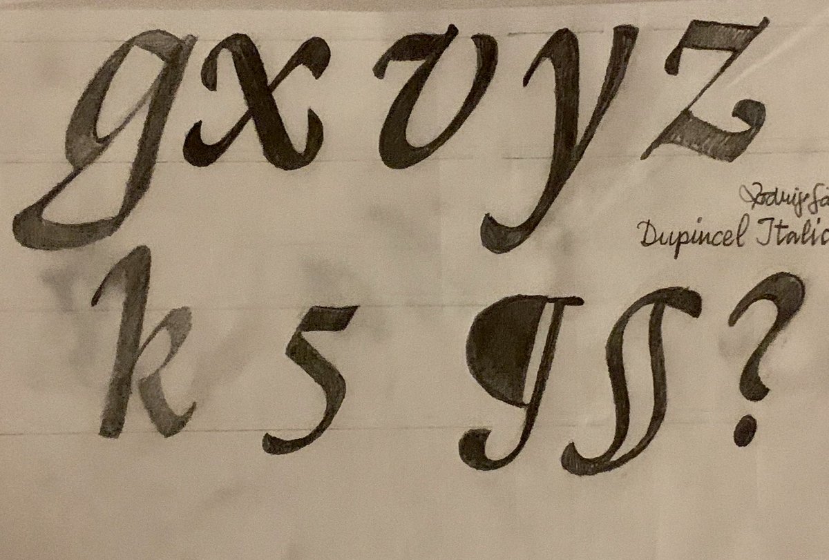
Also, the shape of the lc b changed quite a bit from the first version from an inverted a to a more circular bottom left shape. Lowercase k also a big change, from having an n like terminal to ending a little bit more like the roman counterpart.
lc s has been a tricky one to tackle - this is the regular /display extreme. It has become way more angled, maybe now it& #39;s falling a little to the right. As Mathew Carter once said, having more type experience makes you figure out quicker where you screwed up and fix it faster.
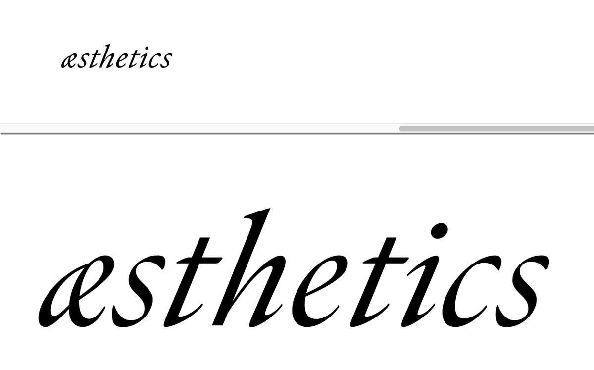
So here are some updates on Dupincel Italics - I found this beautiful æ on the Vervliet book - not sure how readable it is, but I think it& #39;s shipping :)
Started playing with swashes, but there are small caps to attack first. I might release the fonts in the model of In-progress work (like Future Fonts) because adding these very important features require some sort of incentive (for me at least) be it people digging it or cash.
I liked how these came together. It always feel like it& #39;s my first time spacing with these italics. Spacing between UC Hs proved useful on the romans, but not on the italics so I ditched that.
This is Dupincel Medium Italic (Medium meaning between Optical and Display) not sure how to name it just yet. The eszett was done today as well. I need to give them some breathing time so that I come back to it with fresh eyes. n/m/u feel a bit dark overall.
Ligatures are also in the works - I want to find the bullet proof way to handle them so that it& #39;s easy to manage. So far I have some wacky components. Not super neat to treat them. In this paragraph sample, old style figures, which are currently only slanted from the romans.
Listening to @flaviazim at http://twitch.tv/pixotosco ">https://twitch.tv/pixotosco... (in Portuguese) and drawing the Swash Q.
For some obscure reason only Freud will explain, I always end up using Quentin Tarantino& #39;s name in testing fonts :)
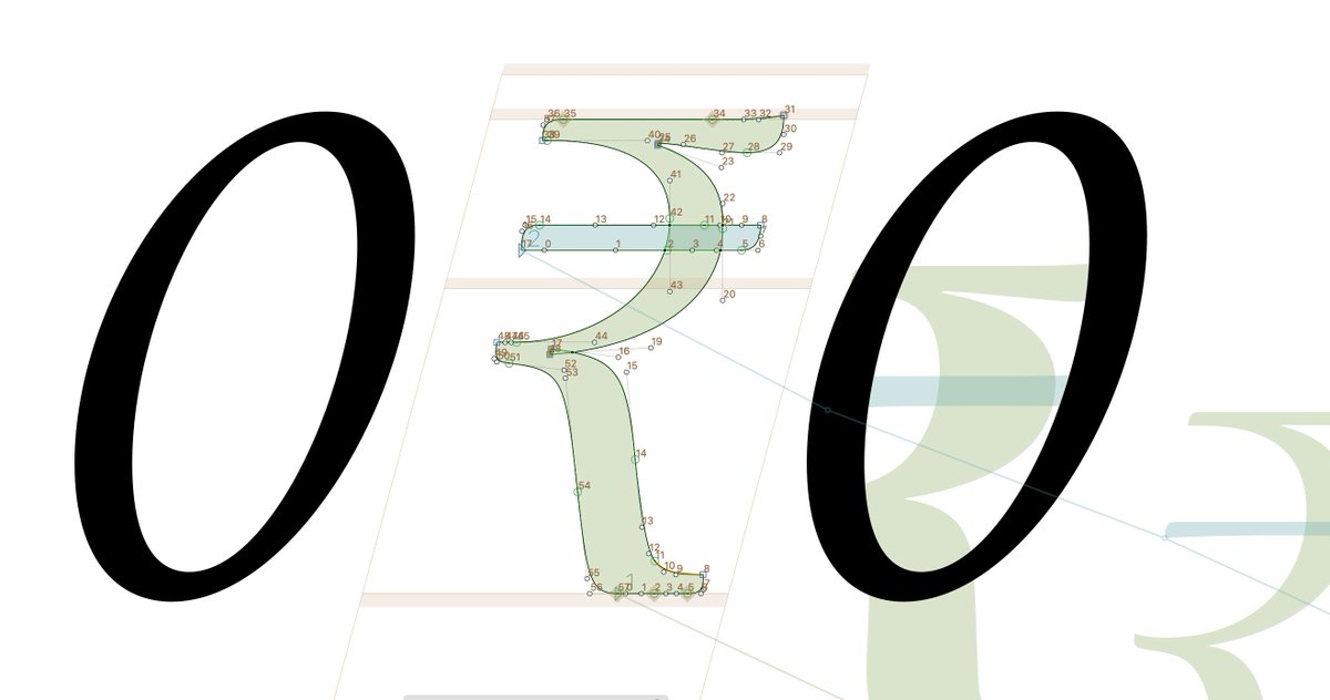
Lesson learned of the day. A handy way of finding out where the f*ck is the master compatibility problem is showing each node& #39;s index number. View > show node indexes. 10 years to learn this - hope you make good use of the hours I am helping you not waste.
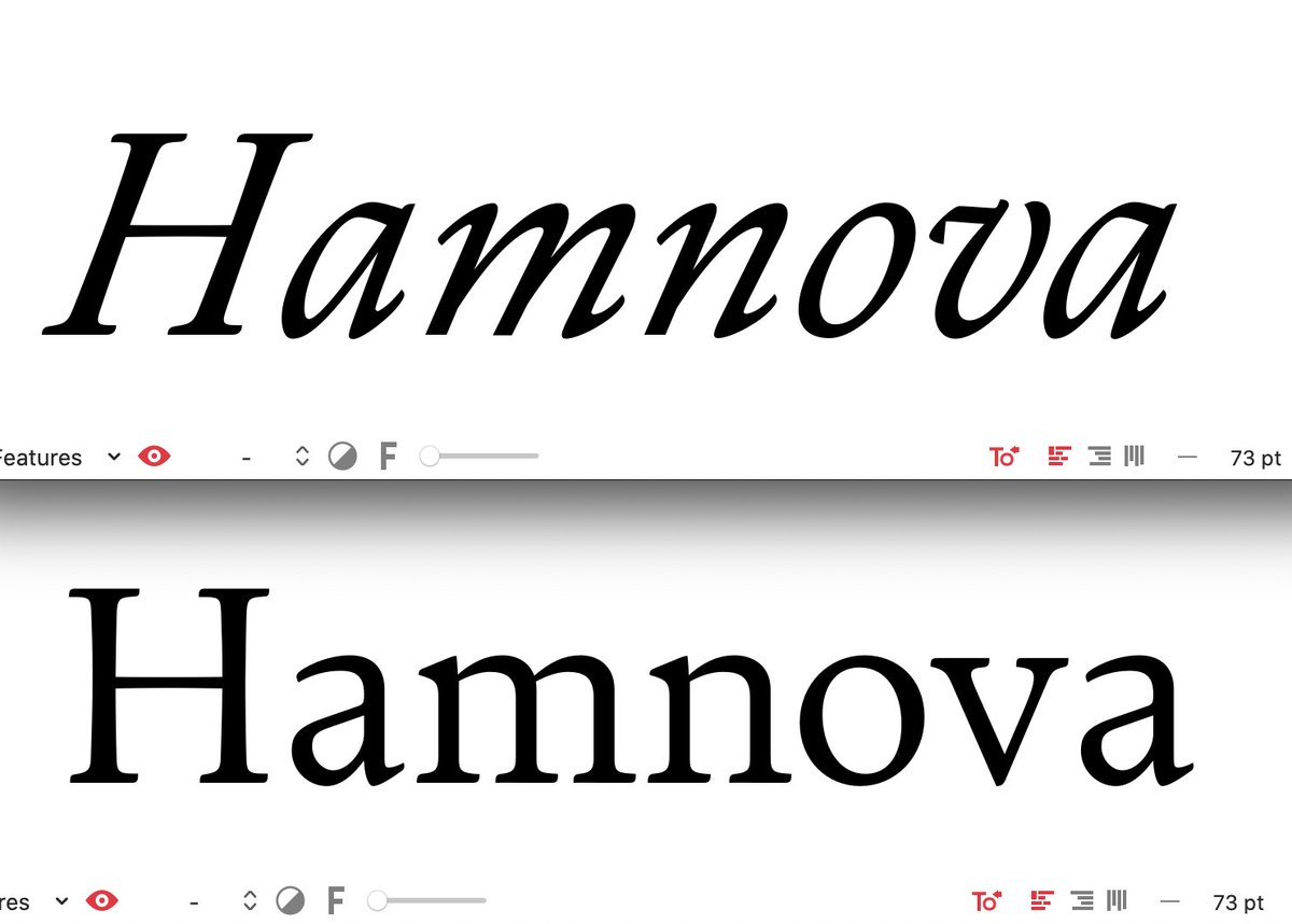
And with the minutes I saved today from that discovery, this is the first pass of the second version of an italic ampersand. Looking at Vervliet& #39;s book and designing directly in Glyphs (no sketch). The weight distribution is off from my reference so I& #39;ll tweak…
This is not quite the reference but let’s just drool together on these ampersands.  https://abs.twimg.com/emoji/v2/... draggable="false" alt="🤤" title="Sabberndes Gesicht" aria-label="Emoji: Sabberndes Gesicht">
It& #39;s been too long. I have gone back and forth many times in these italics, between angles, angle differences, spacing, kerning, then back to a different spacing approach and back again for the original approach. Sometimes it just feels like too much.
Having @fermello78 and @JillPichotta pick some basic things apart just by looking at screenshots helped me immensely. Tip of the day: share your work often with people who know more than you do.
Thank you both!
Thank you both!
After some tweaking of angles and respacing, I exported a new variable version and started evaluating in @abcdinamo Darkroom, a great tool to check var fonts: https://dinamodarkroom.com/gauntlet/ .">https://dinamodarkroom.com/gauntlet/... Here is a screen recording of the optical/weight axis in play.
Kerning Strings, 2021. Figures are proportional and ever since seeing COVID-19 all over the news in Globotipo with spacing issues, I include the word in my strings when using proportional figures. +1 for fi ligature in Pfizer.
Go Vaccines!
Go Vaccines!
And yes, COVID-19, not Covid-19. Sorry!
So next up: Small Caps. Love to use them, have a harder time designing them. I mean, shorter capitals. I have spent a long time designing the regular capitals already. Still they are truly useful for such a typeface. So here we go.
Plus: it& #39;s not like it& #39;s ever done, but I think kerning is at a good stage for now. So let& #39;s focus on the small caps and let the kerning brain sit for a while. Back later with more kerning, of course.
Ok ok. After a lot of tweaking and with the invaluable help of @rmxtools , things are falling into place with Dupincel& #39;s small caps. Just paused spacing/tweaking for now. Will do the same for the italics next and then kerning.
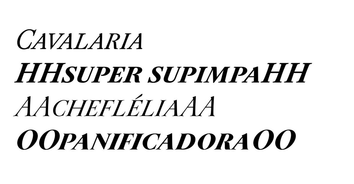
This is the italics small caps. I was surprised and in slight panic to see just how much lighter I drew the small heavy version. It might be necessary to extrapolate and then cleanup unless I judge the weight difference to be ok in context. Italics are usually lighter then romans
Setting up some copy with Dupincel. It took me some back and forth to make the variable fonts work as intended with two different files and also to style link all 30 different instances for the OpenType version. The italic slope is quite rad…
I wonder if I should make the small optical size slope less steep and have it become increasingly "fast" in display sizes. Until I have some spare time to test it, it stays as is. Of course, this would set the project back another couple of weeks or more if something comes up :)
Quick thumbnail sketch of the swash M, with shy top left swirl. Fixed in vector. This is about 2 cm tall. Loved the vellum texture.
Just opened the first file I have for Dupincel named Sumner Stone Exercicio RS 2015.10.15.glyphs. As I said, this typeface started as a letter M and a letter R in @sthoths workshop at @ATypI way back in 2015.
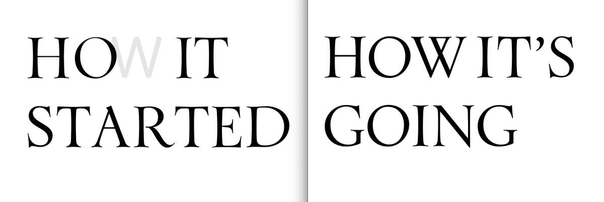
How It& #39;s Started………………………How It& #39;s going
How It& #39;s Started………………………How It& #39;s going
And this is the first sketch to vector digitization of the typeface. In the middle of the process I decided to make the fine details a little different than my first sketches.
How do you prefer the default figures in a font?
Thanks for the answers! And here& #39;s to start the week with a new R swash.
These is it so far for swashes. There are great examples of swashes in Vervliet& #39;s book as well as the first memory I have of these swashes which is Adobe Caslon Pro. More important than making it perfect, it& #39;s just starting them fast so I can fix it soon.
Notice the F/T finishes. I started super soft and then decided to take a more radical approach starting from those. Now another pass at N, M and the such to reshape the endings. Q a bit heavy and spacing is not even close. But it’s going to make me proud once I figure these out.
G, H, I, J, L, U, V, W are not done yet.
So. Much. Tweaking. These past weeks I have been almost exclusively dedicated to this typeface. The problem with this is that I am getting better at this, which means I spot errors in my early decisions. Right now it& #39;s the shape of italic a/d that& #39;s bothering me. Moving target.
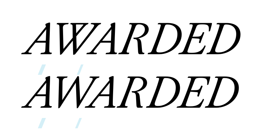
Kerning/shaping this pair has been odd as well. I decided that optical size W should be simple and Large one a double V. Time consuming decision. Had to respace/reshape the simpler one so many times and might have to kern them as separate letters, because look.
I have been crazy about how computery some of the italics looked but designing the swashes provided yet another opportunity for revision. Also time consuming decision: trying to make very detailed serif terminals in the large sizes.
Letters a/b/q/d/o told me they were looking odd. It& #39;s crazy how long it took me to tend to them. The counters in a/o felt like they didn& #39;t belong together at all. Now they do. It helped flipping other letters, looking at other references and just taking a deep breath.
Might be looking terrible tomorrow, but right now, 1:34 am it feels like I have changed belts in the serif italic type design jiu-jitsu. OSS
Found an early sloppy sketch of the italics in @Procreate. The c remains very much in line with this. The diamond shape dieresis… uhmmm… maybe. And update: I still like what I did 1:34 am.
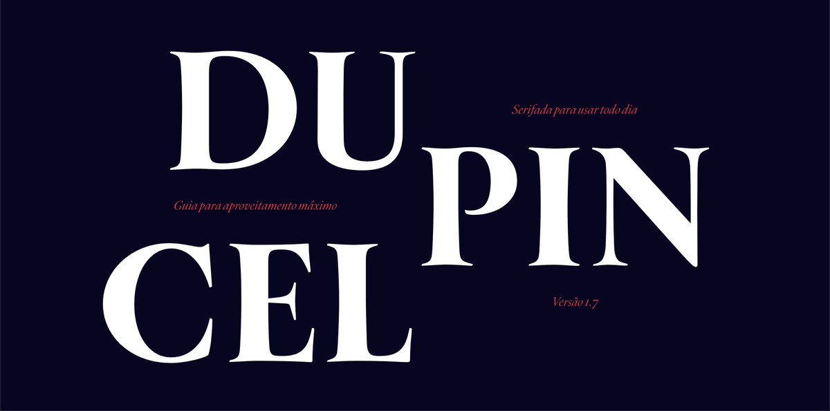
Using @figmadesign to prototype Dupincel& #39;s hotsite, I reached Font Separation Nirvana. With a hot tip from @mekkablue I split Small/Medium/Large optical sizes in 3 different width classes and everything works quite nicely. Figma separates italics from romans in a neat way as well
I want the typeface to speak to non-type initiated people. Hence the website will be pretty much a manual for lay people to use the most advanced features of an editorial-ready typeface. It will be all in Portuguese to start. Again, my core audience for now.
Downside of @figmadesign: NO VARIABLE SUPPORT YET. Upside: no type cache to purge on new font export.
Decided to add weight to the heavier small italic master. What a nightmare. Process is add new extrapolated instance as master, then smart component glyphs get messed up - clean up. Also a lot of inflections cleanup as well. Just one of those days where you sigh.
On the other hand, started coding the page to showcase it, all while tweaking every little detail that stood out. Again, very important to use it and get in the font user mood. Incredible how you become more demanding :)

 Read on Twitter





 " title="This is not quite the reference but let’s just drool together on these ampersands. https://abs.twimg.com/emoji/v2/... draggable="false" alt="🤤" title="Sabberndes Gesicht" aria-label="Emoji: Sabberndes Gesicht">" class="img-responsive" style="max-width:100%;"/>
