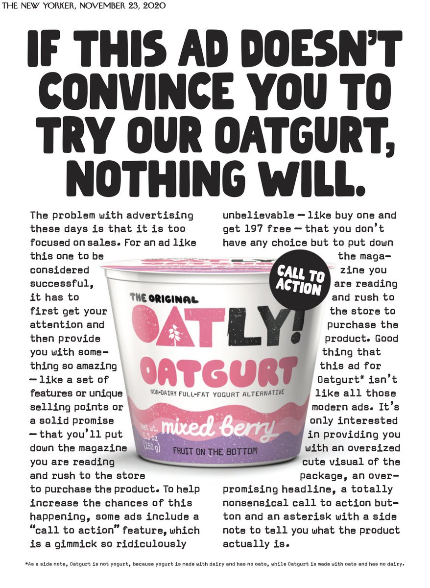
Been seeing ads for Oatly and I love how different they look, in print, and literally pop out to grab attention. The one in The New Yorker is an amusingly self-referential and self-aware ad that seems more like a commentary on present-day advertising and less like one that 1/4
2/4 is intended to sell oats or yogurt or a curious combination of both :) I noticed the fine print below first even before the headline (that& #39;s just me!) and realized as I finished reading the body copy that they have & #39;taken care& #39; to add context about it too - it& #39;s not an
3/4 after-thought, but as an integral part of the gag!
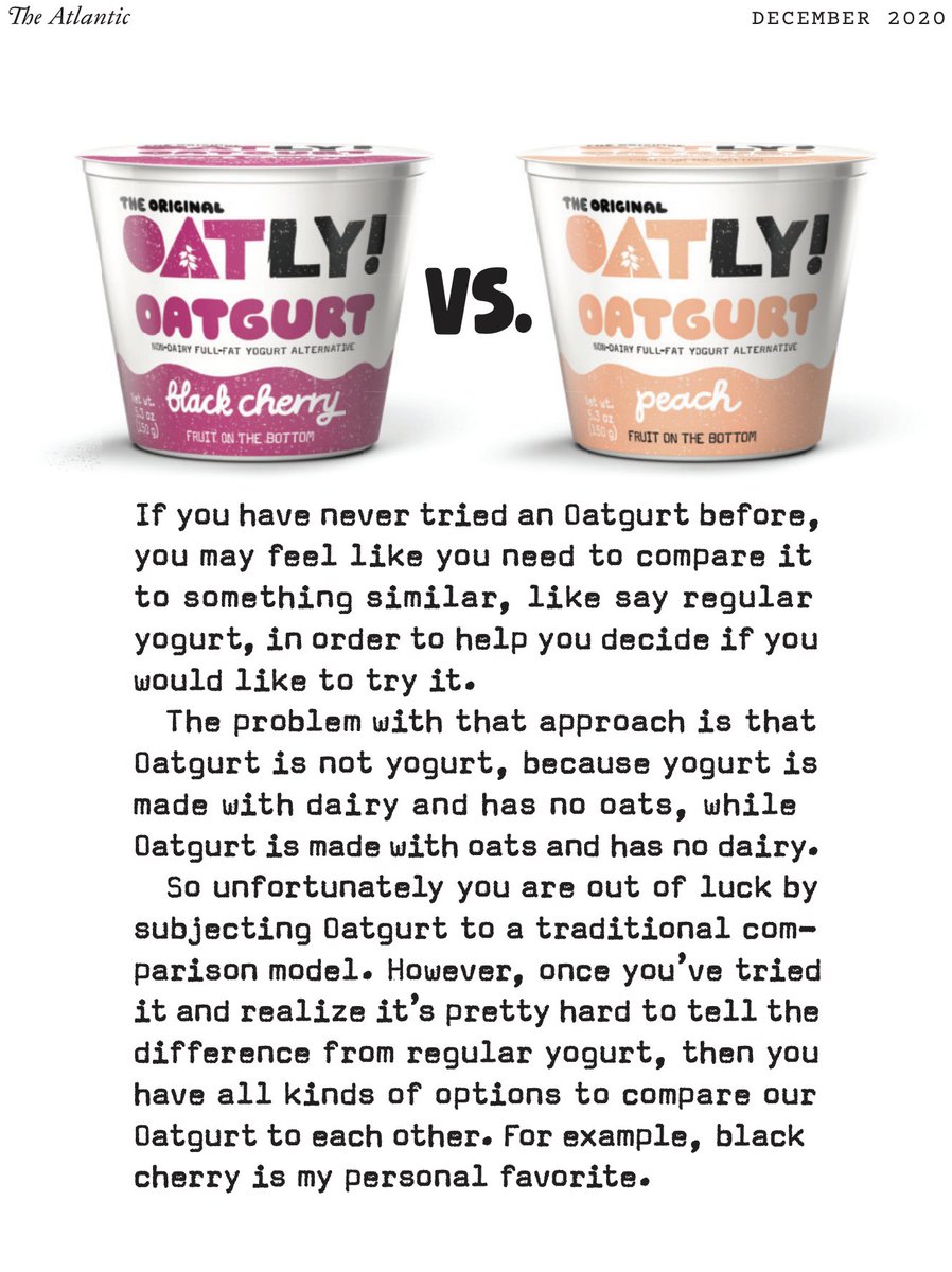
The one in Variety is interesting because of the way it is designed - no border, outline, logo placement in any corner - I added the magazine& #39;s name and date; else it was a blank page with 2 Oatly packs and a body of text!
The one in Variety is interesting because of the way it is designed - no border, outline, logo placement in any corner - I added the magazine& #39;s name and date; else it was a blank page with 2 Oatly packs and a body of text!

 Read on Twitter


