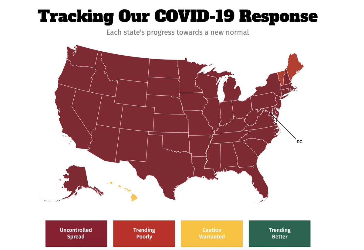
Green is trending better.
Yellow is caution warranted.
Red is going downhill.
Bruised red is uncontrolled spread.
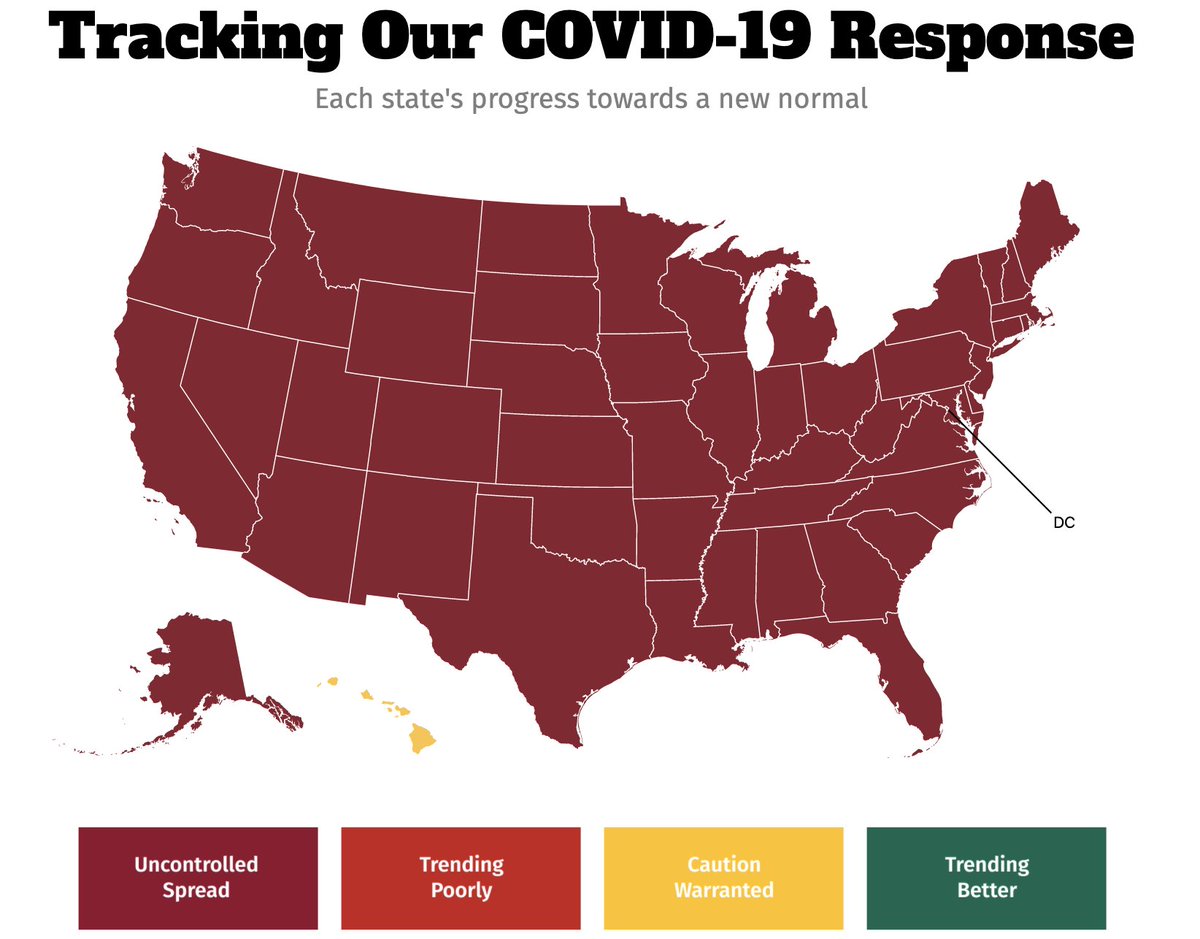
The ENTIRE country is blood red, save Hawaii.
Maybe skip that big family dinner this year, folks. Not even maybe -- skip it!
Maybe skip that big family dinner this year, folks. Not even maybe -- skip it!
Here& #39;s the U.S. one week ago vs today.
It actually got worse. I didn& #39;t think it was possible.
It actually got worse. I didn& #39;t think it was possible.
Louisiana, Vermont and New Mexico have seen the biggest spikes in positive COVID cases in the last 14 days.
Vermont has seen a 214% increase.
Vermont has seen a 214% increase.
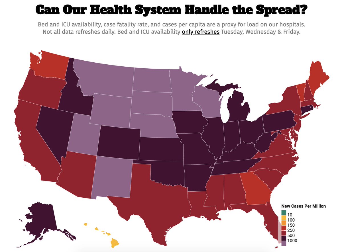
Another way of looking at this data: can our health care system handle this spread? This map uses bed and ICU availability, case fatality rate + cases per capita as a proxy for load on our hospitals.
Hospitals in the Midwest cannot handle what is happening right now.
Hospitals in the Midwest cannot handle what is happening right now.
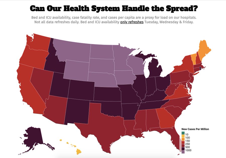
I noted last week that the lavender color on this map is new. It signifies more than 1,000 new cases per million.
The Covid Exit Strategy folks had to add a new color/category to reflect the degree of severity.
Last Monday vs today:
The Covid Exit Strategy folks had to add a new color/category to reflect the degree of severity.
Last Monday vs today:
I look through this data every week and try to find silver linings because my god we need some.
6 states (including D.C.) are doing a good job on testing: D.C., Maine, Hawaii, Massachusetts, New York and Vermont.
6 states (including D.C.) are doing a good job on testing: D.C., Maine, Hawaii, Massachusetts, New York and Vermont.
New Mexico looks like it& #39;s in the worst shape of any state. Look at its ICU capacity right now.
We haven& #39;t even dealt with the inevitable post-Thanksgiving coronavirus spread.
We haven& #39;t even dealt with the inevitable post-Thanksgiving coronavirus spread.
So... Happy Thanksgiving to all!

 Read on Twitter
 https://abs.twimg.com/emoji/v2/... draggable="false" alt="🚨" title="Polizeiautos mit drehendem Licht" aria-label="Emoji: Polizeiautos mit drehendem Licht"> Two days before Thanksgiving, here is today& #39;s snapshot of each state& #39;s progress in reducing COVID cases/hospitalizations/death, via http://covidexitstrategy.org Green is trending better.Yellow is caution warranted.Red is going downhill. Bruised red is uncontrolled spread." title="https://abs.twimg.com/emoji/v2/... draggable="false" alt="🚨" title="Polizeiautos mit drehendem Licht" aria-label="Emoji: Polizeiautos mit drehendem Licht">https://abs.twimg.com/emoji/v2/... draggable="false" alt="🚨" title="Polizeiautos mit drehendem Licht" aria-label="Emoji: Polizeiautos mit drehendem Licht"> Two days before Thanksgiving, here is today& #39;s snapshot of each state& #39;s progress in reducing COVID cases/hospitalizations/death, via http://covidexitstrategy.org Green is trending better.Yellow is caution warranted.Red is going downhill. Bruised red is uncontrolled spread." class="img-responsive" style="max-width:100%;"/>


