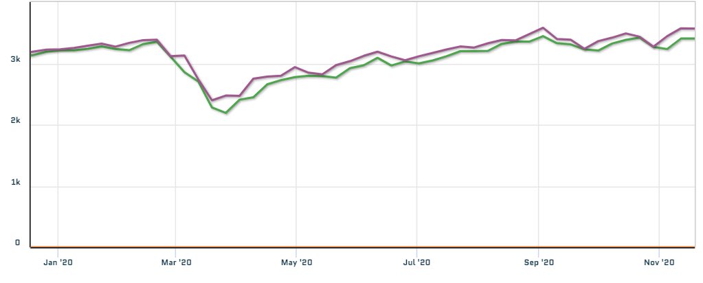
1/8 Thread. Price analysis on the S&P. I run regular models to capture liquidity gaps and have done a fair amount of work on estimating bid-ask spreads through low-frequency modeling. One of the spreads I look at regularly is the Weekly Close to Low gap. Here you can see 2020
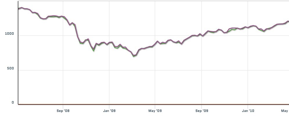
2/8 you can see the persistant gap between the Weekly Close and the Low. This spread is statistically an outlier in size and persistence. First, let’s look at what a bottoming processes and the start of a new bull market look like. I will use 2009 to illustrate.
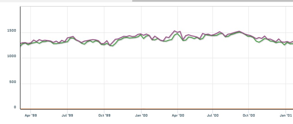
3/8 the spread is much more compressed. And consistent going into the bottom and out. Now let’s look at the single other period when the clustering showed similarity to the current spread. The only period that compares is 1999-2000
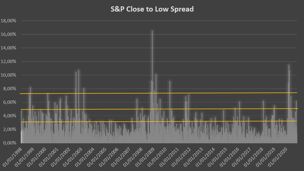
4/8 so what does Close-to-Low spread looks like on a long horizon? Well 2020 belongs to a pedigree of years where observations above 2STD are >= 5. It is in the company of 1998, 2000, 2008, 2009 and 2011
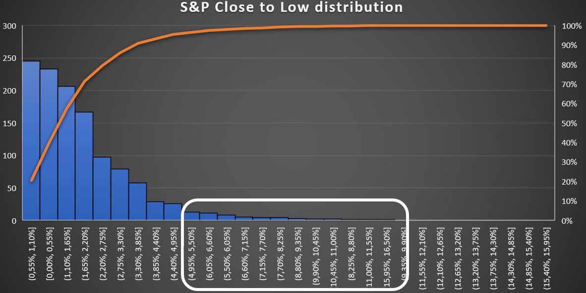
5/8 this is the distribution for illustration. I highlighted where the observations relating to the years in question lie within the sample.
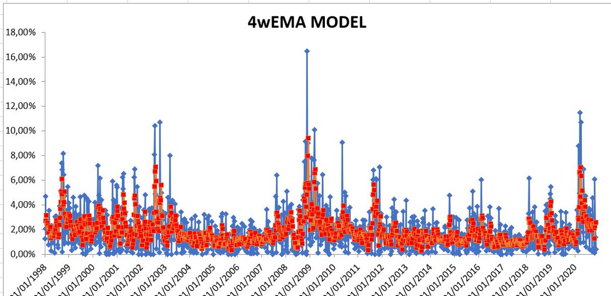
6/8 following chart shows the 4wEMA of the Close-Low spread (blue) vs a predicted model output based on normalized volatility (red). When the spread of the 4wEMA diverges in this way and the divergence clusters it’s a definite red flag. 4wEMA rising is in and by itself a warning
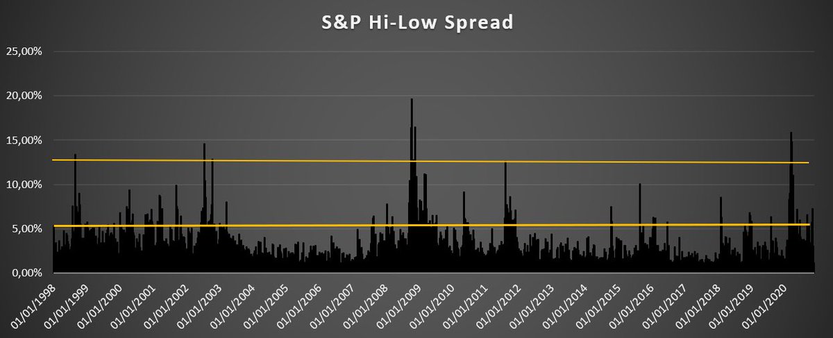
7/8 for illustration, here is the High to Low spread. Without going into the same level of granularity, suffice it to say that all the tests and models yield the same conclusions.

 Read on Twitter