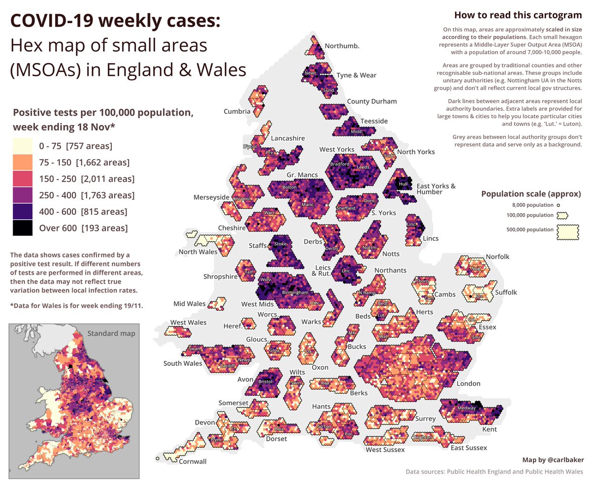
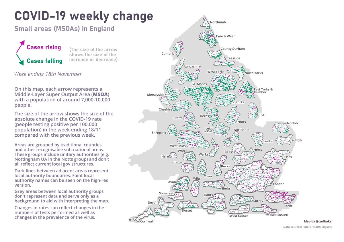
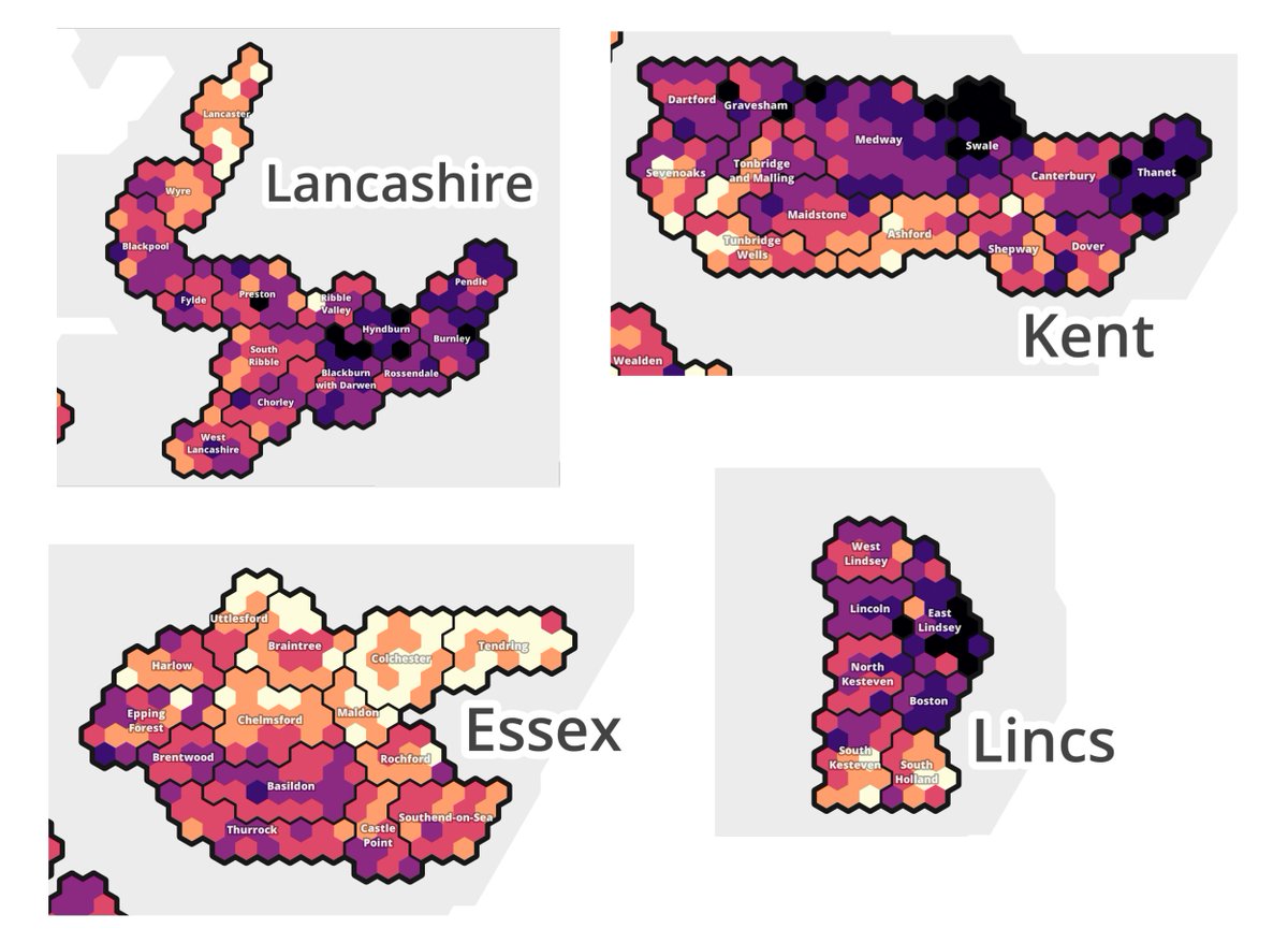
This week& #39;s small-area COVID-19 cartograms: which areas had the highest case rates (left)? And where were the biggest rises and falls (right)?
Each hexagon⬢ represents an MSOA with a population of around 7k-10k. Areas are grouped into counties etc. Data for week ending 18/11.
Each hexagon⬢ represents an MSOA with a population of around 7k-10k. Areas are grouped into counties etc. Data for week ending 18/11.
You can view or download a high-res version of the & #39;change arrows& #39; MSOA cartogram here - it also has local authority labels for easy navigation. https://drive.google.com/file/d/1Rm9BgAIc452nkRrUAt01cji61OlneJtk/view?usp=sharing">https://drive.google.com/file/d/1R...
There are a lot more green "falling arrows" than there were last week! https://twitter.com/carlbaker/status/1328371958057144321">https://twitter.com/carlbaker...

 Read on Twitter


