Corona-Context graph:
Deaths/year as a % of the population.
Either #SwedenWasRight to not engage in any shutdowns and the pro-Panic coalition was disastrously wrong, - OR - we should have done shutdowns about once every five years, approximately forever.
Deaths/year as a % of the population.
Either #SwedenWasRight to not engage in any shutdowns and the pro-Panic coalition was disastrously wrong, - OR - we should have done shutdowns about once every five years, approximately forever.
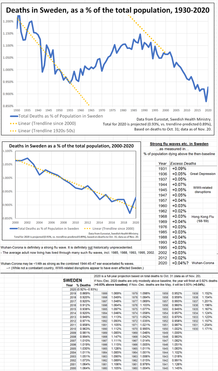
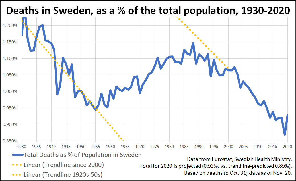
Deaths as % of population in Sweden, 1930-2020:
The death rate& #39;s long-term decline to the 1950s is associated with improved medicine. The rise after that is due to aging society.
The little spikes all along are flu waves, often. There are many; 2020 is one.
The death rate& #39;s long-term decline to the 1950s is associated with improved medicine. The rise after that is due to aging society.
The little spikes all along are flu waves, often. There are many; 2020 is one.
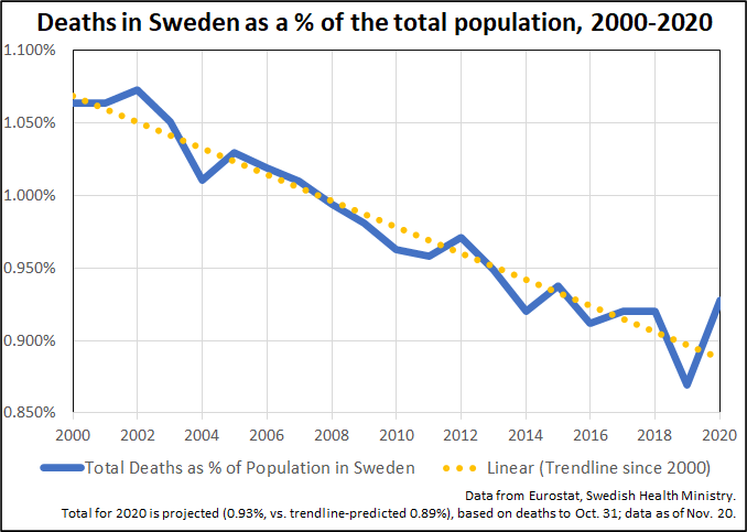
Deaths % in Sweden, 2000-2020:
The downtrend is due to (1) smaller birth cohorts in the late 1920s to mid-1940s and (2) the migrant policy of bringing in younger-age-range people less likely to die in near term.
In any case, we see some years above trendline, some below...
The downtrend is due to (1) smaller birth cohorts in the late 1920s to mid-1940s and (2) the migrant policy of bringing in younger-age-range people less likely to die in near term.
In any case, we see some years above trendline, some below...
Wuhan-Corona in 2020 puts deaths clearly above the baseline/trendline, but the longer graph is needed for historical context. Flu waves of this exact same magnitude are surprisingly regular, given the intense focus on Wuhan-Corona in 2020.
The wild predictions of March, from Niall Ferguson and other influential alarmists, would have put total deaths in Sweden in the range of 2.0%/year for 2020, something over +1.0%, including direct virus deaths and those much-hyped-but-seldom-seen "swamped hospital" deaths.
The actual, observed, full and final impact of Wuhan-Corona is now in sight:
+0.03% or +0.04% for 2020.
--> The predictions were 25x to 50x too high.
+0.03% or +0.04% for 2020.
--> The predictions were 25x to 50x too high.
The +0.04% deaths in one year may seem scary if presented as a raw number, without context; if drumbeat by alarmists by media; if governments engage in crazy lockdowns (manufacturing a crisis)..
...but +0.04% is actually normal for a severe flu wave. You have lived through many.
...but +0.04% is actually normal for a severe flu wave. You have lived through many.

 Read on Twitter


