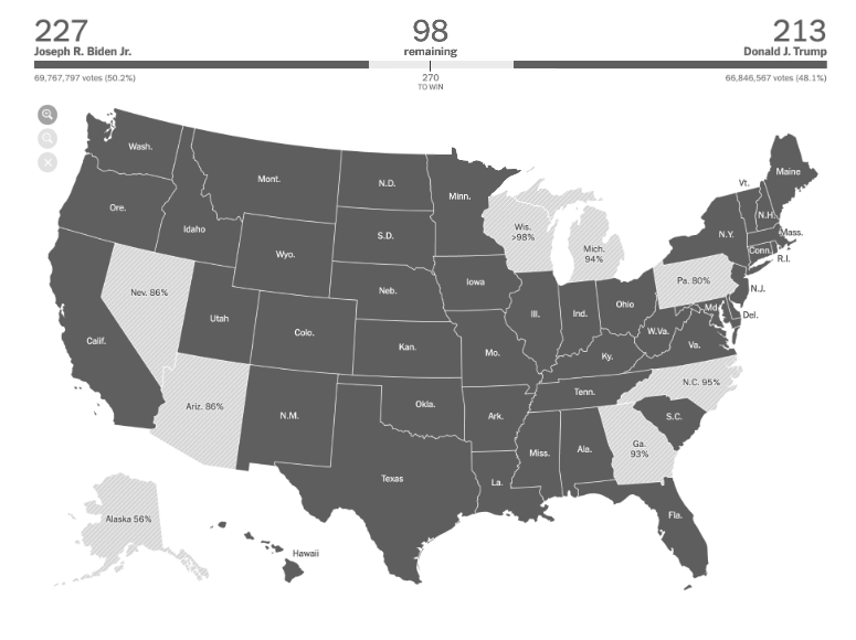
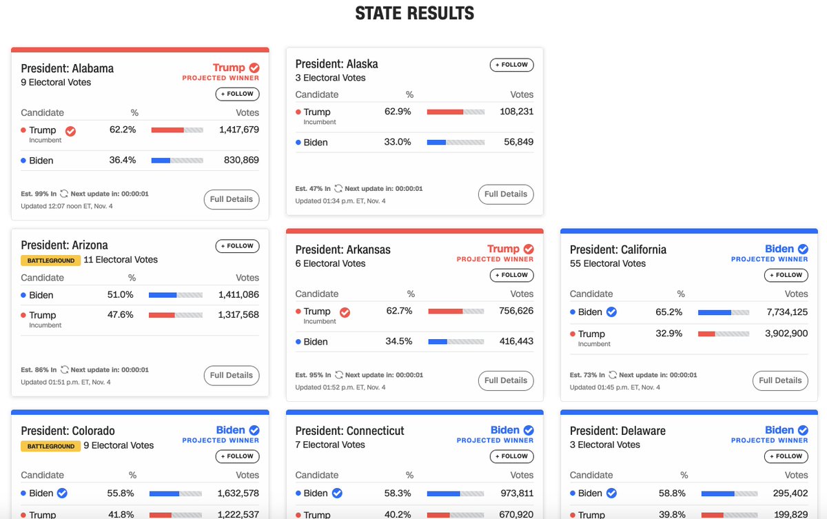
Some highlights: A few sources, like NYT, read all the numbers on the graph, but not the actual useful information.
Video alt: Going through line charts with VoiceOver. VO reads the numbers of the x and y-axis, but doesn& #39;t give any insights on which candidate is leading.
Video alt: Going through line charts with VoiceOver. VO reads the numbers of the x and y-axis, but doesn& #39;t give any insights on which candidate is leading.
Fox News does something similar, as I have previously highlighted on Twitter already. Their progress bar reads the amount of electoral votes per state, but not which candidate or state the votes belong to.
Especially strange since it seems they specifically designed it this way
Especially strange since it seems they specifically designed it this way
They actually hid the information for each candidate, and added a hidden label for screen readers that *only* reads "1 vote", "3 votes", "13 votes" and so on.
FiveThirtyEight reads a summary for each graph. I found their graphs to be the most accessible when it came to "getting the necessary info easily using only VoiceOver", however the exact numbers are not available, and hover effects aren& #39;t keyboard accessible.
Video description: VoiceOver reads "Forecast. Chance of winning: Biden, 89. Trump, 10. Image."
On abc it is possible to navigate the map using keyboard only with VoiceOver (+ Chrome). But as explained in this thread by @FrankElavsky, it doesn& #39;t work with for example NVDA. https://twitter.com/FrankElavsky/status/1324461517194973185">https://twitter.com/FrankElav...
It& #39;s not just about screen readers either. This is a simulation of one of the graphs from NYT for Achromatopsia (complete colorblindness). All other news sources also only rely on color, but NYT was the only one where there was absolutely no contrast between the red and blue.
And we also have overviews like these that literally triggered a night long headache for me. The good news is that all information is there, and the bad news also is that all information is there. What exactly am I supposed to look at?
For a more detailed walkthrough, read the post  https://abs.twimg.com/emoji/v2/... draggable="false" alt="⬇️" title="Pfeil nach unten" aria-label="Emoji: Pfeil nach unten"> https://fossheim.io/writing/posts/accessible-dataviz-us-elections/">https://fossheim.io/writing/p...

 Read on Twitter


